CSS Display Property: Exploring Different Values And Their Effects
 Ayush
Ayush
When building a website or web product, the most crucial factor to consider is user experience. A good user experience makes all the difference; therefore, it should be prioritized. When a user lands on a web page, the first thing their eyes are drawn to is the overall display of the site. This visual design is integral to the overall experience and can make or break how a visitor feels about your site.
Each element of the web page should be at its best display behavior to give an eye-comforting experience to the site’s visitors. To manipulate the display behavior of each element, you can use CSS Display Property, a powerful helping hand tool. CSS styling comes with a display property that lets you experiment with the display behavior of the different elements on a web page and achieve the best user experience.
Not just display when it comes to user experience, the website’s layout also plays a vital role. But in major cases, the actual implementation and layout creation is much more complicated than designing its wireframe. However, CSS has numerous properties to initialize the different aspects of different items present in the layout, such as size, position, location, padding, etc. But still, it becomes a very struggling task to create a perfect layout by using those traditional CSS properties.
And this is where CSS Display Property saves us from spending too much time designing layouts. CSS Display Property also allows us to configure the whole layout of the site by converting the layout into a Flexbox or Grid model layout. Furthermore, we can take advantage of the properties that define model layout features and implement the whole layout much more quickly.
As explained earlier, the CSS Display property allows us to assign the display behavior of the whole interface of the web page and the elements present inside it.
CSS Display Property has many predefined keyword attributes that can be leveraged to get the desired results. Let’s dive deep into each of these in the coming sections of this blog.
This smoke testing tutorial covers what smoke testing is, its importance, benefits, and how to perform it with real-time examples.
display: block
The CSS Display Property with the “block” value is commonly used to create page layouts with elements taking up the full width of their container. The block attribute creates a whole new block and shows the assigned element in that block. Since a new block is created, the element starts from a new line instead of continuing with the last element.
By default, the newly created block takes up the whole available space, but thanks to CSS Display Property, i.e., CSS styling that helps you change the width and height of the block.
Some elements have the display behavior as a block by default. These elements will always have a block as their display behavior with or without assigning any specific display behavior to them. These special elements include < div >, < p >, and < section >.
<body>
    <div>Text for Example, <span>Text for Example</span> Text for Example</div>
  </body>
body {
  font-weight: bold;
  font-size: x-large;
}
span {
  display: block;
  background-color: red;
}
Output:

You can observe that for the < span > tag, we have used the CSS Display Property and assigned it to the block attribute. This has made the < span > appear in a new block taking up the whole screen width.
For display: block, the CSS Display Property is essential for creating page layouts where elements take up the full width of their parent container.
display: inline
The CSS Display Property with the “inline” value is often used for inline elements, such as links or text, to appear side-by-side horizontally. The inline attribute also creates a new block, just like the block attribute. Still, instead of displaying in a new line, the element with the inline attribute stays in continuity with the previous element. The space occupied by the inline attribute is just as same as a common element would occupy.
Since it does not take up the whole screen space, it restricts us from manipulating the height and width of the element.
Like the block attribute, the inline attribute has some specific elements that display inline behavior by default. These specific elements include < span >, < a >, < i >, and < img >.
span {
  display: inline;
  background-color: red;
}
Output:

In the previous HTML code, we have embedded the CSS Display Property in < span > tag and assigned it to the inline attribute. This has created a separate block for the < span > tag and displays it in continuity with the previous elements.
When using display: inline, the CSS Display Property is used to position elements side-by-side horizontally, making it a good value for creating menus or lists.
display: inline-block
The CSS Display Property with the “inline-block” value is useful for creating custom form elements, such as checkboxes or radio buttons, that can be horizontally and vertically aligned.
The inline-block attribute works exactly similarly to the inline attribute. However, the major difference between the inline attribute and the inline-block attribute is that, unlike the inline attribute, the block created by the inline-block allows us to manipulate its height and width depending on the requirements.
span {
  display: inline-block;
  width: 100px;
  background-color: red;
}
Output:

Here, for the < span > tag, we have used the CSS Display property and added the inline-block property. After that, we changed the block’s width created by the inline-block attribute. You can notice the significant changes in this example and the previous one.
Using the display: inline-block value with CSS Display Property allows for custom form elements to be aligned horizontally and vertically, giving web developers more flexibility when designing CSS styling forms.
A complete Manual testing tutorial covering all aspects of Manual testing, including strategies and best practices.
display: inherit
The CSS Display Property with the “inherit” value is used to make an element inherit its parent’s display property value. The inherit attribute is the only attribute offered by CSS Display Property. As the name suggests, the inherit attribute simply makes an element inherit or grab the CSS display property of its parent element.
In other words, whatever the display behavior an element will have, its child element will have the same behavior.
<body>
    <span>Text for Example |
      <div>Text for Example |</div>
      Text for Example</span>
  </body>
body {
  font-weight: bold;
  font-size: x-large;
}
div {
  display: inherit;
}
Output:

Here, we have used a < span > element and inside of that we have initialised a < div > element. As per the default display behavior of < div > tag, all three statements should appear in 3 separate lines. Since we have initialized CSS Display Property for the styling of < div > tag and attached it to the inherit attribute. The < div > tag has inherited the CSS Display Property of tag, i.e., inline-block. Therefore, we are getting all three statements in a single line.
By setting display: inherit with the CSS Display Property, web developers can ensure that an element inherits its parent container’s CSS display property value, simplifying styling and promoting consistency across a page.
display: initial
The CSS Display Property with the “initial” value is used to reset an element’s display property value to its default value. The initial attribute simply sets the element to its default display behavior. So, if we assign a CSS display property to the initial attribute in a < span > tag, the display behavior will be set to its default value, i.e., inline-block.
 <div>
      Text for Example |
      <span>Text for Example |</span>
      Text for Example
    </div>
body {
  font-weight: bold;
  font-size: x-large;
}
span {
  display: initial;
  color: red;
}
Here, we have assigned the CSS Display Property to the initial attribute for the < span > tag. Therefore, all three statements are displayed as an inline block.
Output:

The CSS Display Property’s initial value, display: initial, helps reset an element’s display property value to its default value, which can be especially helpful when starting a new project.
display: none
The CSS Display Property with the “none” value is often used to hide elements from the page without deleting them from the HTML code. The none attribute of the display attribute just makes the entire element content invisible. This attribute makes the whole element withdrawn from the page by leaving no mark behind. It will be like that element never existed on the layout.
If you think removing an aspect will affect the whole layout, then no, this attribute does not affect the layout.
body {
  font-weight: bold;
  font-size: x-large;
}
span {
  display: none;
  color: red;
}
Output:

Here, the CSS Display property has been assigned to none attribute for the < span > element. Therefore, it’s taken off from the layout.
In other words, the CSS Display Property’s none value, display: none, is commonly used to hide elements from a page without deleting them from the HTML code, making it useful for toggling content visibility in response to user interactions.
display: flex
The CSS Display Property with the “flex” value is commonly used for creating responsive layouts, allowing elements to adjust their size and position based on the available space. We have been discussing some basic attributes of the CSS display property. But now it’s time for two major attributes — Flex and Grid. First, let’s discuss the flex attribute, and then we will hop into the grid attribute.
The flex attribute converts the whole display behavior of the element into the flex layout. Flex layout (popular by the name Flexbox layout) is a pre-designed layout model which helps us to create the whole layout. Flexbox layouts have several properties that allow us to align the child elements into the desired positions.
    <div class="flex-container">
      <div class="flex-item"></div>
      <div class="flex-item"></div>
      <div class="flex-item"></div>
      <div class="flex-item"></div>
      <div class="flex-item"></div>
    </div>
flex-container {
  display: flex;
  border: 2px solid black;
}


.flex-item {
  height: 100px;
  width: 100px;
  border: 1px solid black;
  background-color: #cff5e7;
  margin: 20px;
}
Output:

Here, there’s a main container < div > tag, and in that, 5 < div > tags are working as a child element to it. You can observe that we have initialized the CSS Display Property and assigned it to the flex attribute for the container < div > element. This has created the flexbox layout in the container element, and each child element is aligned horizontally.
Since the default behavior of flexbox layout is to align horizontally (row-wise), we are getting such results. However, the Flexbox allows us to change the alignment using the flex-direction property.
flex-direction: column;
Output:
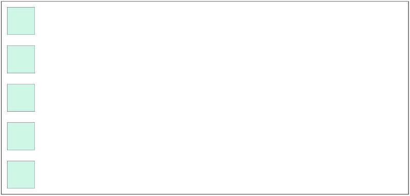
In the above figure, you can observe that on applying the column attribute to the flex-direction property, all the child items get aligned in the vertical direction (column-wise). That’s how flex-direction property helps us to align child items.
There are a bunch of other alignment properties that flexbox layout comes with. Since many of the alignment properties of flexbox layout are the same as of grid attribute offers. Hence, first, lets us have some knowledge of grid attribute and then understand the alignment properties.
When using display: flex, the CSS Display Property provides a powerful tool for creating responsive layouts that can adjust their size and position based on the available space, making it a popular choice for modern web design.
A complete Manual testing tutorial covering all aspects of Manual testing, including strategies and best practices.
display: grid
The CSS Display Property with the “grid” value is used for creating complex layouts by defining rows and columns and placing elements within them. In CSS, assigning positions to the elements to get the desired results has always been hectic and stressful.
Almost every CSS developer would have faced a situation where he is given some position to an element, and the other elements besides it get disoriented. One of the best solutions to avoid this type of situation is to use the CSS Grid Layout Module.
CSS Grid is a 2-dimensional grid layout system comprising a defined number of rows and columns. At the intersection points of rows and columns, blocks (empty cells) get formed. These blocks work as a container where we can add the elements we want to display on the web page.
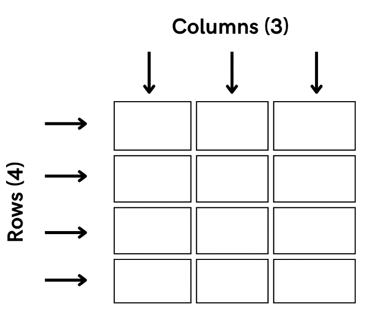
In the above figure, we have attempted to showcase a CSS Grid (looking very much like a table filled with blue color). On the vertical track, we have columns; on the horizontal track, we have rows. So, in the above representation, we have three columns with four rows.
The intersection of these rows and columns gives rise to Grid cells, which work as a container where we can insert the layout elements.
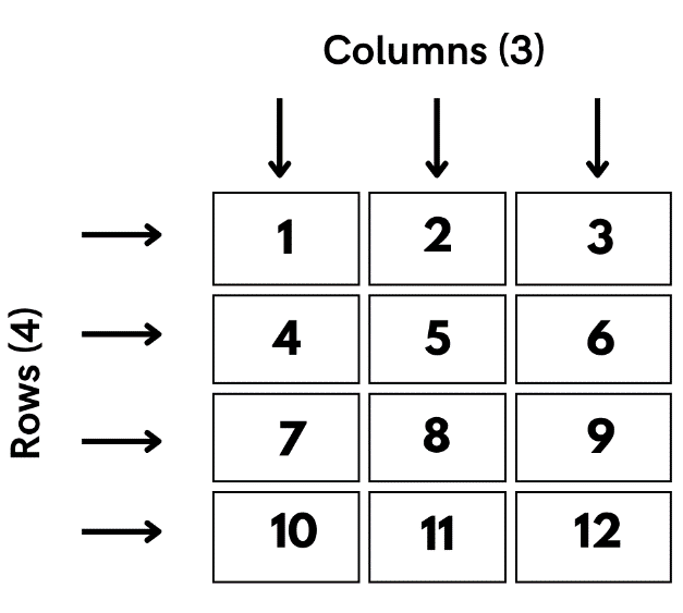
Here, we can observe that a combination of 4 rows and 3 columns gives us 12 (4 x 3) cells, also called Grid cells. There’s one more important terminology related to CSS Grid: Grid Item. Grid Item is the direct children of any particular cell or container; those children could be any kind of tag containing any data.
For better understanding, you can take the example of Microsoft Excel. A CSS Grid Layout has striking similarities with Microsoft Excel Sheet. An excel sheet consists of rows and columns just like a CSS Grid, and in an Excel sheet, we add the data and perform mathematical formulations inside the cells, which is again exactly like the CSS Grid.
Now we have gained good enough information about the CSS Grid, let’s deep dive to see where CSS Grid can be used in practical applications.
How to use CSS Grid?
To apply the functionality of CSS Grid layout in the basic layout, we simply have to assign the CSS display property to the grid attribute.
display: grid;
Adding just this simple line makes the whole layout behave as a grid layout. If you want, you can convert the whole screen layout into a CSS Grid layout, or any particular div tag could be converted to a CSS Grid layout depending upon your requirements.
CSS Grid layout demands assigning the number of rows and columns we want in the grid to form the cells. To add the rows and columns in the grid, CSS grid comes with two properties, namely grid-template-rows property to add rows and grid-template-columns property to add columns. Let’s see some examples of it.
Check out the best CSS Grid Layout Generators that help you in fast prototyping and front-end design of CSS layouts for your projects.
 <div class="container">
      <div class="item"></div>
      <div class="item"></div>
      <div class="item"></div>
      <div class="item"></div>
      <div class="item"></div>
      <div class="item"></div>
      <div class="item"></div>
      <div class="item"></div>
      <div class="item"></div>
    </div>
.container {
  height: 500px;
  width: 550px;
  border: 2px solid black;
  display: grid;
  grid-template-rows: 133px 133px 133px;
  grid-template-columns: 133px 133px 133px;
}


.item {
  height: 100px;
  width: 100px;
  border: 2px solid black;
  margin-top: 10px;
  margin-left: 10px;
  background-color: aqua;
}
Output:
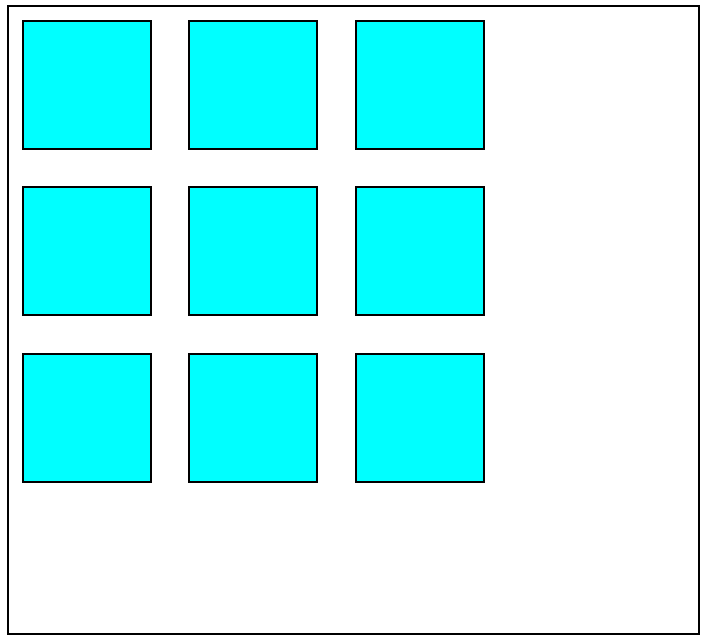
Here, we have created a container div tag and multiple item div tags. Then, some basic CSS styling was assigned to it. Afterward, we converted the container div layout to a grid layout by assigning CSS display property to the grid attribute.
 grid-template-rows: 133px 133px 133px;
 grid-template-columns: 133px 133px 133px;
Furthermore, with the help of the grid-template-rows property and grid-template-columns property, we have initialized three rows and three columns to form the grid. Here you’ll notice that instead of assigning some rows and columns, we have assigned some pixel quantities to the properties.
These pixel quantities are the width of the rows and columns we want, and the number of pixel quantities we have assigned is the number of rows and columns we want. So, here you can observe three-pixel quantities of 133px each. This eventually creates 3 columns and 3 rows of width 133px. Hence, the total number of cells we get in this grid is 9 (3 x 3).
Let’s see some more examples of it.
    <div class="container">
      <div class="item"></div>
      <div class="item"></div>
      <div class="item"></div>
      <div class="item"></div>
      <div class="item"></div>
      <div class="item"></div>
      <div class="item"></div>
      <div class="item"></div>
      <div class="item"></div>
      <div class="item"></div>
      <div class="item"></div>
      <div class="item"></div>
    </div>
.container {
  height: 500px;
  width: 550px;
  border: 2px solid black;
  display: grid;
  grid-template-rows: 133px 133px 133px;
  grid-template-columns: 133px 133px 133px 133px;
}
Output:
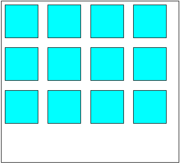
Here we have created 3 rows and 4 columns. For that, 3-pixel quantities have been assigned in the grid-template-rows property, and 4-pixel quantities have been assigned in the grid-template-columns property.
Here’s another example:
  <body>
    <div class="container">
      <div class="item"></div>
      <div class="item"></div>
      <div class="item"></div>
      <div class="item"></div>
      <div class="item"></div>
      <div class="item"></div>
      <div class="item"></div>
      <div class="item"></div>
    </div>
  </body>
  grid-template-rows: 133px 133px;
  grid-template-columns: 133px 133px 133px 133px;
Output:
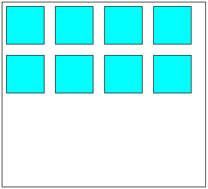
In this case, we have created a grid consisting of 2 rows and 4 columns. To make this grid, just like we did in the previous examples, we allocated 2-pixel quantities in the grid-template-rows property and 4-pixel quantities in the grid-template-columns property.
A complete tutorial on retesting that sheds light on its features, importance, pros and cons, and how to perform it.
We have been using pixel quantities to define the width and number of rows and columns. However, on a professional level, the use of fraction (fr) units is more favorable to a great extent than the use of pixel units in the case of CSS Grids. The fr unit signifies the fraction of the available space inside a container or block. Let’s understand the use of fr unit in CSS Grid.
<div class="container">
      <div class="item"></div>
      <div class="item"></div>
      <div class="item"></div>
      <div class="item"></div>
    </div>
  grid-template-rows: 1fr 1fr;
  grid-template-columns: 1fr 1fr;
Here, in this example, you can observe that in the grid-template-rows property and grid-template-columns property we have made the use of fr units. We have assigned 2 fr units of quantity one, which ultimately created the two fractions of the whole space available in the container, and both fractions are of the same width.
We have used the same 2 fr units of 1 quantity in both the grid-template-rows property and grid-template-columns property, resulting in 2 rows and 2 columns, respectively. All this results in the generation of 4 cells (2 x 2) that you can observe in the example.
Fr units come in super handy when we have to divide a particular container into any number of equal parts, but the container’s space is unknown to us. To simplify it, you can use the repeat function of CSS and assign it the fraction unit and the number of times you want to repeat it (as shown below snippet).
  grid-template-rows: repeat(2, 1fr);
  grid-template-columns: repeat(2, 1fr);
Till now, we were taking the example of items (present inside cells) of defined height and width, but what if we do not assign any height and width to it? In that case, the item content will expand to the whole space inside the cell.
But a situation arises in this case. However, each cell item clearly distinguishes an item from its adjacent item because of its black border. But what if the CSS borders are hidden from us? How will we distinguish between the cells? column-gap and row-gap properties of CSS Grid are the answer to this situation.
As the name suggests, the column-gap and row-gap properties add some gap or space between the columns and rows, respectively. This makes it visible where one row and column end and from where the next row and column begin.
Until now, as you have seen, CSS Grid comprises cells formed by rows and columns, and each cell will have its item, which is restricted to that specific cell. But in a real-life situation, this is not true every time. You will find many situations where you have to expand an item from its cell to another cell to get the desired results.
CSS Grid offers some Start and End properties for this type of situation. To expand the item column-wise, grid-column-start and grid-column-end properties are there; in the case of row-wise, we have grid-row-start and grid-row-end properties. What these properties do is dilate an item from one cell to another cell.
The grid-column-start property is used to allocate from which column the item will start, and the ending column for the item is allocated in the grid-column-end property. The working of the grid-row-start and grid-row-end properties is exactly similar to the grid-column properties for the row-wise. Let’s understand their work with some examples.
<div class="container">
      <div class="item item1"></div>
      <div class="item"></div>
      <div class="item"></div>
     <div class="item"></div>
     <div class="item"></div>
     <div class="item"></div>
     <div class="item"></div>
     <div class="item"></div>
    </div>
.container {
  height: 250px;
  width: 550px;
  border: 2px solid black;
  display: grid;
  grid-template-rows: repeat(3, 1fr);
  grid-template-columns: repeat(3, 1fr);
  row-gap: 10px;
  column-gap: 10px;
}


.item {
  border: 1px solid black;
  margin: 10px;
  background-color: aqua;
}


.item1 {
  grid-row-start: 1;
  grid-row-end: 3;
}
Output:
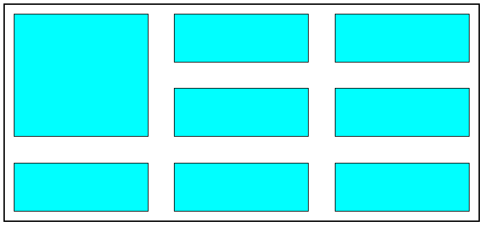
In this example, you will observe that the item of 1st cell is expanding vertically that means it’s going from start of 1st row to the beginning of 3rd row. To get this type of output, we used the grid-row-start and grid-row-end properties for the 1st item and assigned them to 1 and 3. This resulted in the 1st item getting enlarged from 1st row to 3rd row.
Online Selenium Grid to run your browser automation testing scripts on cloud infrastructure containing 3000+ desktop and mobile browser environments. Perform Selenium Testing on a cloud automation testing grid that scales along with your tests.
In the same way, you can use grid-column-start and grid-column-end properties to enlarge the item to the desired columns. Let’s see how it works.
.container {
  height: 250px;
  width: 550px;
  border: 2px solid black;
  display: grid;
  grid-template-rows: repeat(3, 1fr);
  grid-template-columns: repeat(3, 1fr);
  row-gap: 10px;
  column-gap: 10px;
}

.item {
  margin: 10px;
  background-color: aqua;
  border: 1px solid black;
}

.item1 {
  grid-column-start: 1;
  grid-column-end: 3;
}
In this example, you can observe that the item of 1st cell is getting expanded from the start of the 1st column to the beginning of the 3rd column. To get this result, we just added the two properties, grid-column-start, and grid-column-end, in the styling of 1st cell item and assigned those properties to 1- and 3-unit attributes. This made the 1st cell item spread out from the 1st cell to the 2nd cell, as you can observe in the example.
With the help of these grid-column and grid-row properties, you can create endless possibilities of layouts by creating different combinations of these properties. This is how CSS Grid becomes a helping hand to develop layouts and makes it so much easy.
Until now, we have been talking about how the CSS Grid model helps us create complex ways much more effortless. But that’s not the only area in which CSS Grid benefits us. Perfectly aligning items in the layout is as important as the layout itself. Although CSS offers us a variety of properties for the alignment of items, in many cases, aligning items with these properties becomes a headache.
CSS Grid model becomes a savior for us there too. The CSS Grid model comprises unique properties that make it much easier to align the items inside the cells. So now, let us discuss how items could be aligned in the CSS Grid Layout Model.
Aligning items
In layout, aligning items with traditional CSS properties has always been a torturing thing for the developers. Positioning one item could ultimately lead to dispositioning its adjacent items if you use the conventional CSS positioning properties. But CSS Grid is there too to have our back.
CSS Grid comprises a collection of properties to align the items in the cell. These properties can be used to align the items in horizontal and vertical directions.
As we have discussed above, in a grid layout, there are two major compartments — 1st one is the container div working as the wrap for all the cells, and the 2nd major compartment is the cells themselves. On that account, for both these major compartments, there are different properties for the alignment of the items. The align properties made for the container block will only work for the container and not the cells; the same goes for the properties made for the cell compartment.
When it comes to aligning items properties, the first property that comes into play is the ‘justify-items’ property. This property is used to align the items in the horizontal direction. This property falls under the category of container properties. So that means it will not be for a particular item; rather, it will affect all the items inside the container. That’s why the property name has ‘items’ (plural).
The justify-items property comprises many pre-defined keyword attributes for the different positioning of the items. The predefined attributes are listed below:
start
center
end
normal
stretch
baseline
auto
inherit
initial
All these attributes help in aligning the items horizontally. At the default stage, all the items are fixed to the start attribute.
Let’s see how it’s working with this example:
    <div class="container">
      <div class="item">1</div>
      <div class="item">2</div>
      <div class="item">3</div>
    </div>
.container {
  height: 350px;
  width: 550px;
  display: grid;
  grid-template-rows: repeat(6, 1fr);
  grid-template-columns: repeat(3, 1fr);
  row-gap: 10px;
  column-gap: 10px;
  justify-items: center;
  border: 2px solid black;
}


.item {
  border: 1px solid black;
  text-align: center;
  font-size: 40px;
  height: 50px;
  grid-row-start: 2;
  grid-row-end: 6;
  width: 50px;
  background-color: aqua;
}
Output:
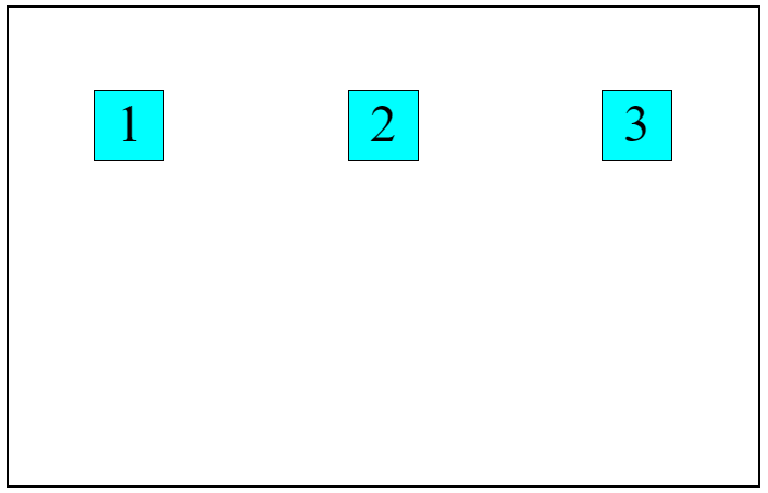
Here, you will notice that in the styling of container class, we have used the justify-items property and assigned it to the center attribute. This has aligned all the items in the container to the center. By using the start attribute, the items will get aligned to the left, and in the case of the end attribute, all the items will get aligned to the right.
Which are the most wanted test automation tools that have climbed the top of the ladder so far? Let’s take a look.
Now the question comes, how can we align a particular cell item without affecting the rest? The answer to this is “justify-self” property. This cell-centric property does not affect the rest of the items except the item in which it is used. The justify-self property works exactly like the justify-items property.
    <div class="container">
      <div class="item">1</div>
      <div class="item item1">2</div>
      <div class="item">3</div>
    </div>
.item1 {
  justify-self: center;
}
Output:
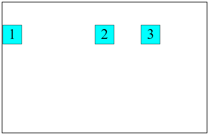
Here, you can notice that in the 2nd, we have used the justify-self property and assigned it to the center attribute. Because of this, the 2nd div is aligned to the center position in the cell. Since we have not assigned any, align property in the container div. Therefore the rest of the items are at their default alignments.
As discussed above, the justify property works for the horizontal alignment. So, for the vertical alignment of the items, CSS Grid has aligned properties for us. The align properties allow us to align the items vertically. And just like the justify property, align-items too has two versions — align-items property for the container block and align-self property for the cells.
Example:
<h2>Container 1</h2>
    <div class="container">
      <div class="item">1</div>
      <div class="item item1">2</div>
      <div class="item">3</div>
    </div>
    <h2>Container 2</h2>
    <div class="cont">
      <div class="item">1</div>
      <div class="item item2">2</div>
      <div class="item">3</div>
    </div>
.container {
  height: 350px;
  width: 550px;
  display: grid;
  border: 2px solid black;
  grid-template-rows: repeat(6, 1fr);
  grid-template-columns: repeat(3, 1fr);
  row-gap: 10px;
  column-gap: 10px;
  align-items: end;
}
.cont {
  border: 2px solid black;
  margin-top: 20px;
  height: 350px;
  width: 550px;
  display: grid;
  grid-template-rows: repeat(6, 1fr);
  grid-template-columns: repeat(3, 1fr);
  row-gap: 10px;
  column-gap: 10px;
}


.item {
  border: 1px solid black;
  text-align: center;
  font-size: 40px;
  height: 50px;
  grid-row-start: 2;
  grid-row-end: 6;
  width: 50px;
  background-color: aqua;
}


.item1 {
  justify-self: center;
}


.item2 {
  align-self: center;
}
Output:
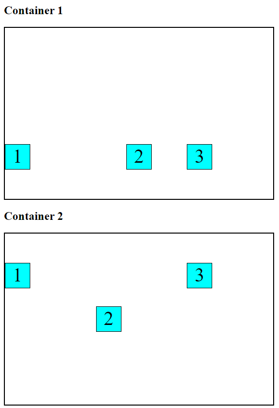
In this example, we have created two main container blocks, and in that, we have performed some basic styling on the items. Now comes the fun part. In the first container, we have embedded the align-items property and assigned it to the end attribute, which has shifted all the items to the vertical end of the cells. And for the 2nd container block, we have used the align-self property in the 2nd div and assigned it to the center attribute. This has made the 2nd div align at the center vertically. You can witness the difference between using the align-items property and the align-self property.
Till now, we have been discussing all the examples by expecting the rows and columns to be in the fraction size of the grid. Fractions depend on the grid container’s size, so it keeps changing depending on the grid container’s size. But the tables get slightly turned if we consider the rows and columns to be in non-flexible units such as pixels.
Sometimes, the size of the grid items is in a non-flexible unit (pixels) which results in the grid of less size as compared to the size of the grid container. In such cases, the grid’s alignment can be set within the grid container.
Just like the CSS Grid offers some inbuild properties for the alignment of items when rows and columns are in fraction size, it has some alignment properties even when the rows and columns are in non-flexible units. CSS Grid majorly comes with two primary properties for the alignment of the content — justify-content property and align-content property.
The justify-content property works the same way for the content as the justify-items for the cell items. The Justify-content property allows us to align the grid in the horizontal direction or, in other words, row-wise direction. And as you might have judged, the align-content property is responsible for aligning the grid in the vertical or column-wise direction. Let’s see these properties in action.
.container1 {
  height: 250px;
  width: 550px;
  border: 2px solid black;
  display: grid;
  grid-template-rows: repeat(3, 1fr);
  grid-template-columns: repeat(3, 1fr);
  row-gap: 10px;
  column-gap: 10px;
  justify-content: center;
}
.container2 {
  height: 250px;
  width: 550px;
  border: 2px solid black;
  display: grid;
  grid-template-rows: repeat(3, 1fr);
  grid-template-columns: repeat(3, 1fr);
  row-gap: 10px;
  column-gap: 10px;
  align-content: center;
}


.item {
  border: 1px solid black;
  text-align: center;
  font-size: 40px;
  height: 50px;
  grid-row-start: 2;
  grid-row-end: 6;
  width: 50px;
  background-color: aqua;
}
Output:
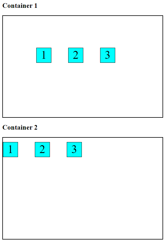
Here, we have created two container blocks, one for the justify-content property and the other for the align-content property. To make the effect of the justify-content and align-content properties visible, we have initialized the grid-template-rows and grid-template-columns properties with pixel quantities in place of fraction quantities.
Check our comprehensive step-by-step guide on CSS Color-Contrast(), which helps you create accessible user interfaces.
Taking the 1st container block into consideration, we have initialized the justify-content property in the styling of the container block and assigned it to the center attribute. As a result, all the grid items will get aligned to the center. And now, no matter what the size of the row and columns will be (in pixels), the items inside the grid cells will always be aligned in the center.
In the case of the 2nd container, we have used the align-content property to align items. To align the items vertically, in case of the non-flexible unit size of row and grid, we have the align-content property. The align-content property works exactly like the justify-content property but in the vertical direction.
Just like other alignment properties, justify-content property, and align-content property too comes with a pack of attributes. Mentioned below is the list of attributes that these properties come with:
center
start
end
left
right
space-between
space-around
space-evenly
stretch
All of these properties work as a helping hand to align the elements at distinct positions.
Until now, we have discussed a couple of different methods to align the grid items in horizontal and vertical positions. But still, there’s one major concept left to discuss: how to align a div block at the center. Let’s look at it.
Centering a div
Placing a div block at the center of a container has always been in practice to give the whole layout a professional look. But placing a div at the exact center position is very annoying. If we use traditional methods of CSS, aligning a div block at the center is nothing less complicated than aligning div blocks at different positions on the layout. But CSS Grid layout becomes our lifejacket even in this situation.
The properties we discussed earlier help us to align the item in the horizontal and vertical directions. The same properties could also be used to align a div block at the center position of a container block. You may have guessed it; we can use both the horizontally and vertically aligning properties simultaneously to align a div at the center.
Let’s understand it with an example shown below:
  <div class="container1">
      <div class="item">1</div>
      <div class="item">2</div>
      <div class="item">3</div>
    </div>
 .container1 {
  height: 350px;
  width: 550px;
  display: grid;
  border: 2px solid black;
  grid-template-rows: repeat(5, 1fr);
  grid-template-columns: repeat(3, 1fr);
  row-gap: 10px;
  column-gap: 10px;
  justify-items: center;
  align-items: center;
}


.item {
  border: 1px solid black;
  text-align: center;
  height: 50px;
  font-size: 40px;
  grid-row-start: 2;
  grid-row-end: 4;
  width: 50px;
  background-color: aqua;
}
Output:
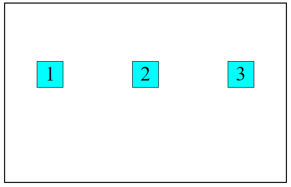
In this example, all three div blocks are exactly equidistant from both horizontal and vertical directions. And to get this effect, we have initialized both the justify-items property and align-items property in the styling of the main container block and assigned them to the center attribute. The justify-items property centered the block horizontally, and the align-items property centered the items vertically, and with the combined effect of these, we got this result.
Now, let’s take an example where we have to center a specific item and not all.
  <div class="container">
      <div class="item">1</div>
      <div class="item item1">2</div>
      <div class="item">3</div>
    </div>
.container {
  margin-top: 20px;
  height: 350px;
  width: 550px;
  display: grid;
  grid-template-rows: repeat(5, 1fr);
  grid-template-columns: repeat(3, 1fr);
  row-gap: 10px;
  column-gap: 10px;
  border: 2px solid black;
}


.item {
  border: 1px solid black;
  text-align: center;
  height: 50px;
  font-size: 40px;
  grid-row-start: 2;
  grid-row-end: 4;
  width: 50px;
  background-color: aqua;
}


.item1 {
  justify-self: center;
  align-self: center;
}
Output:
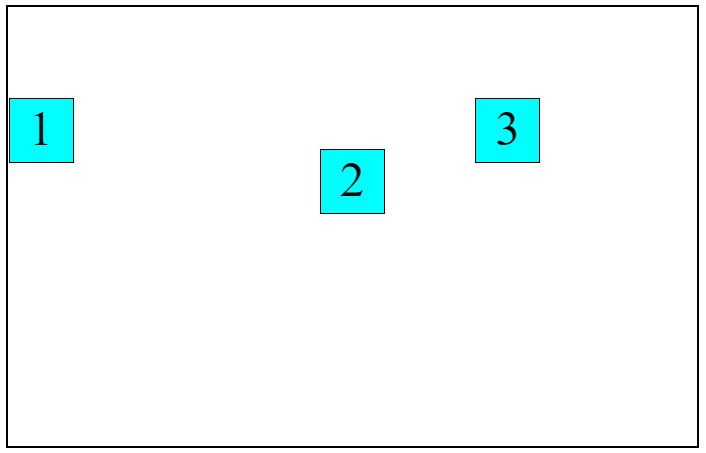
Here, you can notice that only the 2nd div block is aligned at the center. The rest of the div blocks are aligned at their default positions. To get this kind of effect, we have used the justify-self property and align-self property and assigned them to the center attribute. And that’s how we got this result.
Finally, by using display: grid with the CSS Display Property, web developers can create complex page layouts by defining rows and columns and placing elements within them, making it helpful in creating visually appealing and functional websites.
Now imagine how much time it would have taken if we tried to align a div block at the center using the traditional CSS alignment properties. It took us just two lines of code to center a div.
In this way, the CSS Grid makes our life so much easier and saves time.
You might be doubting whether the layouts created using CSS Grid layout are responsive. The layout will be fully responsive if you use flexible units like fr. This is one more reason for using Grid layout mode to create a layout since there is no need to apply CSS media queries for the different screen sizes.
After successfully creating a layout, testing its responsiveness on different screen sizes is highly important. But testing at different screen sizes and resolutions takes a lot of time and is quite tricky. To help us out in this situation, some testing and web development tools are present in the market, making the whole testing procedure much easier and less time-consuming.
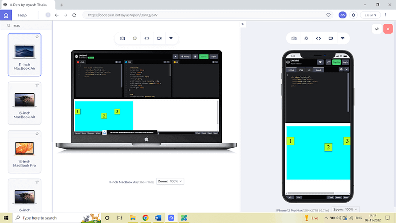
One such tool available in the market is LT Browser 2.0. It is a mobile-friendly tester that becomes a helping hand when performing responsive testing of any web product.
LT Browser by LambdaTest offers 50+ pre-installed viewports for mobiles, tablets, desktops, and laptops, which helps us to test our web product on different viewports and other features like network simulation, hot reloading, creating Google Lighthouse performance reports, and much more. Not just for testing purposes but many more reasons make the LT Browser a must for every developer.
In this article, we take a look at some aspects of simulation and discuss some ways through which we can use the iPhone emulator.
To learn more about Responsive Testing, watch the tutorial below:
%[INVALID_URL]You can also subscribe to our LambdaTest YouTube Channel to learn about web automation tools like Selenium, Playwright, Appium, and more.
Final Thoughts!
Congratulations on reaching this far! You’re a fantastic reader! In this tutorial, we’ve discussed the CSS Display Property and CSS Grid model layout in detail, including the different components of the CSS Display Property and CSS Grid with real-time examples. We also looked at how we can utilize the benefits of the CSS Grid layout model to create website layouts in a much easier and time-saving manner.
We also discussed how CSS Grid saves our time by eliminating the need to assign media queries. We can check the Grid layout’s responsiveness using web development tools like LT Browser 2.0. Thanks for taking the time to read this article to completion. Feel free to ask questions in the comment below, and I’ll gladly reply.
Happy Testing!
#LambdaTestYourApps
Subscribe to my newsletter
Read articles from Ayush directly inside your inbox. Subscribe to the newsletter, and don't miss out.
Written by

Ayush
Ayush
I’m a 22 year old Software Engineer. Completed my Btech in Information Technology field in 2021. I have a keen interest in Web Development field and currently learning and exploring the field of Frontend Web Development. Love to get my hands dirty on JavaScript And React. Also working as a Web Development Freelancer. Alongside, I’m also working as a Content Creator and I create content on Web Development niche to share my knowledge with others and help them in their tech journey. Also loves to write blogs and articles on tech niche. A huge lover of video games, read books in my spare time, and to maintain fitness, I play football and badminton.