How to build charts with Chart.js
 Gideon Akinsanmi
Chart.js is one of the most popular JavaScript charting libraries. It’s the only chart library with over 2.7m weekly downloads on npm and 60k stars on GitHub. With Chart.js, you can easily create and customize different kinds of charts.
At the end of this tutorial, you’d be able to install and set up Chart.js, build simple and complex charts and apply customization to your charts.
The steps to take when creating charts in chart.js involves installing chart.js, creating an instance of Chart object and specifying the configuration and dataset within it.
Setting up
First, you need to create a folder and create an index.html page within it.
Within index.html, add the following code:
<DOCTYPE html>
<html>
    <head>
        <!-- 01 -->
        <script></script>
    </head>
    <body>
        <!-- 02 -->
        <div style='position: relative;width: 80vw;height: 50vh;'>
            <canvas id=’myChart’></canvas>
        </div>
        <!-- 03 -->
        <script>
        </script>
    </body>
</html>
Now let's break down the code:
...
<!-- 01 -->
<script></script>
...
This script element will store the address of the Chart.js source files that will be used to create your charts.
...
<!-- 02 -->
<div style='position:relative;width: 80vw;height: 50vh;'>
    <canvas id=’myChart’ ></canvas>
</div>
...
This div element acts as a container for the canvas element. It'll help make your charts responsive. The canvas element will be used by Chart.js for rendering the charts.
...
<!—03 -->
<script>
</script>
...
This script element will store the code you’ll use to create your chart.
Installing chart.js
Chart.js can be added to your project through any of these methods: npm, CDNJS, jsDelivr and GitHub.
To use npm, open your command line interface, navigate to your project's directory and run this command:
npm install chart.js
Once the package has been successfully installed, store the address of the chart.js file in your script tag.
...
<!-- 01 -->
<script src='path/to/chart.js/dist/chart.umd.js'></script>
...
To use jsDelivr, click on https://www.jsdelivr.com/package/npm/chart.js?path=dist, copy one of the addresses of Chart.js and store the copied address in your script tag.
...
<!-- 01 -->
<script src='https://cdn.jsdelivr.net/npm/chart.js@4.2.1/dist/chart.umd.min.js'></script>
...
To use CDNJS, click on https://cdnjs.com/libraries/Chart.js, copy one of the chart.umd.js links and store the copied link in your script tag.
...
<!-- 01 -->
<script src='https://cdnjs.cloudflare.com/ajax/libs/Chart.js/4.2.1/chart.umd.js'></script>
...
To use GitHub, first download or clone the chart.js Github repository on your system. Then build it to generate the dist files. finally, store the address in your script tag.
Creating charts
How to create a single bar chart
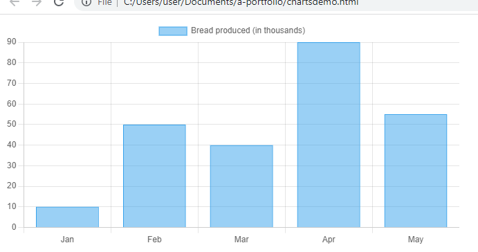
A bar/column chart is a chart that represents values in form of rectangular bars with lengths proportional to the values they represent.
To create a bar chart, add the following code within your script element:
…
<!-- 04 -->
<script>
    // 001
    Let ctx = document.getElementById('myChart');
    // 002
    new Chart(ctx, {
        // 003
        type: 'bar',
        // 004
        data: {
            // 005
            labels: ['Jan', 'Feb', 'Mar', 'Apr', 'May'],
            // 006
            datasets: [{
                // 007
                label: 'Bread produced (in thousands)',
                // 008
                data: [10, 50, 40, 90, 55],
                // 009
                borderWidth: 1
            }]
        },
        // 010
        options: {
            scales: {
                y: {
                    beginAtZero: true
                }
            }
        }
    });
</script>
Result:
Now let's break down the code:
...
// 001
Let ctx = document.getElementById('myChart');
...
We used the getElementById() method to select the canvas element and stored it in a variable.
...
// 002
new Chart(ctx, {...})
...
We created an instance of the Chart object with 2 arguments. The first argument references the canvas element your chart will be rendered in while the second contains the data and configurations for your bar chart.
...
// 003
type: 'bar',
...
When the type property's value is 'bar', it means you want to create a bar chart.
...
// 004
data: {
    ...
}
...
The data property contains the data and configuration for your bar chart datasets.
...
// 005
labels: ['Jan', 'Feb', 'Mar', 'Apr', 'May'],
...
The labels property is used for labelling the x-axis of the bar chart.
...
// 006
datasets: [...],
...
The datasets property stores the data, labels and configurations of your datasets.
...
// 007
label: 'Bread produced (in thousands)',
...
The label property stores the labels of the datasets.
...
// 008
data: [10, 50, 40, 90, 55],
...
The data property stores the values of your datasets.
...
// 009
borderWidth: 1
...
The borderWidth property is used to customize the bar chart's border width. Navigate to 'customizing your chart' to check more customization properties.
...
// 010
options: {...}
...
The options property contains configuration for the scales, axis and overall styling for the bar chart
How to create a horizontal bar chart
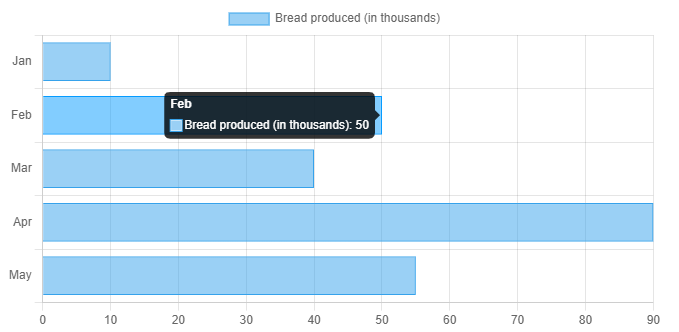
To make it a horizontal bar chart, change the bar chart indexAxis property to ‘y’
...
// 010
options: {
    indexAxis: 'y',
    scales: {
        y: {
            beginAtZero: true
        }
    }
}
...
Result:
How to create a clustered bar chart
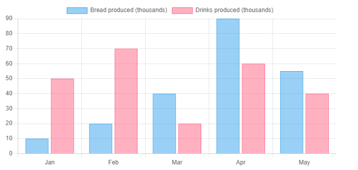
To create a clustered bar chart, add more elements to your datasets property.
...
// 006
datasets: [
    {
        label: 'Bread produced (thousands)',
        data: [10, 20, 40, 90, 55],
        borderWidth: 1
    }, {
        label: 'Drinks produced (thousands)',
        data: [50, 70, 20, 60, 40],
        borderWidth: 1
    }
]
...
Result:
How to create a stacked bar chart
To create a stacked bar chart, add more than one element to your datasets property and change the stacked property of x and y axis to true.
...
// 010
options: {
    scales: {
        x: {
            stacked: true
        }.
        y: {
            stacked: true,
            beginAtZero: true
        }
    }
}
...
Result:

How to create a pie and doughnut chart
A pie and doughnut chart displays data in form of a circle divided into segments with each segment representing a category.
To create a doughnut chart, add the following code:
…
<!—04 ->
<script>
    // 001
    Let ctx = document.getElementById('myChart');
    // 002
    New Chart(ctx, {
        // 003
        type: "doughnut",
        // 004
        data: {
            // 005
            labels: ['Bread', 'Drink', 'Software'],
            // 006
            datasets: [{
                // 007
                label: 'Sales by product (thousands)',
                // 008
                data: [90, 140, 250],
                // 009
                backgroundColor: ['red', 'yellow', 'green']
            }]
        }
    });
</script>
Result:

Here the value of the type property is 'doughnut'.
To create a pie chart, add the following code:
…
<!—04 ->
<script>
    // 001
    Let ctx = document.getElementById('myChart');
    // 002
    new Chart(ctx, {
        // 003
        type: "pie",
        // 004
        data: {
            // 005
            labels: ['Bread', 'Drink', 'Software'],
            // 006
            datasets: [{
                // 007
                label: 'Sales by product (thousands)',
                // 008
                data: [90, 140, 250],
                // 009
                backgroundColor: ['red', 'yellow', 'green']
            }]
        }
    });
</script>
Result:
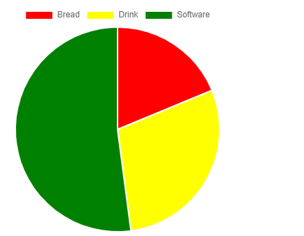
Here the value of the type property is 'pie'.
How to create a line chart
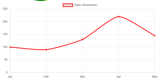
A line chart is a graphical depiction that represents values in the form of a series of data points connected by lines.
To create a line chart, add the following code:
…
<!—04 ->
<script>
    // 001
    Let ctx = document.getElementById('myChart');
    // 002
    New Chart(ctx, {
        // 003
        type: "line",
        // 004
        data: {
            // 005
            labels: ['Jan', 'Feb', 'Mar', 'Apr', 'May'],
            // 006
            datasets: [{
                // 007
                label: 'Sales (thousands)',
                // 008
                data: [100, 90, 130, 220, 145],
                // 009
                borderColor: 'red',
                tension: 0.1
            }]
        }
    });
</script>
Result:
Let's break down some of the code.
Here the value of the type property is 'line'.
The borderColor and tension properties are some of the customizations for line charts.
How to create a mixed chart
A mixed chart combines 2 or more different charts.
To create a mixed chart, add the following code:
…
<!—04 ->
<script>
    // 001
    Let ctx = document.getElementById(‘myChart’);
    // 002
    New Chart(ctx, {
        data: {
            datasets: [
                {
                        type: 'bar',
                        label: 'Drinks produced',
                        data: [30, 10, 15],
                        order: 2
                }, {
                        type: 'line',
                        label: 'Biscuits produced',
                        data: [50, 20, 9],
                        order: 1,
                        tension: 0.5
                }
            ],
            labels: ['Monday', 'Tuesday', 'Wednesday']
        },
        options: {
            scales: {
                y: {
                    beginAtZero: true
                }
            }
        }
    });
</script>
Result:

Now let's explain some of the code.
Here we moved the type property to the datasets property.
The order property describes the stacking order of your charts. the chart with a lower value will be drawn on top while the chart with a higher value will be drawn below.
Customizing your charts
Some of the most properties that can be added to chart.js charts include:
1) backgroundColor: This property specifies a background color for your charts. its value can be solid(red,blue,..), RGB/RGBA, HSL/HSLA and HEX(#FFAA00). it can be applied to all kinds of charts.
...
    datasets: [{
        ...
        backgroundColor: 'rgb(244,004,103)'
    }],
...
Result:
2) barThickness: This value specifies the width of a bar chart's bar. if the value is a number, it specifies the width of each bar in pixels.
…

<script>

    Let ctx = document.getElementById(‘myChart’);

    New Chart(ctx, {

        type: ‘bar’,

        data: {
            ...
            datasets: [{
                ...
                // 009
                barThickness: 8,

            }],
            ...
    });
</script>
3) borderColor: This property specifies the border color of your charts. its value can be solid(red,blue,..), RGB/RGBA, HSL/HSLA and HEX(#FFAA00). it can be applied to all charts.
...
    datasets: [{
        ...
        borderColor: 'rgb(244,004,103)'
    }],
...
4) spacing: This property specifies the arc offset in pixels. it can only be applied to pie and doughnut charts.
…

<script>

    Let ctx = document.getElementById('myChart');

    New Chart(ctx, {

        type: 'pie',

        data: {
            ...
            datasets: [{
                ...
                // 009
                spacing: 2,

            }],
            ...
    });
</script>
5) tension: This property specifies the bezier curve tension of your line chart. 0 means it'll be in straight lines.
…

<script>

    Let ctx = document.getElementById('myChart');

    new Chart(ctx, {

        type: 'line',

        data: {
            ...
            datasets: [{
                ...
                // 009
                tension: 0,

            }],
            ...
    });
</script>
6) borderWidth: This property specified the border width of your charts. its value must be in numbers. it can be applied to all charts.
...
    datasets: [{
        ...
        borderWidth: 7
    }],
...
7) hoverBackgroundColor: This property specifies the chart's background when hovered. it can be applied to all charts.
...
    datasets: [{
        ...
        hoverBackgroundColor: 'red'
    }],
...
8) hoverBorderColor: This property specifies the chart's border color when it's being hovered. it can be applied to all charts.
...
    datasets: [{
        ...
        hoverBorderColor: 'rgb(244,004,103)'
    }],
...
9) hoverBorderWidth: This property specifies the chart's border width when it's being hovered. it can be applied to all charts.
...
    datasets: [{
        ...
        hoverBorderWidth: 9
    }],
...
Responsive charts
In addition to styling your canvas container, there are a few properties that can modify the responsive behaviour of your charts.
1) responsive: it specifies whether the chart canvas should be automatically resized when its container size is changed. its default value is true.
...
option: {
    ...
    responsive: true
}
...
2) maintainAspectRatio: it specifies whether the chart's original aspect ratio should be maintained. its default value is true.
...
option: {
    ...
    maintainAspectRatio: true
}
...
3) aspectRatio: it specifies the chart's aspect ratio. its default value can be either 1 or 2 depending on the chart type.
...
option: {
    ...
    aspectRatio: 3
}
...
Conclusion
Now you see why chart.js is one of the most popular JavaScript charting libraries. It simplifies how you create charts. if you've reached this far, I need you to give yourself a round of applause. it was easy, right? With the knowledge gained from this article, I'm sure you'd be much more confident in creating charts. Check the Chart.js documentation if you want to learn about the kinds of charts, plugins and customizations that can be created with Chart.js.
If you enjoyed reading this article, kindly like and share this article across all your social platforms. You can also follow this blog and sign up for my weekly newsletter. Cheers.
Subscribe to my newsletter
Read articles from Gideon Akinsanmi directly inside your inbox. Subscribe to the newsletter, and don't miss out.
Written by

Gideon Akinsanmi
Gideon Akinsanmi
I love researching and writing about software development tools.