How to Use StencilJS to Create Web Components
 Daniel Olabemiwo
Table of contents
"Getting Started with Stencil.js: A Beginner's Guide" - This article covers an introduction to Stencil.js, including what it is, how it works, and how to set up a new Stencil.js project. This article arises from the need to build reusable and scalable libraries across all frontend stacks. Simply, web components run everywhere!
Stencil is a compiler that generates web components, originally developed by the Ionic team. Stencil takes popular features such as the virtual DOM and Typescript to create stand-alone web components which can be integrated with every popular frontend framework. Stencil combines the best concepts of the most popular frameworks into a simple build-time tool.
Stencil is highly dependent on TypeScript, JSX, and CSS to create standards-compliant Web Components that can be used to craft high-quality component libraries.
At the end of this article, we should be able to build a payment checkout web component library. By doing so, we would have had a good overview of the Stencil framework, used the framework to develop web components and also use it across popular frontend frameworks.
Without further ado, let's get started.
Setup
Stencil requires a recent LTS version of NodeJS and npm/yarn. Make sure you've installed and/or updated Node before continuing.
The create-stencil CLI can be used to scaffold a new Stencil project, and can be run using the following command:
yarn create stencil
? Select a starter project.

Starters marked as [community] are developed by the Stencil
Community, rather than Ionic. For more information on the
Stencil Community, please see github.com/stencil-community

    > component                Collection of web components that can be
                             used anywhere
    app [community]          Minimal starter for building a Stencil
                             app or website
    ionic-pwa [community]    Ionic PWA starter with tabs layout and routes
We're selecting the component option here, to get started. We'll be prompted for the name of our component. For this article, I will be using 'stencilpayform'
✔ Project name › stencilpayform
✔ All setup  in 26 ms

  We suggest that you begin by typing:

  $ cd stencilpayform
  $ npm install
  $ npm start

  $ npm start
    Starts the development server.

  $ npm run build
    Builds your project in production mode.

  $ npm test
    Starts the test runner.

  Further reading:

   - https://github.com/ionic-team/stencil-component-starter

  Happy coding! 🎈
You can proceed to change your directory into Roman, install all appropriate dependencies and start the development server.
Now that we have completed our setup, we can proceed to create our first component.
Stencil components are built with CSS, JSX and Typescript. If you're reading beyond this paragraph, I am assuming you have some understanding of the three technologies.
We can proceed to create our first component which will be our form component. To do that, we need to create a new directory in src/components and then create the two necessary files.
cd src/components
mkdir payform-component && cd payform-component
touch payform-component.tsx && touch payform-component.css
Both files will be empty temporarily. We can proceed to add the code block below into the payform-component.tsx file.
import { Component, h } from '@stencil/core';

@Component({
 tag: 'payform-component',
 styleUrl: 'payform-component.css',
 shadow: true
})
export class SampleComponent{
 render() {
  return (
   <div>
   <h1>STENCIL JS PayForm</h1>
   </div>
  );
 }
}
@Component() is a decorator that designates a TypeScript class as a Stencil component. Every Stencil component gets transformed into a web component at build time. tag value sets the name of the custom element that Stencil will generate. To adhere to the HTML spec, the tag name must contain a dash ('-'). You can get to see more @Component()options here.
The render() function describes the appearance of our component using JSX syntax. In this example, it consists of a div with a h1 tag insight.
Testing our component
Now that we have gotten a base for our component file, we can see how it looks by using it in our index.html. In the body section, we can import our component and remove the standard component. A view of our index.html is below:
<!DOCTYPE html>
<html dir="ltr" lang="en">
  <head>
    <meta charset="utf-8" />
    <meta name="viewport" content="width=device-width, initial-scale=1.0, minimum-scale=1.0, maximum-scale=5.0" />
    <title>Stencil Component Starter</title>
    <script type="module" src="/build/stencilpayform.esm.js"></script>
    <script nomodule src="/build/stencilpayform.js"></script>
  </head>
  <body>
    <payform-component> </payform-component>
  </body>
</html>
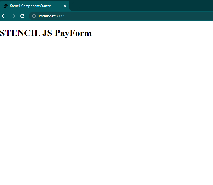
We can run npm starts and navigates to http://localhost:3333/ on our browser to check:

Now, let's modify our payform-component.tsx with the code block below. This will serve as our HTML form.
import { Component, h } from '@stencil/core';
@Component({
 tag: 'payform-component',
 styleUrl: 'payform-component.css',
 shadow: true
})

export class PayFormComponent{
 render() {
  return (
   <div>
<div class="container">
<form action="">
    <div class="row">
        <div class="col">
            <h3 class="title">StencilJs PayForm</h3>
            <div class="inputBox">
                <span>Name on Card :</span>
                <input type="text" placeholder="John Doe" />
            </div>
            <div class="inputBox">
                <span>Card Number :</span>
                <input type="number" placeholder="1111-2222-3333-4444" />
            </div>
            <div class="inputBox">
                <span>Exp. Month :</span>
                <input type="text" placeholder="April" />
            </div>
            <div class="flex">
                <div class="inputBox">
                    <span>Exp. Year :</span>
                    <input type="number" placeholder="2026" />
                </div>
                <div class="inputBox">
                    <span>CVV :</span>
                    <input type="text" placeholder="1234" />
                </div>
            </div>
        </div>
    </div>
    <input type="submit" value="proceed to checkout" class="submit-btn" />
</form>
</div>
   </div>
  )
 }
}
We can go ahead to add our styling into payform-component.css. Let us add the CSS styles below.
@import url('https://fonts.googleapis.com/css2?family=Poppins:wght@100;300;400;500;600&display=swap');

*{
  font-family: 'Poppins', sans-serif;
  margin:0; padding:0;
  box-sizing: border-box;
  outline: none; border:none;
  text-transform: capitalize;
  transition: all .2s linear;
}

.container{
  display: flex;
  justify-content: center;
  align-items: center;
  padding:25px;
  min-height: 100vh
}

.container form{
  padding:20px;
  width:700px;
  background: #fff;
  box-shadow: 0 5px 10px rgba(0,0,0,.1);
}

.container form .row{
  display: flex;
  flex-wrap: wrap;
  gap:15px;
}

.container form .row .col{
  flex:1 1 250px;
}

.container form .row .col .title{
  font-size: 20px;
  color:#333;
  padding-bottom: 5px;
  text-transform: uppercase;
  text-align: center;
}

.container form .row .col .inputBox{
  margin:15px 0;
}

.container form .row .col .inputBox span{
  margin-bottom: 10px;
  display: block;
}

.container form .row .col .inputBox input{
  width: 100%;
  border:1px solid #ccc;
  padding:10px 15px;
  font-size: 15px;
  text-transform: none;
}

.container form .row .col .inputBox input:focus{
  border:1px solid #000;
}

.container form .row .col .flex{
  display: flex;
  gap:15px;
}

.container form .row .col .flex .inputBox{
  margin-top: 5px;
}

.container form .row .col .inputBox img{
  height: 34px;
  margin-top: 5px;
  filter: drop-shadow(0 0 1px #000);
}

.container form .submit-btn{
  width: 100%;
  padding:12px;
  font-size: 17px;
  background: #6d27ae;
  color:#fff;
  margin-top: 5px;
  cursor: pointer;
}

.container form .submit-btn:hover{
  background: #380542;
}
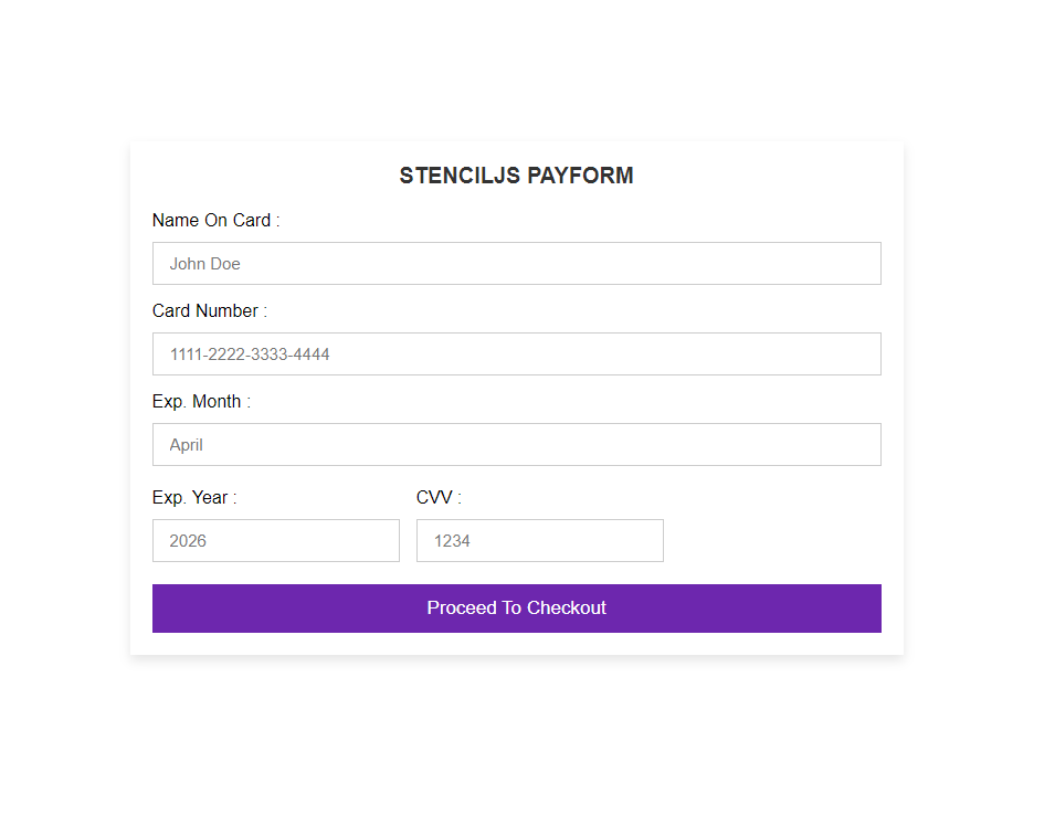
Navigating to http://localhost:3333/, you should have the preview below

If you have the preview above, Congratulations 🎉🎉
Props
Supposedly, we want to pass down data into the web component, we use Prop. Those familiar with JSX will easily understand the logic behind Props. Props should be used to pass data down from a parent component to its child component(s).
In this article, we want to set the payable amount from our parent component.
We are going to modify our payform-component.tsx to reflect our props.
import { Component, h, Prop } from '@stencil/core';

@Component({
 tag: 'payform-component',
 styleUrl: 'payform-component.css',
 shadow: true
})

export class PayFormComponent{
  @Prop() amountPayable : number;

  render() {
  return (
   <div>
    <div class="container">
        <form action="">
            <div class="row">
                <div class="col">
                    <h2 class="title">StencilJs PayForm</h2>
                    <h3 class="title">Amount {this.amountPayable}</h3>
                    <div class="inputBox">
                        <span>Name on Card :</span>
                        <input type="text" placeholder="John Doe" />
                    </div>

                    <div class="inputBox">
                        <span>Card Number :</span>
                        <input type="number" placeholder="1111-2222-3333-4444" />
                    </div>

                    <div class="inputBox">
                        <span>Exp. Month :</span>
                        <input type="text" placeholder="April" />
                    </div>

                    <div class="flex">
                        <div class="inputBox">
                            <span>Exp. Year :</span>
                            <input type="number" placeholder="2026" />
                        </div>

                        <div class="inputBox">
                            <span>CVV :</span>
                            <input type="text" placeholder="1234" />
                        </div>
                    </div>
                </div>
            </div>
            <input type="submit" value="proceed to checkout" class="submit-btn" />
        </form>
        </div>
   </div>

  );

 }

}
We have basically done three things:
We have added
Propto our import list from@stencil/core.We have initialized our
Propmethod in our exported classPayFormComponent.We have included the
Propdeclared in our form
We can also consider adding a default value, you can read more about more options available to Props on these page.
Let's modify our index.html to refle3ct our Props addition.
<payform-component amount-payable="5000"> </payform-component>
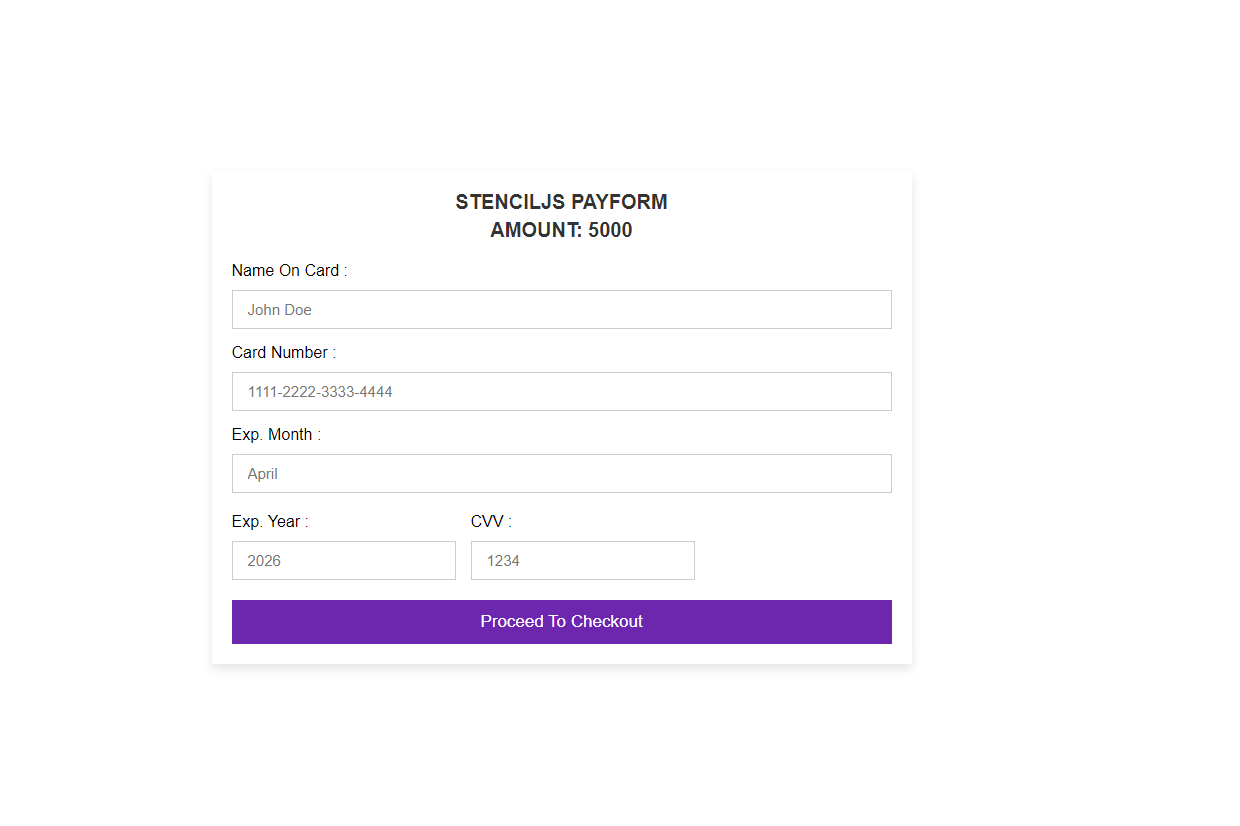
Going to http://localhost:3333/, our output should be similar to these below:

You can run npm run build to bundle your web component for production use. The command will generate a dist folder in the root of our component folder.
In the next article, we will be seeing how we can have Stencil emit Angular, React/Vue libraries by building our componence once. This helps us o achieve Stencil's primary goal.
Congratulations on reaching the end of the article! I hope that it has provided you with a good grasp of the fundamental aspects of Stenciljs and its usefulness.
If you have found this article helpful, please consider sharing and recommending it to other developers in your network.
If you have any inquiries or feedback, feel free to share them in the comments section below.
Subscribe to my newsletter
Read articles from Daniel Olabemiwo directly inside your inbox. Subscribe to the newsletter, and don't miss out.
Written by
