Interaction Modelling and Design: Exploring WIMP Components in GUI Design and Interaction Paradigms
 Arzath Areeff
Interaction Modelling and Design: Exploring WIMP Components in GUI Design and Interaction Paradigms
Interaction Paradigms
Interaction Paradigms are a set of assumptions and practices that define how users interact with software systems. In this slide, we will discuss different types of Interaction Paradigms.
Types of Interaction Paradigms
1. WIMP (Windows, Icons, Menus, and Pointer)
WIMP is the most commonly used Interaction Paradigm in GUI design.
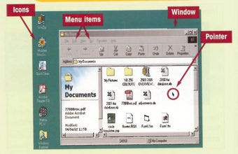
It consists of windows that contain information, icons that represent objects or actions, menus that list available options, and a pointer that allows users to select and manipulate objects on the screen.
Examples of WIMP: Microsoft Windows, macOS, Linux
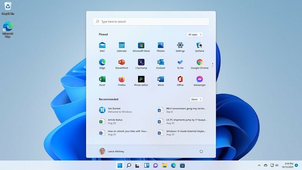
window of Windows
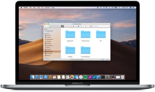
Window of MacOS
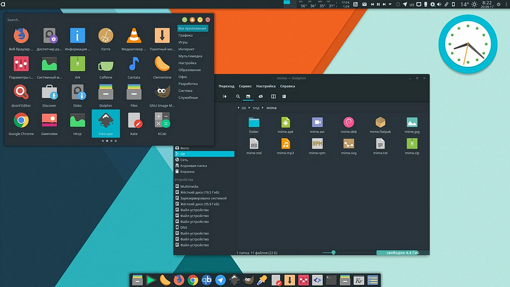
Window of Linux
2. TUI (Tangible User Interfaces)
TUI is an Interaction Paradigm that involves physical objects and the user’s sense of touch to interact with software systems.
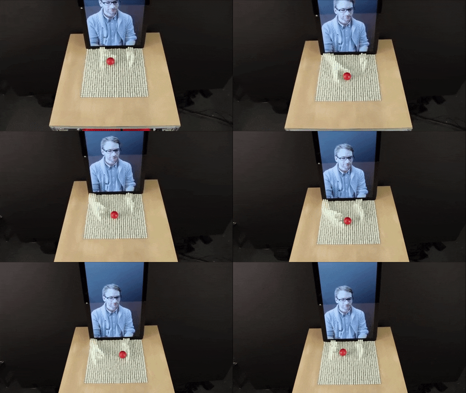
Tangible user interaction
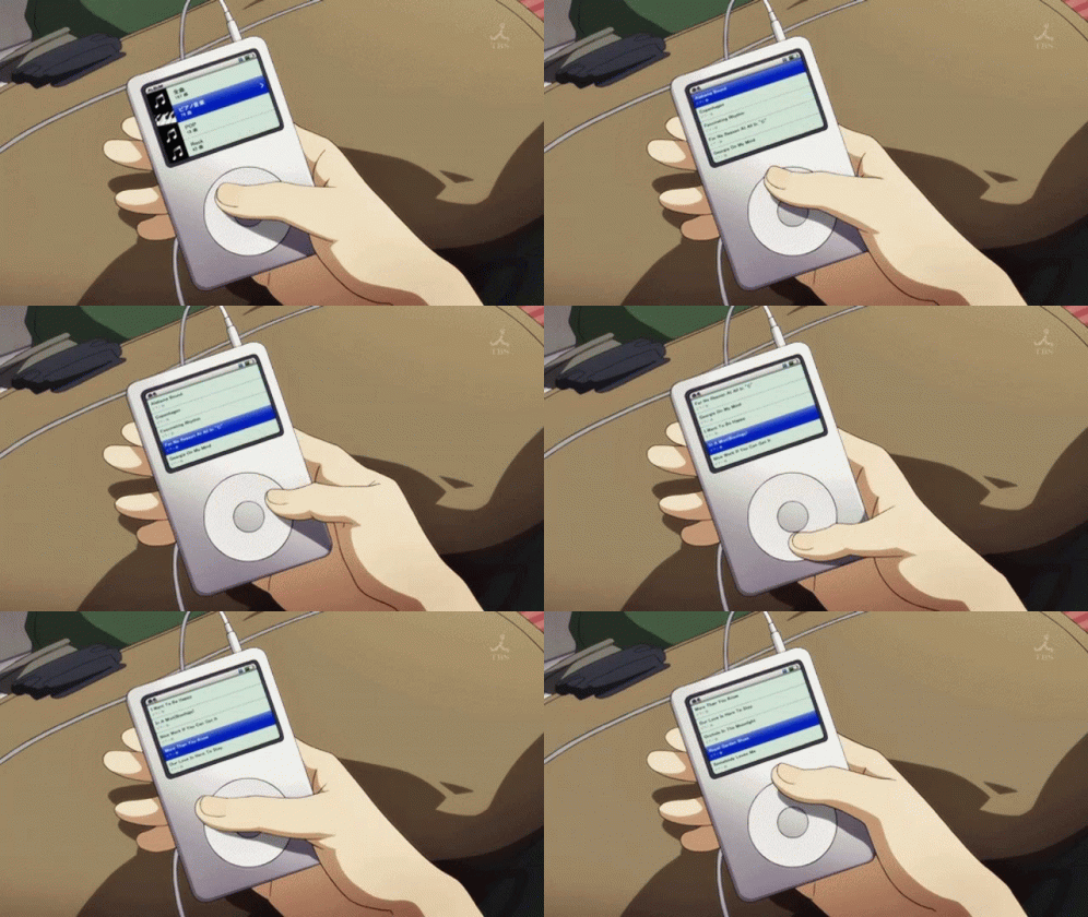
Apple iPod
TUI devices can range from simple buttons to more complex touchscreens that detect gestures and movements.
Examples of TUI: Apple iPod, Nintendo Wii, Microsoft Kinect
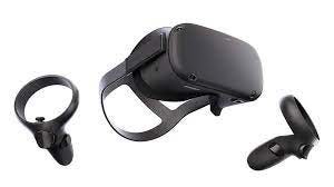
3. VR (Virtual Reality)
VR is an Interaction Paradigm that involves creating an immersive, computer-generated environment that users can interact with.
VR systems typically use head-mounted displays, hand controllers, and sensors to track users’ movements and actions.
Examples of VR: Oculus Rift, HTC Vive, Google Cardboard
4. AR (Augmented Reality)
AR is an Interaction Paradigm that overlays digital content onto the physical world.
AR systems typically use a camera and a display to capture and project digital content onto the user’s surroundings.
Examples of AR: Snapchat filters, Pokemon Go, IKEA Place

Understanding the different Interaction Paradigms can help designers choose the most appropriate one for their software systems, based on the needs of their users and the nature of the tasks they need to perform.
WIMP Components in GUI Design
WIMP components are fundamental building blocks of most GUI designs. This sets the context for the rest of the slide.
WIMP stands for Windows, Icons, Menus, and Pointers. These components form the basis of most GUI designs. They help users interact with digital interfaces by providing visual and interactive elements
Types of WIMP Components
1. Windows
They are rectangular graphical user interface objects that contain other objects like text, buttons, images, etc.
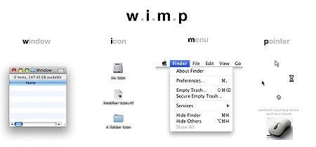
They are movable and resizable, and users can interact with them in multiple ways.
Examples of Windows: Browser windows, dialog boxes, pop-up windows
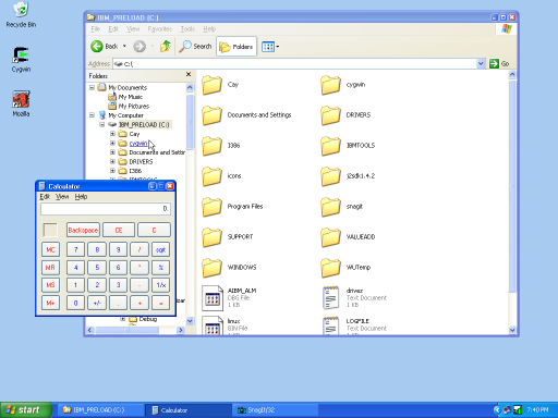
2. Icons
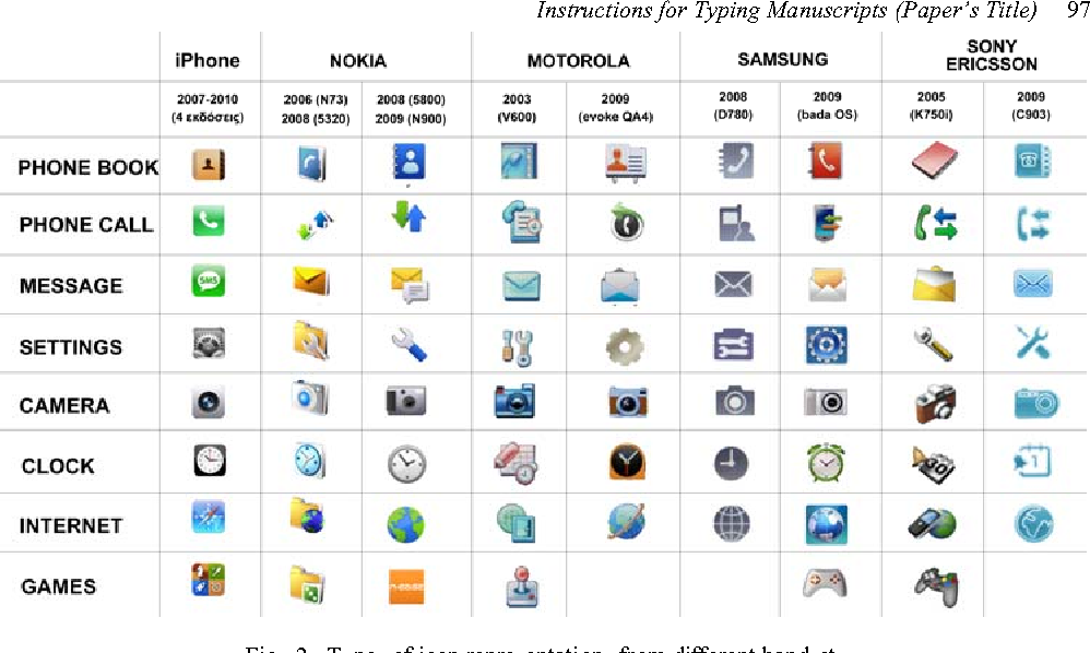
They are small graphical representations of objects, actions, or concepts that users can interact with.
They are used to represent files, folders, applications, and other elements of an interface.
Clicking or tapping on an icon can trigger an action, like opening a file or launching an application.
Examples of Icons: App icons on mobile devices, file icons in a file explorer, toolbar icons in a software application

3. Menus
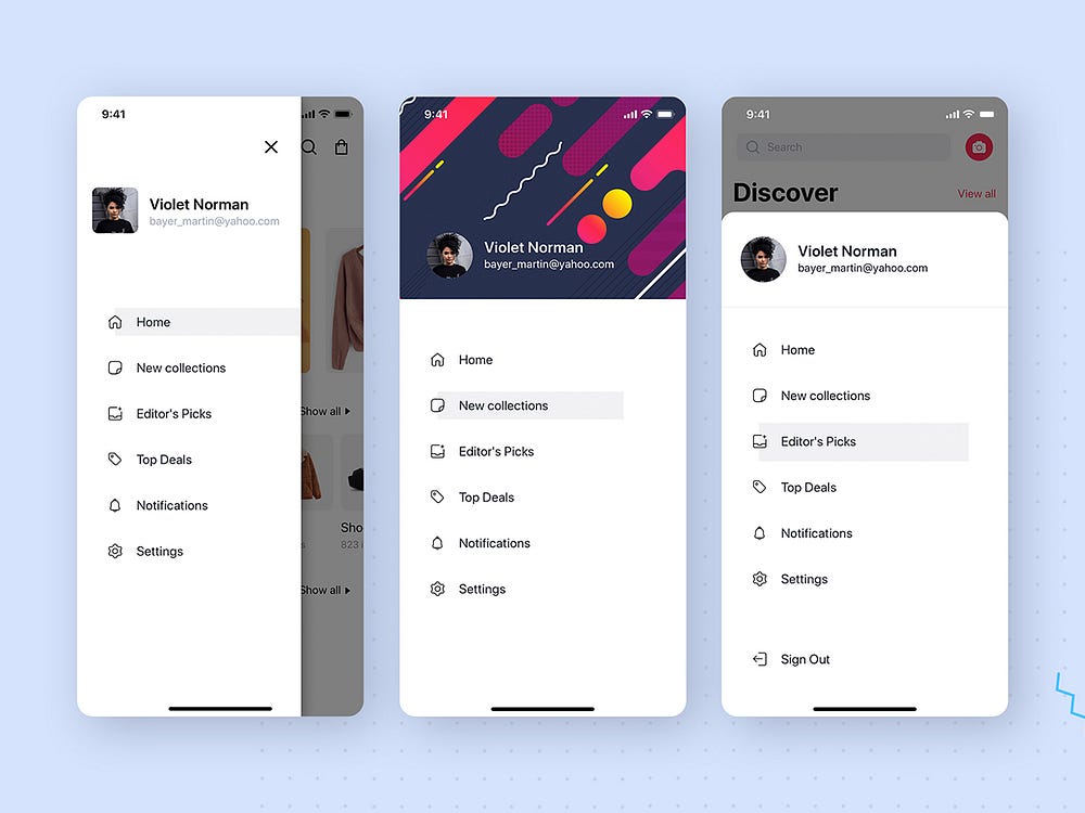
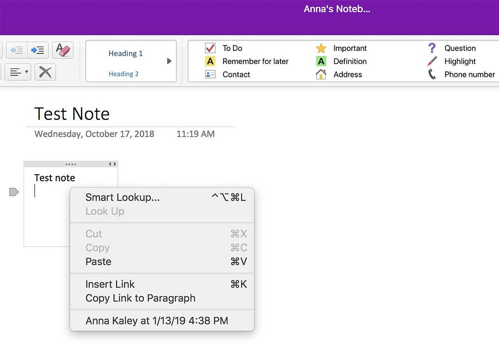
They are lists of options that users can choose from. They are usually displayed when users click on a menu bar or right-click on an object.
Menus can be hierarchical, with submenus and options within options.
Examples of Menus: Drop-down menus in web forms, context menus in desktop applications, menu bars in software applications
4. Pointers
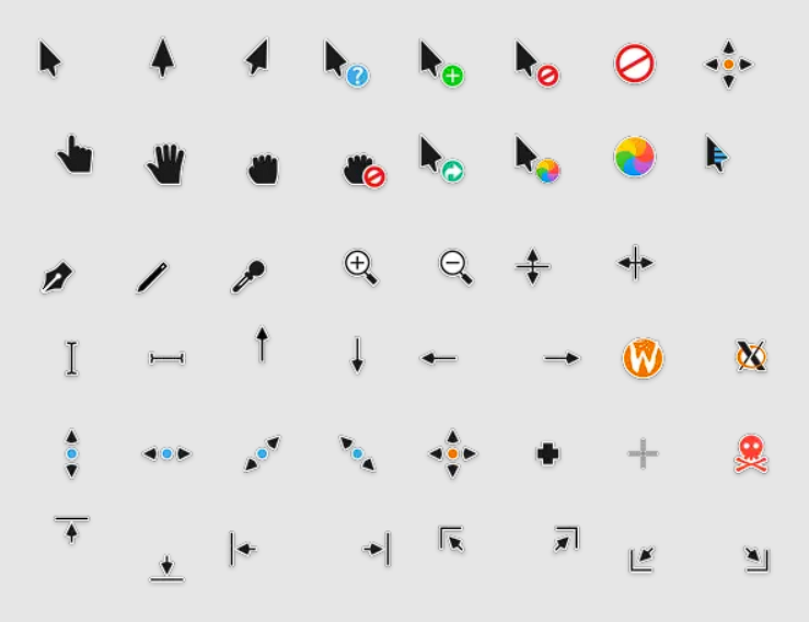
They are graphical representations of the user’s input device, like a mouse cursor, touch screen pointer, or stylus.
They help users select and interact with interface elements.
Examples of Pointers: Mouse cursor on a desktop computer, finger or stylus on a touch screen device
By understanding and incorporating these WIMP components in GUI design, designers can create more intuitive and user-friendly interfaces that enhance the user experience.
Advantages of WIMP Components:
Familiarity: WIMP components have been widely used in GUI design for several decades, making them a familiar and intuitive interface for users.
Efficiency: WIMP components allow for efficient navigation and control of complex applications, as they enable users to quickly access the features and functions they need.
Standardization: The use of WIMP components has become standardized across operating systems and applications, making it easier for users to transition between different systems and programs.
Disadvantages of WIMP Components:
Limited Screen Space: WIMP components can take up a significant amount of screen space, which can be problematic for smaller devices such as smartphones or tablets.
Over-reliance on Visual Cues: The use of icons and other visual cues in WIMP components can make it difficult for users with visual impairments to navigate and use the interface.
Lack of Flexibility: WIMP components are often inflexible, making it difficult to customize the interface or add new features without significant redesign.
References
https://medium.com/@bluehair.co/what-are-tangible-user-interfaces-ce6a5aa5c912
Subscribe to my newsletter
Read articles from Arzath Areeff directly inside your inbox. Subscribe to the newsletter, and don't miss out.
Written by

Arzath Areeff
Arzath Areeff
I co-founded digizen.lk to promote online safety and critical thinking. Currently, I’m developing an AI app to fight misinformation. As Founder and CEO of ideaGeek.net, I help turn startup dreams into reality, and I share tech insights and travel stories on my YouTube channels, TechNomad and Rz Omar.