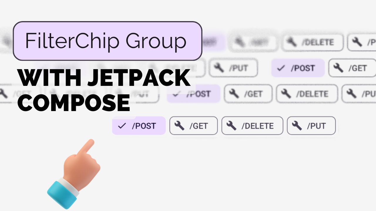
Custom FilterChip Group using Jetpack Compose in Android
 Rhytham Negi
In this tutorial, we learn How to Create FilterChipGroup step-by-step:
Define the
FilterChipGroupfunction with parameters:items: A list of strings representing the filter chip labels.defaultSelectedItemIndex: Index of the initially selected item.selectedItemIcon: Representing the icon for the selected item (Optional).itemIcon: Representing the icon for unselected items (Optional).onSelectedChanged: A callback function to be called when the selected item changes, passing the selected index.
Example:
    @Composable
    fun FilterChipGroup(
        items: List<String>,
        defaultSelectedItemIndex: Int = 0,
        selectedItemIcon: ImageVector = Icons.Filled.Done,
        itemIcon: ImageVector = Icons.Filled.Build,
        onSelectedChanged: (Int) -> Unit = {}
    )
Create a
selectedItemIndexmutableStateOf to store the currently selected item index. Initialize it with thedefaultSelectedItemIndex.var selectedItemIndex by remember { mutableStateOf(defaultSelectedItemIndex) }Create a
LazyRowto display the filter chips horizontally and allow scrolling and createFilterChipsfor all items in theitemslist.LazyRow(userScrollEnabled = true) { items(items.size) { index: Int -> } }Inside the
items(), create aFilterChip%[https://github.com/Rhythamtech/FilterChipGroup-Compose-Android]
 FilterChip(
     modifier = Modifier.padding(end = 6.dp),
     selected = items[selectedItemIndex] == items[index],
     onClick = {
         selectedItemIndex = index
         onSelectedChanged(index)
     },
     label = { Text(items[index]) },
     leadingIcon = if (items[selectedItemIndex] == items[index]) {
         {
             Icon(
                 imageVector = selectedItemIcon,
                 contentDescription = "Localized Description",
                 modifier = Modifier.size(FilterChipDefaults.IconSize)
             )
         }
     } else {
         {
             Icon(
                 imageVector = itemIcon,
                 contentDescription = "Localized description",
                 modifier = Modifier.size(FilterChipDefaults.IconSize)
             )
         }
     }
 )
I hope you understand the step-by-step procedure for creating the FilterChipGroup Composable. You can use this function to create a scrollable list of filter chips that can be used as RadioButton with customizable icons and a callback that returns selectedItemIndex for when the selected item changes.
Example:
val dateRanges = listOf("Today", "This Week", "This Month", "Custom")

FilterChipGroup(
    items = dateRanges,
    onSelectedChanged = { selectedIndex ->
        // Filter the list of events based on the selected date range
        when (dateRanges[selectedIndex]) {
            "Today" -> filterEventsByDateRange("Today")
            "This Week" -> filterEventsByDateRange("This Week")
            "This Month" -> filterEventsByDateRange("This Month")
            "Custom" -> showCustomDateRangeDialog()
        }
    }
)
Subscribe to my newsletter
Read articles from Rhytham Negi directly inside your inbox. Subscribe to the newsletter, and don't miss out.
Written by
