CSS FLEXBOX - the complete beginners guide
 Ujjwal Jha
In this blog post, we will learn about The FlexBox in detail.
Introduction of Flexbox
Flexbox or we can say flexible box model in CSS is a one-dimensional layout in CSS. In CSS we use Flexbox to distribute space between the items, it works on the cross-axis and main axis. We can use Flexbox to make a web page mobile responsive.
How to apply flexbox in a container
To apply the flexbox we need the parent container and the child container. First, we apply display flex to the parent container which has the children which will be affected by flexbox.
<!-- css -->
<style>
 .container {
  background-color: #f5f5f5;
  width: 100vw;
  height: 100vh;
  display: flex;
}

.box {
  background-color: #cfcfcf;
  width: 50px;
  height: 50px;
  border: 2px solid blue;
}
</style>
<!-- HTML -->
<!--parent container-->
<div class="container">
  <!-- child div-->
  <div class="box box-1"></div>
  <div class="box box-2"></div>
  <div class="box box-3"></div>
  <div class="box box-4"></div>
</div>
By default when we apply the Flexbox to any container, the children of that container will get affected by the Flexbox, and by default they go to the main horizontal axis.
To change it to cross axis or change their alignment we can use flex properties.
Flex Properties
We can play with flexbox alignment using the flex properties.
To change the alignment to cross axis we can use flex-direction to column.
There are many flex properties in Flexbox like:
Flex-direction: with this property, we can change the direction of the items inside the container.
Values in flex-direction property
row(default): This is the default value and it’s allowed to stack items from left to right horizontally. with the first item at the start of the main axis and the last item at the end.Row-reverse: it reverses the position of the items horizontally from right to left.Column: same as row but it goes top to bottom, which means on the cross axis.column-reverse: same as row-reverse but bottom to top.
Flex-wrap: it determines whether items will wrap or not when it exceeds the width of the container. The values are:
nowrap(default): it is the default value and allows it to be online even if it exceeds the width of the container.Wrap: the flex items will wrap onto multiple lines from top to bottom when items exceed the width of the container.Wrap-reverse:it acts just like the wrap value, but it aligns from bottom to top.
Justify Content
Justify Content: this property is used to align the flex items along the main axis of a flex container.
The values are:
flex-start(default): this is the default value allowed to align items to the start of the container along the main axis.Flex-end: it aligns the flex items at the end of the container along the main axis.Center: this is the most commonly used value. It aligns the items to the center of the container.Space-between: it aligns the equal space between the first item and the last item.Space-around:it distributes equal space between all the flex items.Space-evenly: it distributes the Items that will have equal space around them.
Align items
Align-items property works to align the flex properties to the cross axis of the container.
The values of align-items:
stretch(default): it stretches the items to fill the container of the cross-axis.Flex-start: it aligns the items to the start of the container of the cross-axis.Flex-end: it aligns the items to the end of the container of the cross-axis.Center:it aligns the items to the center of the container of the cross-axis.
Item properties
Let's learn about the properties of the item
Flex-grow: this property specifies how much the item will grow relative to the rest of the flexible items inside the container.Flex-shrink: this property specifies how much the item will shrink relative to the rest of the flexible items inside the container.Flex-basis: This property specifies the initial length of a flexible item.Order: it specifies in which order the item will appear in the container.Align-self: this property specifies how the flex items should be aligned along the cross-axis in the container. It has the same values as align-items properties like flex-start, flex-end, and center.
Master Flexbox using a Game
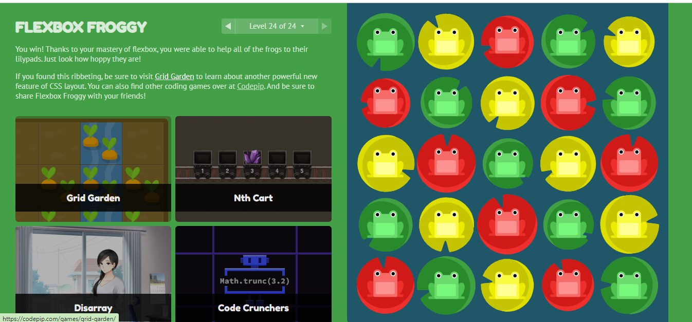
You can master the Flexbox by playing a simple game which is called Flexbox Froggy. You simply have to move the frog to its correct position using your flexbox skill.

You can master the Flexbox by just passing all 24 levels of Flexbox Froggy.
Conclusion
In this blog post, I have covered all the basic concepts of Flexbox like how to implement Flexbox in CSS, how to create a Flex container, how to align it in the container, etc.
I hope this blog post helps you to understand Flexbox properly. If yes then put your valuable feedback in the comment box. Thanks for reading.
Subscribe to my newsletter
Read articles from Ujjwal Jha directly inside your inbox. Subscribe to the newsletter, and don't miss out.
Written by
