Expand Card Visuals to the Next Level in Power BI
 CloudStakes Technology
Introduction
Power BI is a powerful tool that offers a variety of visualizations and solutions to transform business requests into polished reports. Despite its versatility, there are certain limitations when it comes to specific user requirements that may require workarounds to achieve desired functionalities.
Expand/Collapse Functionality
One of the limitations of Power BI is the lack of Expand/Collapse functionality in visuals other than Matrix. Even in Matrix visual, it was not possible to use the “+” sign for expanding until November 2019 update. This can be surprising for those coming from the SSRS world.
Workaround
Fortunately, there is a workaround for adding Expand/Collapse functionality to non-Matrix visuals. For instance, you can apply this functionality to a Card visual. In this section, we will use the Contoso sample database to demonstrate the workaround.
Scenario
Suppose there is a report page with a stacked column chart in the center and two card visuals in the upper right corner displaying Sales Quantity and Sales Amount.
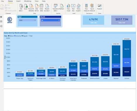
To provide users with more detailed insights into the figures presented in the report, the Tooltip page is not enough. Tooltips are static and do not allow interaction with the underlying data. To address this, bookmarks can be used to mimic expand/collapse functionality.
Bookmarks are a powerful technique in Power BI that allows capturing the current state of the report page and navigating between different bookmarks using buttons or images. They can be used to customize reports and improve the overall user experience. While a broader explanation of bookmarks is out of scope, it's worth noting their usefulness in creating customized reports.
Step 1 — Insert images and create bookmarks
To make it clear to users that they can expand and collapse the card visuals, we can use transparent icons of "+" and "-" signs. These icons are imported and placed on top of each other to create a toggle effect.
Put both icons one over another, displayed in the picture below:
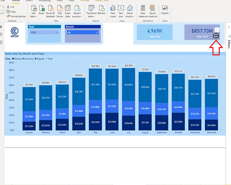
To achieve expand/collapse functionality for the Sales Qty Card visual, follow the same steps as for the Sales Amount Card visual. Additionally, place another pair of icons between the two cards. This icon will allow the user to expand/collapse both cards simultaneously, while the smaller icons will handle each card individually.

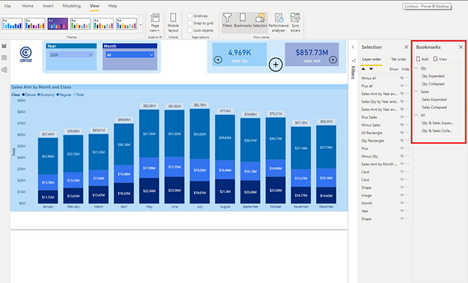
Next, we need to enable the Bookmarks and Selection panes under the View tab. Two bookmarks are required for each scenario: expand/collapse for Sales Qty card only, Sales Amt card only, and both cards.
Below is a screenshot of the bookmark pane that has been created:
Step 2 — Setting visibility within bookmarks
Next, it's time to define the appearance of each bookmark. This entails hiding the "-" icons when the report page is initially opened so that only the "+" icons are visible.

Next, it is necessary to configure the Show/Hide property for all visuals based on the user's selection. While illustrating every step in detail would be time-consuming, let's take Sales Qty as an example (the same logic applies to Sales Amt).
Enable the Action field, select Bookmark under Type, and choose the Qty Expanded bookmark. This instructs the icon to direct the user to a particular bookmark that displays the captured status of the report page.
After pressing CTRL+click on the "+" sign, the report page will change:
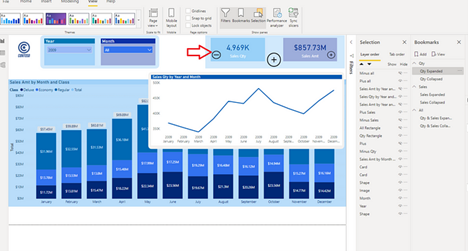
Upon clicking the Sales Amt "+" icon, the report page changes to display the Sales Amt broken down per month Line Chart visual. The "+" icon is replaced with a "-" icon, allowing the user to collapse the extended visual when needed. This is achieved by utilizing bookmarks to capture the current state of the report page and navigate between them using buttons/images with the Action property set to Bookmark.
Step 3 — Playing around with bookmarks
If user clicks Sales Amt “+” icon, this will take places:
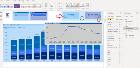
The visuals have now been synchronized to display both Sales Qty and Sales Amount broken down per month. The big “+” sign has also been synchronized with the small “+” sign to indicate to the user that both visuals have been expanded. Similarly, if the user wants to collapse both visuals with one click, they can do so by clicking on the big “-” sign between the cards.
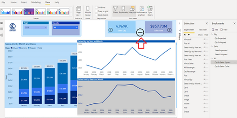
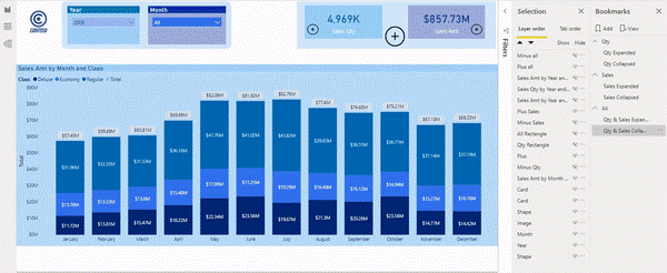
Finally, this is the final output on the fly & in action:
Conclusion
In data analytics services, the combination of tooltip pages and interactive bookmarks brings added value to data exploration and presentation. While tooltip pages offer supplementary insights, the use of interactive bookmarks revolutionizes data visualization by providing users with a highly interactive and immersive experience. By enabling cross-filtering, drilling down, and customizable data storytelling, interactive bookmarks open new avenues for users to extract meaningful insights and make data-driven decisions. Embrace these powerful techniques to elevate your data analytics services and deliver exceptional data exploration experiences to your users.
Subscribe to my newsletter
Read articles from CloudStakes Technology directly inside your inbox. Subscribe to the newsletter, and don't miss out.
Written by

CloudStakes Technology
CloudStakes Technology
CloudStakes Technology Pvt. Ltd. is a leading cloud solutions providing company located in India, with other three branches in the UK, Australia and Canada. We are serving in this industry for more than 6 years and helping clients to achieve their industry level innovations. Our all solutions are built with perfectly executed strategies and approaches. We thrive to provide our digital solutions to global businesses and desires to be an essential part of digital transformation and technology innovation. Our all solutions are inclined with clients’ industry standards, and 24/7 dedicated support will help them stay competitive in this forward driving world.