How to Use useState Hook with Conditional Rendering in React: Showing and Hiding Components
 Adetutu Oluwasanmi
Introduction
In React, useState hook is used to declare and manage state variables in a functional component and with conditional rendering (using a boolean value) we can display or hide a component (or control the visibility of a component) based on certain conditions.
In this article, we will go through a step-by-step process on how to use the useState Hook with Conditional Rendering to show and hide components in React.
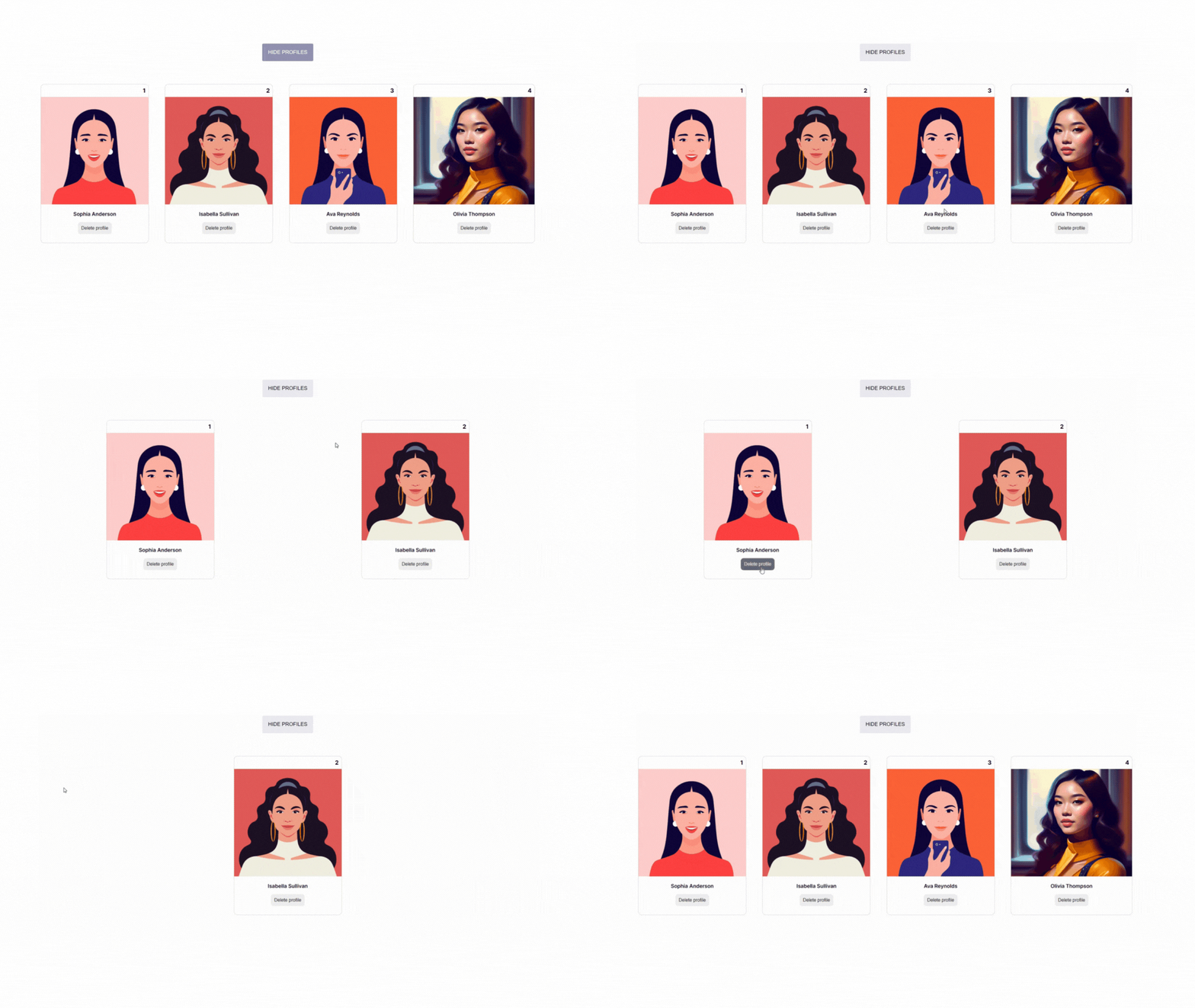
Here is a video snippet of the project we would be working on:

Prerequisites
Before getting started, ensure that Node.js and NPM are installed on your system. You can check if you have these installed by running the following commands in your terminal:
node -v
npm -v
If you do not have these packages installed on your computer, download and install Node.js from the official website.
Setting your React project with Vite
Follow the process outlined in this blog post Setting your React project with Vite to create a new React project.
In the new React project, remove the pre-existing code and styles in the index.css, App.jsx, and App.css files.
Step-by-step process on how to use the useState hook for conditional rendering and showing/hiding components in React
STEP 1: Import packages and files
Inside the project directory, navigate to the App.jsx file and import the necessary package and file.
import { useState } from 'react';
import './App.css';
This imports the useState hook from the 'react' package, which allows you to use state in functional components. It also imports the App.css file for styling.
STEP 2: Create a functional component
In this next step, create a functional component named ‘App’ and initialize a state variable using the useState hook.
import { useState } from 'react';
import './App.css';

const App = () => {

  const [showEvents, setShowEvents] = useState(true)
 const [profiles, updateProfiles] = useState([
    { id: 1, name: "Sophia Anderson", profilePic: "https://rb.gy/9jh39" },
    { id: 2, name: "Isabella Sullivan", profilePic: "https://rb.gy/gs5lt" },
    { id: 3, name: "Ava Reynolds", profilePic: "https://rb.gy/rs32e" },
    { id: 4, name: "Olivia Thompson", profilePic: "https://rb.gy/xbjed"},
  ])

return (
    <div>
      {/* Code to be executed*/}
    </div>
  );
}
This code declared two state variables showEvents and profiles. The showEvents state variable will control the visibility of the component you want to show or hide. It is also set to true indicating that the user profiles will be displayed. The profiles state variable contains an array of user objects each containing an id, name, and profile picture.
STEP 3: Add the hide and show button
import { useState } from 'react';
import './App.css';

const App = () => {

  const [showEvents, setShowEvents] = useState(true)
 const [profiles, updateProfiles] = useState([
    { id: 1, name: "Sophia Anderson", profilePic: "https://rb.gy/9jh39" },
    { id: 2, name: "Isabella Sullivan", profilePic: "https://rb.gy/gs5lt" },
    { id: 3, name: "Ava Reynolds", profilePic: "https://rb.gy/rs32e" },
    { id: 4, name: "Olivia Thompson", profilePic: "https://rb.gy/xbjed"},
  ])

return (
    <div>
// Hide and show button

  {showEvents && <button onClick={() => setShowEvents(false)} className="profile-btn">Hide profiles</button>}

  {!showEvents && <button onClick={() => setShowEvents(true)} className="profile-btn">Display profiles</button>}

// Hide and show button
    </div>
  );
}
Based on the boolean value of the showEvents state variable, we can conditionally render the component we want to show or hide.
{showEvents && <button onClick={() => setShowEvents(false)} className="profile-btn">Hide profiles</button>}
This line conditionally renders the hide profilesbutton, if showEvents is true. The onClick event is set to a function that calls setShowEvents(false), which updates showEvents to false when the button is clicked.
{!showEvents && <button onClick={() => setShowEvents(true)} className="profile-btn">Display profiles</button>}
This line conditionally renders the display profiles button, if showEvents is false. The onClick event is set to a function that calls setShowEvents(true), which updates showEvents to true when the button is clicked.
STEP 4: Render the profile card component
import { useState } from 'react';
import './App.css';

const App = () => {

  const [showEvents, setShowEvents] = useState(true)
 const [profiles, updateProfiles] = useState([
    { id: 1, name: "Sophia Anderson", profilePic: "https://rb.gy/9jh39" },
    { id: 2, name: "Isabella Sullivan", profilePic: "https://rb.gy/gs5lt" },
    { id: 3, name: "Ava Reynolds", profilePic: "https://rb.gy/rs32e" },
    { id: 4, name: "Olivia Thompson", profilePic: "https://rb.gy/xbjed"},
  ])

  const handleDelete = (id) => {
    let filteredProfiles = profiles.filter(each => each.id !== id)
    updateProfiles(filteredProfiles)
  }


return (
  <div className='App'>

    {showEvents && <button onClick={() => setShowEvents(false)} className="profile-btn">Hide profiles</button>}

    {!showEvents && <button onClick={() => setShowEvents(true)} className="profile-btn">Display profiles</button>}

     <div className='profile-card'>

      {showEvents &&  profiles.map((profile) => (

          <div key={profile.id}>

                <div className="card">

                    <div className="number">
                        {profile.id}
                    </div>

                     <div>
                        <img className="profile-pic" src={profile.profilePic}     alt="profile picture" />
                    </div>

                    <div className="descr">
                        <p className="name">{profile.name}</p>
                        <button className="delete-profile" onClick={()=> handleDelete(profile.id)}> Delete profile</button>
                    </div>

                </div>

          </div>

        ))}
   </div>

  </div>
)
}

export default App;
Code explanation
In this profile card component section, the block of code is conditionally rendered based on the value of showEvents. If showEvents is true, the map function iterates over the profiles array.
The profiles array has been defined using the useState hook. It contains four profile user objects with properties such as id, name, and profile pic (URLs to the profile pictures). The map function used on the profiles array then iterates over each user object and executes the code within the curly braces for each element.
Each profile is rendered within a nested div, and a unique key is assigned using the profile.id. Then, each item in the profiles object is passed in as props into the profile card component.
The Delete Function (Optional)
<button className="delete-profile" onClick={() => handleDelete(user.id)}> Delete profile</button>
When the delete profile button is clicked, it calls the handleDelete function below with the user’s id.
const handleDelete = (id) => {
  let remove = users.filter(each => each.id !== id);
  updateUsers(remove);
};
This above code declares an handleDelete function that takes in an id as a parameter.
This line let filteredProfiles = profiles.filter(each => each.id !== id) uses the filter method on the profiles array to create a new array called filteredProfiles. The filter method iterates through each element in the profiles array and returns a new array that excludes the profile objects whose id matches the provided id parameter.
This line updateProfiles(filteredProfiles) updates the state of the profile array by replacing it with the new filtered array. This causes React to re-render the component and reflect the updated array in the user interface.
STEP 5: Add styles to the component
Add the following styles below to your App.css file;
.App {
  text-align: center;
  margin: 3rem;
}

.profile-card{
  display: flex;
  flex-direction: row;
  justify-content: space-around;
  margin-top: 4rem;
}

.card {
  border: 1px solid rgba(0, 0, 0, 0.175);
  border-radius: 10px;
}

.number{
  text-align: right;
  font-weight: 700;
  padding: 0.5rem;
}

.name{
  font-size: 0.9rem;
  font-weight: 600;
}

.profile-pic{
  width: 100%;
  height: 300px;
}

.descr{
  margin-bottom: 1.5rem;
}

.delete-profile{
  padding: 0.6rem;
  outline: none;
  border: none;
  border-radius: 8px;
  cursor: pointer;
  font-size: 0.8rem;
}

.delete-profile:hover{
  background-color: #6a6d6d;
  color: #ffff;
}

.profile-btn{
   background-color: #ebebf2;
  border-radius: 3px;
  cursor: pointer;
  font-size: 0.9rem;
  padding: 1rem;
  outline: none;
  border: none;
  text-transform: uppercase;
  font-weight: 500;
}

.profile-btn:hover{
  background-color: #9393B2;
  color: #ffff;
}

@media screen and (max-width: 1400px) {

  .profile-card{
    display: flex;
    flex-direction: column;
    margin-top: 1rem;
  }

  .card{
    margin-top: 3rem;
  }

}
Links to the project
Conclusion
Finally, we have a React component that utilizes useState Hook to hide and show components using conditional rendering. We also implemented a delete function that removes a profile from the profiles state array.
Subscribe to my newsletter
Read articles from Adetutu Oluwasanmi directly inside your inbox. Subscribe to the newsletter, and don't miss out.
Written by
