Understanding the CSS Box Sizing Property
 kunal gavhane

Have you ever wondered why elements on a webpage sometimes appear larger or smaller than you expected? Or why adding padding or borders to an element can affect its overall size? These are common questions when working with web design and layout.
In this article, we will explore a CSS property called "box-sizing" that can help us better control the size and layout of elements on a webpage.
Before we dive into the box-sizing property, let's briefly discuss the basic box model concept in CSS.
In CSS, every element on a webpage is considered a rectangular box. This box consists of four important components: content, padding, border, and margin.
1) The content refers to the actual text, images, or other media inside the box.
2) Padding is the space between the content and the border.
3) Border is the line that surrounds the box, and margin is the space between the box and other elements on the webpage.
Now, here comes the interesting part: the default behavior of CSS is to include the content size, padding, and border when calculating the total size of an element. This means that if you specify a width of 200 pixels for an element and add 10 pixels of padding and a 2-pixel border, the total width of the element will be 224 pixels (200 pixels + 10 pixels of padding on each side + 2 pixels of border on each side). This default behavior can sometimes make it difficult to create consistent and predictable layouts.
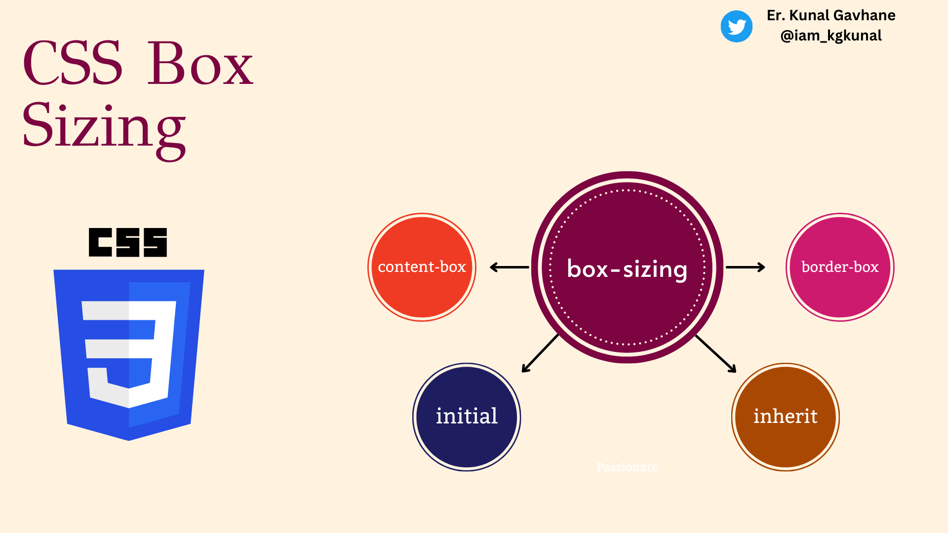
Fortunately, the CSS box-sizing property comes to our rescue. By using this property, we can change the way the browser calculates the total size of an element. The box-sizing property has two possible values: "content-box" and "border-box". Let's explore each of them.
- content-box (default value): When the box-sizing property is set to "content-box", the browser calculates the total size of an element by including the content size, padding, and border. This is the default behavior we discussed earlier. Here's an example of how it looks in code:
.box {
  width: 200px;
  padding: 10px;
  border: 2px solid black;
  /* The default value is content-box, so we don't need to specify it explicitly */
}
In the above code, the total width of the .box element will be 224 pixels, as we explained earlier.
- border-box: When the box-sizing property is set to "border-box", the browser calculates the total size of an element by including the content size only. In this case, the padding and border are included within the specified width. This can be very useful when you want to have a consistent layout and easily control the size of elements. Here's an example:
.box {
  width: 200px;
  padding: 10px;
  border: 2px solid black;
  box-sizing: border-box;
}
By setting the box-sizing property to border-box, the total width of the .box element will be exactly 200 pixels, regardless of the padding and border. The browser automatically adjusts the size of the content to fit within the specified width.
Now, let's see how this property can make a difference in a real-world scenario. Imagine you have a webpage with several elements in a row, and you want them to have equal widths with some space between them. Here's an example without using the box-sizing property:
<div class="container">
  <div class="box">Element 1</div>
  <div class="box">Element 2</div>
  <div class="box">Element 3</div>
</div>
.container {
  width: 600px;
}

.box {
  width: 200px;
  padding: 10px;
  border: 2px solid black;
  margin-right: 20px;
}
In the above code, the elements will not have equal widths due to the addition of padding and border. The total width of each element will be 224 pixels instead of the desired 200 pixels, causing misalignment.
Now, let's modify the CSS code by adding box-sizing: border-box; to the .box class:
.box {
  width: 200px;
  padding: 10px;
  border: 2px solid black;
  box-sizing: border-box;
  margin-right: 20px;
}
With the box-sizing property set to border-box, the elements will have equal widths of 200 pixels, including the padding and border. The misalignment issue is resolved, and the layout looks consistent.
In conclusion, the CSS box-sizing property is a powerful tool that allows us to control the size and layout of elements on a webpage. By changing the default behavior of how the browser calculates the total size of an element, we can create more predictable and consistent layouts. Whether you're a beginner or an experienced web designer, understanding and utilizing the box-sizing property will greatly enhance your web development skills.
Remember, the box-sizing property can take values of "content-box" or "border-box", and setting it to "border-box" includes padding and border within the specified width. So, go ahead and experiment with this property to create amazing web layouts!
If you found this article helpful in your understanding of arrays and array methods in JavaScript, please consider sharing it with your friends and colleagues who may also find it useful. Your support in spreading the word is greatly appreciated! Additionally, I welcome any feedback or comments you may have on this article. Thank you for taking the time to read and engage with my article.
This blog is part of my #100Days100Blogs 🚀 challenge on #hashnode.
To join me In this challenge connect with me on the following handles 👇
Subscribe to my newsletter
Read articles from kunal gavhane directly inside your inbox. Subscribe to the newsletter, and don't miss out.
Written by

kunal gavhane
kunal gavhane
Where people see a problem, we see an opportunity and a new project! Hello, I am an Engineer;