Digital Mapping Projects
 Leonard Fidelis
These mapping projects were completed either as personal experimental projects or for freelance clients. While these are not detailed project documentation, each project discusses the aim, data source, method and results.
Where relevant, explainer videos from my YouTube Channel will be included.
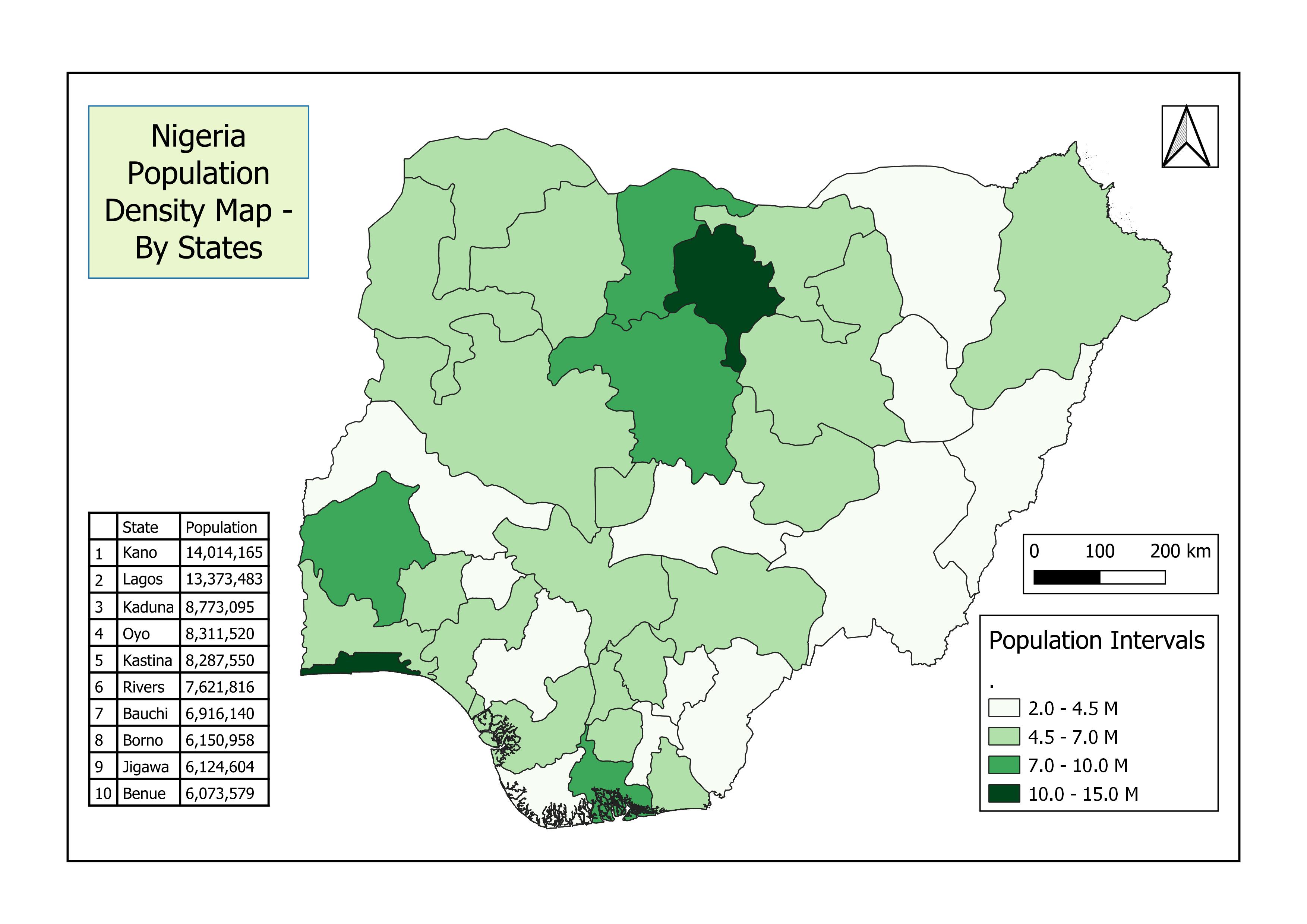
CHOROPLETH MAP: [Nigerian Population Density Map]
Aim
The aim of this project is to visualize the population density of states in Nigeria using a choropleth map.
Data Source
The population dataset was obtained from WorldPop. It records the spatial distribution of the population in 2020 with the country's total adjusted to match the corresponding UNPD estimate, Nigeria.
The state boundary data was obtained from Diva-GIS
Result
Using the method of zonal statistics, the sum of population data points within each state boundary was calculated and stored in a new column. The map was further classified into 4 classes of unequal intervals to capture major data shifts. The top ten most populated states are displayed in a table to provide further data insights.
The colour choice was influenced by the country's flag colours; Green and White.
This map is live and can be found on my GitHub profile
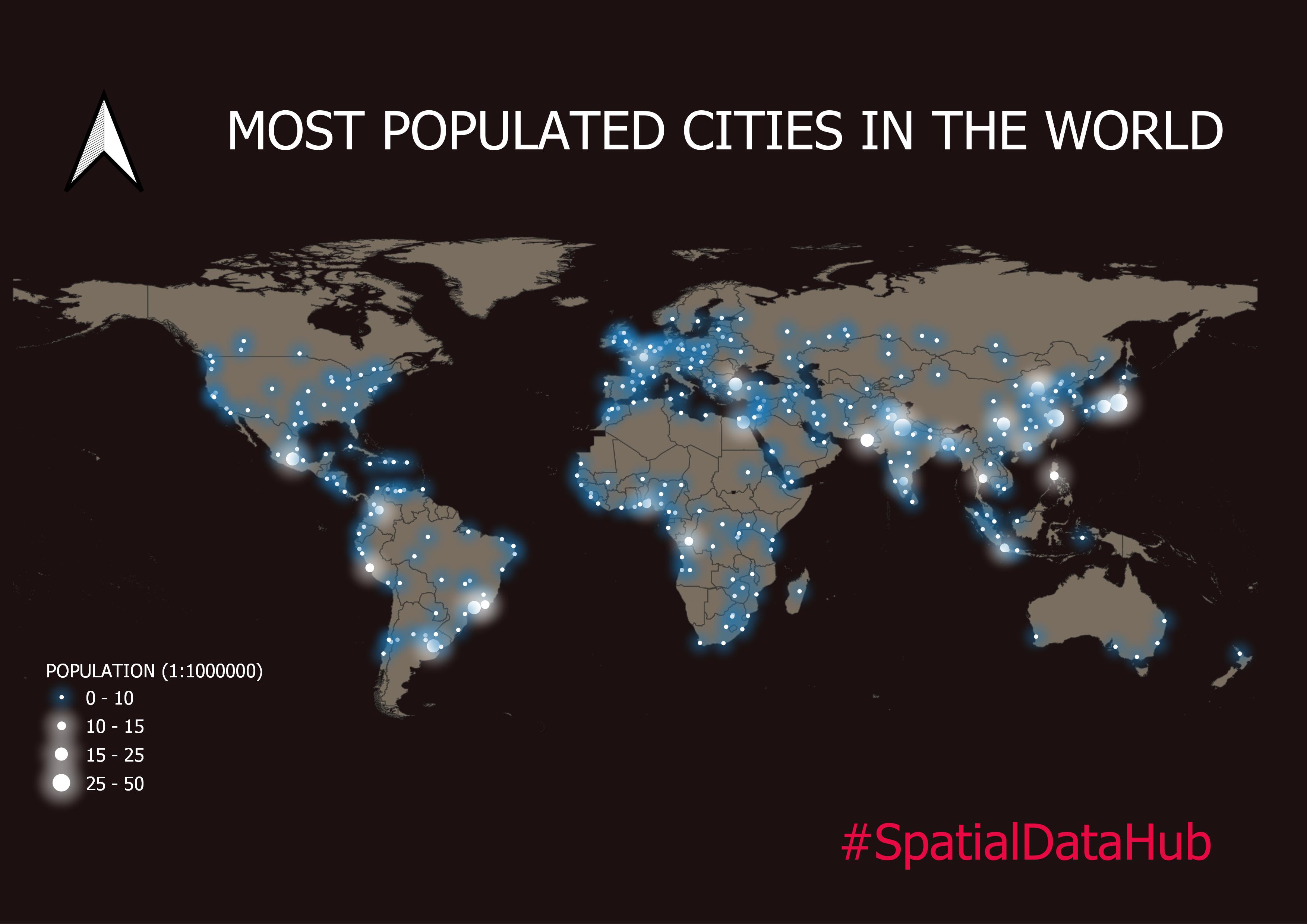
FIREFLY MAP: [Largest Cities In The World By Population]
Aim
The aim of this project was to visualize the available data to determine which world cities have the most population.
Data Source
The population and world map data were gotten from Worldometers and Worldbanks databases.
Result
The final map was produced by styling the base map to create a colour contrast with the population layer. The population density layer was classified into 4 graduated symbols.
Here's a video from my channel describing the process.
.
.
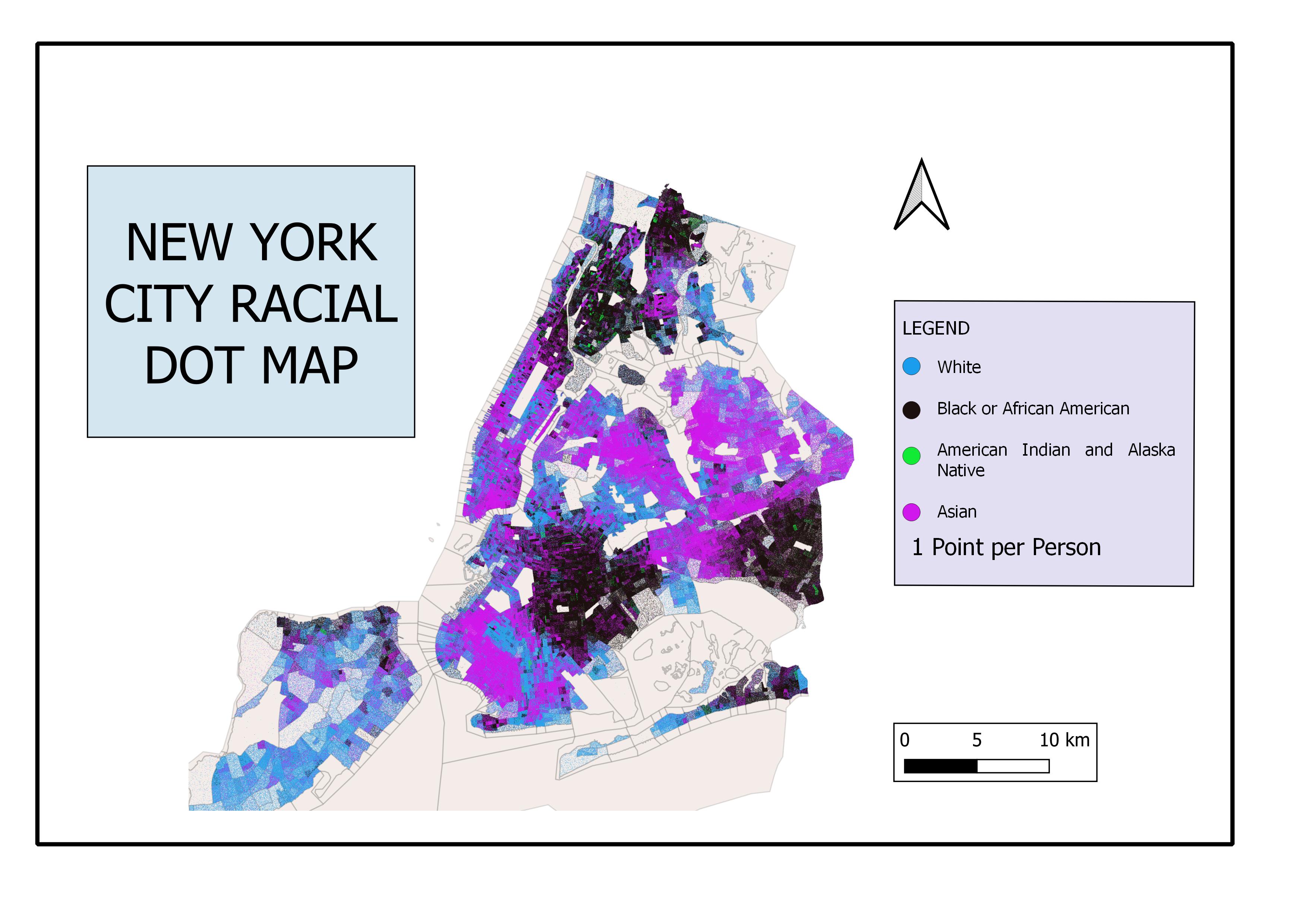
Racial Dot Map - [New York]
Aim
The purpose of this analysis was to determine the distribution of the Multi-racial city of New York.
Data Source
The census data for this project was obtained from Census Reporter while the boundary data was obtained from OpenStreetMap.
Result
A racial dot map showing the population of White, Black, Indian American, and Asian races in the city of New York. Each dot on the map represents a person.
.
.
Flood Vulnerability Map - [Ikpoba-Okha]
Aim
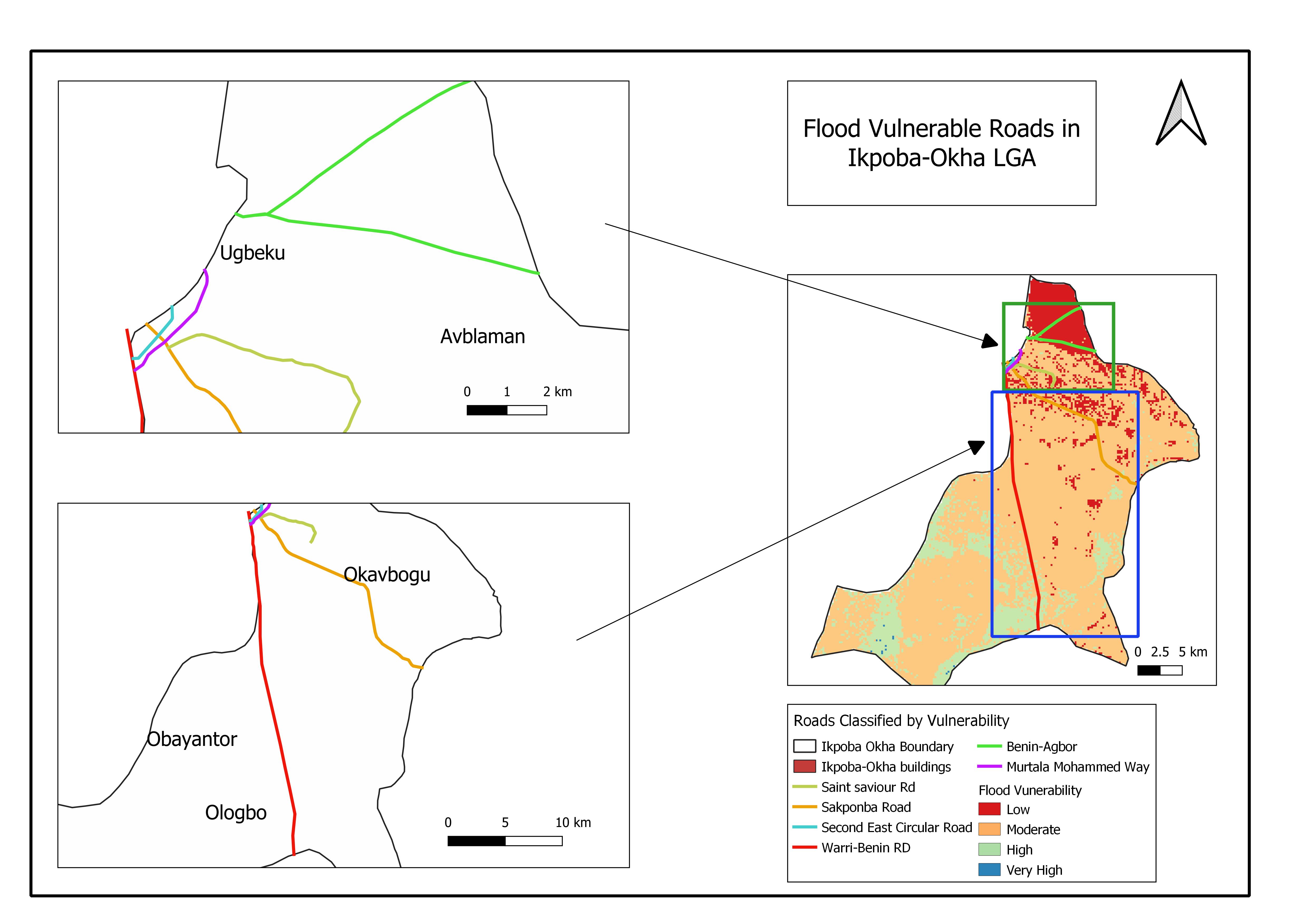
The goal of this project was to how the flood vulnerable roads and buildings in the Ikpoba-Okha Local Government area.
Data Source
The roads and buildings were obtained from OpenStreetMaps Database. The flood vulnerable areas were determined using the multi-criteria analysis, including, LULC maps and Digital Elevation Model analysis.
Result
The flood-vulnerable buildings and roads map was created by overlaying the buildings and roads on the flood-vulnerability map. As shown in the map legend, infrastructure located within regions of 'High' vulnerability are at higher risk of flooding.
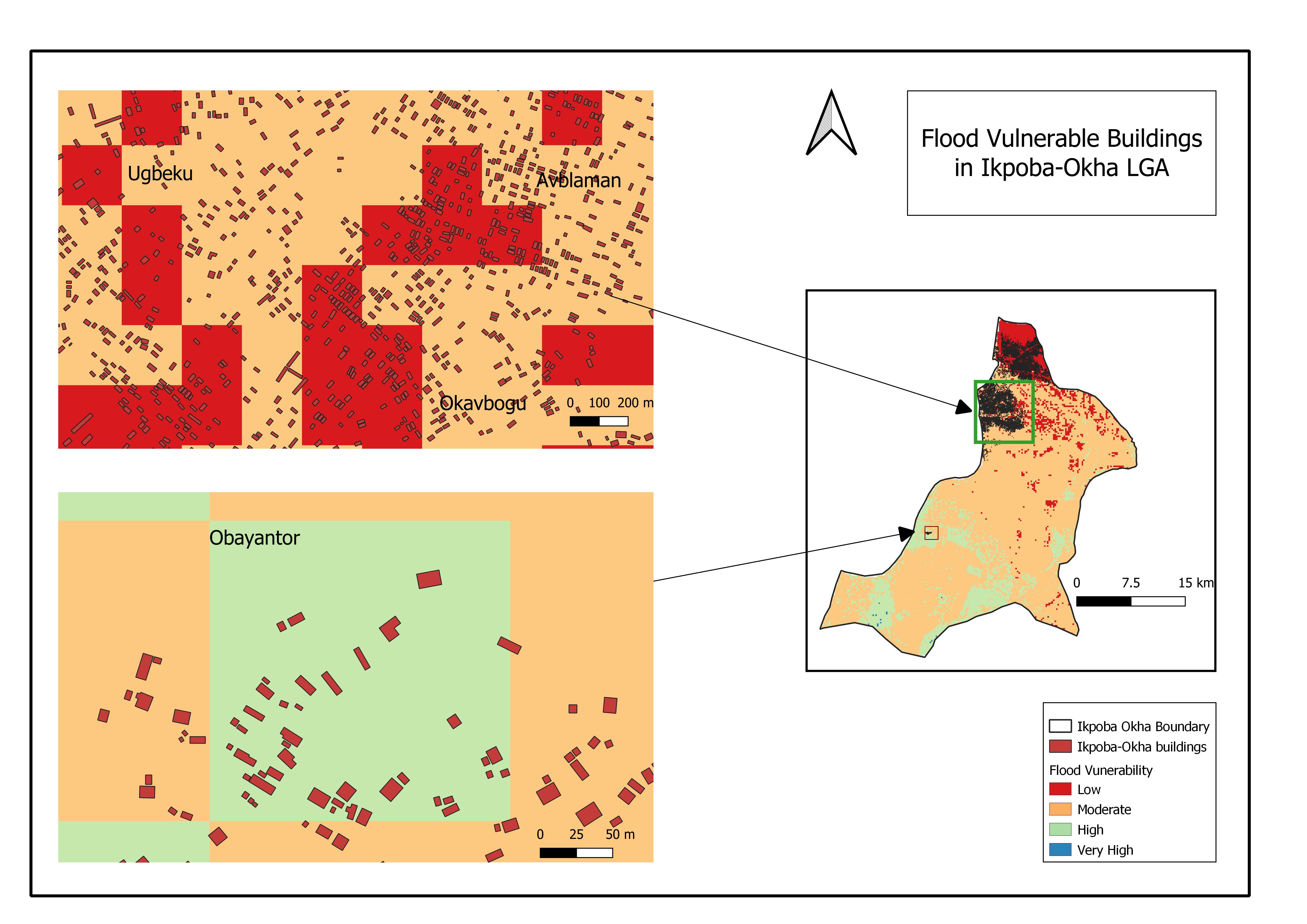
Flood vulnerable roads.
.
.
Study Area Maps - [Ossiomo Transmission Line]
Aim
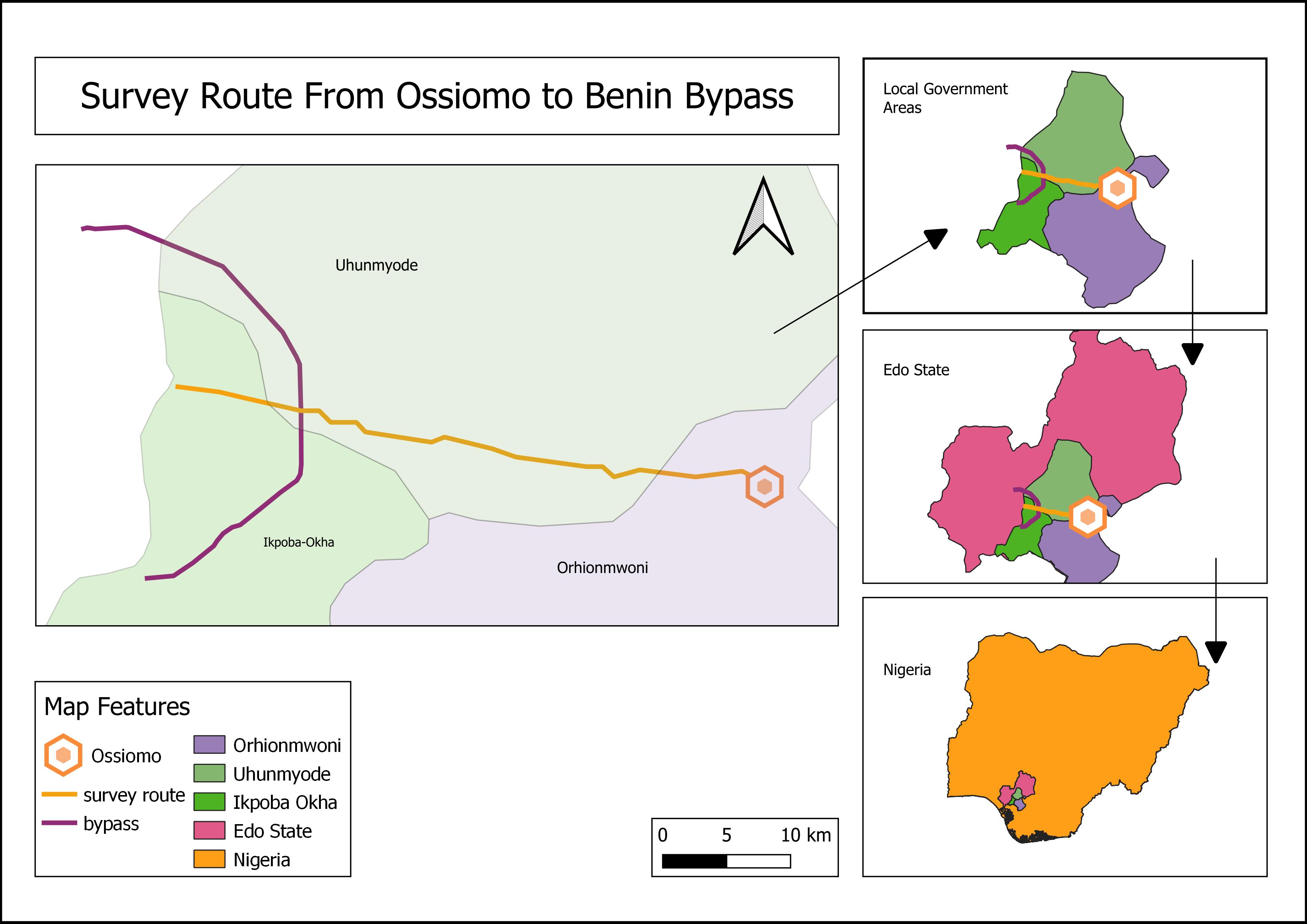
The goal of this project was to show the geographic location of the route survey project for the establishment of a transmission line. The required route is 10+ km. route that cuts across three local government areas in Edo State, Nigeria.
Data Source
The route data were acquired from the field using a total station. The boundary data for each local government area was manually digitized, while the country boundary data was obtained from DivaGIS.
Results
The map was created by importing the survey points of the route survey, connecting them, and digitizing the three local government area boundaries. It shows the relative location of the LGAs in the state, Edo State, as well as the country, Nigeria.
Here's a video tutorial on how to make a study area map on QGIS
Subscribe to my newsletter
Read articles from Leonard Fidelis directly inside your inbox. Subscribe to the newsletter, and don't miss out.
Written by

Leonard Fidelis
Leonard Fidelis
Hi, I'm Leo. A Geomatician and Data Analyst who loves unfolding the metrics of daily human activities. I recently started a YouTube channel where I share explainer videos on GIS analytical processes. And here I am, starting out a blog for the same purpose. I'm currently working on adding a host of python libraries to my stack, and I'd be sure to update you as I do. When I'm not writing codes or crunching numbers to inform Geospatial decisions, you'd find me writing texts on how exactly you can do that. Yes, a Technical Writer. Here's my Stack: SQL {PostgreSQL, MySQL} Python {NumPy, Pandas, Matplotlib, Seaborn} GIS Applications [QGIS, ArcGIS, Google Earth Pro, AutoCAD]