Choosing Visuals for Embedded Dashboards – Tips & Tricks
 Ragavan Angamuthu
Introduction
Data visualization is the best way to understand the story in a data set quickly. Displaying the key metrics simply and attractively using visuals can give viewers an important perspective on the data, which in turn facilitates clearer decision-making. One such visualization choice would be charts for a dashboard. A dashboard comprises a collection of charts and other visuals in a single user interface. Choosing the most effective chart for your type of data can have a major impact on your dashboard.
Embedded analytics allow you to embed your dashboards and business intelligence tools into your business applications, enabling you to improve your analytics and gain valuable insights that will help you grow. With features like prebuilt data connectors, calculated metrics, and engaging data visualization, Bold BI makes it simple to embed interactive dashboards in any business application. In this blog post, we will go over some tips and tricks to choosing the right chart for your metrics to make your dashboard better.
Data representation types
Basically, there are four data representation types:
Comparison
Relationship
Proportion
Distribution
Most of the available chart types will fall into one of these categories. Let’s discuss each of these representations with the associated chart types.
What are comparison charts?
Comparison charts help you see differences over time by comparing one or more data sets. The chart types, which we are going to look at in more detail, are:
Bar chart
Column chart
Stacked bar chart
Stacked column chart
100% Stacked bar chart
100% Stacked column chart
Radar polar chart.
What is a bar chart?
Bar charts are used to compare values across categories through horizontal bars. Each bar represents a category and the length of the bar denotes the value.
When Can Bar Charts Be Used?
When you have long labels with a lot of categories for comparison, bar charts give you more room for them.
When you need to display a large number of data sets on the category axis.
When the chart items have more than five categories.
When you need to show a ranking of the top 5 categories of a longer list.
When you need to view the values of each category.
Tips:
Start the axis scale value from zero for best visualization.
A bar chart is the best option when the changes are larger.
Avoid using bar charts when you have negative values.
Put value labels on the bars.
Example
Bar chart
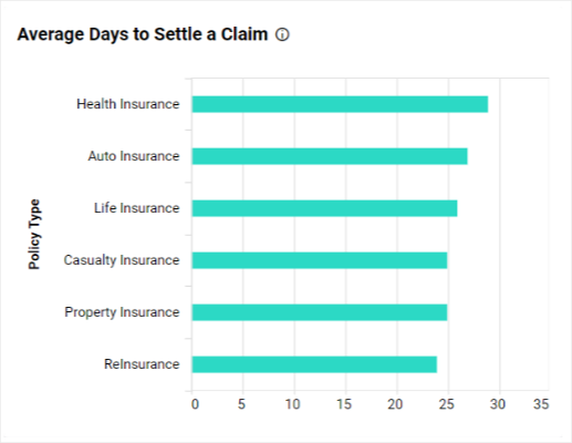
The bar chart in Bold BI’s Policy Claim Detailed Analysis Dashboard explains the average time taken to settle each claim based on policy types.
What is a column chart?
Column charts are used to compare values across categories through vertical bars. Each bar represents a category and the length of the bar denotes the value.
When Can Column Charts Be Used?
When you are trying to show change over time.
When you need to display a set of data that contains negative values.
When you are trying to present data with short category labels.
When you need to show a trendline on the chart
Tips:
Only show data sets with up to 12 categories.
Add data labels, it will make comparing the data easier.
Example
Column chart
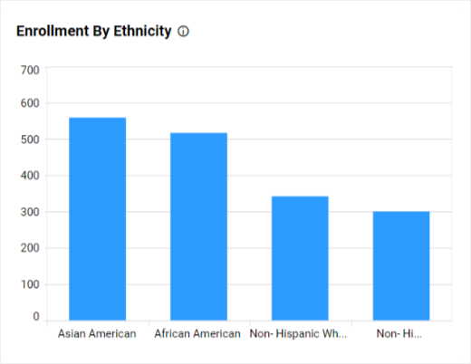
The column chart in the Bold BI’s Higher Education Enrollment and Retention Dashboard shows the enrollment of students based on their ethnicity. With the help of column charts, you can showcase the number of students who passed, failed, or did not attend the exam in each subject.
What is a stacked bar chart?
Stacked bar charts are used to compare categories with multiple values stacked in a series horizontally. Visually, a stacked bar chart conveys more information about the data categorization.
When Can Stacked Bar Charts Be Used?
When you need to showcase a part of the whole relationship in a category.
When you need to display the total size of groups.
When you have long labels.
Tips:
- Apply sorting and choose impressive color patterns to the categories for quick understanding.
Example
Stacked bar chart
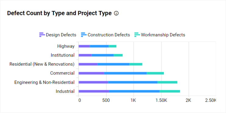
The stacked bar chart in Bold BI’s Construction Quality Management Dashboard shows you the defect count based on the defect types for each project type.
What is a stacked column chart?
Stacked column charts are used to compare categories with multiple values stacked up in a series vertically. Visually, a stacked column chart conveys more information about the data categorization over time.
When Can Stacked Column Charts Be Used?
When you want to show the relationship of the individual sub-items with the whole.
When you want to show how results changed from one to the next period of time.
When you have less than 10 columns to display.
Tips:
When comparing time data, make sure that you have dates with the same intervals.
Limit the number of data series and categories.
Example
Stacked column chart
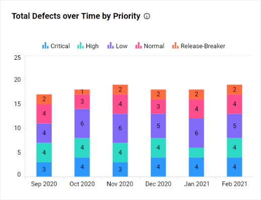
The stacked column chart in Bold BI’s Defect Management in Agile Dashboard shows the comparison of the defects and how each defect was distributed over the past six months by priority.
What is a 100% stacked bar chart?
100% stacked bar charts are used to compare categories with multiple values stacked in a series horizontally with percentages. Visually, a 100% stacked bar chart conveys information about the parts to the total by percentage.
When Can 100% Stacked Bar Charts Be Used?
To compare categories with multiple values that represent a percentage of a total value horizontally.
When you need to compare multiple categories and data series in a compact space.
Example
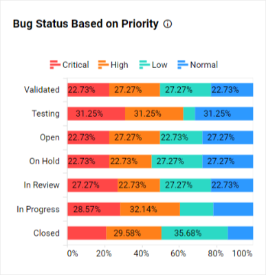
100% stacked bar chart
The 100% stacked bar chart in Bold BI’s Team Management in Agile Dashboard helps you showcase the bug task status based on priority.
What is a 100% stacked column chart?
100% stacked column charts are used to compare categories with multiple values stacked up in series vertically with percentages. Visually, a 100% stacked column chart conveys information about the data categories over time to show the parts to total percentage.
When Can 100% Stacked Column Charts Be Used?
To compare categories with multiple values over time that represent a percent of the total vertically.
When you need to display part to whole changes over time and category.
Example
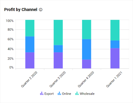
100% stacked column chart
The 100% stacked column chart in Bold BI’s Pharmaceutical Sales Performance Dashboard helps you visualize the profit earned as a relative percentage of multiple channels in each quarter. Also, you can compare the results with previous quarters.
What is a radar polar chart?
Radar polar charts are used to display multivariate data in the form of a two-dimensional chart using three or more quantitative variables represented on axes starting from the same point.
When Can The Radar Polar Chart Be Used?
When you want to compare two or more products over a range of characteristics.
To identify the outliers or mutual relationships among multiple quantitative data points quickly. For example: If you have school data, you can plot student results in each subject to find the outliers, like which subject is exceptionally tough for students.
Example:
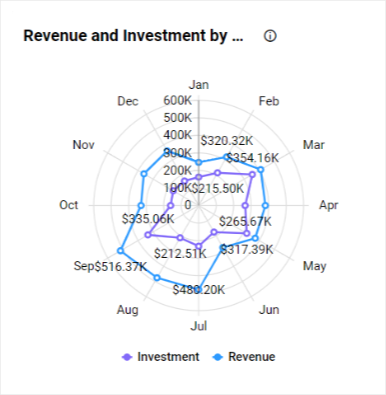
Radar polar chart
The radar polar chart in Bold BI’s Project Overview Dashboard shows the monthly breakdown of a company’s finance by total investment and total revenue earned.
What are relationship charts?
Relationship charts help you showcase the connections or correlations between two or more variables. The chart types, which we are going to look at in more detail, are:
Map
Grid
Pivot grid
Tree map
Heat map
What is a map?
Maps are used to visually represent geographical data, like latitude and longitude, or regions, like country or state.
When Can The Map Widget Be Used?
When you need to show the distribution of your organization’s presence.
When you need to analyze activity across several locations.
When you need to compare analysis data by region.
Tips:
Always use legends; maps without legends will confuse the users.
Using data labels helps you visualize and compare the data properly.
Example
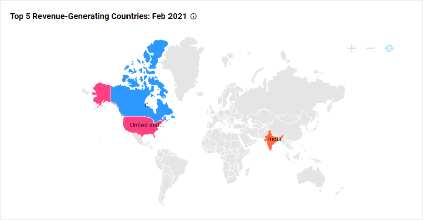
Map widget
The map widget in Bold BI’s Profit and Loss Dashboard is highlighting the top five revenue-generating countries.
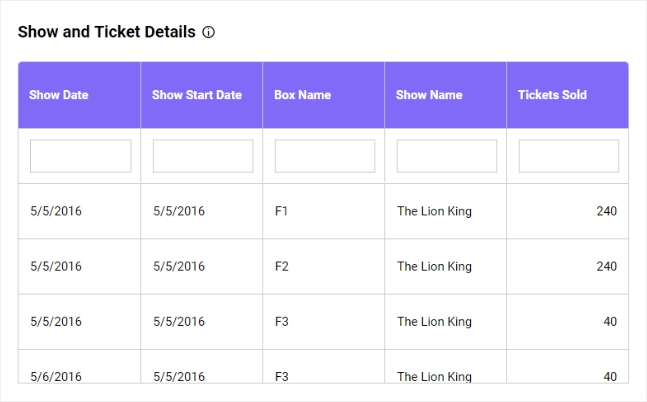
What is a grid?
Grids are used to showcase ranking by the vertical arrangement of items ordered from top to bottom.
When Can A Grid Be Used?
When you need to compare more categories and groups.
When you need to group items, records, or rows into categories.
When you need to find data patterns that occur over a period of time.
Example
Grid
The grid in Bold BI’s Tickets Sales Analysis Dashboard showcases the details of a show’s ticket details, like the number of tickets sold with respect to show date.
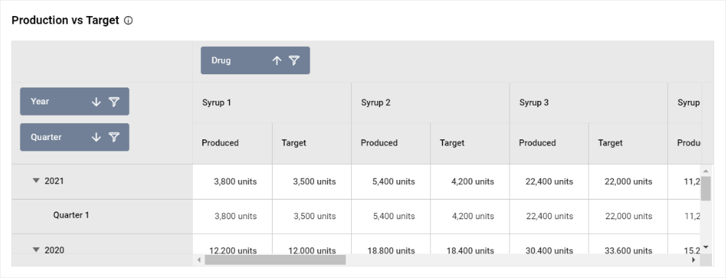
What is a pivot grid?
Pivot grid is a tool that helps you summarize, sort, reorganize, group, count, total, or average data. You can report on and explore the trends in the data.
When Can A Pivot Grid Be Used?
When you need to compare sales totals of different products.
When you need to summarize and analyze a large amount of data.
Example
Pivot grid
The pivot grid in Bold BI’s Pharmaceutical Production Analysis Dashboard helps you compare the produced units of drugs versus the target set for that quarter. You can also filter out quarters or drug names of your choice to limit the data displayed in this pivot grid.
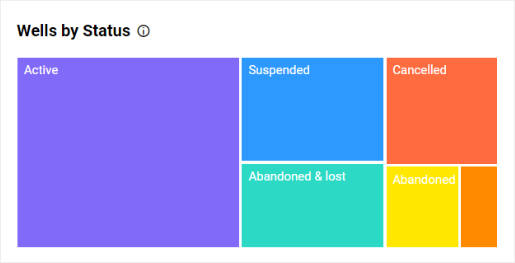
What is a tree map?
Tree maps are used to visualize large amounts of data using proportional shelves and color scales. Data is represented hierarchically with the rectangles representing two numerical values for the categories using color variation.
When Can A Tree Map Be Used?
When you need to display hierarchically structured data.
When you need to display the magnitude of the major categories.
Tips:
Don’t use data that is not hierarchical.
Avoid cluttering your tree map with too many boxes.
Consider using colors that are safe for color-blind people.
Example
Tree map
The tree map in Bold BI’s Oil and Gas Wells Summary Dashboard visualizes the count of the wells based on their status.
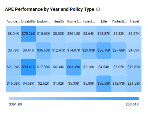
What is a heat map?
Heat maps are used to visualize large amounts of hierarchical data as a series of clustered rectangles of sizes proportional to the corresponding data values with a color scale.
When Can A Heat Map Be Used?
When you need to simultaneously display the magnitude of the categories and subcategories in one visualization.
When you have a lot of hierarchical data and limited space.
When you need to study the data with respect to the quantitative values.
Example
Heat map
The heat map chart available in Bold BI’s Insurance Analysis Dashboard helps you analyze which policy types are performing better and which are performing comparatively lower.
What are proportion charts?
Proportion charts help you compare the different parts of a whole category and change over time. The chart types, which we are going to look at in more detail, are:
Pie chart
Doughnut chart
Pyramid chart
Funnel chart
What is a pie chart?
Pie charts are used to show the part-to-whole comparison among categories for data with all slices totaling 100%.
When Can The Pie Chart Be Used?
When you need to do a part-to-whole analysis.
When you need simple proportions and not specific percentages.
When you have a small number of categories to compare.
When you have to compare six or fewer categories.
Tips:
Don’t use 3D pie charts.
Don’t use legends in pie charts.
Don’t use similar colors.
Don’t use negative or zero values.
Example
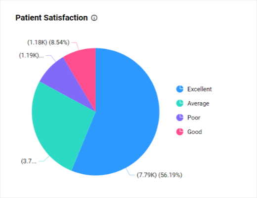
Pie chart
The pie chart in Bold BI’s Patient Experience Analysis dashboard shows you the percentage of patient satisfaction levels.
What is a doughnut chart?
Doughnut charts are used to show part-to-whole comparisons among categories of data with all slices totaling 100%. It is one of the variants of the pie chart.
When Can The Doughnut Chart Be Used?
To showcase the proportionality of each item to the total.
When you need to represent the multiple data sets.
When you have to compare fewer than seven categories.
Tips:
Don’t use 3D doughnut charts.
Don’t use negative or zero values.
Example
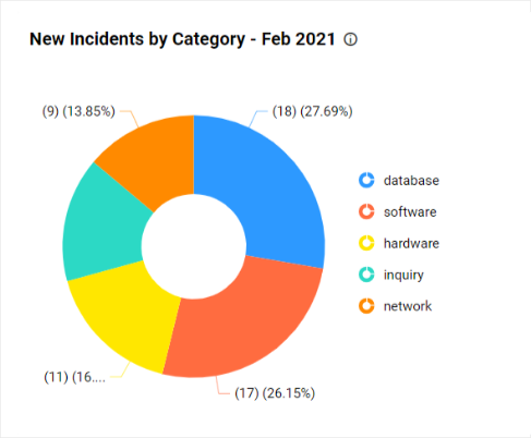
Doughnut chart
The doughnut chart in Bold BI’s Incident Management Dashboard helps you track the number of incidents created by category.
What is a pyramid chart?
Pyramid charts are used to make proportional comparisons among values in a progressively increasing manner. They consist of various segments, each representing a data point.
When Can The Pyramid Chart Be Used?
When you need to show data in a hierarchical structure.
When you need to differentiate the most important and least important topics.
When you need to organize items by size or quantity.
Tips:
Avoid using many layers for better clarity.
Clearly label the subcategories.
Example
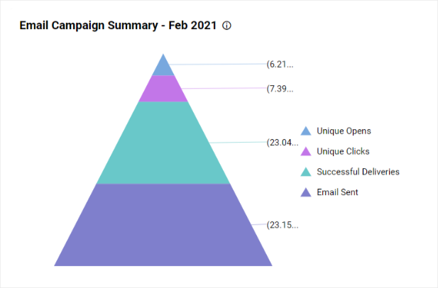
Pyramid chart
The pyramid chart in Bold BI’s Email Campaign Performance Dashboard helps you track unique opens and clicks by the campaign for the current month.
What is a funnel chart?
Funnel charts are used to show values across multiple steps of a process by highlighting different stages with different colors. It allows you to make proportional comparisons among values showcased in a progressively decreasing manner.
When Can The Funnel Charts Be Used?
When the available data is in order and moves through at least four stages.
When you need to calculate and track conversion and retention rates.
When you need to track the progress and success of click-through marketing campaigns.
Tips:
Maintain consistent stage spacing.
Use at least three stages.
Example
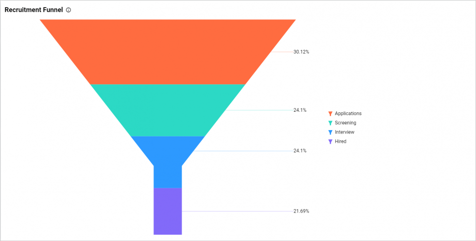
Funnel chart
The funnel chart in Bold BI’s HR Recruitment Dashboard helps you look at the stages in the recruitment process and the proportion of applicants in each stage.
What are distribution charts?
Distribution charts help you see how variables are distributed over time and analyze trends. The chart types, which we are going to look at in more detail, are:
Area chart
Stacked area chart
100% stacked area chart
Line chart
Spline chart
What is an area chart?
Area charts are used to compare values for a set of unordered items across categories through filled curves ordered vertically.
When Can The Area Chart Be Used?
When you want to show trend changes over time.
When you need to showcase large differences in your data.
When you need to compare a small number of categories.
When you have many dates in your data.
Tips:
Start the baseline at zero.
Use transparent colors for better understanding.
Use annotations and highlight ranges to add explanations to your chart.
Group many tiny values to one bigger value for better visualization.
Example
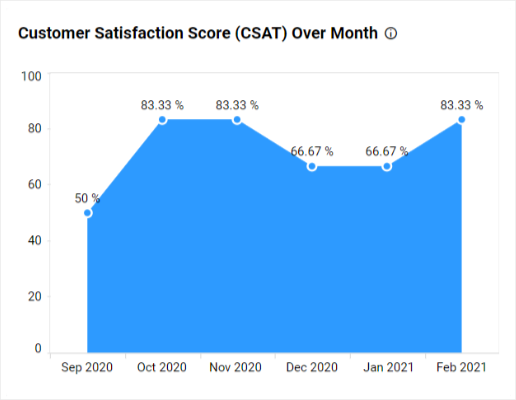
Area chart
The area chart in Bold BI’s Customer Satisfaction Dashboard shows how satisfied the customers have been with a product for the past six months.
What is a stacked area chart?
Stacked area charts are used to compare multiple measures through filled curves stacked one on another vertically.
When Can Stacked Area Charts Be Used?
When you need to understand the breakdown of a total by groups and how each category contributes to the cumulative total.
When you have two or more quantities to compare.
To find the measures of each category from the total summation, avoiding negative values.
Tips:
Use transparent colors for better understanding.
Start the baseline at zero.
Example
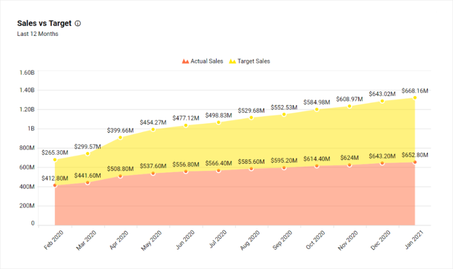
Stacked area chart
The stacked area chart in Bold BI’s Real Estate Management Dashboard helps you find the difference between the actual and target sales numbers of the property sales.
What is a 100% stacked area chart?
100% stacked area charts are used to compare multiple measures through filled curves stacked one on another vertically with percentages.
When Can 100% Stacked Area Charts Be Used?
- When you need to show how the distribution of categories as part of a whole has changed over time in percentages.
Tips:
Use transparent colors for better understanding.
Start the baseline at zero.
What is a line chart?
Line charts are used to showcase trends for analysis over a time period with data points connecting using straight lines.
When Can The Line Chart Be Used?
When you need to show the change in data over a time period to find a trend or pattern.
When you need to predict the future outcome based on past data trends or patterns.
When you need to know the breakdown of data across different subgroups.
Tips:
Use an appropriate measurement interval between the axes.
Clearly label your axes.
Don’t showcase too many lines, limit them to five or fewer lines.
Avoid using a zero-value baseline wherever needed.
Example
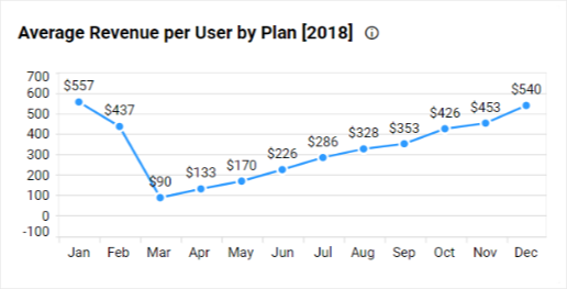
Line chart
The line chart in Bold BI’s General Management Dashboard helps you analyze how much revenue is earned per customer over the month. You can also see revenue per service plan.
What is a spline chart?
Spline charts are used to showcase trends for analysis over a time period with data points connected by splines.
When Can The Spline Chart Be Used?
When you need to showcase the data changes at equal intervals of time.
To display time-series data with multiple categories using spline connections.
Tip:
- Start the baseline at zero.
Example
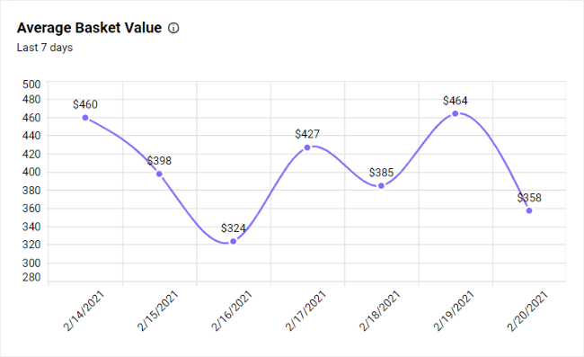
Spline chart
The spline chart in Bold BI’s Retail Store Performance Dashboard helps you find the trend of average value spent per customer per transaction in the store.
Additionally, you can use combination charts to identify how data values are composed with different measurements.
What are combo charts?
Combo charts are used to compare values by combining multiple Cartesian charts (column, bar, stacked column, stacked bar, 100% stacked column, 100% stacked bar, spline, line, area, stacked area, 100% stacked area).
When can the combo chart be used?
When you need to display multiple chart types in a single chart.
When you want to show the relationship between two or more sets of data.
When you need to compare the data sets from the different periods.
Example
Combo chart
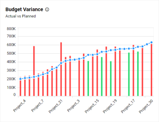
The combo chart in Bold BI’s Construction Project Monitoring Dashboard showcases the budget variance, which is the difference between the planned budget, or baseline amount of expense, and the actual amount spent.
We have seen all charts usages, tips, and showcase samples with Bold BI. Check this visualization widgets documentation for more details about configuration and formatting the available widgets in Bold BI.
General tips for data visualization
Make use of sorting options that help you analyze the data more effectively.
Use different colors if you want to compare categories to make charts look impressive. Use transparent colors wherever applicable. For example: In area charts, as they improve chart clarity.
Use the same color palette if you want to compare values from high to low for easy comparison.
If a chart has a lot of overlapping in its display because there’s a lot of data, look for an alternative chart, showcase a handful of the values on one end, or split the chart into two types for better clarity.
Make use of a legend or apply a tooltip to the values for quick data interpretation.
Remember you can rotate long labels for better readability.
Aggregating values based on the type of data will be useful to display consolidated data points.
Avoid showing irrelevant data (like empty points) and make use of filtering in these cases.
If you want to show more details about a category, use drill-down for a better visual.
Apply formatting for the values for better visualization. For example: Show costs with a currency format.
Identify your audience before creating your dashboard.
Clean up your data properly before binding it to charts.
Conclusion
We hope this blog post helped you learn about chart types with some general tips for chart selection to make your dashboard a meaningful one. Bold BI offers various charts and other visuals with interactive features for your dashboard. We also have prebuilt solutions for dashboards organized into industry, department, and data analytics domains with the appropriate charts based on different situations.
Using Bold BI, you can embed your analytics dashboard into your application. Bold BI is a powerful SDK for embedding analytics seamlessly inside your application built with popular frameworks like Angular, ASP.NET Core, or MVC. Since Bold BI is flexible and allows deployment in any environment (like Windows, Linux, Kubernetes, or Docker), you can easily deploy analytics with your software in any of these platforms. See our website for more embedding samples by framework. To learn more about embedded analytics, refer to this blog.
Get started with Bold BI by signing up for a free 15-day trial and create more interactive business intelligence dashboards. If you have any questions on this blog, please feel free to post them in the following comment section. You can also contact us by submitting your questions through the Bold BI website or, if you already have an account, you can log in to submit your support question.
Subscribe to my newsletter
Read articles from Ragavan Angamuthu directly inside your inbox. Subscribe to the newsletter, and don't miss out.
Written by

Ragavan Angamuthu
Ragavan Angamuthu
As a passionate writer and tech enthusiast, I explore the human side of technology, capturing both the challenges and triumphs. Here, you’ll find heartfelt stories of personal growth alongside in-depth analyses of the latest tech trends. Each post is crafted with care, blending emotion with expertise, to offer a unique perspective that resonates on multiple levels. Whether you're here for inspiration or innovation, my goal is to connect, inform, and inspire through the power of words and technology. Join me on this journey of discovery and connection. Together, we'll navigate the wonderland of words, exploring, learning, and, above all, enjoying every moment. The adventure begins now—stay tuned for what's next!