The best CSS frameworks to be using in 2023
 Dumebi Okolo
Table of contents

Hello and welcome!! 🤩🤩🤩
In today's lesson, we will discuss various CSS frameworks to make writing your CSS much more effortless, save you more time, and build efficiency.
In our Beginner CSS and Advanced CSS classes, we have learned the fundamentals of vanilla CSS and all that we need to style our website.
CSS frameworks are a bunch of relevant CSS code written by someone else or compiled by a team of people and made ready to use for the sole purpose of making styling a website faster, easier, and more straightforward.
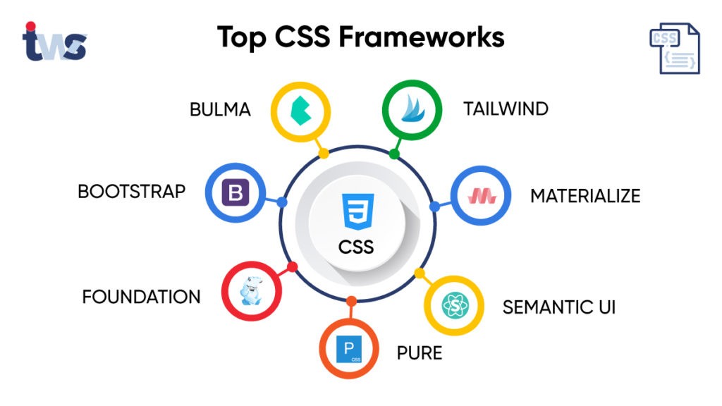
There are many CSS frameworks available for web developers and designers to choose from, depending on need and convenience. I'd list a few. You can learn about a lot more that are relevant and in use in 2023 at CSS Frameworks 2023.
Bootstrap: is the most popular HTML, CSS, and JavaScript framework for developing responsive, mobile-first projects on the web.
Tailwind CSS: a utility-first CSS framework for rapid UI development.
Foundation CSS: is the most advanced responsive front-end framework in the world.
Null Js: is a free and open-source framework built only with HTML, CSS, and pure JavaScript, with no dependencies.
Material UI: this is a lightweight CSS framework that follows Google's Material Design guidelines.
98.css: CSS library for building interfaces that look like Windows 98.
TuiCss: Library to create MS-DOS interfaces.
For this tutorial, we will use Code Pen. To enable any of the CSS frameworks, go to the settings button on the CSS editor on your pen, search for the framework you want to use, and then enable it.
Tailwind CSS
Information on Tailwind Css can be found on their website. When on a local IDE, tailwind is installed using the Node Package manager, npm.
A utility-first CSS framework packed with classes like flex, pt-4, text-center and rotate-90 that can be composed to build any design, directly in your markup. When installing Tailwind, you install, as said, a compilation of CSS code that has previously been written, to make the building of various style points easy. Tailwind takes effect on your project by using certain class names that have already been pre-programmed into the compiled CSS code that you downloaded upon installation.
See how fascinating this is! Without writing a single line of CSS, we have been able to style our website, although very poorly styled 🤣🤣🤣 This is the power and flexibility a CSS framework offers! To use Tailwind to style your website, you will need to have a good working knowledge of CSS, as most of the class names you will be modifying are vanilla CSS properties, although some have been shortened for readability. A full list of the things possible with Tailwind can be found on their documentation page. Of course, there are a lot more things you can do with Tailwind as regards styling your website. The above example was just to give a sneak peek into what is possible.
Note: Tailwind can be used in conjunction with normal vanilla CSS to achieve the exact styling you want.
Bootstrap
Information on Bootstrap can be found on their website. In our local IDEs, we access Bootstrap using a CDN, Content Delivery Network.
A content delivery network (CDN) is a geographically distributed group of servers that caches content close to end users. A CDN allows for the quick transfer of assets needed for loading Internet content, including HTML pages, JavaScript files, stylesheets, images, and videos.
Bootstrap is a powerful, feature-packed front-end toolkit. Build anything—from prototype to production—in minutes. Bootstrap is unlike Tailwind in a lot of ways, one of the most prominent being that Bootstrap comes pre-styled. Much like Tailwind, Bootstrap also uses class names. However, with Bootstrap, you aren't just typing in vanilla CSS properties, you are copying their components directly.
<nav class="navbar navbar-expand-lg bg-body-tertiary">
  <div class="container-fluid">
    <a class="navbar-brand" href="#">Navbar</a>
    <button class="navbar-toggler" type="button" data-bs-toggle="collapse" data-bs-target="#navbarSupportedContent" aria-controls="navbarSupportedContent" aria-expanded="false" aria-label="Toggle navigation">
      <span class="navbar-toggler-icon"></span>
    </button>
    <div class="collapse navbar-collapse" id="navbarSupportedContent">
      <ul class="navbar-nav me-auto mb-2 mb-lg-0">
        <li class="nav-item">
          <a class="nav-link active" aria-current="page" href="#">Home</a>
        </li>
        <li class="nav-item">
          <a class="nav-link" href="#">Link</a>
        </li>
        <li class="nav-item dropdown">
          <a class="nav-link dropdown-toggle" href="#" role="button" data-bs-toggle="dropdown" aria-expanded="false">
            Dropdown
          </a>
          <ul class="dropdown-menu">
            <li><a class="dropdown-item" href="#">Action</a></li>
            <li><a class="dropdown-item" href="#">Another action</a></li>
            <li><hr class="dropdown-divider"></li>
            <li><a class="dropdown-item" href="#">Something else here</a></li>
          </ul>
        </li>
        <li class="nav-item">
          <a class="nav-link disabled">Disabled</a>
        </li>
      </ul>
      <form class="d-flex" role="search">
        <input class="form-control me-2" type="search" placeholder="Search" aria-label="Search">
        <button class="btn btn-outline-success" type="submit">Search</button>
      </form>
    </div>
  </div>
</nav>

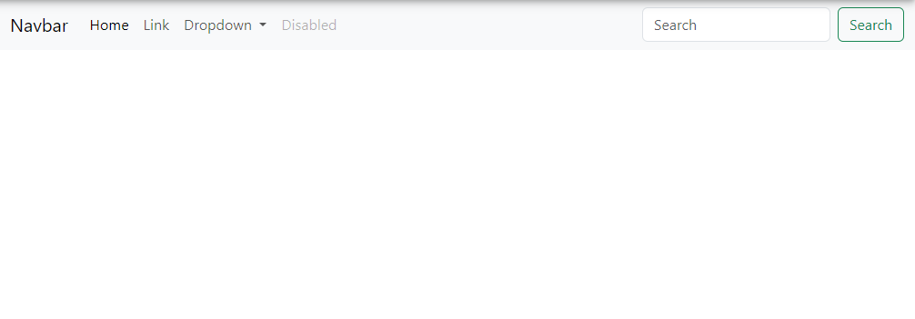
We can see from the example above, how we were able to create a standard navigation bar skeleton. This was possible with Bootstrap's pre-styled navbar component. There are loads more components that you can use on Bootstrap (as seen on their website) to quickly build a responsive and styled website. Reading through the Bootstrap documentation, you can see how to further customize these components to suit your needs.
Foundation CSS
Information on Foundation can be found on their website. Like Tailwind, Foundation is installed using the node package manager , npm.
However, very similar to Bootstrap, Foundation makes use of pre-styled components. Foundation for Sites was built to be the most advanced responsive front-end framework in the world.
In the codepen above, we see an example of a pre-styled progress bar. See how with just HTML, and the class names corresponding to the compiled CSS by Foundation, we have been able to build four different progress bars, with different colors. Of course, the filling of the progress bars will be moderated using Javascript. In our next class, we will be starting on Javascript!! 🥳🥳🥳
Null JS
Information about Null Js can be found on their website.
Null JS is a free and open-source framework built only with HTML, CSS, and pure JavaScript, with no dependencies. It has a lot of pre-built components, and it allows developers to easily build small to medium websites. It is responsive, simple design, RTL-ready, easy to use, and well-documented.
    <form method="get" action="/">

        <div class="null-margin-bottom-20">
            <label class="null-color-main null-font-weight-bold null-display-block null-margin-bottom-10" for="firstName">
                First Name :
            </label>
            <input class="null-form-input" id="firstName" type="text"     name="firstName" required/>
            <span  class="null-form-error">First name is required</span>
        </div><!--End null-margin-bottom-20-->


        <div class="null-margin-bottom-20">
            <label class="null-color-main null-font-weight-bold null-display-block null-margin-bottom-10" for="lastName">
                Last Name :
            </label>
            <input class="null-form-input" id="lastName" type="text"     name="lastName" required/>
            <span  class="null-form-error">Last name is required</span>
        </div><!--End null-margin-bottom-20-->


        <div class="null-margin-bottom-20">
            <label class="null-color-main null-font-weight-bold null-display-block null-margin-bottom-10" for="email">
                Email :
            </label>
            <input class="null-form-input" id="email" type="text"     name="email" required/>
            <span  class="null-form-error">Email name is required</span>
        </div><!--End null-margin-bottom-20-->

        <div class="null-margin-bottom-20">
            <label class="null-color-main null-font-weight-bold null-display-block null-margin-bottom-10" for="number">
                Number :
            </label>
            <input class="null-form-input" id="number" type="number"    name="number" required/>
            <span  class="null-form-error">Number name is required</span>
        </div><!--End null-margin-bottom-20-->

        <div class="null-margin-bottom-20">
            <label class="null-color-main null-font-weight-bold null-display-block null-margin-bottom-10" for="password">
                Password :
            </label>
            <input class="null-form-input" id="password" type="password"     name="password" required/>
            <span  class="null-form-error">Password name is required</span>
        </div><!--End null-margin-bottom-20-->

    </form>

Above is a snippet of what we can do with Null Js. In the above snippet, we built a functional form page, using the pre-styled component from Null Js. As you read through the documentation, you will come across other components that you can use to efficiently and effectively style your website.
Hi, guys! We have come to the end of our lessons on CSS. I hope you have learned a lot in the past three weeks. Starting next week, we are entering the last phase of our 12-day lesson plan. We will be starting on Javascript, and rounding up with it!! 💃🏾💃🏾💃🏾💃🏾
See you all next week!
References
Subscribe to my newsletter
Read articles from Dumebi Okolo directly inside your inbox. Subscribe to the newsletter, and don't miss out.
Written by

Dumebi Okolo
Dumebi Okolo
Every great bio starts with a story. I believe that I'm more of an experience. I am a Developer Relations Engineer with knowledge of the Frontend:HTML, CSS, React, Bootstrap and TailwindCSS; Backend: Solidity, ExpressJs, Nodejs. I am looking to transition to fully in the Developer Relations space.