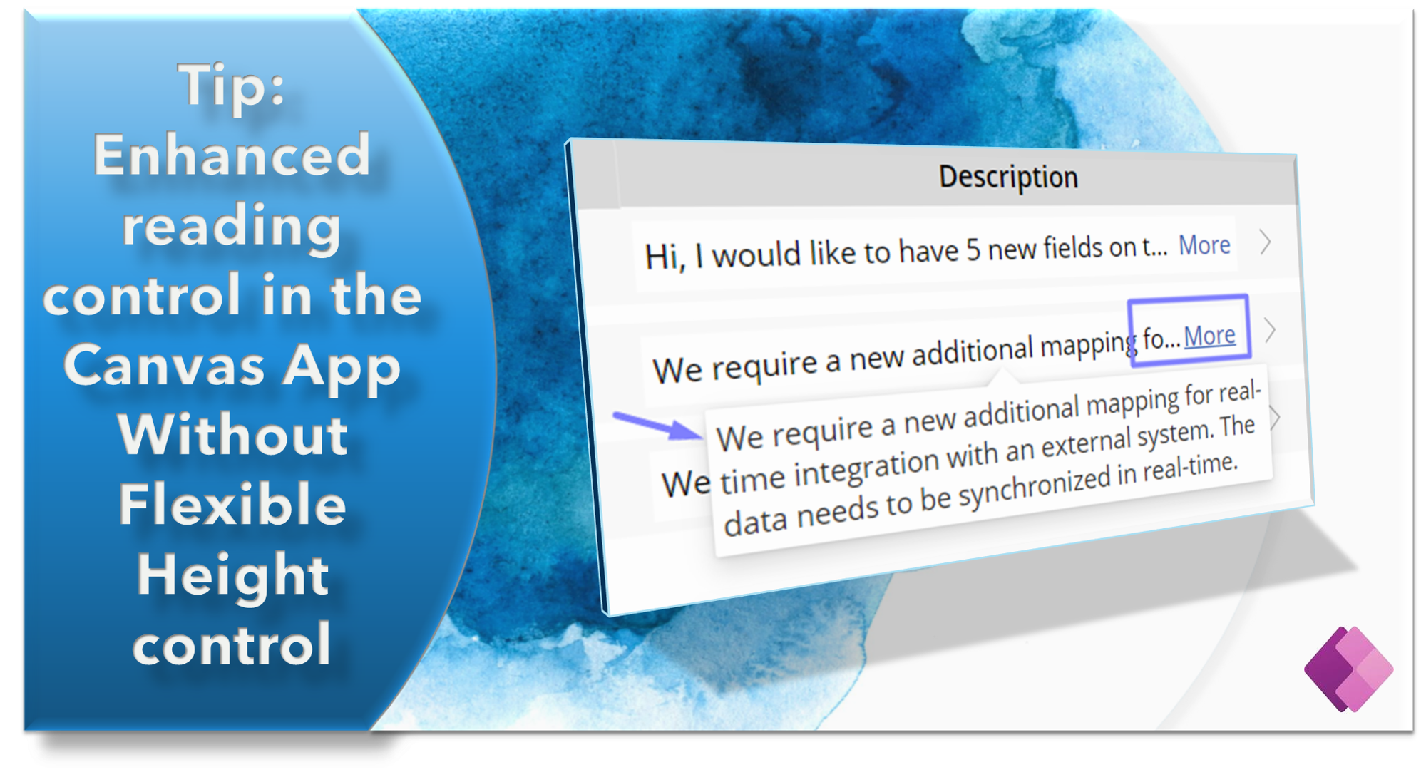
Tip: Enhanced reading control in the Canvas App without the use of flexible height labels or galleries
 Ethan Rebello
Introduction
Hello, PowerApps enthusiasts!
Finding an effective method for displaying lengthy text in a user-friendly manner within a restricted amount of real estate may be challenging. While flexible height labels and galleries are popular choices, they might be complex when developing a rich layout experience.
But don't worry, we have a better solution in the works! This article will demonstrate a unique approach to employing flexible controls that goes beyond the norm. Prepare an efficient way to handle and display lengthy text in your Canvas PowerApps.
So, if scroll bars and complex layouts bore you, let us look at a better alternative that gives a seamless reading experience without sacrificing visual attractiveness or demanding complex layout setups.
A secret control - Combobox control😲
Yes! PowerApps combobox has 1 powerful feature that we normally don't apply in such scenarios but it's really helpful and effective.

Pros:
It can truncate text and indicate partial display with an ellipsis while in View mode.
It displays "more," which is clicked and displays a tooltip-like interface with a comprehensive summary of the text within the control.
This is responsive and will fill the required area on the screen as a pop-up without disturbing any controls on the screen.
This feature will replace normal adjustable height labels and galleries, allowing for a more complex arrangement.
Cons:
Because this only works in View mode, the contents can only be referred to rather being modified.
- To get around this, you can either launch a pop-up form for modifying the item or always keep a pair of TextInput controls on hand for editing and displaying a combo box for viewing.
Implementation Steps
As I'll be demonstrating the control directly, I won't go over the sample data and gallery layout implementation.
Step 1: Create a simple Gallery or any experience where you wish to use combo box control. For this blog, I prepared the following sample layout:

Step 2: As you see the combo box control in the above image, below are its properties and formulas used.
Property "DefaultSelectedItems" -
{Value: ThisItem.Description}Property "DisplayMode" -
DisplayMode.View
Output

Summary
That's it! I hope you found this tip useful and I encourage you to employ such tips for improving control usage and minimizing dependencies.
If you come across other scenarios or applications where similar techniques can be applied, I would be delighted to hear about them. Please feel free to share your thoughts and experiences.
Thank you for reading! 😊
Subscribe to my newsletter
Read articles from Ethan Rebello directly inside your inbox. Subscribe to the newsletter, and don't miss out.
Written by
