Is Auto Layout hard for you? Here’s a solution.
 Boluwatife Olasupo
Rearranging elements and having them respond exactly opposite can be very annoying, especially when you don’t get results, but the force heard your cries, Figma introduced auto layout in 2019.
Auto Layout lets you easily arrange elements in your preferred order. Auto Layout makes it easier to create buttons, lists, and much more. In this article, I’ll walk you through applying auto layout, padding, direction, alignment, distribution, constraints and resizing, and some cool new features in Figma as related to Auto Layout. Let’s dive in.
Applying auto layout
There are two (2) steps to applying an Auto Layout;
Select the element(s) you want to auto-layout (pun intended).
Click the plus button beside Auto Layout in the right sidebar, or simply press “Ctrl + A” on your keyboard.
Congratulations, you just created an Auto Layout.
Note that when you apply an Auto Layout, a frame is created around the elements. This frame is called the parent frame and the elements are called children.
After applying auto layout, you notice some things on the right sidebar when the auto layout frame is selected, let’s talk about them in no particular order.
Padding
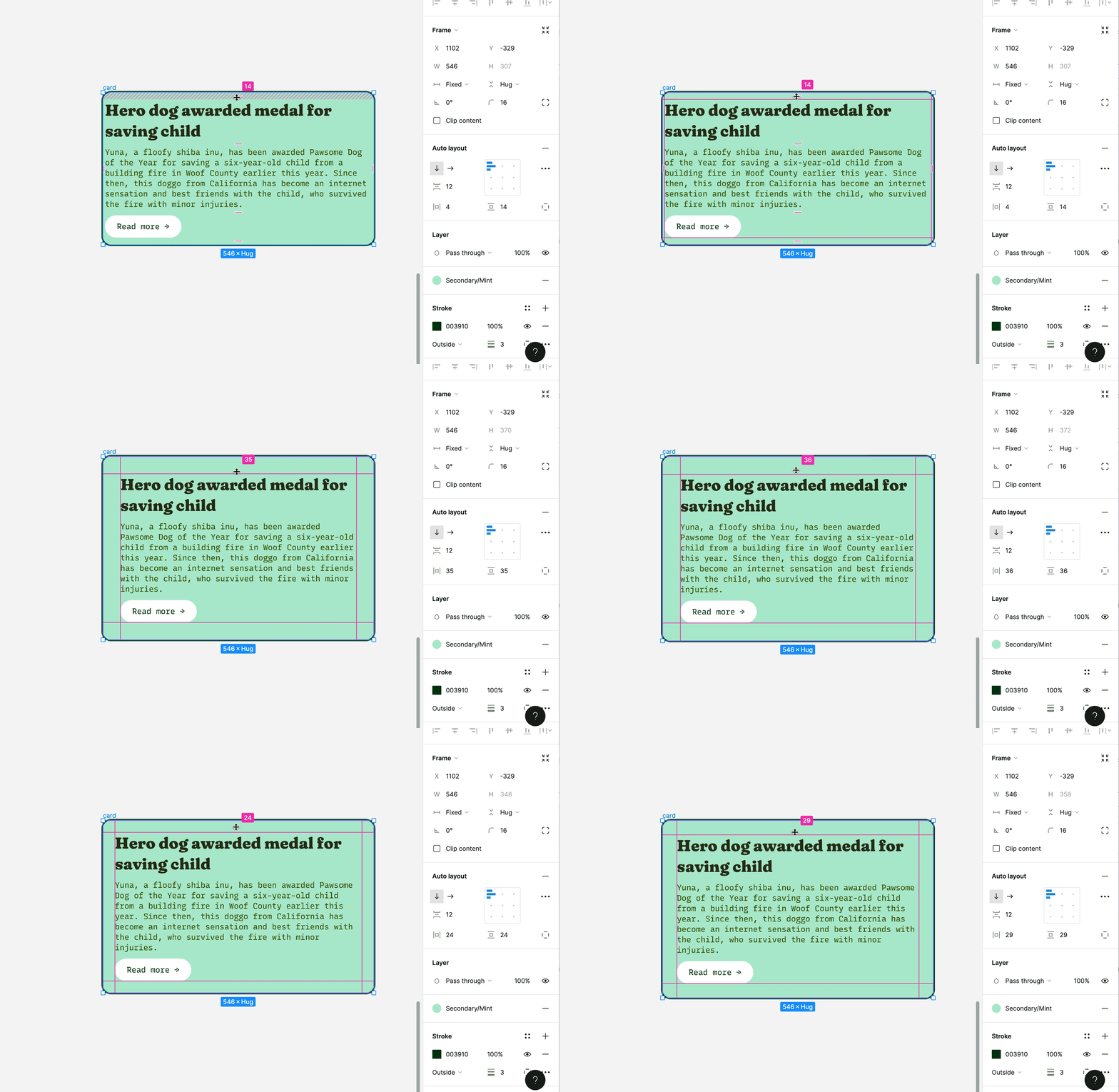
You’ve laid out your elements and you can notice some space around (and between) them, “What’s going on?” You wonder. Simple answer, padding. Padding is the space between and around child elements. There are two directions padding can be added around elements, that is, vertical and horizontal. These values can be changed individually.
How padding works in Figma
Then there’s space between elements that allows you to input the amount of space (in pixels) you want between siblings in a parent frame.
Direction
You see those two arrows (one pointing down and the other pointing right), exactly, those signify the direction in which the parent grows or shrinks should a child element be added or removed. This new child is called a sibling. The down arrow means an addition/removal of a sibling will make the parent grow/shrink vertically, while the right arrow means an addition/removal of a sibling will make the parent grow/shrink horizontally.
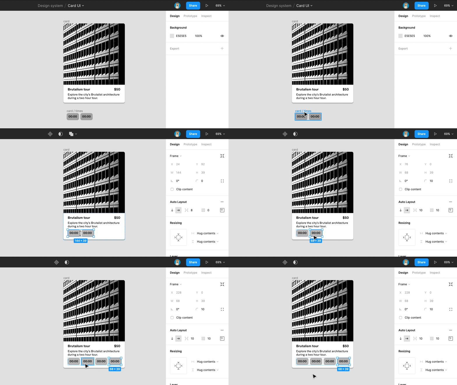
Children's direction in Figma
Alignment
Now you know in what direction children fix themselves, it’s time to know how they relate with one another. There are nine (9) ways they can relate to one another, namely; top left, top centre, top right, left, centre, right, bottom left, bottom centre, and bottom right. I’ll leave you to try these out and see how the siblings behave with one another.
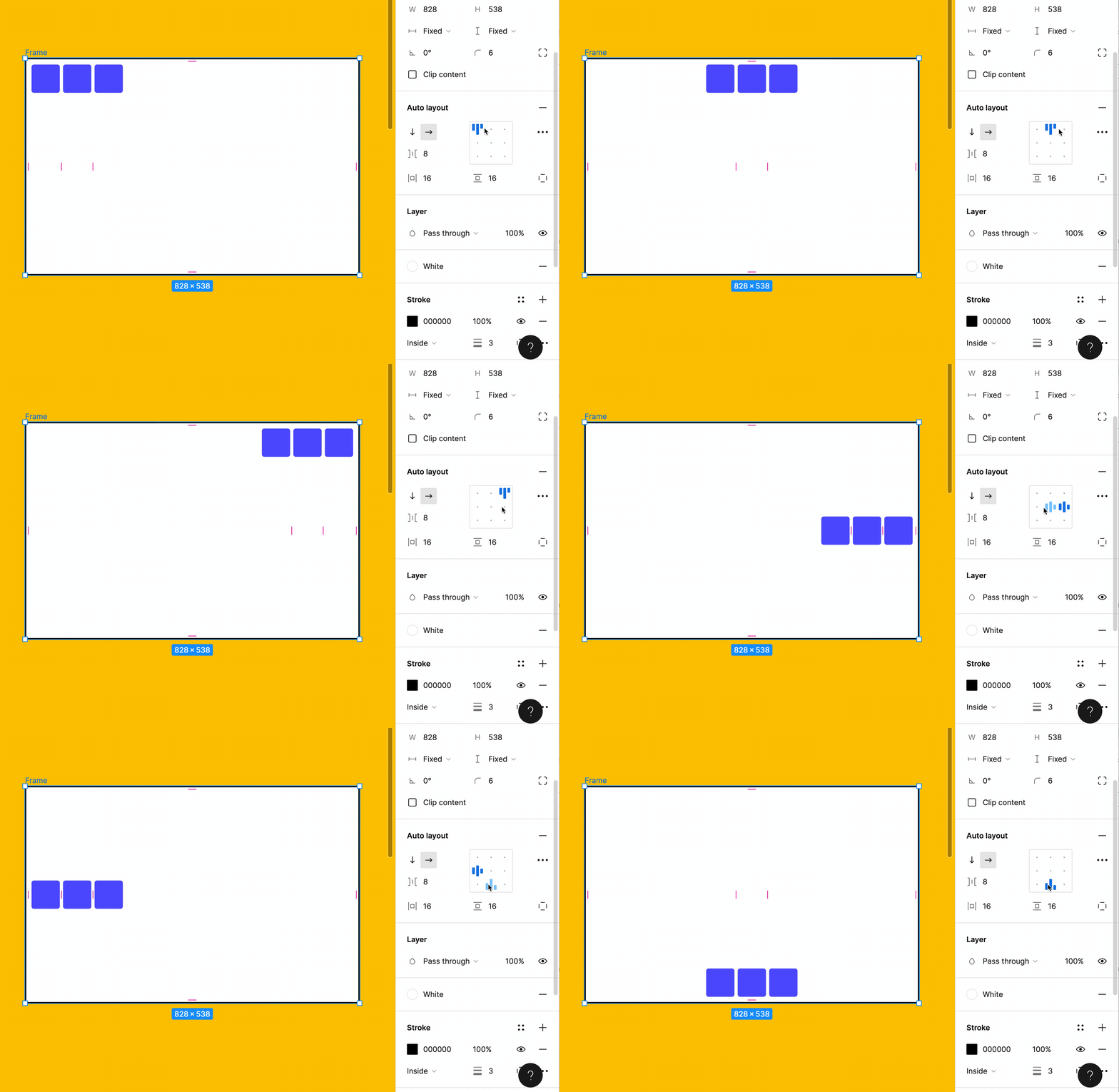
The nine alignment patterns in Figma
Distribution
After alignment, it’s time to do some family planning, that is, distribution. Distribution allows you to set the spacing between elements. There are two options, which are packed and space between. Packed lets you dictate the amount of space that is between elements, while “space between” spreads the elements to fill the parent frame, either vertically or horizontally depending on the direction you’ve set.
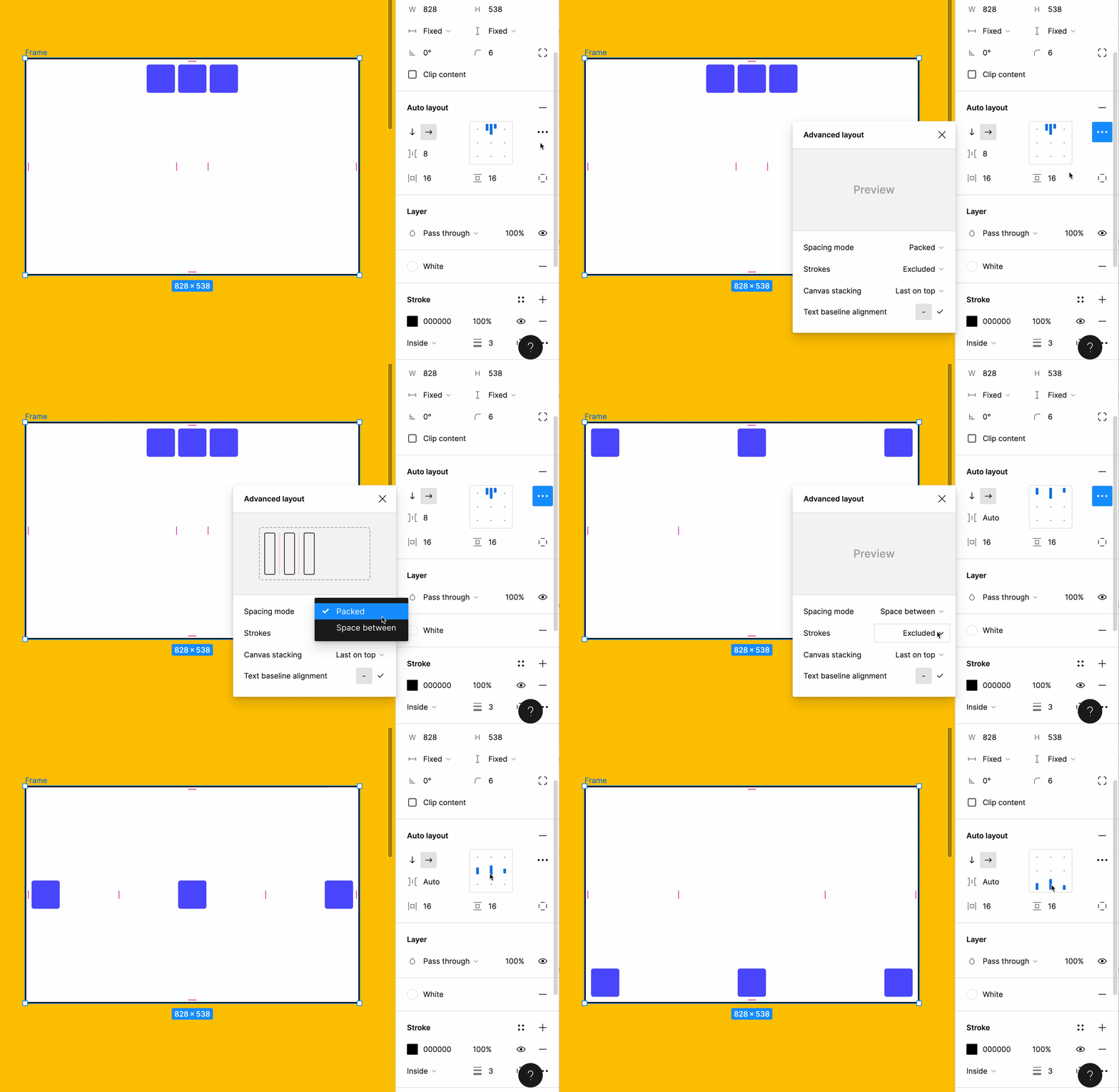
Space between
Constraints and Resizing
Okay, you have successfully added an auto layout, created your padding and all the other stuff, let’s determine how the children and parent behave when changes are made to one or the other.
Constraints are simply the limits we set to determine the position of elements in a frame while resizing is how the child reacts to a change in the size of the parent and vice versa.
Constraints in Figma are divided into two categories; vertical and horizontal. The vertical constraints are top, bottom, top and bottom, centre and scale, while the horizontal constraints are left, right, left and right, centre and scale. Combinations of vertical and horizontal constraints are only limited by your creativity.
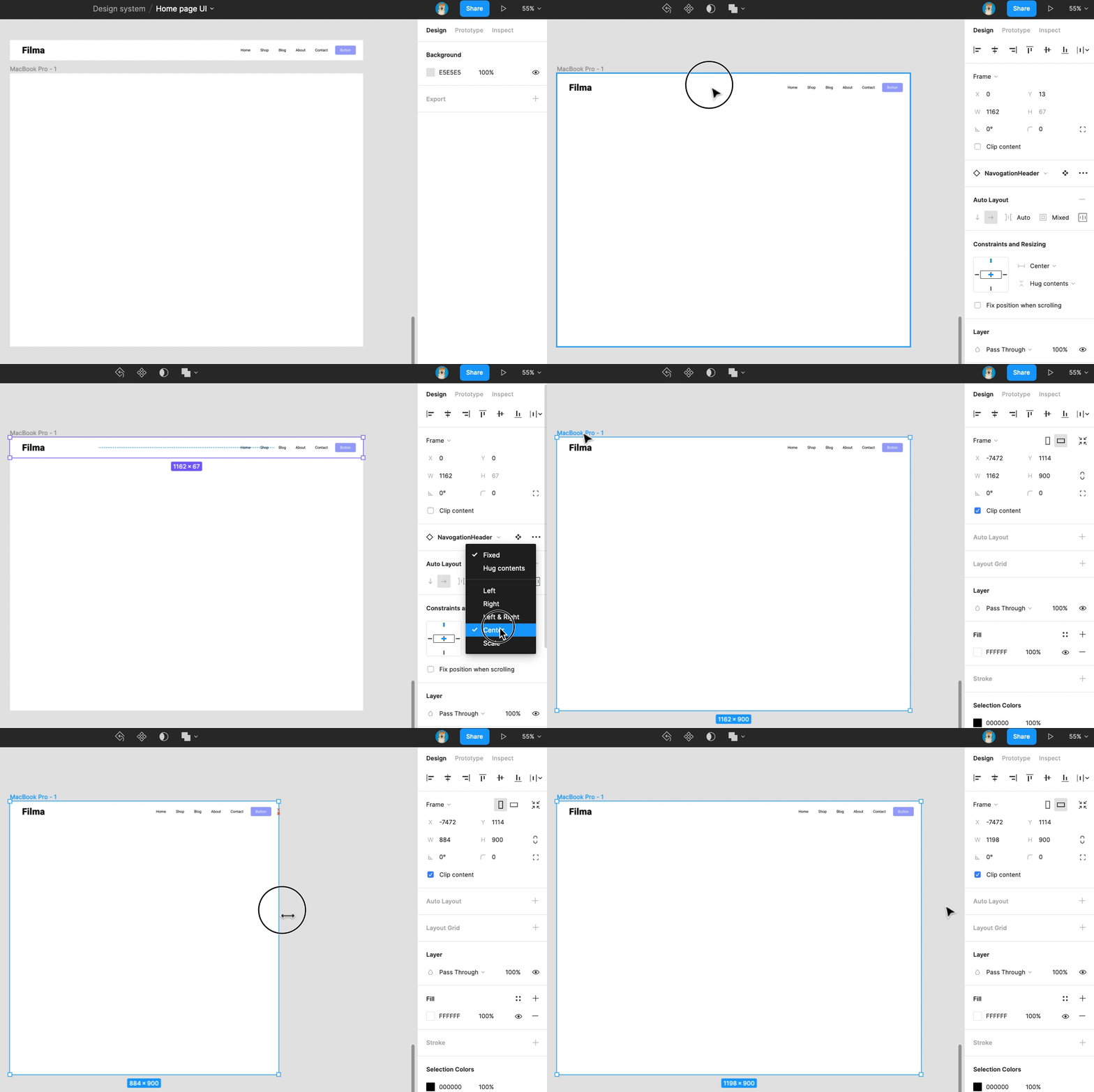
How constraints work in Figma
To learn more about constraints, click here.
Now, let’s do some resizing. There are three (3) resizing properties, and they are fixed width/height, hug contents and fill container. Children can have all three, but parents only have fixed width/height and hug contents.
If fixed width/height is applied to the parent, the size of the parent does not change even if the size of the child changes. If the size of the child gets bigger than that of the parent, the remaining parts are hidden behind the parent. Fixed width/height can also be applied to children, and that limits the parts of the visible element.
Hug content, on the other hand, allows the parent to change its size with the size of the child, that is, if a child grows, the parent grows, and vice versa. Think of it as moving into a new apartment when the family grows bigger and moving to a smaller one when the kids move out.
Fill container is pretty different. In this case, the child has to meet up with the standard set by the parent. The size of the parent is fixed and the child grows to fill it up.
Cool new features
Now that you’re a senior in Auto Layout, it’s time for some boss skills.
First on the list is absolute position. Absolute position allows you to place an element anywhere within the Auto Layout frame. Here’s how to enable absolute position.
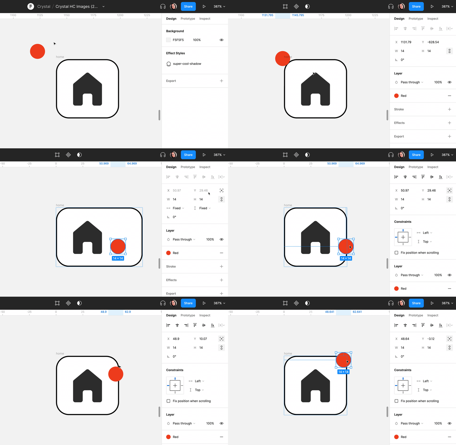
How to apply absolute position
Next up is canvas stacking where you allow things to overlap one another. With canvas stacking, you can add negative spaces between elements stacking them one on top of the other. To do this, select the elements and add auto layout, then make the spacing between elements negative to whatever degree. After stacking, you can choose to change the order, simply select the frame, click the meatball menu on the right sidebar, go to canvas stacking and choose your preferred order (first on top or last on top). Here’s what canvas stacking looks like.
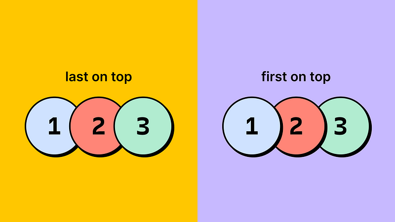
Canvas stacking
An important note from Figma, when the stacking order changes, the order of layers in the layers panel stays the same. Canvas stacking is solely a visual change that happens on the canvas.
Next to enter the fray is text baseline alignment. With text baseline alignment, you can align icons with the baseline of texts or just texts with texts, making your designs neater. To see the magic, simply select the parent Auto Layout frame, click the meatball menu on the right sidebar and check the text baseline alignment box. Voila, your buttons now look superb, don’t they?
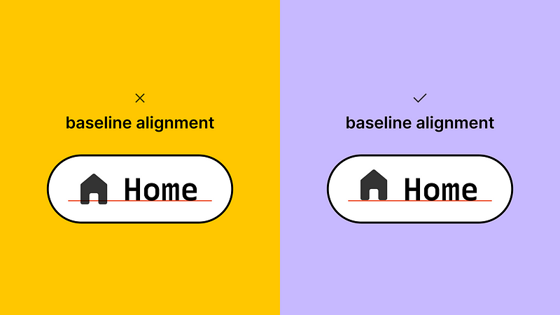
Text-baseline alignment
The last on the list as we expect more features from Figma is strokes in layout. Normally, when calculating object sizes, strokes are not considered, but this has always caused rancour between designers and devs when the projects are coded, now say bye-bye to those design vs dev wars. With Strokes in layout, you can allow strokes to take up space in an Auto Layout or not. To enable/disable this, simply click the meatball menu on the right sidebar, then in the drop-down next to stroke choose “included in layout” or “excluded in layout”, and congratulations you’ve avoided the “tweef” between designers and devs.
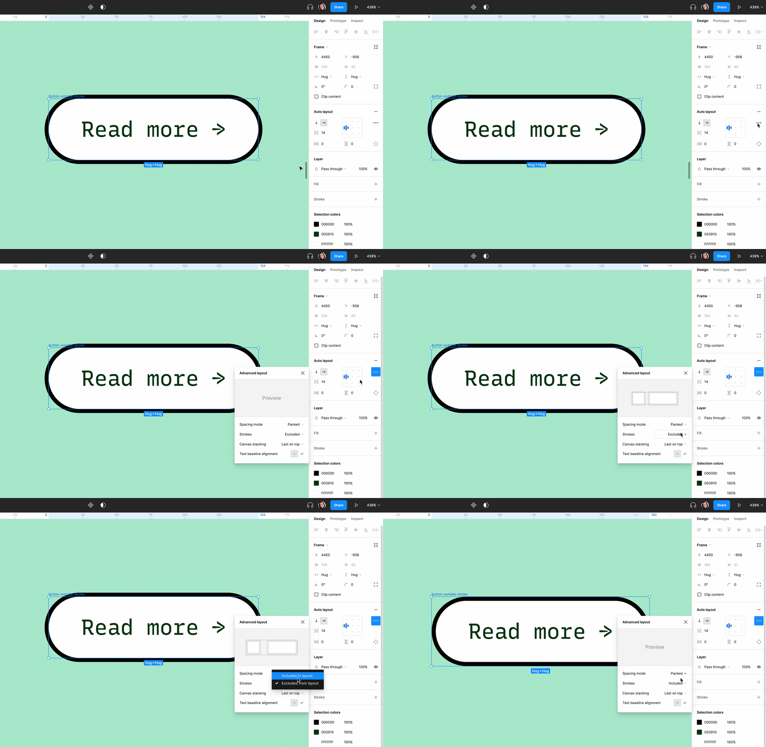
Strokes in layout
Alright, so far, we have covered how to apply Auto Layout, padding, cool new features and much more. I’d like you to apply these to your designs and show them to the world. You can always tag me on Twitter @tife_olasupo and Instagram, @tifeolasupo, on any of your works.
Also, feel free to follow the design community on Twitter, you’ll get loads of free stuff there. Till we see in the next article, keep a weather eye on the horizon.
Subscribe to my newsletter
Read articles from Boluwatife Olasupo directly inside your inbox. Subscribe to the newsletter, and don't miss out.
Written by

Boluwatife Olasupo
Boluwatife Olasupo
I am a UX Designer and Content Creator with an eye for details and flair for immersive and converting content.