Building Your Website with Webflow: A Step-by-Step Guide
 Mansi
MansiTable of contents
Introduction:
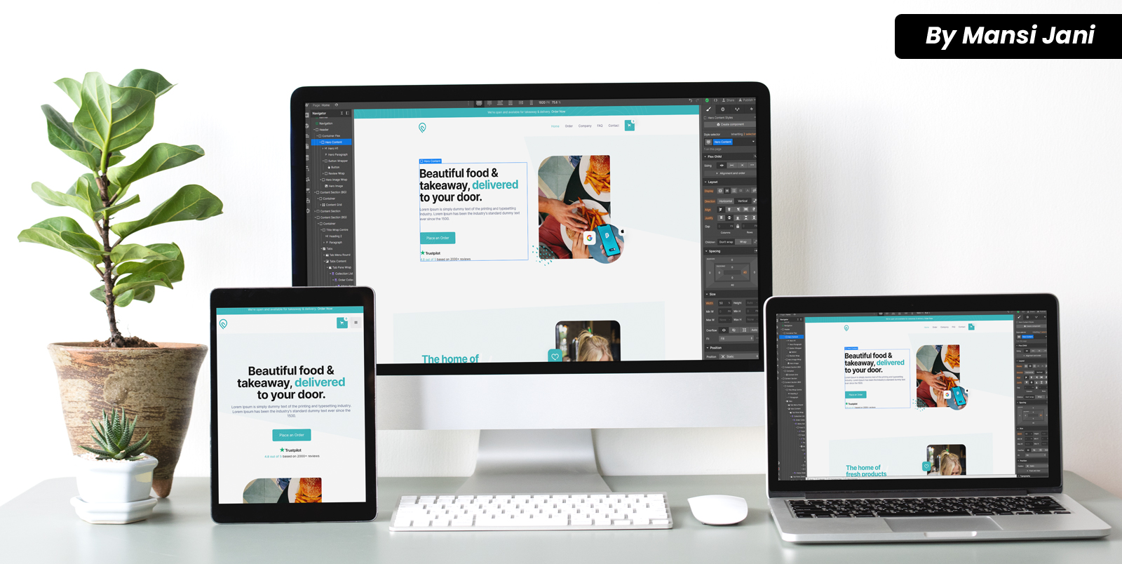
In today's digital age, having a professional and visually appealing website is essential for individuals and businesses alike. With the rise of user-friendly website builders, you no longer need to be a coding expert to create a beautiful site. Webflow is one such platform that empowers users to design and build stunning websites without writing a single line of code. In this step-by-step guide, we will walk you through the process of creating your website using Webflow.
Step 1: Sign up for a Webflow Account
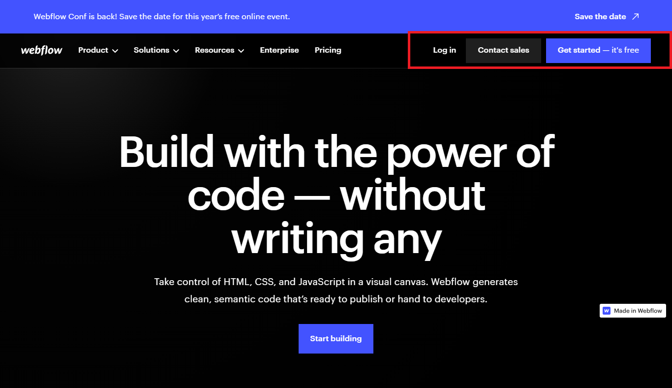
To get started, visit the Webflow website and sign up for an account. You can choose from different pricing plans based on your needs, including a free plan that allows you to explore the platform and build a basic website.
Step 2: Define Your Website's Purpose and Structure
Before diving into the design process, it's important to have a clear understanding of your website's purpose and target audience. Identify the key pages and features your site will include, such as a homepage, about page, services, portfolio, blog, and contact page. Plan out the structure and navigation of your website to ensure a logical flow for your visitors.
Step 3: Choose a Template or Start from Scratch
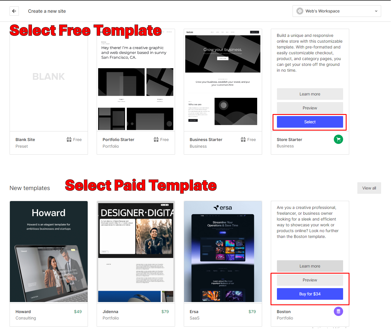
Webflow offers a wide range of professionally designed templates that you can customize to fit your brand and requirements. Browse through the template gallery and select one that aligns with your vision. Alternatively, you can choose to start from a blank canvas and build your site from scratch.
Step 4: Customize the Design
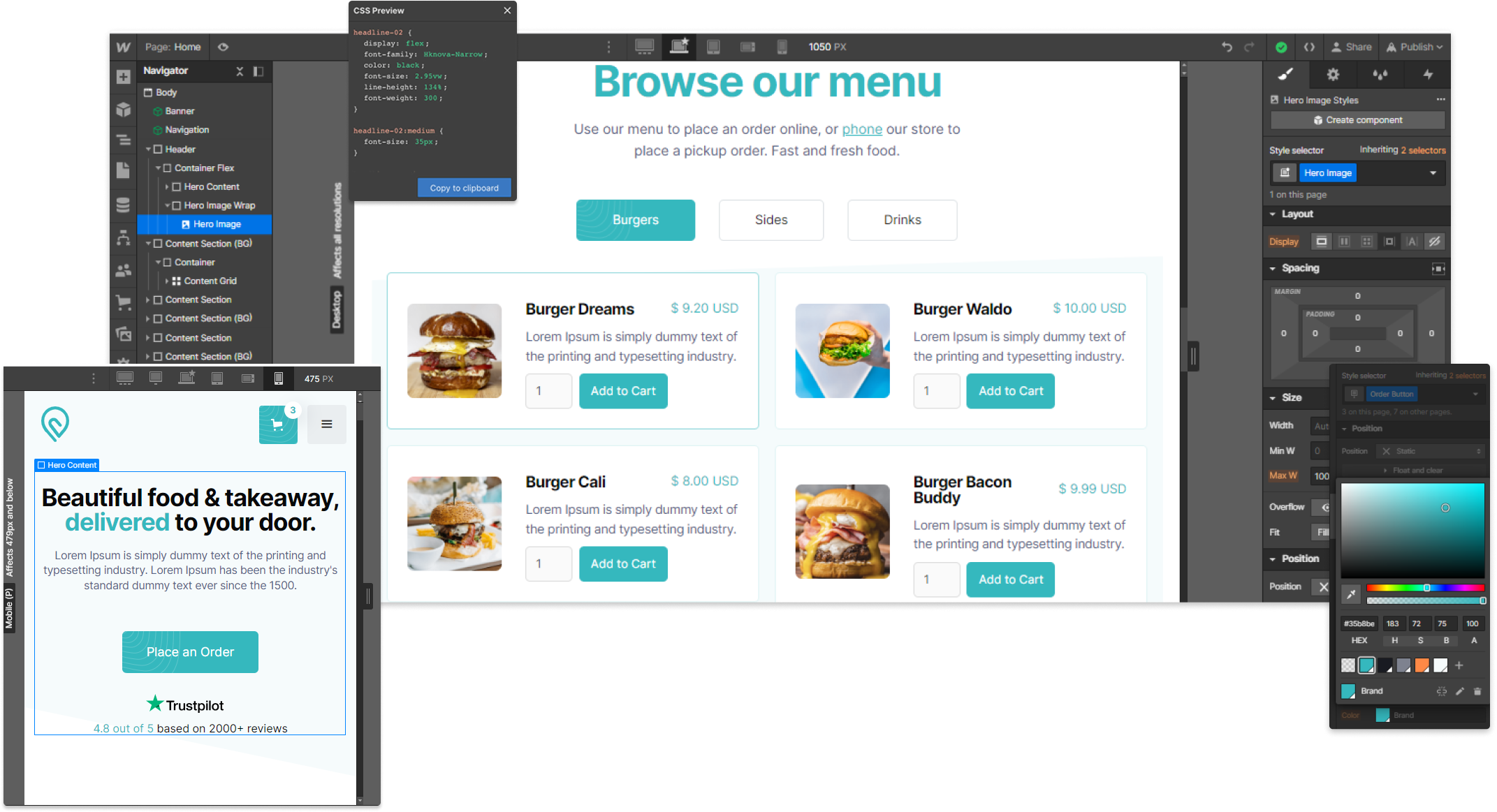
Once you have chosen a template or started with a blank canvas, it's time to unleash your creativity and customize the design of your website. Webflow's visual editor allows you to modify every aspect of your site, from fonts, colors, and layouts to animations and interactions. Use the style panel to make adjustments and experiment with different design elements until you achieve the desired look and feel.
Step 5: Add Content and Images
Now that your design is taking shape, it's time to populate your website with compelling content. Start by creating and adding relevant pages to your site. Use Webflow's intuitive editor to enter text, insert images, and embed media. Ensure your content is engaging, concise, and tailored to your target audience.
Text Content:
Open your Webflow project in the Designer.
Navigate to the desired page where you want to add text content.
Drag and drop a text element from the toolbar onto the canvas or select an existing text element to edit.
Double-click the text element to start editing the content.
Use the text editor toolbar to format the text, apply styles, add links, or create lists.
Customize the typography, font styles, colors, and sizes using the style panel on the right.
Repeat the process for other text elements or pages as needed.
Images:
To add an image, drag and drop an image element from the toolbar onto the canvas or select an existing image element to modify.
Click the image element to open the asset manager.
In the asset manager, you can choose to upload an image from your computer or select one from your existing assets.
Once the image is uploaded or selected, adjust its position, size, and alignment within the image element.
Use the style panel to customize additional image settings such as borders, filters, or animations.
You can also add alt text to the image for better accessibility and SEO optimization.
Rich Media:
Webflow allows you to embed rich media content such as videos, audio players, maps, or social media feeds.
Drag and drop the appropriate element onto the canvas and follow the specific instructions for embedding or linking the media content.
Customize the element's appearance and settings using the style panel.
Dynamic Content:
Webflow provides a powerful CMS (Content Management System) feature that allows you to create dynamic content sections like blog posts or product listings.
Set up your CMS collections, fields, and templates following Webflow's documentation.
Create dynamic lists or grids to display the content from your CMS collections.
Use the CMS editor to add and manage the dynamic content.
Styling and Formatting:
Customize the appearance and styling of your content using the style panel.
Experiment with different typography, colors, spacing, and alignments to achieve your desired design.
Apply class styles to specific content elements for consistent styling across your website.
Remember to save your changes regularly and preview your website to ensure the content and images are displayed correctly. Webflow provides a user-friendly interface that allows you to have full control over your website's content, making it easy to create engaging and visually appealing web pages.
Step 6: Fine-tune Responsiveness
Webflow automatically generates responsive websites that adapt to different screen sizes, ensuring a seamless user experience on desktops, tablets, and mobile devices. However, it's essential to review and fine-tune the responsiveness of your site. Use the responsive breakpoints feature in Webflow to adjust the layout, font sizes, and other elements to ensure optimal display across various devices.
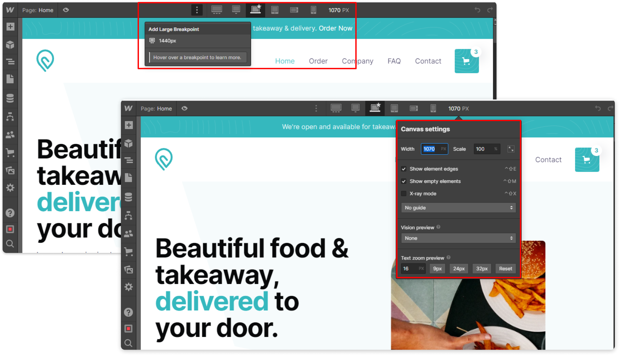
Here's how you can fine-tune responsiveness in Webflow:
Enable Responsive Preview:
Open your Webflow project in the Designer.
Click the device icon at the top of the Designer panel to access the responsive preview mode.
This allows you to view and edit your website's design for various device sizes, such as desktop, tablet, and mobile.
Adjust Layout and Elements:
While in responsive preview mode, select a specific device size from the top navigation.
Review the layout and check if any elements need adjustment to fit properly within the available space.
Use the grab handles on the sides of elements to resize or reposition them as needed.
Experiment with rearranging elements or hiding/showing certain elements for specific device sizes.
You can also adjust margins, padding, and alignment to fine-tune the appearance of elements.
Set Responsive Breakpoints:
Webflow allows you to define custom responsive breakpoints where your design adapts to different screen sizes.
In the Designer panel, click the breakpoint icon (horizontal lines) at the top.
Add, remove, or adjust breakpoints based on your desired design and the devices you want to optimize for.
Select a specific breakpoint and make modifications to your layout and elements for that particular size.
Modify Typography and Spacing:
To ensure legibility and visual consistency, you may need to adjust typography settings for different device sizes.
Select the text element and navigate to the typography settings in the style panel.
Modify font sizes, line heights, and letter spacing to optimize readability on smaller screens.
Adjust margins and padding around elements to create appropriate spacing for each device size.
Review and Test Interactions:
If your website includes interactive elements or animations, review their behavior in responsive preview mode.
Ensure that interactions and animations work smoothly across different device sizes.
Make adjustments to timing, positioning, or effects to ensure a seamless user experience on all devices.
Test on Real Devices:
While the responsive preview mode in Webflow provides a good indication of how your website will appear on different devices, it's essential to test on real devices.
Preview your site on actual smartphones, tablets, and desktop screens to ensure everything displays as intended.
Use Webflow's publish functionality to make your site live temporarily or share a staging link with others for feedback.
By following these steps, you can fine-tune the responsiveness of your website in Webflow, creating an optimal user experience across various devices. Regularly review and adjust your design as needed to ensure your site looks and functions flawlessly for your visitors, regardless of the device they're using.
Step 7: Set Up Hosting and Publish Your Website
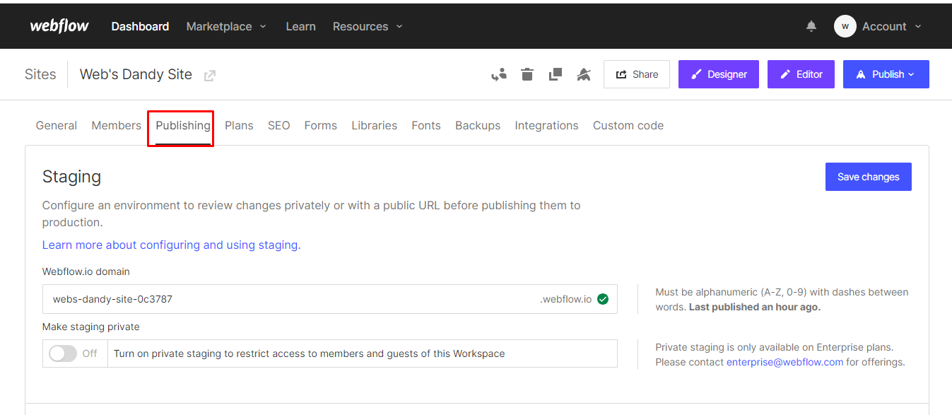
Webflow provides hosting services, so you can easily publish your website with just a few clicks. Connect your domain or use a Webflow subdomain to make your site live on the web. Take advantage of Webflow's built-in SEO settings to optimize your website for search engines and increase its visibility online.
Set Up Hosting:
Open your Webflow project in the Designer.
In the top right corner, click on the "Project Settings" gear icon.
In the project settings panel, select the "Hosting" tab.
Click on the "Upgrade to Paid Hosting" button if you haven't already subscribed to a paid plan. Reference: https://university.webflow.com/lesson/connect-a-custom-domain
Follow the prompts to set up hosting by selecting your desired plan, entering payment information, and completing the process.
Connect a Custom Domain:
If you have a custom domain, you can connect it to your Webflow site.
In the project settings panel under the "Hosting" tab, click on the "Add Custom Domain" button.
Follow the instructions to connect your domain by updating your DNS settings.
Webflow provides detailed documentation and step-by-step instructions for popular domain registrars.
Publish Your Website:
After setting up hosting and connecting your domain, you are ready to publish your website.
In the Designer, click on the "Publish" button in the top right corner.
Webflow will start the publishing process, which may take a few moments depending on the complexity of your site.
Once the publishing is complete, you will receive a confirmation message.
Test Your Published Website:
Visit your website using the custom domain or the Webflow subdomain assigned to your site.
Go through your website again to ensure that everything looks and functions as expected.
Test on different devices and browsers to ensure a consistent experience.
Conclusion:
You have successfully built your website using Webflow, a powerful and user-friendly website builder. With its intuitive interface and extensive customization options, Webflow empowers individuals and businesses to create visually stunning and professional websites without the need for coding skills. By following this step-by-step guide, you have taken a significant step toward establishing a strong online presence. Now it's time to promote your website and enjoy the benefits of your hard work.
Subscribe to my newsletter
Read articles from Mansi directly inside your inbox. Subscribe to the newsletter, and don't miss out.
Written by