Superstore Sales Visualization Using Power BI
 Immaculata Lughas
It's quite a good practice to keep a record of the various activities in our place of business and organization. The recorded data is gathered for further analysis and proper visualization to keep track of the growth of the business and identify more business opportunities.
This project explores and analyzes the data collected over four years of a Superstore operation. The data are being analyzed to avoid an ecological debt. In a brighter view, "Ecological debt" is the accumulation of the overexploitation of resources at the moment that would require urgent attention later in the future.
The analysis was performed to note the effectiveness of the strategies being used, to know the areas of difficulty and points of strength, and to identify several trends and patterns to enhance productive decision-making. The project aims at noting if the Superstore is meeting demands, thereby making profits after several expenses relating to their cost of production and management.
About the Dataset
This is a dataset about a Superstore's sales, showing the day-to-day activities of the business. After downloading it, it was imported into the PowerBI application. The dataset comprises five different tables, which are the Products, Location, Customer, and Sales Rep tables, which are connected to the Sales table.
The Customers table consists of 3 columns; it shows the customer's name, assigned ID, and segments.
The Location table describes the locality where the orders are being delivered, and the table consists of five different columns.
The Products table consists of 4 columns, showing the names of the products, their IDs, and what type (category) of products they are.
The Sales table displays the order date, the day and mode through which it was delivered, the location where it was delivered, the customer and product ID, the number of products sold, and the discount given. It comprises 13 columns in total.
The Sales Rep table consists of 4 columns that show the names of the various sales teams, the names and IDs of their members, and the names of the managers.
Data Cleaning
The data were thoroughly cleaned, and the empty rows and columns were removed to avoid empty values and to also narrow concentration and ease focus. There was also the removal of errors.
All tables went through data formatting and proper profiling. During the formatting process, the data type of several columns was changed, like "ship date" and "order date" in the "Sales" table. There was the creation of a new table (Calendar), which was done to hold all the date values in the various tables. There are also additions to new columns.
Analysis and Visualization of Data
The dataset was visualized using PowerBI to help ease comprehension and get a visual insight into the supermarket's sales activity.
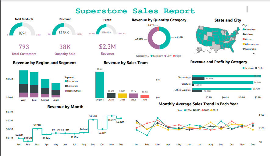
According to the report; several pieces of information are represented using a variety of different charts or plots. The formula used for collecting all date values into the "Date" column in the Calendar table is "Calendar = CALENDARAUTO()".
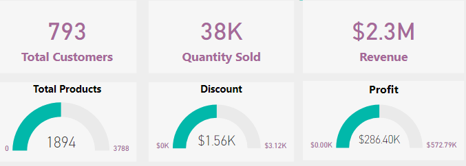
The Cards and Guage display a single distribution representing the number of customers, total number of products in the store, total profit made, total revenue accumulated, and quantity sold.
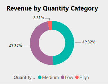
The Doughnut chart presents the quota contributed to the generation of revenue relating to the quantity category.
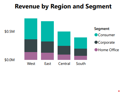
The Stacked Column chart depicts the relationship between the revenue generated by each segment in the various regions. The graph was used since there is a common metric value that is relative to zero.
The Shape Map chart indicates the states and cities where the stores' products were ordered. This is to note the areas where the store's products are mostly purchased.
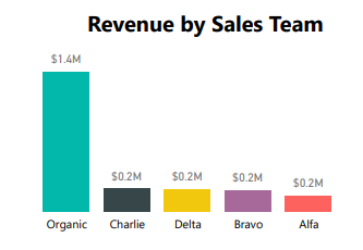
The Column chart displays the sales made by several sales teams; this is to know which team is making the most sales, thereby largely contributing to the generation of revenue. It is important to note this and reward and encourage every team member to increase their performance and effectiveness.
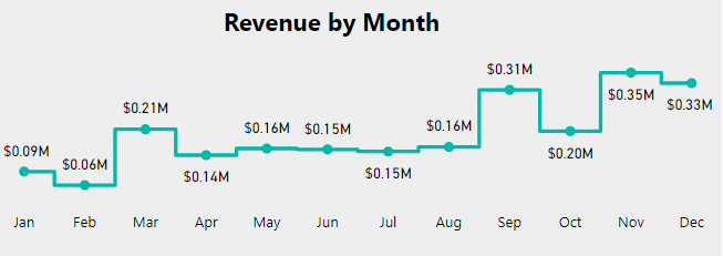
The Stepped Line plot reflects the sum of revenue generated monthly. This is to compare a continuous variable within a particular period.
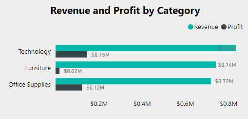
The Clustered Bar chart compares the total revenue and profit generated by each segment.
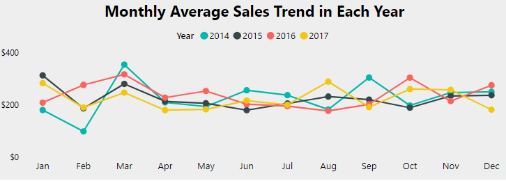
The Line plot displays a graphical representation of the average sales made monthly throughout the four years of business operation. This is to trace the supermarkets' sales activity within the period of operation.
Conclusion
Based on the evaluation report, about 49% of the orders made were at a moderate level (medium), 47% were at a low quantity, and 3% involved large quantities.
The highest average sales made by the Superstore were in 2014, around March, after having their lowest fall in February. In 2017, business sales were in a range from April to July and created a new high in August, though not higher than the ones created in March and September 2014.
The total revenue generated was mostly in November, with a low in February. The Organic team made up most of the sales, with about 60% of the revenue generated ($2.3 million), and the remaining 40% was contributed by the other 4 teams.
And a total of $1056 was given out as a discount during the sales and business activities.
Subscribe to my newsletter
Read articles from Immaculata Lughas directly inside your inbox. Subscribe to the newsletter, and don't miss out.
Written by

Immaculata Lughas
Immaculata Lughas
I am a Data Analyst, GIS Analyst and also Content Writer.