Swiggy's new WhatToEat feature: A closer look
 Utkarsh Bindal
What is Swiggy's WhatToEat feature?
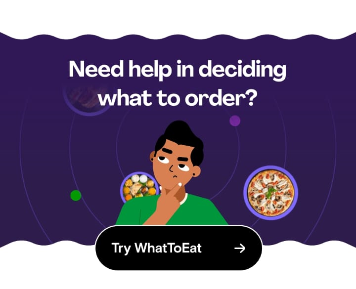
Swiggy recently launched a new feature to help its users decide what to eat. The feature is aimed at reducing the time its users spend deciding what to order.
What user problem is it solving?
I face this problem at least a couple of times a week and end up wasting about 30 mins to an hour on a single session at times while placing my order.
Moreover, the exhausting task of scrolling through 10-30 restaurant pages mentally fatigues me.
It's similar in some manner to the problem I face while trying to decide what to watch on platforms like Netflix and Hotstar.
Who is this feature for?
I would segment the people ordering from Swiggy into the following categories based on the frequency of ordering.
High frequency or power users: Users ordering from Swiggy 5-15 times a week. They rely on Swiggy for their daily intake of food a lot of times.
Medium frequency: Users ordering from Swiggy 1-4 times a week. They don't rely on Swiggy for their daily intake of food but occasionally use it for a variety or to try new restaurants, etc.
Low frequency: Users order around once a month or 2. They only order when there is a situation where it's not convenient to make food at home or there is some occasion or gathering at home.
I chose the frequency of order as a factor instead of something like age because I feel the behavior of the users is very different based on this factor.
Since the intensity of the pain point being addressed is a lot more for the power users compared to the other two categories I think it'll be most helpful to them. For others, it can be seen as more of a delightful feature.
What does Swiggy gain from this?
The user problem Swiggy is solving for its users is to provide a convenient way to order food at home. To make this more effective, it makes sense for them to try to minimize the time it's taking for their users to place their orders.
Although I don't have access to the data, my hunch is that the dropoff rate at this stage in the user journey is probably high and this feature could be an attempt to reduce this.
My observations while using this feature
I think the user experience of using the feature is just okay.
The feature presents itself while scrolling vertically and is placed very similarly to how an ad on Instagram would be placed. Since it uses a similar placement, I don't feel a lot of friction as a user in the scenario when I'm not interested in using the feature.
But I would have preferred to see this feature only when I'm taking too long to order. Swiggy could easily track how much time I'm spending on the application just browsing and bring this up when that time exceeds 10 mins instead of showing it to me the second I open the app. It doesn't make sense to show this to someone who knows what they want to order.
Upon clicking on the feature, it completely changes the UI and presents food categories in the form of circles (similar to how stories are portrayed on WhatsApp and Instagram). This is a very different experience from the rest of the application and I'm personally neutral towards it.
But I don't think it helped me at all while choosing what to order. The categories/options which were given to me were something I hadn't thought of in my head before and I didn't see any noticeable change in the time it took me to place an order.
Moreover, after exploring the feature I ended up going back to the home screen and randomly scrolling through the list of restaurants.
Final thoughts
I think the user problem Swiggy has identified is a real one and something which is an intense pain point for some of its users.
But for me at least, I don't think this solution solves it at all. The feature helps me structure my thoughts better but that doesn't help me with my problem.
And thus, I don't plan to use this feature again in the future in its current form.
Subscribe to my newsletter
Read articles from Utkarsh Bindal directly inside your inbox. Subscribe to the newsletter, and don't miss out.
Written by
