The Inclusive Web: Where Everyone Clicks
 KikiDotPy
How I got passionate about accessibility
Inclusion has always been a crucial issue for me. However, it wasn't until this past December that my enthusiasm for web accessibility skyrocketed. In our team at Thoughtworks's client, we embarked on a thorough accessibility assessment and discovered that the services we were maintaining and building were barely accessible, meaning that not all users could complete the user journeys. The thought that because of our oversimplification and oversight during development has led to a limitation of the usage of internet resources, which nowadays should and must be available to everyone, made me face my privilege.
Since that moment, I've decided to take action by having as a personal mission to make the web a little more inclusive and accessible, bit by bit. So I got heavily involved in web accessibility by actively participating in the accessibility community in the workplace and pushing accessibility in the Definition Of Done for our team stories. I've also tried to have a little impact outside my project by participating in a challenge called "A11y Friday," where you commit to deploying an accessibility fix every Friday (whether it's in your work, on personal projects, or open-source projects).
During the past 5 wild months, I've gained some knowledge and insights. This is not only in terms of specific development concepts and tricks but also in terms of fundamental principles that have become an integral part of my thinking.
Let's start with some basics.
What does web accessibility mean?
Web accessibility means enabling all people to use and understand the web. The goal of web accessibility is that all people can perceive, understand, navigate, interact with, and contribute to the Web.
What about the strange A-ELEVEN-Y term we often see around, what does it mean?
"A11y" is a numeronym derived from the word "accessibility." Numeronyms are abbreviations that use numbers to shorten or abbreviate words. In the case of "accessibility," it becomes "a11y" by taking the first and last letters ("a" and "y") and counting the letters in between. Since there are 11 letters between "a" and "y," it becomes "a11y." A fun fact is that it's often joked that the "a11y" numeronym itself is not immediately accessible without explanation, but it serves a purpose. It's shorter and fits within the character limits on platforms like Twitter. Moreover, using "a11y" in searches yields more relevant results for web accessibility, as it is primarily used in that specific context.
Now, get ready for some acronyms!
As most of you probably already know, the World Wide Web Consortium (W3C) develops web standards for HTML, CSS, etc., and the Web Accessibility Initiative (WAI) is part of the W3C and they are the ones developing the standards for accessibility, some of the standards published by WAI are the WCAG (Web Content Accessibility Guidelines) organized under four principles known as POUR:
P stands for Perceivable: meaning that information and user interface components must be presentable to users in ways they can perceive.
O stands for Operable: meaning that user interface components and navigation must be usable by users.
U stands for Understandable: meaning that information and how to use the interfaces must be clear to users.
R stands for Robust: and it's about content, meaning it must be robust enough to be interpreted by a wide range of user agents, including assistive technologies.
What are the most common accessibility mistakes to avoid?
While implementing and deep diving into web accessibility, I've encountered common errors that hinder inclusivity. Let's address some of them for quick wins on web accessibility!
Low contrast
As we previously mentioned when speaking about POUR principles, users must be able to perceive the content on the page. A sufficient contrast ratio supports that perception. In WCAG, contrast is measured using "relative luminance," which is the brightness between two colours. Relative luminance is expressed as a ratio ranging from 1:1 (white text on a white background) to 21:1 (black text on a white background). According to the W3C, the contrast ratio between text and its background should be at least 4.5 to 1.
Tools like the WebAIM colour contrast checker can help evaluate and ensure proper contrast ratios.
Missing alt text
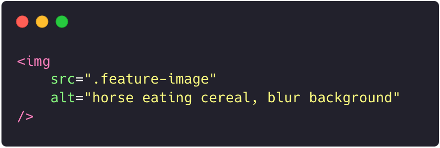
People with low vision rely on screen readers to "hear" the web. Providing alternative text for images is crucial to give meaning to all users. There are two ways to present alternative text:
using the
<alt>attribute of the image elementmaking use of the context or surroundings of the image.
Try to describe what’s happening in the image and how it matters to the story, rather than just saying something like "picture." Context is everything.
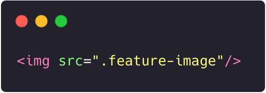
Bad Code example of image element without alt attribute
Good Code example of image element with alt attribute
Empty links
If a link contains no text, the function or purpose will be imperceptible to some users. This happens when an anchor element has an href attribute but contains no text; this is a common error found especially when it comes to SVG used for social media links.
Bad Code example of anchor element without text
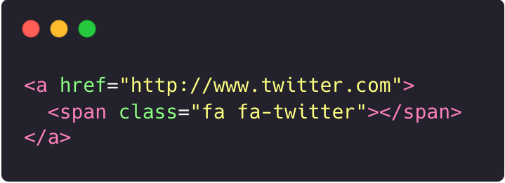
Good Code example of anchor element with text
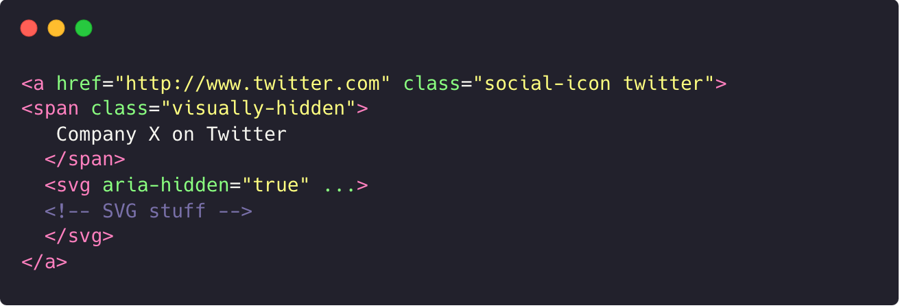
In the above example, the link contains a visually-hidden span of text that provides the name of the link but doesn't show the text by default. The SVG also has aria-hidden="true" because the icon is more redundant to the link text. As good practice in these specific cases, when there is an icon font or SVG within a link or button, the button/link markup should do one of the following:
Provide both the icon and text together, with the icon being decorative by setting
aria-hidden="true"on it.Visually hide the meaningful text, but also set the graphic to
aria-hidden="true".Give the icon an
aria-labelto provide a meaningful name if real text can't be included in the link or button
If the link or button is an SVG, then the SVG's role attribute should be set to the proper element and given a name through aria-labelledby.
If the SVG is intended to be a button or link, a user should be able to use the Enter and/or Space bar as necessary to activate the SVG just like a mouse could.
Also, tools that can help you easily find empty links are accessibility evaluation tools like WAVE.
Missing input labels
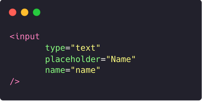
Using placeholder text as labels is one of the biggest mistakes on a form. Placeholder text is usually grey and has low contrast, so it’s hard to read. If you are like me, you usually forget what you’re even writing, so it’s challenging to know what the fields are about once the placeholder is removed. Also, screen reader users navigate forms using the Tab key and rely on <label> elements for context. Non-label text, such as placeholder text, is typically skipped over. So always help people understand what they should do and write in a form by explicitly associating labels with form fields using the HTML <label> element. In addition, use the for attribute to match the id attribute of the associated input element.
Bad Code example of input element without label
Good Code example of an input element with a label
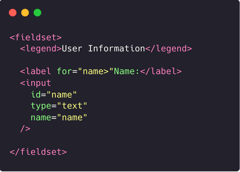
In the above example, we use have a full and proper implementation using <fieldset>, <legend>, <label>, and <input> elements in HTML forms to make them easier to use and understand. These elements help organize and label form elements, making the forms more user-friendly for everyone, including people with disabilities.
<fieldset>groups similar form elements together.<legend>adds a title to the group.<label>describes each form element.<input>represents different types of form elements like text boxes or checkboxes.
Missing semantic markup
One of the most common and undervalued errors is missing semantic markup. Proper use of structural elements in HTML is crucial for web accessibility. But it also brings other benefits like having cleaner code that is easy to read and better search engine ranking.
HTML elements communicate to the browser what kind of content they contain and how the browser should render or treat that content. The components and structure of a page are what arrange an accessibility tree, and this tree powers the screen reader to "listen" to a page. That’s why incorrect markup can affect accessibility. So avoid applying HTML tags solely for styling purposes and explore the HTML5 new semantic elements for specific purposes.
The semantic elements are divided into two categories based on their usage: HTML semantic tags for structure and HTML semantic tags for text. Let's review some of them together.
HTML SEMANTIC TAGS FOR STRUCTURE
<header>element is crucial for defining the introductory information of a page or section. It typically includes elements such as a logo, the site title, and perhaps a tagline.<nav>element is specifically designed for navigation links. Whether it's a horizontal menu bar or a vertical sidebar, using the<nav>element helps us create a clear and accessible navigation structure.<article>and<section>.The<article>element is used to define independent content, such as a blog post or a news article. On the other hand, the<section>element groups nearby content with a similar theme.<aside>element defines less relevant content, often found in sidebars or additional information sections. It's essential to ensure that the content within the<aside>element doesn't distract from the main content but provides complementary information or related links.
Regarding text semantic elements, the most important and undervalued ones are the H tags. These tags mark where the content starts and establish the hierarchy of the page content. <h1> is used to represent the heading at the highest level, while <h6> is used to represent the heading at the lowest level. Titles with big font sizes help readers understand the order of the content better. Likewise, screen readers also use heading tags to read the content. This way, people with low vision get an overview of the page, exactly like everyone else, thanks to the hierarchy of the headings.
Note: There are more semantic HTML tags available beyond this, remember to always check documentation!
Final Notes
Aside from the practical concepts that have certainly helped me throughout the journey, my greatest discovery has been what questions to ask myself to make inclusiveness and accessibility a reality for everyone.
One of the most impactful questions has been "What kind of future am I aiming for?"
That made me realize that as people working in technology, we have the power to shape the future through the products we build or help build. Personally, I aim for a future in which every single person matters. If you share this vision, I invite you to join me in creating that future. Bring your individuality, knowledge, and experience, and let's design, develop, and test with everyone in mind. Together, we can build a future that embraces everyone, regardless of who they are.
Want to know more?
For anyone who wants to know more or explore some interesting references, I’ll leave here some interesting links that are helping me in my web accessibility journey:
W3C recommendations and examples to build accessible component
Interesting blog on a11y component
Workshop on a11y about testing
A11y Coffee serving size web accessibility information (a11y Friday initiative)
Alt Text as Poetry Workbook by Shannon Finnegan and Bojana Coklyat
⚠️ Copyright warning: All the awesome GIFs belong to Pablo Stanley, check their interesting post on how to design for accessibility!
Subscribe to my newsletter
Read articles from KikiDotPy directly inside your inbox. Subscribe to the newsletter, and don't miss out.
Written by

KikiDotPy
KikiDotPy
I'm a Software Developer with a past as an Italian chef, aiming for a future in which every single person matters. I share my notes, thoughts, knowledge, and experience on tech through this journey!