Ep. 9: Typography
 Oluwasegun Idowu
Udemy Figma Course: Complete Web & Mobile Designer in 2023: UI/UX, Figma, +more by Andrei Neagoie & Daniel Schifano.
Episode 9: Typography
Typography is the art of arranging letters and text in a way that makes the copy legible, clear, and visually appealing to the reader. There are four categories of typography.
Categories of Typography.
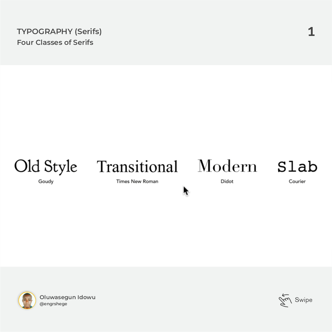
Serif: The little curls at the end of the letter forms are called serifs.
Serifs are classified into four(4):
a. Old Style (e.g. Goudy)
b. Transitional (e.g. Times New Roman)
c. Modern (e.g. Didot)
d. Slab (e.g. Courier)
Sans Serif: Sans means "Without" in French. This means that Sans Serifs are typographies without serifs (curls at the end of the letter forms) and they are much more modern in appearance. Sans Serifs are made up of a lot of different fonts and typefaces that we use today.
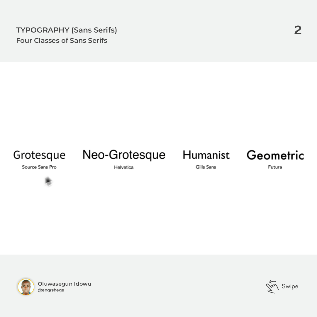
Sans Serifs are also classified into four(4):
a. Grotesque (e.g. Source Sans Pro)
b. Neo-Grotesque (e.g. Helvetica)
c. Humanist (e.g. Gills Sans)
d. Geometric (e.g. Futura)
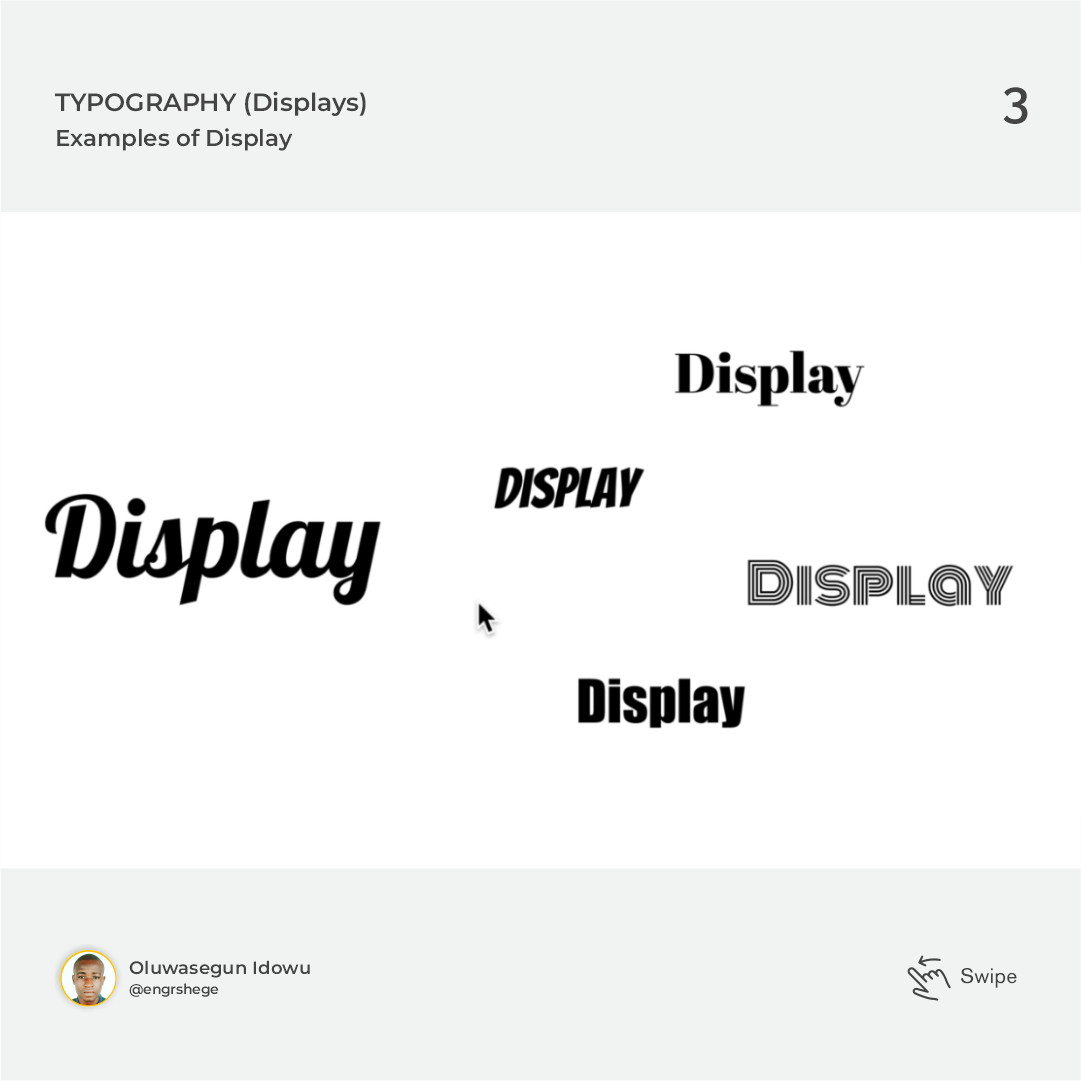
Display: This includes typefaces like Lobster or Abril. They are generally unsuitable for body copy and it is best used for things like Headlines, Larger Text or maybe even Shorter Copy. Mostly used to draw attention to something.
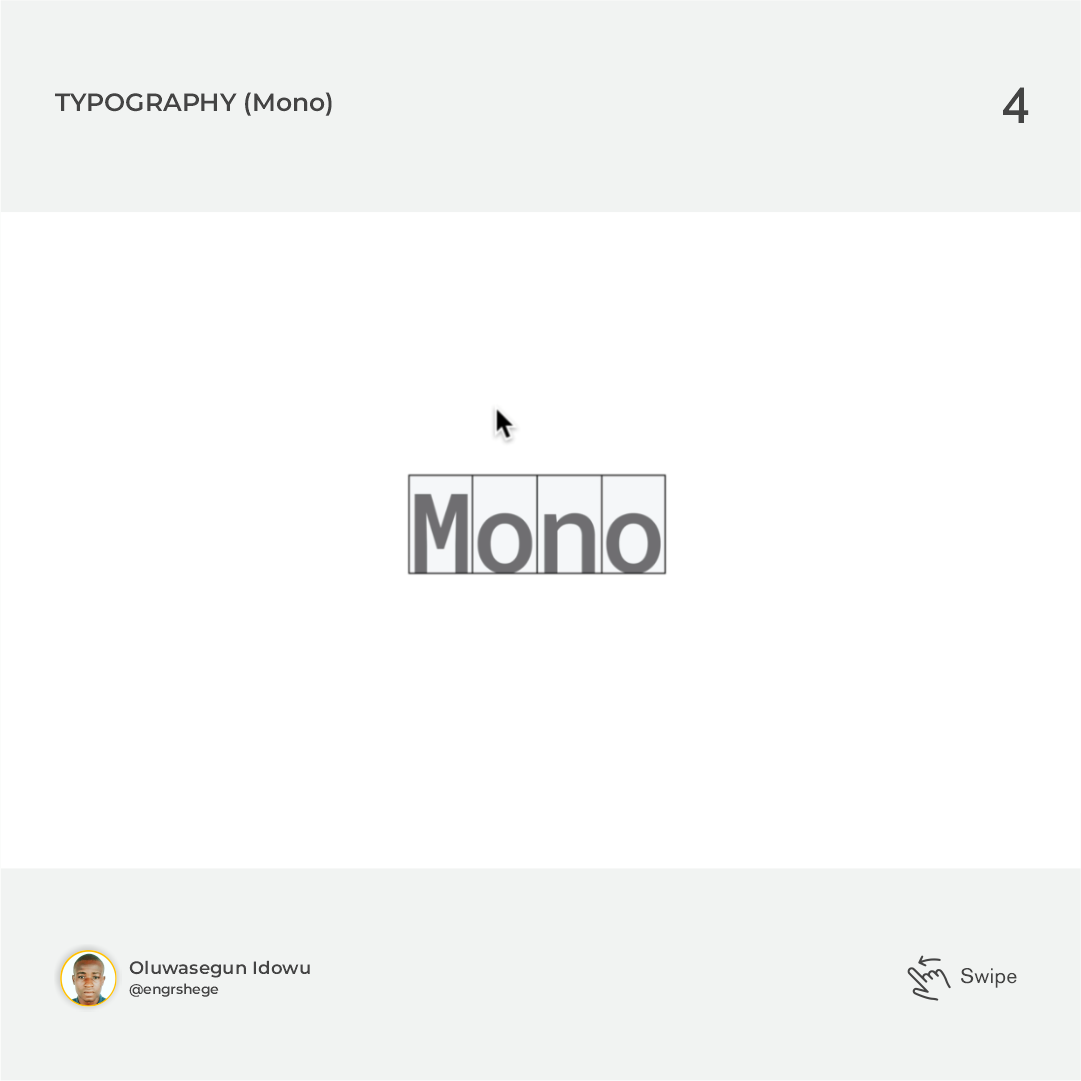
Mono: They are variants of Serif and San Serif. These are best used for areas where you want to evoke some sort of technical feeling. Mono typefaces have widely been used in programming because of their higher importance in reading.
Picking Typefaces
Typefaces do have their mood and personality. Now, the mood of typefaces is a very important aspect of how they should be used. You will notice that some different typefaces have strikingly different moods.
Some typefaces are very formal or traditional, while others seem more light and modern. When looking for typefaces for a specific brand or purpose, one should think about how it best represents the brand.
How do I Pick the Right Typeface for my Project?
As designers, sometimes we get lucky when clients come to us with an established typeface for their brand but most of the time, we face this dilemma when starting a project that doesn't have typeface chosen already.
In scenarios like this, you might want to:
Think about what the brand is like.
Know what the goals of the product are.
Know what you are trying to build.
Know what platform you are designing for? etc.
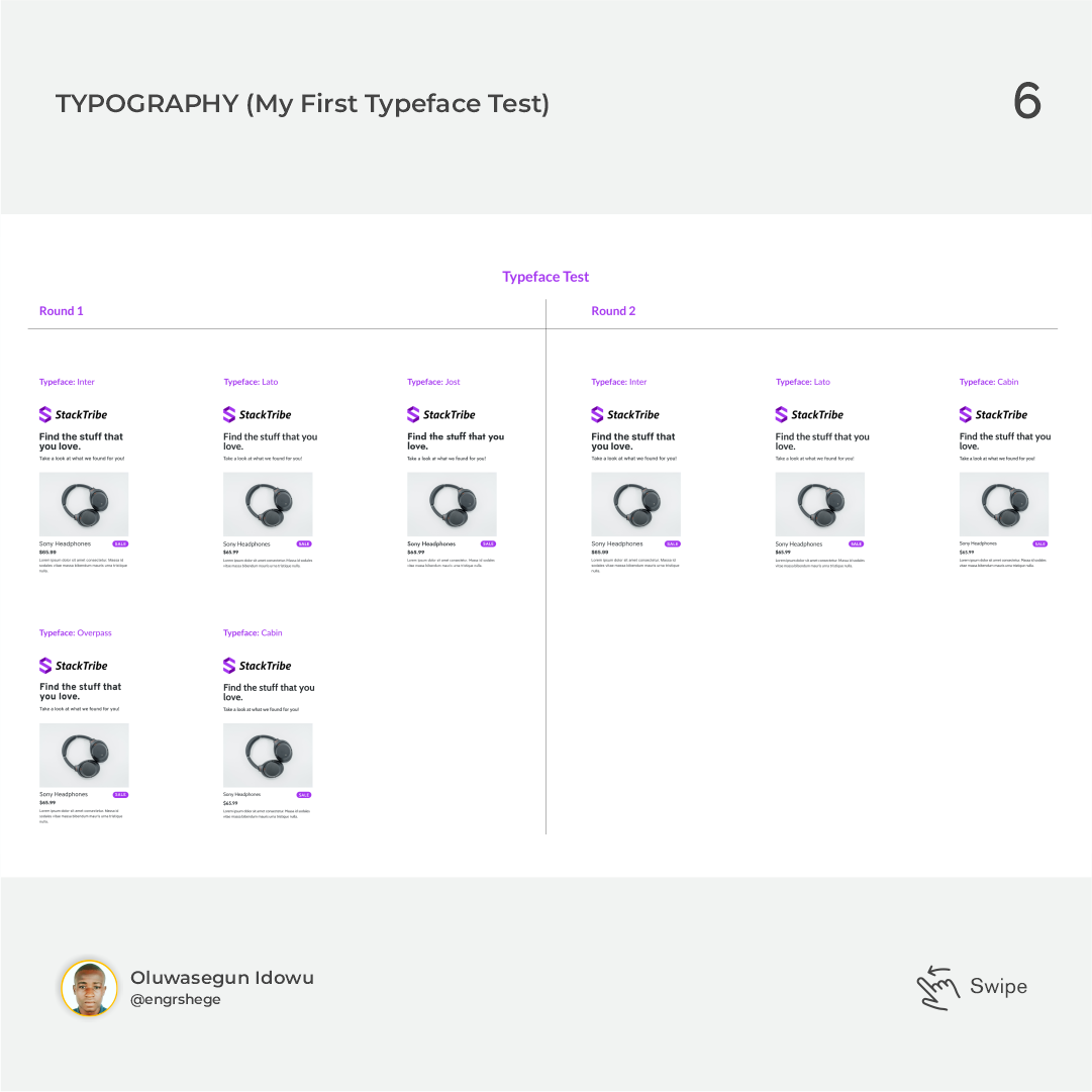
Compare/Test fonts to see how Legible and Clear the font should be.
My insight on this Episode:
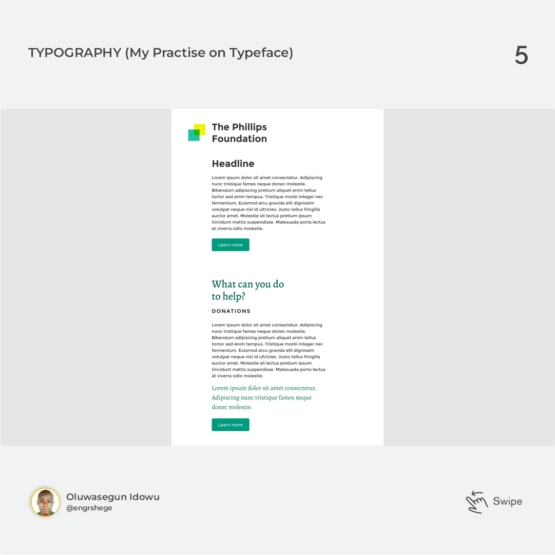
I learned/practised how to test different typefaces for my project.
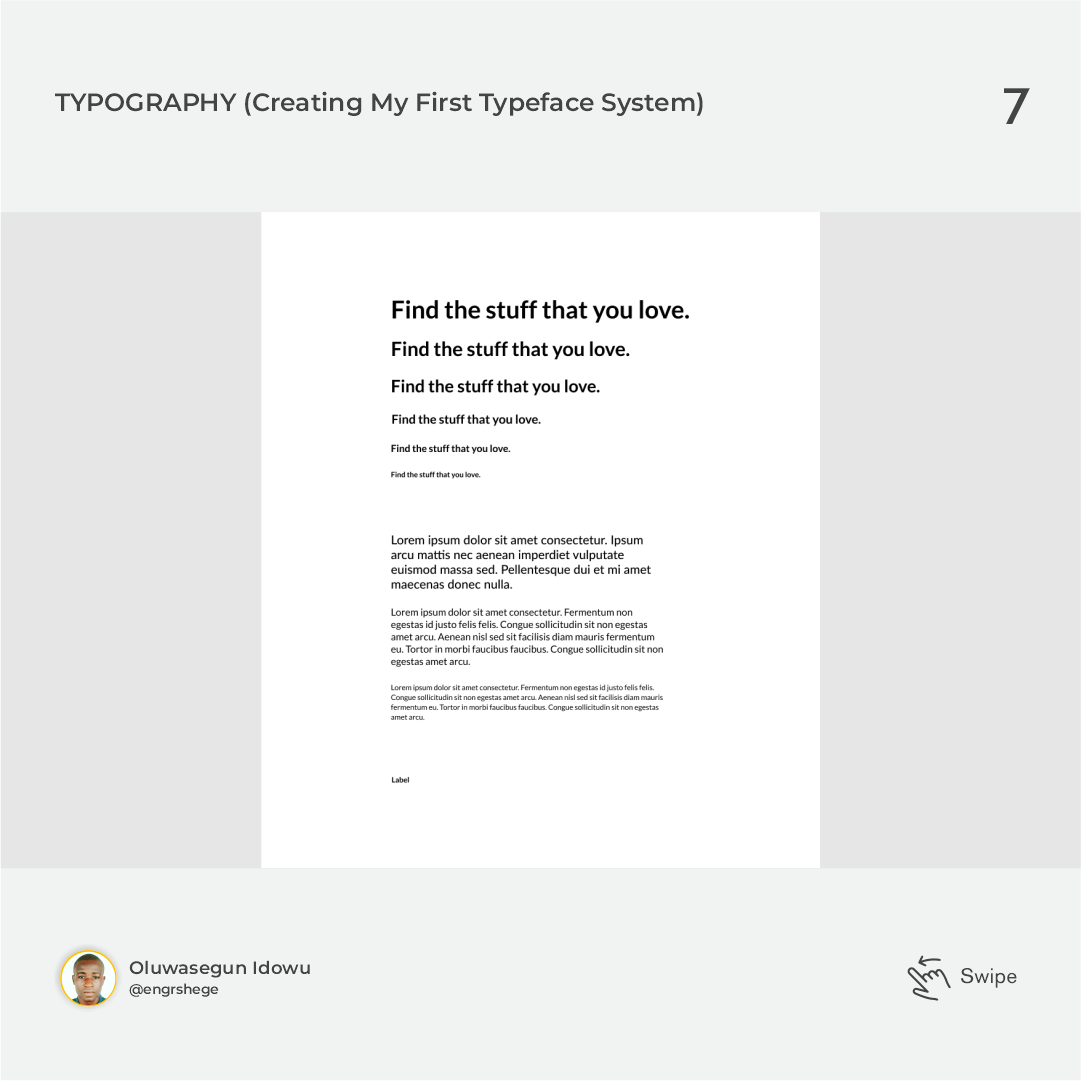
I learned/practised how to create my typography system from the ground up.
The journey gets better...
#Figma #ProductDesign #UIUXDesign #UIUX #UIUXCourse #Branding #BrandStrategy #Udemy #UdemyCourses #ZTM #ZeroToMastery #DocumentingMyTechJourney #BuildingMySkillset #TechSkill #SkillSets #ProductDesigner #EngrShege #ES
Subscribe to my newsletter
Read articles from Oluwasegun Idowu directly inside your inbox. Subscribe to the newsletter, and don't miss out.
Written by

Oluwasegun Idowu
Oluwasegun Idowu
Welcome to my blog! I am Oluwasegun aka (engrshege). Founder & CEO: @StackTribe