Building notes app in React using React Markdown
 Danyl Kecha
Introduction
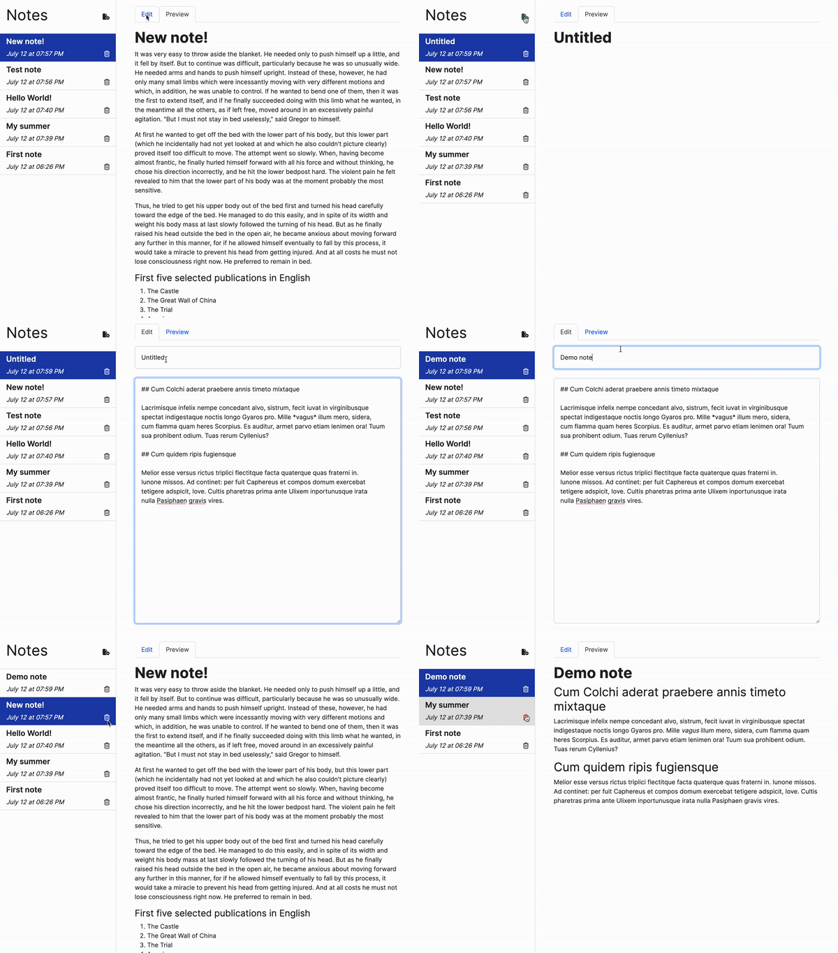
When it comes to web application development, React provides developers with the flexibility to create applications of different complexities. In this tutorial, we'll dive into building a CRUD notes application using React. You'll learn how to apply basic React hooks, style components with React Bootstrap, handle data using local storage, render markdown using the React Markdown library, and more! By the end, you will have developed a functional notes application similar to the demo below:

This tutorial is great for beginners who are in the process of learning React and are eager to embark on an exciting project. So, let's dive in and start building something amazing with React!
Getting Started
To kickstart our React application, we will use Vite, a blazingly fast frontend tool. To create the application, run the following command in the terminal:
npm create vite@latest
Next, we'll configure the app as React project with JavaScript:
✔ Project name: … notes-app
✔ Select a framework: › React
✔ Select a variant: › JavaScript
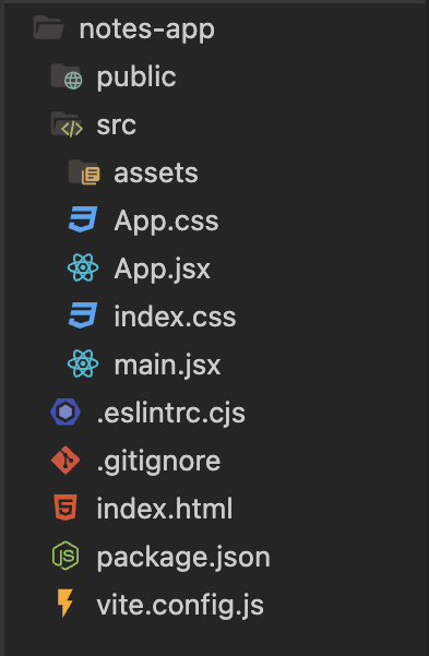
Inside the src directory, you'll come across a few files containing boilerplate code, similar to what is shown in the image below:

Feel free to delete all of them except App.jsx and main.jsx, as they will serve as the foundation for our React app.
Then, we'll install React Bootstrap. This library provides a versatile collection of customizable UI elements that are perfect for building UI with ease.
npm install react-bootstrap bootstrap
It is essential to import the CSS file that contains the basic styles provided by Bootstrap for the library to work properly. Write the following import statement inside main.jsx:
// main.jsx
import React from "react";
import ReactDOM from "react-dom/client";
import App from "./App.jsx";
import "./index.css";
// Importing the CSS file:
import "bootstrap/dist/css/bootstrap.min.css";

ReactDOM.createRoot(document.getElementById("root")).render(
    <React.StrictMode>
        <App />
    </React.StrictMode>
);
Additionally, we will use Font Awesome which offers a wide range of convenient and customizable icons. To download Font Awesome, simply execute the following commands:
# SVG core
npm i --save @fortawesome/fontawesome-svg-core

# Free icons styles
npm i --save @fortawesome/free-solid-svg-icons
npm i --save @fortawesome/free-regular-svg-icons

# Font Awesome React component
npm i --save @fortawesome/react-fontawesome@latest
Managing notes: CRUD functionality
Now that we're all set, let's dive into the main logic that will allow us to perform CRUD operations on our notes. At this stage, we will be creating all these functions within a single App component. This component will handle the state of the notes and serve as the parent for multiple other components.
So, let's get coding and start building our CRUD notes application!
Creating the notes
To store our collection of notes, we will use the useState() hook and represent it as an array:
const [notes, setNotes] = useState([])
Next, we can handle the logic for creating new notes. Each note will be represented as an object with a unique ID, title, content, and the date of the last edit. Therefore, the collection of notes will be an array of those objects.
To start, we'll need to install the nanoid library, which will be used to generate unique IDs for our notes. Execute the following command to install nanoid:
npm install nanoid
Then, let's proceed by creating a function that will allow us to add new notes to our application:
function addNote() {
    // Creating an object representing new note
    const newNote = {
        id: nanoid(),  // generating unique ID using nanoid
        title: "Untitled",
        content: "",
        updatedAt: Date.now()
    };
    // Updating the state using the spread operator
    setNotes(prevNotes => [...prevNotes, newNote]);
}
Updating the notes
To update a note, we will create a function that takes an object representing the updated note as an argument. In this function, we'll iterate through the previously created notes using the map() function. We'll compare the unique ID of each note with the one we want to update. Once we find a matching note, we'll replace it with the updated note object:
function updateNote(updatedNote) {
    setNotes(prevNotes => prevNotes.map(note => {
        if (note.id === updatedNote.id) {
            return updatedNote;
        } else {
            return note;
        }
    }));
}
Storing the notes inside the local storage
Now, let's introduce a more complex functionality to ensure that the user's notes collection will be preserved even after page refresh or when the user leaves the website. To make this possible, we need to make a few code alterations.
a) When initializing the notes state with useState(), check if any notes exist in the local storage. If they do, retrieve them and set them as the initial state. Otherwise, set an empty array as the initial state.
const [notes, setNotes] = useState(() => JSON.parse(localStorage.getItem("notes")) || []);
b) Create a useEffect() hook to watch for changes in the state of the notes collection by including the notes array in the dependency array. Whenever the state changes, we'll update the local storage with the latest notes collection.
useEffect(() => {
    localStorage.setItem("notes", JSON.stringify(notes));
}, [notes]);
Reading the notes
Now that we've implemented the logic for creating and updating notes, let's focus on allowing the user to select and view a specific note. To achieve this, we'll store the ID of the currently selected note as a state within our App component.
const [currentNoteId, setCurrentNoteId] = useState(notes[0]?.id || "");
We will automatically select the first note as the current note during the component rendering.
Consequently, to obtain the object representing the currently selected note, we will create the following function:
function getCurrentNote() {
    return notes.find(note => note.id === currentNoteId) || notes[0];
}
We're using a find() method which returns the first note in the array that satisfies the provided testing function. In our case, we compare the ID of each note with the ID of the current note to find a match. If no matching note is found, we return the first note in the array as a fallback option.
For the sake of user convenience, we can make a small adjustment to the function for adding notes. After adding the new note to the notes collection, we'll set it as the current note. This ensures that when a new note is created, the user can immediately start typing in it without having to manually select it.
function addNote() {
    const newNote = {
        id: nanoid(),
        title: "Untitled",
        content: "",
        updatedAt: Date.now()
    };
    setNotes(prevNotes => [...prevNotes, newNote]);

    // Automatically select the newly created note
    setCurrentNoteId(newNote.id);
}
Deleting the notes
So far, our progress has been great! Now, let's move on to the final part of our application's functionality, which involves deleting notes.
function deleteNote(noteToDeleteId) {
    setNotes(prevNotes => prevNotes.filter(note => note.id !== noteToDeleteId));

    // Automatically selecting the latest note if the user deletes the currently selected note
    if (noteToDeleteId === currentNoteId && notes.length > 0) {
        setCurrentNoteId(notes[0].id);
    }
}
In our case, we're creating a function that takes the ID of the note to be deleted as an argument. Within this function, we're using a filter() method to create a new array that excludes the note with the specified ID. This effectively removes the note from the collection. In addition, we're handling a scenario where the current note is deleted, as we automatically select the last updated note as the new current note.
User Interface
Now, let's shift our focus to the design aspect of our application. To help you better understand our next steps, here's another demo of the final version of our app's UI:

Sidebar
First of all, we'll create a sidebar that will display a list of all the created notes. To achieve this, we'll create a separate folder called components and inside it, we'll place the Sidebar.jsx component.
To gain a better understanding of the sidebar's functionality, let's outline its responsibilities:
Displaying the list of created notes
Selecting a note to view or edit
Adding and deleting the notes
Since our App component handles the state of our application, we will just pass the necessary props to the Sidebar component. Based on the outlined functionality, we need to pass the following props: an array of notes; the ID of the current note; a function to update the current note ID; functions to add and delete notes.
The code for the Sidebar component will appear as follows:
// components/Sidebar.jsx
import Stack from "react-bootstrap/Stack";
import { faFileCirclePlus } from "@fortawesome/free-solid-svg-icons";
import { FontAwesomeIcon } from "@fortawesome/react-fontawesome";

function Sidebar(props) {
    return (
        <div className="sidebar border-end">
            <Stack direction="horizontal" className="p-3 border-bottom">
                <h1>Notes</h1>
                <FontAwesomeIcon className="ms-auto icon-btn add-btn" icon={faFileCirclePlus} onClick={props.addNote} />
            </Stack>
            <Stack>
                {props.notes.map((note) => {
                    return (
                        <NoteCard
                            key={note.id}
                            id={note.id}
                            title={note.title}
                            updatedAt={note.updatedAt}
                            deleteNote={props.deleteNote}
                            currentNoteId={props.currentNoteId}
                            setCurrentNoteId={props.setCurrentNoteId}
                        />
                    );
                })}
            </Stack>
        </div>
    );
}
The code breakdown:
We use the Bootstrap Stack component to vertically align the boxes with the info about each note, header, and a button to add a new note. The placement direction can be modified using the
directionprop (default is "vertical").We add an
onClickevent handler to the icon for adding new notes.We iterate through each note in the collection and pass the relevant information to the
NoteCardcomponent, which we will discuss in more detail later.
The following CSS styles are applied to the sidebar and its related buttons:
/* index.css */

.sidebar {
    position: fixed;
    top: 0;
    left: 0;
    width: 300px;
    overflow-x: hidden;
    height: 100%;
}

.icon-btn {
    cursor: pointer;
    transition: "color .2s ease-in-out";
}

.delete-btn:hover {
    color: #DC2626;
}

.add-btn:hover {
    color: #15803D;
}
As you may have noticed, we use the mysterious NoteCard component within the Sidebar. Now, let's create it! This component will be in charge of presenting the details (such as the title, update date, and delete button) for each individual note. To accomplish this, we'll create a NoteCard.jsx file within the designated components folder:
// components/NoteCard.jsx
import { FontAwesomeIcon } from "@fortawesome/react-fontawesome";
import { faTrashCan } from "@fortawesome/free-regular-svg-icons";
import { Fade } from "react-bootstrap";

function NoteCard(props) {
    function handleNoteDelete(event) {
        event.stopPropagation();
        props.deleteNote(props.id);
    }

    return (
        <Fade appear in>
            <div
                className={`border-bottom py-2 p-3 ${props.id === props.currentNoteId ? "selected" : "note-card"}`}
                onClick={() => props.setCurrentNoteId(props.id)}
            >
                <h3 className="fw-semibold fs-5">{props.title}</h3>
                <div className="d-flex justify-content-between align-items-center">
                    <p className="m-0 fs-6 fst-italic">{props.updatedAt}</p>
                    <FontAwesomeIcon
                        className="icon-btn delete-btn"
                        icon={faTrashCan}
                        onClick={handleNoteDelete}
                    />
                </div>
            </div>
        </Fade>
    );
}
OK, that's a lot! Let's break it down:
We use the Fade component from Bootstrap to introduce a fade animation to the note card
Each note card is dynamically assigned either the
selectedornote-cardclass based on a ternary operator. This operator checks if the note's ID matches the ID of the current note, indicating that this note is currently selected.
Below are the CSS styles for thenote-cardandselectedclasses:
/* index.css */

.note-card {
    cursor: pointer;
    transition: "background-color .3s ease-in-out"
}

.note-card:hover {
    background-color: #E5E5E5;
}

.selected {
    color: #fff;
    background-color: #1E40AF;
}
We utilize an
onClickevent handler to enable note selection when the user clicks on it.Lastly, we assign an
onClickevent handler to each "delete icon" to handle note deletion when the button is clicked.
An important aspect to consider is how I handle the deletion of notes. Besides invoking the deleteNote function, I also use the event object, which is automatically passed, in order to invoke the stopPropagation() method. This is necessary because in JavaScript when an event occurs on an element, it first triggers the handlers on that specific element, then on its parent, and continues upwards to other ancestors. In our scenario, the event would not only trigger the handler for deleting the note but also the handler responsible for selecting the current note. Consequently, the deleted note would remain selected. To prevent this, we call the stopPropagation() method. I won't delve extensively into this topic, but if you wish to explore it further, I recommend reading this article.
Make sure to include the newly created sidebar in your App component:
// App.jsx
import Sidebar from "./components/Sidebar";
import { useEffect, useState } from "react";
import { nanoid } from "nanoid";

const App = () => {
    const [notes, setNotes] = useState(() => JSON.parse(localStorage.getItem("notes")) || []);
    const [currentNoteId, setCurrentNoteId] = useState(notes[0]?.id || "");

    useEffect(() => {
        localStorage.setItem("notes", JSON.stringify(notes));
    }, [notes]);


    function addNote() {
        const newNote = {
            id: nanoid(),
            title: "Untitled",
            content: "",
            updatedAt: Date.now()
        };
        setNotes(prevNotes => [...prevNotes, newNote]);
        setCurrentNoteId(newNote.id);
    }

    function updateNote(updatedNote) {
        setNotes(prevNotes => prevNotes.map(note => {
            if (note.id === updatedNote.id) {
                return updatedNote;
            } else {
                return note;
            }
        }));
    }

    function getCurrentNote() {
        return notes.find(note => note.id === currentNoteId) || notes[0];
    }

    function deleteNote(noteToDeleteId) {
        setNotes(prevNotes => prevNotes.filter(note => note.id !== noteToDeleteId));

        if (noteToDeleteId === currentNoteId && notes.length > 0) {
            setCurrentNoteId(notes[0].id);
        }
    }

    return (
        <Sidebar
            notes={notes}
            addNote={addNote}
            deleteNote={deleteNote}
            currentNoteId={currentNoteId}
            setCurrentNoteId={setCurrentNoteId}
        />

    );
};
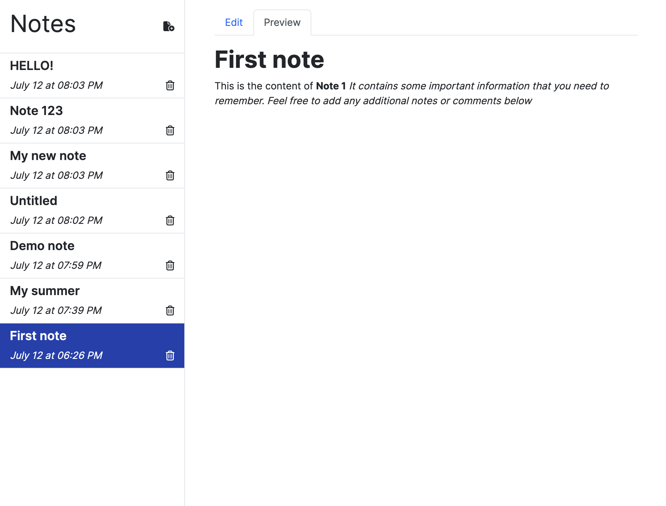
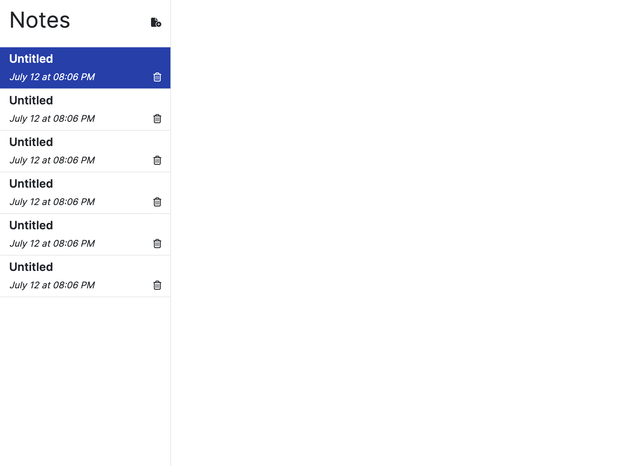
OK, that's all for the Sidebar! To ensure that we're on the same page, let's take a look at the current working directory and how the application should look like:

Now, let's focus on what will be displayed to the user when they select any note. We want to provide them with the ability to edit the title and content of the note, as well as view the rendered version of their notes. To achieve this functionality, we will create the Note.jsx component, which will be divided into two separate components: Editor and Preview.
Editor
To create the Editor component, we will work with the Form component from Bootstrap.
// components/Editor.jsx
import Form from "react-bootstrap/Form";

function Editor(props) {
    return (
        <Form>
            <Form.Group>
                <Form.Control
                    name="title"
                    type="text"
                    placeholder="Title..."
                    className="mb-4 p-3"
                />
                <Form.Control
                    name="content"
                    type="text"
                    placeholder="Content..."
                    as="textarea"
                    className="p-3"
                    rows={25}
                />
            </Form.Group>
        </Form>
    );
}
The primary role of this component is to handle user input within the note's input field, essentially managing the content that the user types inside the note.
Therefore, we'll need to pass to Editor two functions as props: one for updating the note and one for accessing the current note. To process the logic of updating the note, we will follow the common practice of controlling the input value using the value and onChange properties.
When creating the form inputs, make sure to provide the name, value, and onChange properties for each input element. This allows us to track and update the values of the input fields accordingly. As a result, our Editor component will look like this:
// components/Editor.jsx
import Form from "react-bootstrap/Form";

function Editor(props) {
    function handleFormChange(event) {
        // Destructuring event element to name and value
        const {name, value} = event.target;
        props.updateNote({ ...props.currentNote, updatedAt: Date.now(), [name]: value });
    }

    return (
        <>
            { props.currentNote ?
                (<Form>
                    <Form.Group>
                        <Form.Control
                            name="title"
                            type="text"
                            placeholder="Title..."
                            className="mb-2"
                            value={props.currentNote.title}
                            onChange={handleFormChange}
                        />
                        <Form.Control
                            name="content"
                            type="text"
                            placeholder="Content..."
                            as="textarea"
                            className="h-100 my-2"
                            value={props.currentNote.content}
                            onChange={handleFormChange}
                        />
                    </Form.Group>
                </Form>) :
                (<div>
                    <h2>No added notes yet.</h2>
                </div>)
            }
        </>);
}
Note that we can also add a ternary operator to display an appropriate message in case no notes have been created. That's it for the Editor component, so now let's focus on Preview and its functionality.
Preview
To support the markdown language in our app, we will create a separate component called Preview. For rendering the markdown content, we will utilize the React Markdown library.
React Markdown offers a seamless and safe approach to using the markdown in your app. In order to install the library, we'll run the following in the terminal:
$ npm install react-markdown
After installing the library, we can pass the title and content of the current note as props to our Preview component. The passed content will be rendered as markdown text and displayed alongside the note title.
Additionally, React Markdown can be improved by integrating various plugins to expand its capabilities. For example, these plugins allow support for strikethrough, tables, task lists, etc. However, for our current project, we won't be using any of them. You have the freedom to explore and add these plugins later on to enhance your app.
The code for Preview will appear as follows:
// components/Preview.jsx
import ReactMarkdown from "react-markdown";

function Preview(props) {
    return (
        <>
            <h2 className="fw-bold">
                {props.currentNote.title}
            </h2>
            <ReactMarkdown>
                {props.currentNote.content}
            </ReactMarkdown>
        </>
    );
}
Note
The primary question lies in connecting the Preview and Editor components. As previously stated, we will create the Note component to handle the data transfer from the Editor to the Preview. In our case, we will implement two tabs that allow the user to seamlessly switch between the options to write new content and view the created text. To accomplish this, we will use the setup offered by the Tab and Tabs components in React Bootstrap:
// components/Note.jsx
import Tab from "react-bootstrap/Tab";
import Tabs from "react-bootstrap/Tabs";

function Note(props) {
    return (
        <div className="content p-3 px-5">
            { props.currentNote ?
                <Tabs
                    defaultActiveKey="preview"
                    className="mb-3"
                >
                    <Tab eventKey="edit" title="Edit">
                        <Editor
                            currentNote={props.currentNote}
                            updateNote={props.updateNote}
                        />
                    </Tab>
                    <Tab eventKey="preview" title="Preview">
                        <Preview
                            currentNote={props.currentNote}
                        />
                    </Tab>
                </Tabs> :
                <p className="fw-semibold fs-4">
                    No added notes yet
                </p>}
        </div>
    );
}
This is CSS applied to the Note component:
/* index.css */

.content {
    margin-left: 300px;
}
Lastly, we will modify the return statement within the App component to incorporate the Note:
// App.jsx
return (
        <>
            <Sidebar
                notes={notes}
                addNote={addNote}
                deleteNote={deleteNote}
                currentNoteId={currentNoteId}
                setCurrentNoteId={setCurrentNoteId}
            />
            <Note
                updateNote={updateNote}
                currentNote={getCurrentNote()}
            />
        </>
);
Utility Functions
Great! We're all set with the main features of our notes app. But before we wrap things up, there are a couple of small tasks to tackle. First off, you might have noticed that the date on our notes appears in an ugly manner. In order to fix that, we'll use a separate function that formats the date in a more appealing way, and apply this function inside the NoteCard component.
For "helping" functions like this one, we can create a separate folder called utils. Inside this folder, we'll place the file formatDate.js which contains the following pure function:
// utils/formatDate.js
export function formatDate(updatedAtDate) {
    const options = {
        hour: "2-digit",
        minute: "2-digit",
        month: "long",
        day: "numeric",
    };
    return new Date(updatedAtDate).toLocaleDateString("en-US", options);
}
I suggest taking a look toLocaleDateString function to dive deeper into its capabilities.
When it comes to using this function inside the NoteCard component, we can do it like this:
<p className="m-0 fs-6 fst-italic">{formatDate(props.updatedAt)}</p>
Furthermore, we want to arrange the notes in descending order based on their update dates, meaning the most recent notes should be displayed first. To achieve this, we can create a simple utility function called sortNotes inside the same utils folder. It's a breeze to implement:
// utils/sortNote.js
export function sortNotes(notes) {
    return notes.sort((a, b) => b.updatedAt - a.updatedAt);
}
Now, let's apply this function inside the Sidebar component:
{sortNotes(props.notes).map((note) => {
    return (
        <NoteCard
            key={note.id}
            id={note.id}
            title={note.title}
            updatedAt={note.updatedAt}
            deleteNote={props.deleteNote}
            currentNoteId={props.currentNoteId}
            setCurrentNoteId={props.setCurrentNoteId}
        />
    );
})}
Lastly, we'll address the way we display the title of the application within the NoteCard. To accomplish this, we'll introduce another utility function called formatTitle. This function will format the title based on its length, providing a more visually appealing presentation:
// utils/formatTitle.js
export function formatTitle(title) {
    if (title.length > 0) {
        return title.length > 20 ? title.substring(0, 20).concat("...") : title;
    } else {
        return "Untitled";
    }
}
Once again, we'll apply this function within the NoteCard component:
<h3 className="fw-semibold fs-5">{formatTitle(props.title)}</h3>
Wrap Up
Congrats 🎉 We have successfully built a CRUD notes application using React! I hope this project has been useful in improving your React skills. Building practical applications like this is a great way to enhance your coding abilities and explore different frameworks and libraries.
If you encounter any difficulties along the way, you can refer to the complete source code available on my GitHub repository. If you have any questions or need assistance, don't hesitate to reach out to me. Feel free to contact me, even if it's not related to this project 😃
If you enjoyed this article, remember to follow me on Twitter, where I share daily updates. And feel free to connect with me on LinkedIn.
Subscribe to my newsletter
Read articles from Danyl Kecha directly inside your inbox. Subscribe to the newsletter, and don't miss out.
Written by
