Making Radio Buttons Shine: A Tale of Accessibility and Pizza Cravings
 KikiDotPy
As software engineers, it is our responsibility to ensure that the web applications we build are accessible to all users, including those with disabilities. In this blog post, we will walk through the steps to create accessible radio button groups following accessibility criteria using HTML5 alone!

Basic of Radio Buttons
Let's start with the basics: as you all know, a radio button is an HTML element allowing a single choice between multiple options. When there is more than one radio button at the same time, we talk about a radio group. In some implementations, all buttons in the set may be unchecked so that the user must check one before proceeding. Others can have pre-selected options to facilitate the user journey.
How to make a simple radio button accessible? By using and associating HTML <label> element with radio buttons <input>. It's essential to carefully bind each pair together by using the same value for the for attribute of the <label> element and the id attribute of the associated <input> element. This association allows users to select a radio button by clicking the corresponding label instead of just clicking the radio buttons themselves. This makes it easier for all individuals to interact with them.
Here's an example:
<input type="radio" name="pizza" id="yesAnswer">
<label for="yesAnswer">Yes</label>

<input type="radio" name="pizza" id="noAnswer">
<label for="noAnswer">No</label>

<input type="radio" name="pizza" id="pineappleAnswer">
<label for="pineappleAnswer">Only pineapple one!</label>
In this code snippet, we have three radio buttons related to a question about pizza. Each radio button has an associated label using the for attribute and the matching id attribute. This ensures that clicking on the label selects the respective radio button.
Remember to provide meaningful labels for each radio button option. Descriptive labels help users understand the purpose of each choice. For each radio button option within the group, repeat this pattern to ensure they share the same name attribute value!
ARIA Attributes for Radio Button
In some cases, we may need to provide additional information to assistive technologies, such as screen readers, about the state of radio buttons. We can use ARIA (Accessible Rich Internet Applications) attributes to accomplish this. Two of the most used ARIA attributes for radio buttons are:
aria-checked, an attribute that informs assistive technologies about the selected option, is commonly used when we have a pre-selected option.aria-disabled, an attribute that indicates whether a radio button is disabled and cannot be selected.
Here's an example that includes these ARIA attributes:
<input type="radio" name="pizza" id="yesAnswer" aria-disabled="true">
<label for="yesAnswer">Yes</label>

<input type="radio" name="pizza" id="noAnswer">
<label for="noAnswer">No</label>

<input type="radio" name="pizza" id="pineappleAnswer" checked aria-checked="true">
<label for="pineappleAnswer">Only pineapple one!</label>
In this updated code snippet, we've added the aria-disabled="true" attribute to the "Yes" radio button to indicate that it is disabled. Additionally, we've included aria-checked="true" on the "Only pineapple one!" radio button to indicate that it is the currently selected option.
Grouping Radio Buttons
However, we can still take additional steps to improve accessibility and semantics: we can utilize <fieldset> and <legend>, to group radio buttons sharing the same context.
We can replace the general <div> container with the <fieldset> element, which is specifically designed to contain multiple-choice input elements. This change helps the browser understand the structure and purpose of the radio button group without additional workarounds from developers.
Within the <fieldset>, we will add an <legend> element. The purpose of the <legend> is to provide a text description or question associated with the radio buttons.
Here's an example:
<fieldset role="radiogroup">
  <legend>
    Do you like pizza?
  </legend>

  <input type="radio" name="pizza" id="yesAnswer">
  <label for="yesAnswer">Yes</label>

  <input type="radio" name="pizza" id="noAnswer">
  <label for="noAnswer">No</label>

  <input type="radio" name="pizza" id="pineappleAnswer"
    checked aria-checked="true">
  <label for="pineappleAnswer">Only pineapple one!</label>
</fieldset>
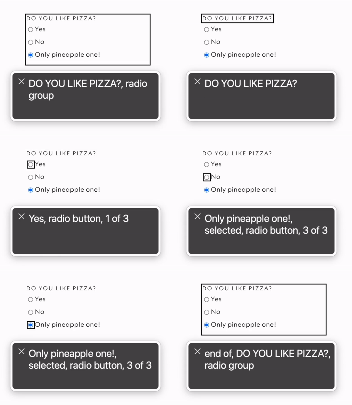
In this final code snippet, we've used the <fieldset> element to group all the input and label pair we had before. We've also added the role="radiogroup" attribute to the <fieldset> to explicitly specify the type of grouping as a radio button group. Inside the <fieldset>, we've included an <legend> element that serves as the question, "Do you like pizza?"
The radio buttons remain the same, with their associated <input> and <label> elements. As we said, it's crucial to ensure that each pair has the same id attribute for the <input> element and the for attribute for the <label> element.
By following these steps and implementing radio button groups with proper labels, ARIA attributes, and grouping semantics, we can create web applications that are more accessible to everyone!
Conclusion
In summary, when implementing radio button groups look out for these web accessibility tips:
Use the
<fieldset>element as the container for the group.Include a descriptive
<legend>to provide context or ask a question related to the radio buttons.Associate each radio button with its corresponding label using the
idandforattributes.Ensure that radio buttons within the same group share the same
nameattribute.Use the
aria-checkedattribute to indicate the initially selected radio button if applicable.
With these practices in place, we can create inclusive web applications that cater to a diverse range of users, promoting equal access and usability for everyone. Remember, accessibility should be an integral part of our software development process. Let's strive to build inclusive digital experiences that empower and include all users!
Subscribe to my newsletter
Read articles from KikiDotPy directly inside your inbox. Subscribe to the newsletter, and don't miss out.
Written by

KikiDotPy
KikiDotPy
I'm a Software Developer with a past as an Italian chef, aiming for a future in which every single person matters. I share my notes, thoughts, knowledge, and experience on tech through this journey!