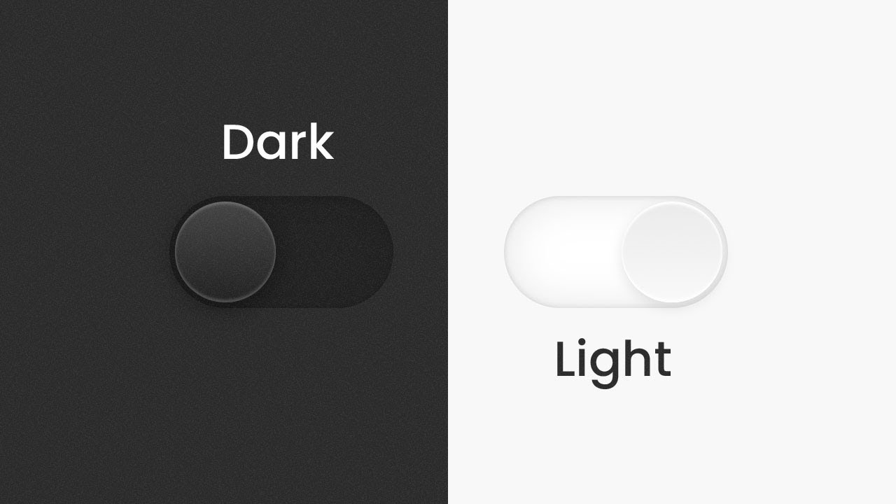
Toggling Between Light and Dark Mode: Enhancing Your React.js Website
 ajeet achal
Table of contents

Introduction:
In recent years, Dark Mode has become increasingly popular among web users due to its aesthetic appeal and potential benefits for eye strain reduction. As a React.js developer, implementing Dark Mode in your website can be an excellent way to enhance user experience and cater to varying preferences. In this blog, we'll explore how to toggle between Dark and Light Mode in a React.js website, allowing users to choose their preferred color scheme effortlessly.
Prerequisites:
Before we dive into the implementation, make sure you have the following prerequisites set up on your development machine:
Node.js and npm installed.
Basic knowledge of React.js and CSS.
Step 1: Set Up a React Project:
Begin by creating a new React.js project using Create React App (CRA) or your preferred setup method.
Step 2: Install Necessary Packages:
To facilitate the implementation of Dark Mode, we'll need the useState hook from React to handle state changes. Additionally, we'll use localStorage to store the user's preferred mode. Install these dependencies using npm:
npm install react react-dom
npm install --save-dev @babel/plugin-transform-react-jsx @babel/preset-react react-scripts
Step 3: Create DarkModeToggle Component:
In your React project, create a new component called DarkModeToggle.js. This component will handle the logic for toggling between Dark and Light Mode.
import React, { useState, useEffect } from 'react';

const DarkModeToggle = () => {
  const [isDarkMode, setIsDarkMode] = useState(false);

  useEffect(() => {
    const preferredMode = localStorage.getItem('darkMode');
    setIsDarkMode(preferredMode === 'true');
  }, []);

  const toggleMode = () => {
    const updatedMode = !isDarkMode;
    setIsDarkMode(updatedMode);
    localStorage.setItem('darkMode', updatedMode);
    applyMode(updatedMode);
  };

  const applyMode = (isDarkMode) => {
    const root = document.documentElement;
    root.style.setProperty('--background', isDarkMode ? '#121212' : '#FFFFFF');
    root.style.setProperty('--text-color', isDarkMode ? '#FFFFFF' : '#121212');
    // Add more CSS variables and their values as per your design requirements.
  };

  return (
    <div className="dark-mode-toggle">
      <label className="switch">
        <input type="checkbox" checked={isDarkMode} onChange={toggleMode} />
        <span className="slider round"></span>
      </label>
    </div>
  );
};

export default DarkModeToggle;
Step 4: Styling the Toggle Button: In the CSS file (e.g., App.css), style the dark mode toggle button to give it a sleek appearance:
.dark-mode-toggle {
  position: fixed;
  top: 20px;
  right: 20px;
}

.switch {
  position: relative;
  display: inline-block;
  width: 60px;
  height: 34px;
}

.switch input {
  opacity: 0;
  width: 0;
  height: 0;
}

.slider {
  position: absolute;
  cursor: pointer;
  top: 0;
  left: 0;
  right: 0;
  bottom: 0;
  background-color: #ccc;
  transition: 0.4s;
  border-radius: 34px;
}

.slider:before {
  position: absolute;
  content: '';
  height: 26px;
  width: 26px;
  left: 4px;
  bottom: 4px;
  background-color: white;
  transition: 0.4s;
  border-radius: 50%;
}

input:checked + .slider {
  background-color: #2196F3;
}

input:focus + .slider {
  box-shadow: 0 0 1px #2196F3;
}

input:checked + .slider:before {
  transform: translateX(26px);
}
Step 5: Implementing Dark Mode Across the Website: Now that the DarkModeToggle component is ready, we can use it in our main App.js file or any other component where we want to enable Dark Mode.
import React from 'react';
import DarkModeToggle from './DarkModeToggle';

const App = () => {
  return (
    <div>
      <h1>Welcome to My Website</h1>
      <p>... Your website content goes here ...</p>
      <DarkModeToggle />
    </div>
  );
};

export default App;
Conclusion:
In this blog, we've learned how to implement Dark Mode in a React.js website using the useState hook and localStorage. By adding a simple toggle button, users can now switch effortlessly between Dark and Light Mode, providing a more personalized and enjoyable user experience. Feel free to further customize the color scheme and styling to match your website's theme and design preferences. With Dark Mode now integrated into your React.js project, your users will appreciate the added convenience and aesthetics. Happy coding!
Subscribe to my newsletter
Read articles from ajeet achal directly inside your inbox. Subscribe to the newsletter, and don't miss out.
Written by

ajeet achal
ajeet achal
As a Full Stack Developer with experience in CMS platforms such as WordPress and OpenCart, I am proficient in both front-end and back-end technologies. With expertise in PHP, HTML, CSS, JavaScript, and MySQL, I have developed and maintained multiple web applications using these CMS platforms, delivering seamless and user-friendly experiences for clients.