Jetpack Compose Modifiers
 Faisal
Jetpack Compose is a modern UI toolkit for building Android user interfaces using a declarative programming model. It allows developers to build complex UI components with ease by simply composing smaller, reusable components. One of the key features of Jetpack Compose is its Modifier system. In this article, we will take a closer look at what modifiers are and how they work.
What are Modifiers?
In Jetpack Compose, a Modifier is an object that can be used to modify the layout or behaviour of a UI component. Modifiers are applied to a UI component to adjust its appearance, size, position, and other attributes. A Modifier can be chained with other Modifiers to create a sequence of transformations, each building on the previous one.
A Modifier can be used to achieve various effects such as adding padding, margins, or a background color to a UI component. Modifiers can also be used to change the behaviour of a component, for example, by making it clickable or adding a tooltip.
How to Use Modifiers?
To apply a Modifier to a UI component, you simply chain it with the component using the dot notation. For example, if you want to add some padding to a Text component, you can use the following code:
Text(
    text = "Hello World",
    modifier = Modifier.padding(16.dp)
)
In the above code, we have applied a padding Modifier to the Text component with a value of 16.dp. The dp unit is a density-independent pixel that allows UI elements to scale correctly across different device screen densities.
Modifiers can also be combined to create more complex transformations. For example, to apply both padding and a background color to a Text component, we can use the following code:
Text(
    text = "Hello World",
    modifier = Modifier
        .padding(16.dp)
        .background(Color.Red)
)
In the above code, we have applied both a padding Modifier and a background color Modifier to the Text component.
Common Modifiers
Jetpack Compose provides a wide range of built-in Modifiers that can be used to modify the appearance and behavior of UI components. Some of the commonly used Modifiers are:
padding: Adds padding to a UI component.background: Adds a background color or drawable to a UI component.clickable: Makes a UI component clickable.width: Sets the width of a UI component.height: Sets the height of a UI component.weight: Sets the weight of a UI component within a Composable layout.fillMaxWidth: Makes a UI component fill the available width within a Composable layout.fillMaxHeight: Makes a UI component fill the available height within a Composable layout.
Modifier Chaining and Order
We will almost always find ourselves chaining a bunch of modifiers while developing UI in Compose, hence it is very important to be mindful of the order in which we define our modifiers.
Reusing our example from above,
Text(
    text = "Hello World",
    modifier = Modifier
        .padding(16.dp)
        .background(Color.Red)
)
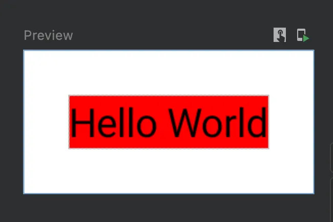
We are setting the padding for the Text first and then setting the background to Color.Red which means that the modifier system will,
First, apply a padding of 16 dps around the text, and
Then draw a Red colored background behind the text.
Result,

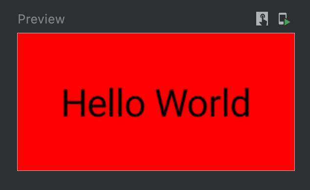
If instead we switch the order of the modifiers ,
Text(
    text = "Hello World",
    modifier = Modifier
        .background(Color.Red)
        .padding(16.dp)
)
The modifier system will,
First, draw a Red background behind the text, and
Then apply a padding of 16 dp in all directions.
Result,

Custom Modifiers
Developers can also create their own custom Modifiers to achieve specific layouts or behavioural effects. To create a custom Modifier, you need to define a function that takes in a Modifier object and returns a new Modifier object with the desired transformation applied. For example, the following code defines a custom Modifier that adds a border to a UI component:
fun Modifier.border(
    width: Dp = 1.dp,
    color: Color = Color.Black
): Modifier = this.then(
    BorderStroke(width, color)
)
In the above code, we have defined a border Modifier that takes in two parameters, width and color. The Modifier applies a BorderStroke transformation to the UI component with the given width and color.
Conclusion
Jetpack Compose Modifier system is a powerful tool that allows developers to create complex UI components with ease. Modifiers provide a declarative way to define layout and behavioral transformations, making it easier to reason about the UI code, but it is important to be mindful of things like modifier chaining and ordering while writing UI.
Subscribe to my newsletter
Read articles from Faisal directly inside your inbox. Subscribe to the newsletter, and don't miss out.
Written by
