Crafting Dynamic Layouts with CSS Flexbox: A Case Study
 Mustafa Dalga
CSS Flexbox is a powerful tool for building flexible, dynamic layouts on the web. But like any tool, its real power shines through when you face a problem that seems simple at first, but turns out to be quite tricky. One such problem is creating a layout with a header, footer, and a main content area that adjusts to fill the remaining space, regardless of the amount of content it contains.
Today, I’m going to share with you a real-world problem I encountered in a Nuxt.js project, and how CSS Flexbox provided a simple, elegant solution.
The Problem
In the project, I needed to create a layout with a header and footer that remained fixed in size, and a main content area that dynamically expanded or contracted to fill the remaining space, regardless of the content’s size.
At first glance, this might seem simple. However, traditional layout methods quickly fall short. For instance, using fixed heights for the main content area can lead to issues when the content size changes or screen sizes vary. Similarly, other CSS properties like height: auto can lead to the main content area not fully occupying the remaining space, especially when it has less content.
The Flexbox Solution
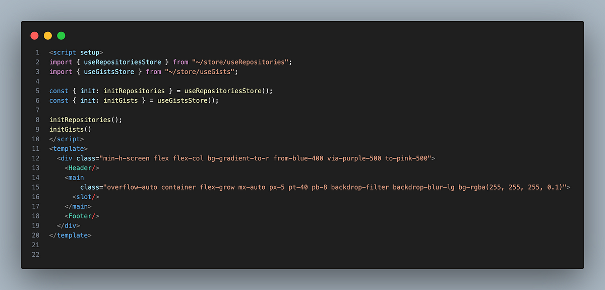
Here is the core structure of my solution:
<div class="bg-gray-100 min-h-screen flex flex-col">
  <header>
    <!-- Header content goes here -->
  </header>

  <main class="bg-blue-100 flex-grow p-8">
    <!-- Main content goes here -->
  </main>

  <footer class="w-full h-20 p-6 text-gray-700">
    <!-- Footer content goes here -->
  </footer>
</div>
Let’s break down this solution:
The outer div is turned into a flex container (
flex), andflex-colarranges the children (header, main, footer) in a column.min-h-screenensures the container takes up at least the full height of the viewport.The header and footer take up as much space as they need. Their heights are determined by their content or explicitly set dimensions.
The main content area uses
flex-grow, which allows it to expand and fill any remaining space in the container after the header and footer have taken up their required space.
The Result
The result is a layout that is flexible and adjusts beautifully to different viewport sizes. The header and footer maintain their sizes, while the main content area fills up the remaining space, regardless of its content size.
This solution leverages the power of CSS Flexbox to create a responsive layout without any complex calculations or dependencies. It showcases how understanding core web technologies can empower us to create better, more flexible UIs.
Creating dynamic layouts can be a challenging task in web development. However, with a deep understanding of CSS properties and a little bit of creativity, we can solve these challenges in elegant ways. CSS Flexbox is a powerful tool in our CSS toolkit, and knowing how to leverage it can help us create more dynamic, flexible layouts that provide a better user experience.
Subscribe to my newsletter
Read articles from Mustafa Dalga directly inside your inbox. Subscribe to the newsletter, and don't miss out.
Written by

Mustafa Dalga
Mustafa Dalga
I am a highly qualified software developer with over 6 years of experience in developing desktop and web applications using various technologies.My main programming language is JavaScript, and I am currently working as a Front-end developer at Heybooster. I am passionate about software development and constantly seek to improve my skills and knowledge through research and self-teaching. I share my projects on Github as open source to not only learn and grow, but also contribute to the development community. As a software developer, I am committed to upholding ethical standards in my work.