Navigating with a Smile: Creating an Inclusive Multi-Step Menu
 KikiDotPy
In my ongoing journey to enhance web accessibility, I recently encountered a fascinating challenge: implementing a vertical side progress menu that adheres to accessibility criteria.
It will be implemented in our service request form, where the user enters different types of information in 3 steps. So, we wanted to ensure that all users could easily navigate through the different steps. After some exploration, we discovered a solution inspired by W3C's breadcrumb pattern.

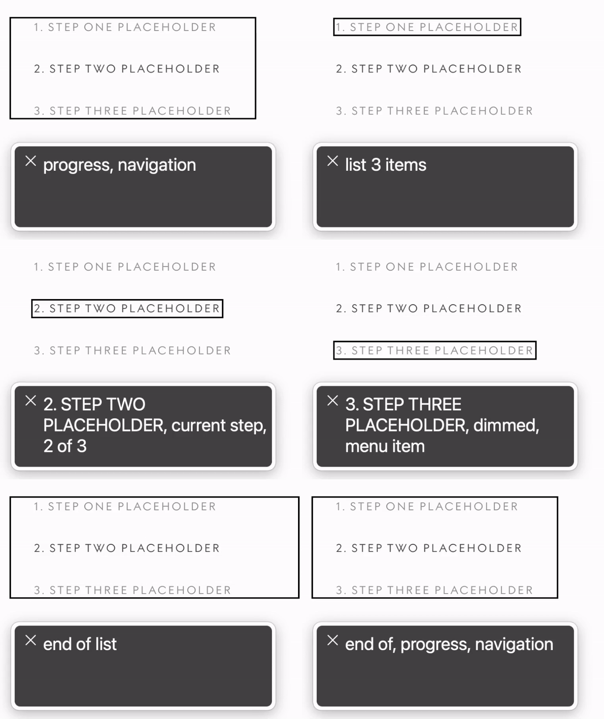
To begin, we decided to use an <nav> element to house our progress menu, since it will be navigable and its purpose is mostly to orient the navigation. The aria-label attribute was added to the <nav> element to specify the navigation type, in this case, "progress." This ensures that screen readers and other assistive technologies correctly identify the purpose of the navigation element.
Next, we structured our progress menu as an ordered list (<ol>) with individual steps represented as list items (<li>). Each step is wrapped in an <a> element that links to the previous or next step when clicked.
To provide further context for screen readers, we added the aria-current attribute. The step that corresponds to the current location in the process is assigned a value of "step" for the aria-current attribute. This allows users to easily identify their progress and understand where they are in the overall process.
Additionally, we wanted to indicate steps that have not been completed yet. We decided to use the aria-disabled attribute and set it to "true" for these steps.
Here's a code example implementation of the side-step component following the web accessibility criteria we discussed:
<nav aria-label="progress">
    <ol>
        <li>
            <a href="<link>"aria-current="step">1. Step one placeholder</a>
        </li>
        <li>
            <a href="<link>" aria-current="false" aria-disabled="true">2. Step two placeholder</a>
        </li>
        <li>
            <a href="<link>" aria-current="false" aria-disabled="true">3. Step three placeholder</a>
    </ol>
</nav>
In the example above, the first step is highlighted as the current step using the selected class and aria-current="step". The second and third steps are greyed out and marked as disabled using aria-disabled="true".
A brief notice about aria-disabled: we discovered that in certain situations, VoiceOver on Mac might not correctly recognize the aria-disabled attribute. To ensure consistent behaviour across different screen readers, we thought to introduce a role attribute of "menuitem" to wrap the disabled steps and that would switch back to the normal anchor element when the element is no longer disabled. This workaround allows all screen readers to correctly announce the aria-disabled attribute but I've learned that it is better not to indulge in workarounds. They can compromise semantic meaning, cause compatibility issues, complicate maintenance, and hinder future-proofing.
Remember, web accessibility is an ongoing process, and it's essential to test the implementation with different assistive technologies and gather feedback from users with disabilities. Continuously improving and iterating based on real-world usage and feedback will help create a more inclusive web for everyone!
Want to explore more?
For anyone who wants to explore more about how I came up with this implementation, I’ll leave here some interesting references I used:
Subscribe to my newsletter
Read articles from KikiDotPy directly inside your inbox. Subscribe to the newsletter, and don't miss out.
Written by

KikiDotPy
KikiDotPy
I'm a Software Developer with a past as an Italian chef, aiming for a future in which every single person matters. I share my notes, thoughts, knowledge, and experience on tech through this journey!