CSS Margin and Padding
 Emore Ogheneyoma Lawrence
The CSS Margin and Padding are undoubtedly one of the most used CSS property-value pairs in the CSS world. Understanding how they work will be extremely useful when coding CSS.
The CSS Margin and Padding allow us as Frontend developers to give space to elements on the page and create space around the content of an element.
As with most things with writing CSS are visual i.e. you get to see the changes as you code, it seems not to be the case with margin and padding as the only visual effect they give off is space which can sometimes be hard to visualize.
Even if you know how the Margin and Padding work, stick around. You'll learn a thing or two.
Prerequisites
This tutorial assumes that you know the basics of HTML and a bit of CSS.
Ready, Let's go
CSS Box Model
To have a firm understanding of Margin and Padding in CSS, it is important to know how the CSS Box Model works.
Everything displayed by CSS is a box
To buttress the quote above, let us check how the browser renders elements on inspection of them
To inspect elements on the page,
- right click on the element you want to inspect then select the inspect option
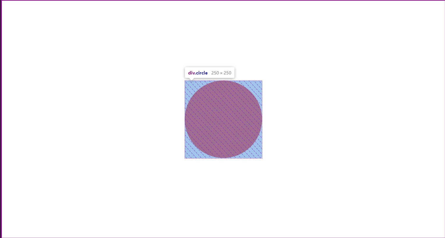
Pictorial representations of the CSS Box Model
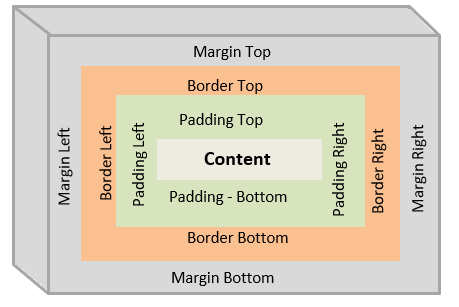
The CSS box model is a container or box wrapped around every HTML element. It consists of:
Content Box: This is where the content is displayed, like texts and images.
Padding Box: This is the space surrounding the content area.
Border Box: This is the container between the padding and margin box.
Margin Box: The outermost layer or invisible square outside the border. The Margin Box is used to break apart two elements from each other
What is CSS Margin
The CSS Margin (or margin for short) is the spacing on the outside of our border. The Margin is what we use to space two elements apart from each other on a webpage.
At its core, the CSS Margin is used to define the space around elements.
Margin Properties
The Margin properties are used for setting the margin for each side of an element.
When writing CSS, we can set margins for the respective sides of an element or use the margin shorthand properties we have in CSS to set the margins.
Margin property for setting individual sides of an element have the following sub-properties
margin-top
margin-right
margin-bottom
margin-left
Margin Shorthand Properties
Margin Property having 4 values
 .container{
     margin: 50px 50px 50px 50px;
 }

 /* margin: <top> <right> <bottom> <left> */
From the above code snippet, we see that all the margins have the value of
50pxMargin Property having 3 values
 .container{
     margin: 50px 75px 50px;
 }

 /* margin: <top> <left & right> <bottom> */
When we have margin written in this form, it means:
margin-top is 50px
margin-left and margin-right are 75px
margin-bottom is 50px
Margin Property having 2 Values
 .container{
     margin: 60px 50px;
 }

 /* margin: <top & bottom> <left & right> */
When we have margin written in this form, we can say that:
margin-top and margin-bottom are 60px
margin-left and margin-right are 50px
Margin Property having 1 value
 .container{
     margin: 50px;
 }

 /* all 4 sides of the margin will have 50px */
When we have margin written in this form, it simply means all the sides of the element will have an equal margin value
NB:
margin: 50px;is the same as usingmargin: 50px 50px 50px 50px;ormargin: 50px 50px 50px;ormargin: 50px 50px;
So a general rule of thumb is when you use the same value of margin in a CSS declaration, opt for using the margin with 1 value property
An example showcasing how to use the Margin CSS property
if we remove the margin-right, the spacing within the elements reduces and they appear combined or joined
Margin Tips
Centering elements Horizontally with
margin: 0 auto;ormargin-inline: auto;
When we useautoin CSS, we are simply saying the element in question can take all the available space.Here is a working example of how it is used
<div class="container"> <div class="box"></div> </div>.container{ height: 500px; border: 1px solid red; } .box{ width: 200px; height: 200px; background: lightblue; margin-inline: auto; 👈 /* NB: margin: 0 auto; also works the same way */ }
Pushing an element in a div or container to the extreme left or right positions using
margin-left: auto;ormargin-right: autoThe example below is a working example of the
margin-left: autowhich also works the same way for themargin-right: auto/* using the HTML code we used above earlier */ .container{ height: 500px; border: 1px solid red; } .box{ width: 200px; height: 200px; background: lightblue; margin-left: auto; 👈 /* margin-right: auto; works the same way but pushes the element to the extreme left. */ }
NB: Combining the
margin-left: autoandmargin-right: autoin a CSS rule is equivalent to usingmargin-inline: autoandmargin: 0 autowhich centers a div or box horizontally..box{ margin-left: auto; margin-right: auto; } /* The above code is eqivalent to */ .box{ margin-inline: auto; /* or */ margin: 0 auto; }Centering elements Horizontally and Vertically using the
margin: autocombined with the grid or flex combination ⚡<div class="container"> <div class="box"></div> </div>.container{ height: 500px; border: 1px solid red; display: grid; 👈 /* using display: flex works the same way too */ } .box{ width: 200px; height: 200px; background: lightblue; margin: auto; 👈 }
NB: If you want the element or div to be in the middle of the page(i.e. at the center of the viewport), set the height attribute to 100vh.
Things to note about the CSS Margin
Margin can be Negative.
A negative margin looks like this#content{ margin-top: -40px; }A common use case for using negative margin is for Overlapping CSS Boxes to fit the design objective.
Here is a working example of how it is used<div class="container"> <div class="box"></div> </div>.container{ margin-top: 70px; width: 350px; height: 350px; border: 3px solid red; } .box{ width: 150px; height: 150px; border: 2px solid black; margin-top: -40px; 👈 }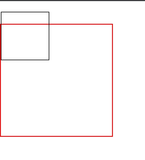
Margin Collapse
When writing CSS, margin collapse occurs between two elements that are next to each other and both share a margin. The element with the largest margin will have its margin appliedLet us look at a working example of how it works
<div class="container"> <div class="box"></div> <div class="box1"></div> </div>.box{ width: 150px; height: 150px; border: 2px solid black; margin-bottom: 20px; 👈 } .box1{ margin-top: 100px; 👈 width: 150px; height: 150px; border: 2px solid red; }
In this scenario, the
.box1margin property is used. Themargin-top: 100pxwill be the applied margin.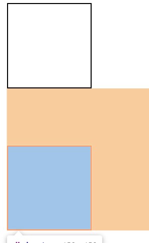
What is CSS Padding
CSS Padding (or padding for short) is a CSS property that is used to generate space around HTML elements
Padding Properties
The Padding properties are used for setting the padding of each side of an element.
As seen with Margins when writing CSS, we can also set Paddings for the individual sides of an element or use the padding shorthand properties we have in CSS to set the padding
The Padding Properties include:
padding-top
padding-right
padding-bottom
padding-left
Padding Shorthand Properties
Padding Property having 4 values
 .container{
     padding: 25px 50px 75px 100px;
 }

 /* padding: <top> <right> <bottom> <left>*/
When we have padding written in this form, it means:
padding-top is 25px
padding-right is 50px
padding-bottom is 75px
padding-left is 100px
Padding Property having 3 values
 .container{
     padding: 50px 100px 75px;
 }

 /* padding: <top> <left & right> <bottom>*/
When we have padding written in this form, it means:
padding-top is 50px
padding-left and padding-right is 100px
padding-bottom is 75px
Padding Property having 2 values
 .container{
     padding: 50px 100px;
 }

 /* padding: <top & bottom> <left & right>*/
When we have padding written in this form, it means:
padding-top and padding-bottom are 50px
padding-left and padding-right are 100px
Padding Property having 1 value
 .container{
     padding: 50px;
 }

 /* all 4 sides of the padding will have 50px */
Padding written in this form simply means all the sides of the element will have an equal padding value
NB:
padding: 50px;is the same as usingpadding: 50px 50px;orpadding: 50px 50px 50px;orpadding: 50px 50px 50px 50px;Just as we said with margins above, you should opt for using the Padding with 1 value property when you have the same values for padding in a CSS declaration
An example showcasing how to use the Margin CSS property
As we can see in the result above that the text is touching the screen and it's not looking too good. We can add the padding property to create space between the text and the edges of the screen.
We used the Padding property with 2 values in the codepen example above.
The padding-top and padding-bottom value is 0, while the padding-right and padding-left value is 30px.
Things to Note about the Padding Property
Padding cannot be set to
autoAs seen with the Margin property, we can write
margin: auto;and this will center the elementPadding value cannot be
negativeAs previously demonstrated above, CSS margins can have negative values, but CSS paddings cannot be assigned negative values.
Padding on
Inline-Elementdoes not work as intended
Applying padding to an inline element only adds padding(reflectable change) on the horizontal axis of the element. Changes do not reflect on the vertical axis.%[https://codepen.io/devyoma/pen/wvQQvyL]
Summary
We have covered a lot of ground in this article write-up and we have been able to see some use cases, tips and tricks that will take our CSS game to the next level.
I am happy that you read to this point and I would love that you not only read it but also put to practice what you've read here. Happy Coding
What are your thoughts on the CSS Margin and Padding topic? Kindly share other instances, tips and tricks that have been of help to you on this topic. Let us know in the comments section below.
Thank you
Subscribe to my newsletter
Read articles from Emore Ogheneyoma Lawrence directly inside your inbox. Subscribe to the newsletter, and don't miss out.
Written by

Emore Ogheneyoma Lawrence
Emore Ogheneyoma Lawrence
FrontEnd React JS Developer || Open Source Lover || Building Products