CSS Flexbox: The Complete Beginners's Guide.
 Mujahid Abdhamid
Introduction
The world of web design and development is constantly evolving and developers are always on the lookout for faster and more flexible ways to create responsive layouts. Enter "Flexbox" - an efficient and powerful method that has revolutionized how we build and design web interfaces. In this article, we will explore its use, importance, properties, and why it has become one of the most essential tools for modern web development.
Understanding Flexbox
Flexbox is a CSS module that provides an easier way of arranging and aligning elements within a container. It is a one-dimensional layout method of building responsive and adaptive designs without complex positioning or float-based layout.
Importance of Flexbox
Flexbox provides various benefits that make it an essential tool for web developers
Flexbox is a helpful tool that simplifies the process of structuring layouts without requiring excessive HTML and CSS coding. With Flexbox, the limitations of traditional box models are a thing of the past.
Flexbox has a unique capability of rearranging elements without altering the HTML structure. This is particularly handy for creating designs that respond to different screen sizes, where the element order may need to change.
When using Flexbox, elements are able to adjust their size and position according to available space, making it quicker and simpler to create layouts that are able to adapt to various screen sizes and devices.
You can use Flexbox to control the distribution of space between elements, achieving precise centering, evenly spaced columns, and justified spacing, among other things.
It is worth noting that most modern browsers support all of Flexbox's functionalities.
Flexbox concepts and properties
Flex container
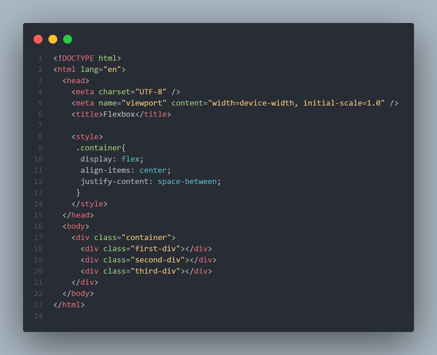
- Display: An element becomes a flex container by applying the display property on it and setting it to flex or inline-flex
.container {
  display: flex;
}
- Align-items: This property controls the alignment of flex items in the cross-axis (vertically, by default). It has various options such as:
Stretch: This is used to make all flex items stretched to fit the container
Flex-start: This is used to align flex items to the beginning of the container
Flex-end: This is used to align flex items to the end of the container
Center: This is used to align flex items to the center.
Baseline: This is used to position flex items to the baseline
.container {
  align-items: stretch | flex-start | flex-end | center | baseline |
}
- The justify-content property controls the positioning of flex items along the main axis, which is horizontal by default. It provides various options, including:
To align flex items to the center, use the "center" justification option.
Flex-end: This is used to justify flex items to the end of the container
Space-between: This property is used for distributing space between flex items.
Space-around: This property is used for distributing space before, between, and after flex items.
Space-evenly: This property is used for distributing space equally between flex items.
.container { justify-content: center | flex-end | space-between | space-around | space-evenly | }- The "gap" property is utilized to create space between flex items without the need for margins.
    .container {
      gap: 20px;
    }
- The "flex-direction" property determines the layout direction of flex items. The default direction for a flex container is horizontal, or "row". However, it provides other options as well such as:
Column
Row
Row-reverse
Column-reverse
  .container {
    flex-direction: column;
  }
The flex-wrap property allows flex items to wrap onto a new line if they are too big. It provides various options, including:
Wrap
Wrap-reverse
.container {
  flex-wrap: wrap;
}
Flex items
Flex items are the child elements of a flex container. Flexbox properties can be used to align and control them.
- The align-self property overrides the align-items property for individual flex items. It provides options similar to align-items, including:
Stretch
Center
Flex-start
Flex-end
Baseline
.first-div {
  align-self: center;
}
- The flex-grow property enables flex items to expand. A value of 0 means the item will not grow, while a value of +1 means it will.
.first-div {
  flex-grow: +1;
}
- The flex-shrink property enables a flex item to decrease in size ({0} means no decrease, {+1} means decrease).
.first-div {
  flex-shrink: 0;
}
- Flex-basis: This property is used to define an item width, instead of the width property
.first-div {
  flex-basis: 50px;
}
- The flex property is a shorthand for writing flex-grow. flex-shrink and flex-basis.
.first-div {
  flex: +1 0 50px;
}
- The order property controls the order of items. -1 makes the item first, and +1 makes it last.
.first-div {
  order: -1;
}
Conclusion
The use of Flexbox has revolutionized the way web layout design is approached by providing a powerful and flexible solution for creating responsive and adaptive interfaces. Its simplicity, efficiency, and broad support across different browsers have made it an essential tool for modern web development.
Subscribe to my newsletter
Read articles from Mujahid Abdhamid directly inside your inbox. Subscribe to the newsletter, and don't miss out.
Written by
