ServiceNow Custom Components Explained
 Reece Poulsen
Recently I was searching for a simple explanation of the basics behind ServiceNow custom components and didn't find what I was looking for. Hopefully, this helps the next person who comes along.
An Intro to the File Structure
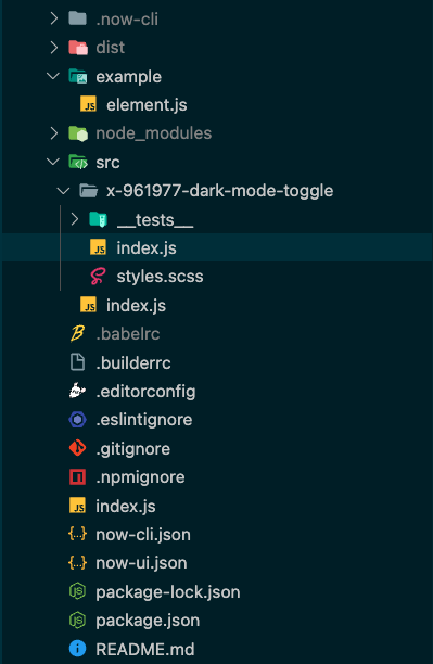
When you create a new custom component from the Now CLI, it automatically generates a file structure that follows this pattern, it may seem like a lot but luckily the majority of these files can be ignored. The 'src' folder has a folder with your component name and an index.js file, once you open the folder for your component you will see another index.js file. This second index file is where you will write your custom component code. This folder will also contain a styles.scss file, this is where you will add your CSS for your component.

If you need some tips on how to handle file structures for more complex custom component projects check out this section of the ServiceNow docs.
Important Concepts
Before we break down the anatomy of a custom component, there are a couple of important concepts that need to be touched on, if you are already familiar with them feel free to skip this section.
Web Components
State: Thinking Reactively
Basic Anatomy
Here are the pieces of custom components that we will be getting familiar with:
Import statements
The view definition
Properties
Actions, Dispatches, and Action Handlers
Events and Event Handlers
Build using
createCustomElement()Now-ui.json
Import Statements
Each component that you build will start with a couple of crucial import statements. These import statements are a way for us to pull pre-built functionality into our code. Here are the three that every component starts with:
import { createCustomElement } from "@servicenow/ui-core";
import snabbdom from "@servicenow/ui-renderer-snabbdom";
import styles from "./styles.scss";
createCustomElementis imported from ServiceNow'sui-corepackage and is used to build your component. There is a lot of additional functionality in theui-corepackage, but we only want thecreateCustomElementfunction for now so we destructure the import to get that specific function rather than grabbing the entirety of the package.snabbdomis the default renderer used to render your component.stylesis simply a reference to the CSS styles that are defined in your 'styles.scss' file.
As you get more involved in custom components, you will likely add to these import statements. If you have more questions, check the Mozilla docs for import statements here.
The View Definition
Each component has a view function that is used to render the component. This view function is where you define the structure of your component and how it reacts to state changes.
const view = (state, helpers) => {
    return <div></div>
};
Here are some details to keep in mind when developing the view function:
It always receives two parameters
stateandhelpers. Thestateparameter contains all of the state variables for the component. Thehelpersparameter contains 3 helper functionsupdateState(),dispatch(), andupdateProperties().💡Both of these parameters are objects that can be destructured. For exampleconst view = ({stateVar1, stateVar2}, {updateState}) => {....}It should always return JSX which defines the HTML structure of the component. Here is a quick run-through on how to write JSX from W3Schools.
You should avoid putting business logic inside the view definition
Properties
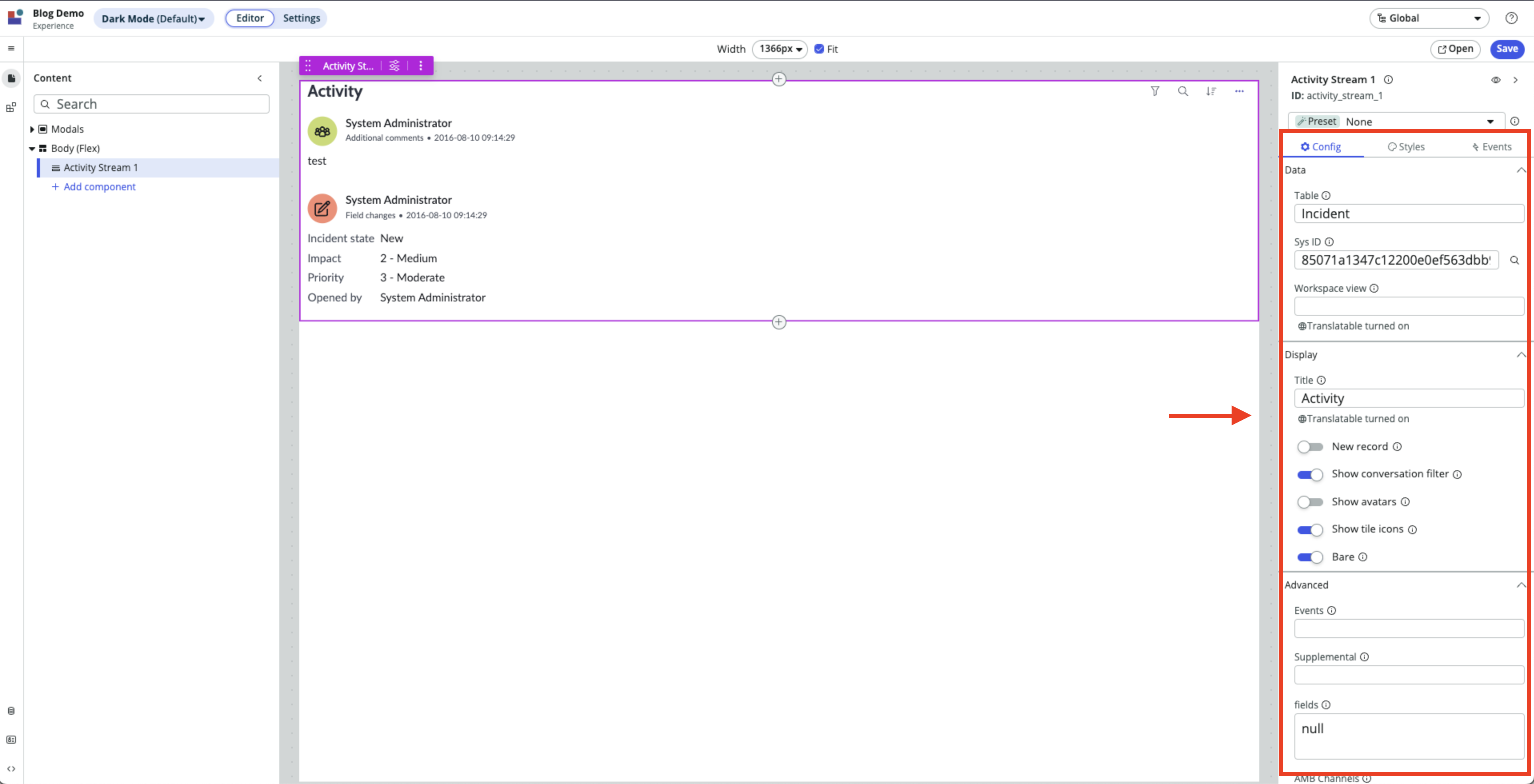
Component properties are a way for you to define configuration options for your components in UI Builder and allow you to pass outside data into your component.

Properties are defined following this pattern:
// Replace property_name, default_value, and type_here with
// the appropriate values
const properties = {
    property_name: {
        default: "default_value",
        schema: { type: "type_here" },
    },
    property_name: {
        default: "default_value",
        schema: { type: "type_here" },
    },
    property_name: {
        default: "default_value",
        schema: { type: "type_here" },
    },
};
Properties can be modified within the component using the updateProperties() helper function but this should be avoided.
Avoid setting properties internally as opposed to them being passed down externally. This functionality primarily exists for unmanaged primitive components and to support complex ARIA use cases. (ServiceNow docs)
Actions, Dispatches, and Action Handlers
Components are meant to respond to user interactions. When a user clicks a button on a webpage, they expect it to do something! Actions, Dispatches, and Action Handlers are how we can get our components to actually do something.
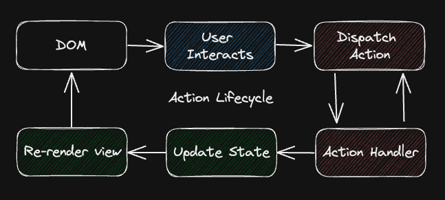
Before we look at the code, let's take a high-level look at the action lifecycle:
A user interacts with a component rendered on the DOM.
An action is dispatched in response to the interaction.
The corresponding action handler executes.
- Action handlers can dispatch further actions, leading to action chaining.
Action handler uses the
updateState()function to update the state of the component.An update in state triggers a re-render of the component.
The newly re-rendered component is presented on the DOM for further user interaction.

Now that we've looked at the action lifecycle, let's build a button that dispatches an action and then handles it.
// Basic import statements
import { createCustomElement } from "@servicenow/ui-core";
import snabbdom from "@servicenow/ui-renderer-snabbdom";
import styles from "./styles.scss";

// Define the component view
const view = (state, {dispatch}) => {
    const doSomething = () => {
        dispatch('MY_FIRST_ACTION', data: {"I'm the payload data!"});
    }
    return <button on-click={doSomething}>Click Here</button>
}

// Define action handlers
const actionHandlers = {
    "MY_FIRST_ACTION": {
        effect: (coeffects) => {
            const { action: { payload } } = coeffects;
            console.log("Action payload", payload.data);
        }
    }
};

/**********************************************************
* Could also be written using the Action Handler shorthand
* const actionHandlers = {
*     "MY_FIRST_ACTION": ({ action: { payload } }) => {
*         console.log("Action payload", payload)
*     },
* }
**********************************************************/

// Render the component using the view, actionHandlers, styles
// and renderer defined above
createCustomComponent("scope-component-tag-here", {
    view,
    actionHandlers,
    styles,
    renderer: { type: snabbdom }
});
coeffects parameter can be destructured.So, if we did everything correctly, this button should log "I'm the payload data" to the console when it's clicked. Now, you may be asking, 'Why wouldn't you just have the doSomething function do the console.log instead of dispatching an action?' and there are a couple of reasons why.
Dispatching actions allow the component to move on after the dispatch is sent. Since this is a trivial example, the
console.logdoesn't block the code execution. However, if we needed to do an HTTP request when the button was clicked then we would want the request to be kicked off and move on instead of the component waiting for the request to finish.The console.logs, HTPP requests, state changes etc. are considered side effects so they should be detached from the view definition to keep things nice and tidy.
Here are a couple of rules to follow when developing Actions and Action Handlers:
Action names should be past tense, they notify the system that something happened.
Action names should be UPPER_SNAKE_CASED.
Effectful code, or side effects, should be isolated to the Action Handler
effectfunction.
Actions can also be dispatched by a component and then handled inside of UI Builder to update client state variables to influence other components. The Now CLI tool is supposed to read the actions list specified in the now-ui.json file and automatically create actions (known as events in UIB) in UI Builder but at the time of writing this, there is currently a bug that prevents that from happening. Luckily, it's pretty easy to manually create the records needed to make the events show up in UI Builder. First, you need to create the actions in the sys_ux_event table and then you need to connect the action to the 'dispatched events' field of the component record in the sys_ux_macroponent table.
Events and Event Handlers
Custom components are also able to interact with native JavaScript DOM events with the use of Event Handlers. Event Handlers are quite similar to Action Handlers but an important distinction to make is that the framework doesn't produce or dispatch these events, but rather the events come from the DOM.
Here is how you define an event handler:
const eventHandlers = [
    {
        events: ['click'], // Accepts a list of events
        effect(coeffects) {
            const { action: { payload: {event, host} } } = coeffects;
            console.log(event) // Native DOM JS Event object
        }
    },
];
// Tip: the coeffects object can be destructured
Build Using createCustomElement()
The createCustomElement() function builds the component using all of the different pieces that have been explained above. It accepts two parameters, the first is the component-tag-name and the second is a context object that has the details for what makes up the component.
Here's the code for a simple component that I built. This component is just a button that switches between light mode and dark mode when you click it. Here's the link to the Github repo if you want to take a look at the source code.
import { createCustomElement } from "@servicenow/ui-core";
import snabbdom from "@servicenow/ui-renderer-snabbdom";
import styles from "./styles.scss";

// Declare the initial state of the component
const initialState = {
    darkMode: false,
};

// Define the view
const view = ({ darkMode, properties }, { updateState, dispatch }) => {
    const doSomething = () => {
        dispatch("MY_FIRST_ACTION", { data: "I'm the payload data" });
    };

    return (
        <button
            id="container"
            className={darkMode ? "dark" : "light"}
            on-click={() => {
                doSomething();
                updateState({
                    darkMode: !darkMode,
                });
            }}
        >
            {properties.buttonText}
        </button>
    );
};

// Define the properties
const properties = {
    buttonText: {
        default: "Click Me!",
        schema: { type: "string" },
    },
};

// Define action handlers
const actionHandlers = {
    MY_FIRST_ACTION: ({ action: { payload } }) => {
        console.log("MY_FIRST_ACTION payload:", payload.data);
    },
};

// Define event handlers
const eventHandlers = [
    {
        events: ["click"], // Accepts a list of events
        effect({
            action: {
                payload: { event, host },
            },
        }) {
            console.log("Native DOM JS Event:", event); // Native DOM JS Event object
        },
    },
];

// Render the component
createCustomElement("x-961977-dark-mode-toggle", {
    initialState,
    view,
    properties,
    actionHandlers,
    eventHandlers,
    styles,
    renderer: { type: snabbdom },
});
Now-ui.json
The last piece of the puzzle is the now-ui.json file. This file is used to help UI Builder know what is going on inside of your component when you deploy it to your ServiceNow instance. Here is a brief example of what this file could contain:
{
  "components": {
    "scoped-component-name-here": {
      "innerComponents": [],
      "uiBuilder": {
        "associatedTypes": ["global.core", "global.landing-page"],
        "label": "Label that UI Builder will use for your component",
        "icon": "document-outline",
        "description": "Your description of the component",
        "category": "primitives"
      },
      "properties": [
        {
          "name": "property_name_here",
          "label": "property_label_here",
          "description": "Your description of the property",
          "fieldType": "property data type",
          "defaultValue": "property default value"
        },
      ],
      "actions": [
        {
          "action": "DISPATCHED_ACTION_NAME_HERE",
          "label": "Action label",
          "description": "Your description of the action",
          "payload": [
            {
              "name": "imageData",
              "label": "Image Data",
              "description": "The image data from the camera after the snap is completed",
              "fieldType": "string"
            }
          ]
        },
      ]
    }
  },
  "scopeName": "component_scope_here"
}
Inside this object, you can define things like what sub-components are included in your component, how UI Builder should label your component, what properties your component has, and what actions your component produces. You can also have multiple components defined within this file if your project has multiple components in a single scope (check out this article).
Helpful resources
Here are some helpful resources that I used as references for this blog post:
Creating Custom Components, Darren Richards YouTube tutorial
Subscribe to my newsletter
Read articles from Reece Poulsen directly inside your inbox. Subscribe to the newsletter, and don't miss out.
Written by

Reece Poulsen
Reece Poulsen
Back in my freshman year of college, I was introduced to the world of programming, and it immediately caught my attention. The idea of creating something new with just a little learning and a couple of lines of code fascinated me—it was like discovering a whole new universe of possibilities! Ever since that moment, I've been on a continuous journey to expand my programming knowledge and skills. Now I'm a relatively new software developer on the ServiceNow platform, and I'm eager to explore its potential. Through this blog, I hope to share some of the things I'm learning along the way. Let's dive into the world of ServiceNow together and uncover the tricks and insights that can make a difference for us as developers!