Maximizing Microsoft Excel Functions: A Step-by-Step Guide to Mastering Pivot Tables - Part I
 gift osakue
Introduction
I used to always wonder why some people used to say that they were skilled data analysts in Microsoft Excel (MS Excel). I mean, it’s a really basic MS- app. Then, I used MS Excel for creating worksheets and basic arithmetic - SUMS, MAX, MIN and that was it. Now, after some years of training, I have discovered that there’s truly more to MS Excel than meets the eye. I am very excited to help guide you on this journey of learning advanced MS Excel functions.
To make it as easy to learn as possible, we would use a scenario and tasks to learn these functions.
Case scenario
Gracious Furniture is a company based in Abuja, Nigeria and specializes in office supplies and furniture. The company’s customers range from individual consumers and small businesses to corporate organizations delivering retail and wholesale services.
You have been contracted as a business intelligence analyst to help the Kano subdivision of the company. The business manager has presented you with an Excel file containing order dates from 2009-2012 and he would like you to analyze and present your insights.
Data set
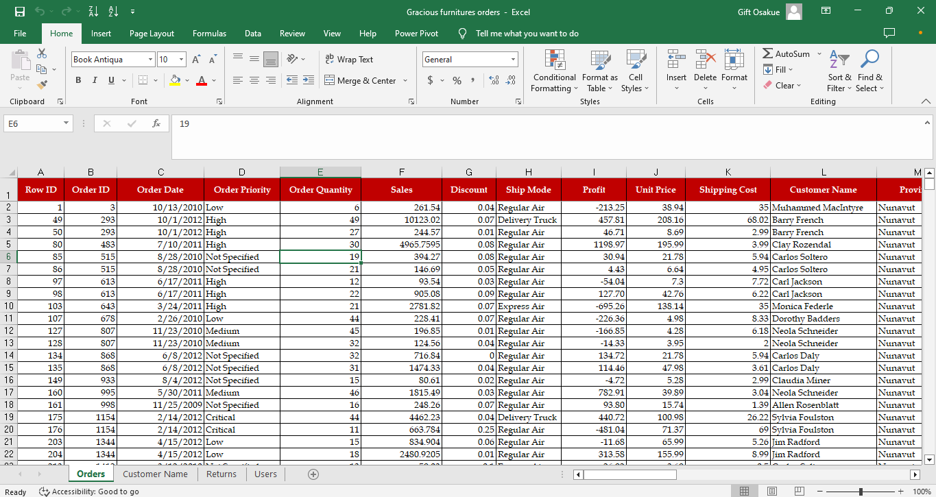
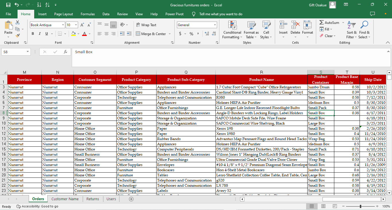
Check out our dataset in these pictures
Creating Pivot tables
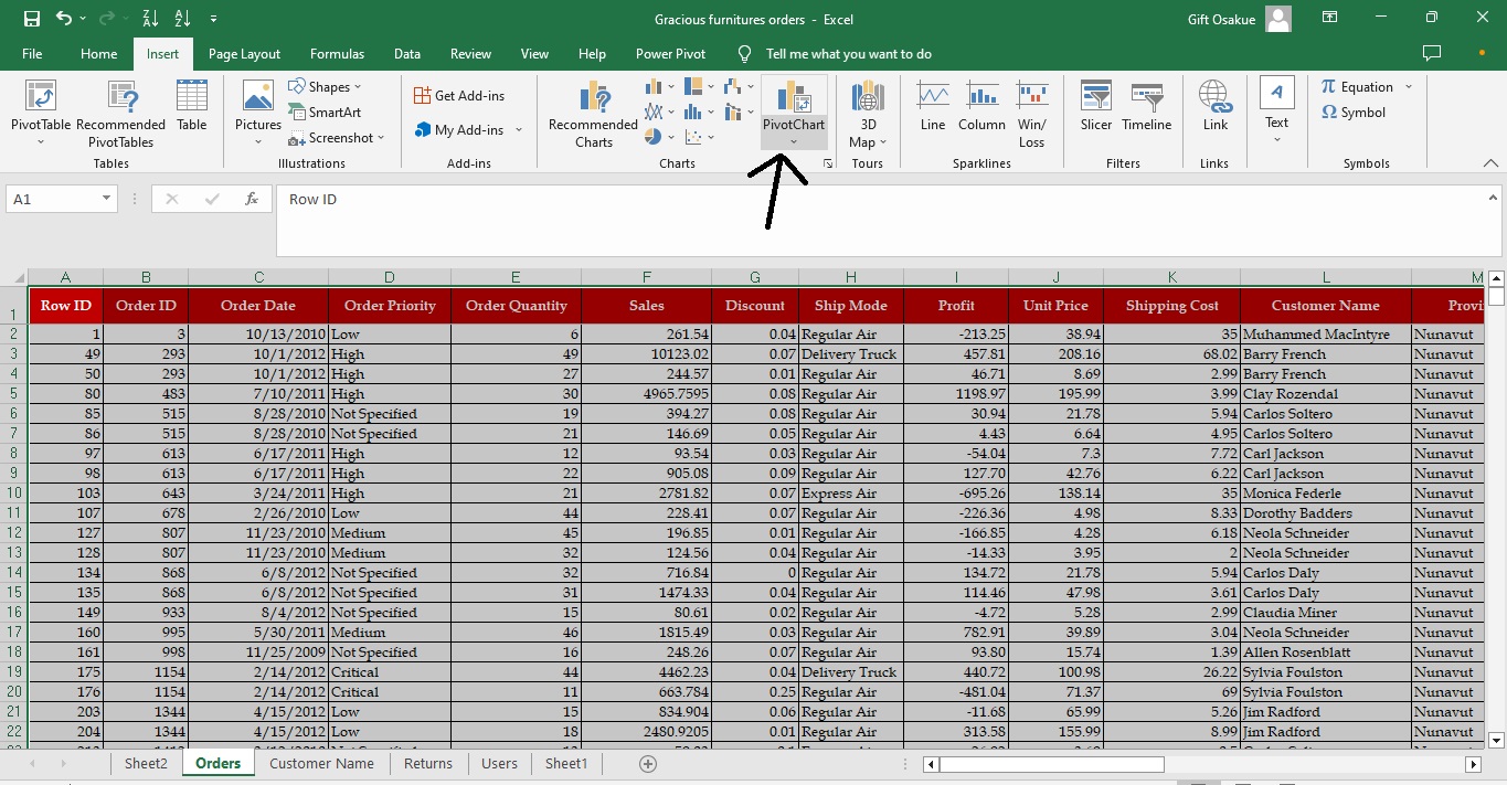
This is an easy task to carry out. We would create a pivot table from the data set. You can do this by selecting the table that has all our parameters of interest. (CTRL + A works for this).
Click on the “INSERT” Tab on your Excel sheet.
Click “PivotCharts” and then “Pivot charts and table”
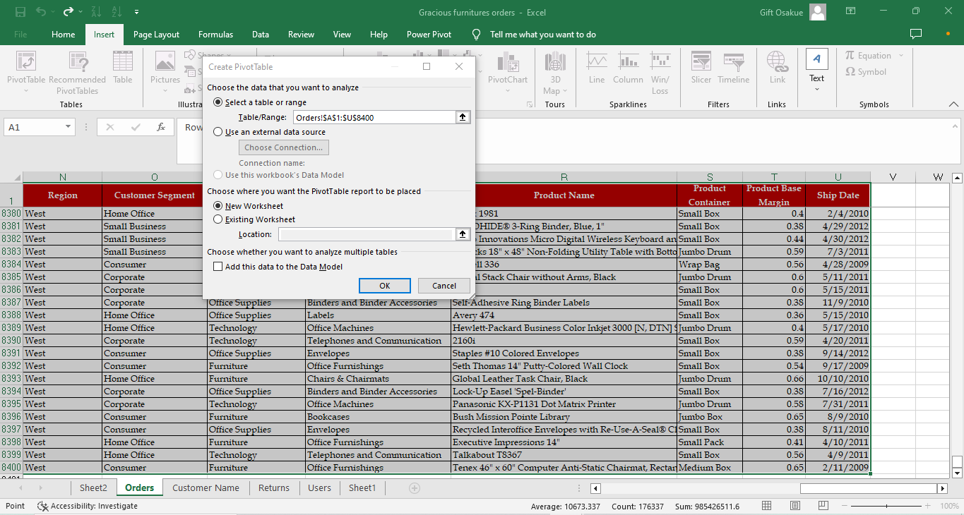
A dialog box would appear titled ‘Create Pivot Table’. It should already show the highlighted table since we had already selected it. It would also automatically click on ‘New worksheet’. You can decide to make the ‘Existing worksheet’. But I’ll advise you to use a new worksheet because you would need your workspace to be clear while doing Power Pivot.
Click ‘Ok’
This automatically takes us to a new sheet.
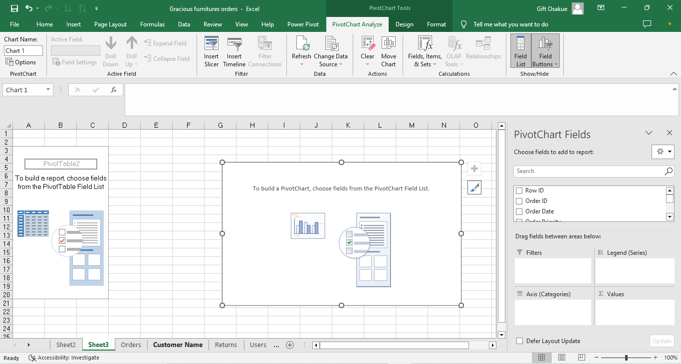
Let’s go over to our more interesting tasks.
Task 1: Which product category has the highest sales?
In the Pivot chart fields, you would easily see a list of all the columns of the table we are working on.
Drag the column ‘Product category’ to ‘Axis(categories)’ ’ or ‘Rows’
Then drag ‘Sales’ to ‘Values’
This automatically sums up the sales of each product category and also shows a bar chart.
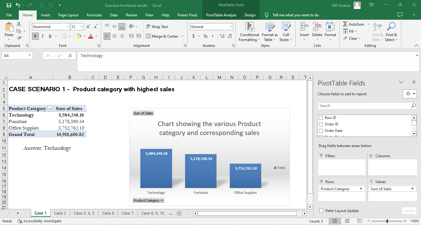
You can go ahead to rank it from highest to lowest by clicking on the ‘arrow box’ beside the column ‘Product category’ in our new table.
You can also go ahead to customize your bar chart and tables by changing the font size, font, bar chart type etc.
Answer: Technology has the highest sales with 5,984,248.18 sales.
Let’s take a break
I think this is a lot to learn in one read so we’ll take a break here. Watch out for more tasks on Power Pivot in our next article.
Like and follow so you’ll get notifications when I drop the next article. You can also drop questions in the comment box. I’m here for you.
/#MicrosoftExcel #Excel #PowerPivot #PivotTables #DataAnalyst #BusinessIntelligence #DataScience #DataScientist #DataAnalysis
Subscribe to my newsletter
Read articles from gift osakue directly inside your inbox. Subscribe to the newsletter, and don't miss out.
Written by
