Build a Sliding Navigation Menu Component with Tailwind CSS and JavaScript
 Diana Nnaemeka
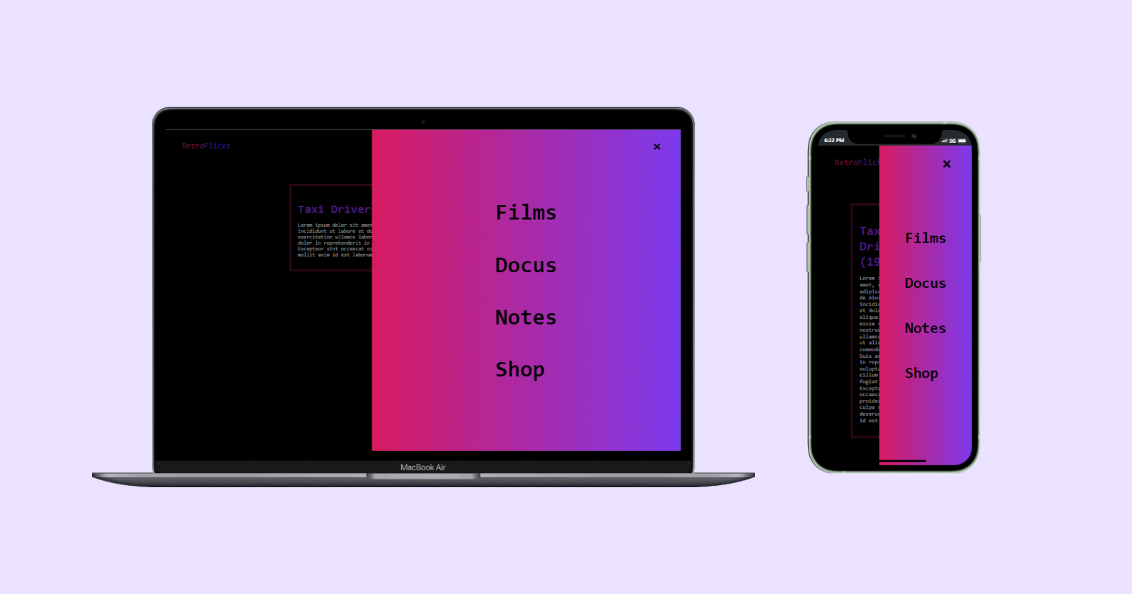
Introduction
Lots of websites and web applications feature one tangible and critical detail: a navigation menu. When you browse around the web, it is clear that a navigation menu is one of the essential elements - if not the most important - in web and app design.
The singular presence of a navigation menu enhances the overall user experience, ensuring that users can find what they need with ease. How else can users efficiently navigate through the different sections, pages, or features of their preferred websites or applications?
In this tutorial, we will learn how to create a navigation menu that animates with a sliding motion on click, using the full power of Tailwind CSS and JavaScript.
What is Tailwind CSS?
Tailwind CSS is a highly popular, utility-first CSS framework that is used to rapidly build custom user interfaces. It provides low-level CSS classes that can be used to independently define styles for design and components.
Why Tailwind CSS?
As a developer, crafting CSS styles from scratch or wrestling with bloated frameworks can be quite tedious. This is where Tailwind’s utility classes come in handy. We can simply style elements by applying pre-existing classes directly in our HTML without writing CSS. This is what we call a utility-first approach.
I build user interfaces (UI) with Tailwind CSS simply because its utility classes offer a responsive, reusable and customizable UI approach that fast-tracks the web page build process. Coding time should be well-spent.
Now, let’s delve into building our fun menu :)
Prerequisites
This tutorial is intended for developers who are fairly familiar with the basics of:
npm
Front-end web development stack (HTML, CSS and JavaScript)
Navigation Menu Layout
For a visual representation of our sliding menu layout, I created a blueprint.
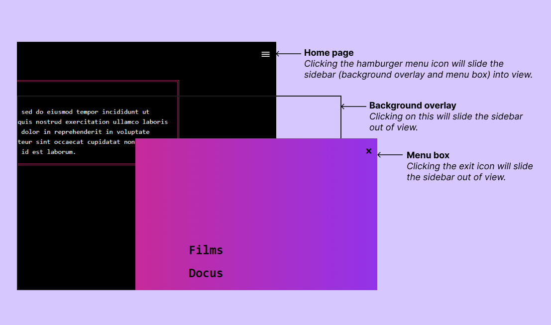
Navigation Menu Live Demo
Here's a preview of how the sliding menu works - try it out by clicking the hamburger menu:
Our implementation relies on Tailwind CSS for styling and animation, and JavaScript functions to handle triggering the click events. We’ll begin by installing Tailwind and creating our page layout.
Getting Started
The simplest and fastest way to get up and running with Tailwind CSS is with the Tailwind CLI tool.
Install Node
The first step is to have node.js installed on our local computer. Node uses a package manager (npm) to manage dependencies, with which we will install Tailwind.
To check if Node is available, run the command on your terminal:
node -vIf the node version isn't returned, download the latest version of Node for your specific OS.
Install Tailwind CSS via npm
Next, we will create a folder for our project and run the following command in the terminal to install Tailwind CSS:
npm install -D tailwindcssTailwind works well with a template
tailwind.config.jsfile used to customize themes, fonts and other fun stuff. We can create this by running this command:npx tailwindcss initConfigure template paths
Next, we will add the path to our template files
"./**/*.{html,js}"in thetailwind.config.jsfile we created in the step above. This will allow Tailwind to scan our HTML file for utility classes./** @type {import('tailwindcss').Config} */ module.exports = { content: ["./**/*.{html,js}"], theme: { extend: {}, }, plugins: [], }Add the Tailwind directives to your CSS file
Create a main CSS file - we'll use
menu.cssin this case - and add the following@tailwinddirectives for each of Tailwind’s layers:@tailwind base; @tailwind components; @tailwind utilities;Start the Tailwind CLI build process
As a final step, run the command to build the CSS file which will contain utility classes:
npx tailwindcss -i ./menu.css -o ./output.css --watchThe above command will use
menu.cssas an input file, and create a CSS fileoutput.csscontaining all the utility classes being used in this project.Link output file as stylesheet to HTML
Most importantly, in your HTML file, link the output.css file like this:
<link href="./output.css" rel="stylesheet"/>
You can also read through the installation guide for any additional information useful to your project.
Create the basic HTML markup
Let's create the basic layout structure of our navigation menu.
<body>
<nav>
<p>Retro<span>Flicks</span></p>
<!--Hamburger menu icon svg to trigger the slide-in menu when clicked-->
<div onclick="openNav()">
<svg xmlns="http://www.w3.org/2000/svg" width="18.853" height="12" viewBox="0 0 18.853 12">
<g id="Icon_feather-menu" data-name="Icon feather-menu" transform="translate(-4.5 -8)">
<path id="Path_3" data-name="Path 3" d="M4.5,18H23.353" transform="translate(0 -4)" fill="none" stroke="#fff" stroke-linejoin="round" stroke-width="2"/>
<path id="Path_4" data-name="Path 4" d="M4.5,9H23.353" transform="translate(0)" fill="none" stroke="#fff" stroke-linejoin="round" stroke-width="2"/>
<path id="Path_5" data-name="Path 5" d="M4.5,27H23.353" transform="translate(0 -8)" fill="none" stroke="#fff" stroke-linejoin="round" stroke-width="2"/>
</g>
</svg>
</div>
<!--background overlay element, it will close navbar when clicked-->
<div onclick="exitNav()" id="sideBar">
<!--navigation menu box-->
<div id="sideNav">
<!--exit icon, it will close navbar when clicked-->
<a href="javascript:void(0)" onclick="exitNav()">×</a>
<ul>
<li><a href="#">Films</a></li>
<li><a href="#">Docus</a></li>
<li><a href="#">Notes</a></li>
<li><a href="#">Shop</a></li>
</ul>
</div>
</div>
</nav>
<!--just a hero section with generic content-->
<section>
<div>
<h1>Taxi Driver (1976)</h1>
<p>Lorem ipsum dolor sit amet, consectetur adipiscing elit, sed do eiusmod tempor incididunt ut labore et dolore magna aliqua. Ut enim ad minim veniam, quis nostrud exercitation ullamco laboris nisi ut aliquip ex ea commodo consequat. Duis aute irure dolor in reprehenderit in voluptate velit esse cillum dolore eu fugiat nulla pariatur. Excepteur sint occaecat cupidatat non proident, sunt in culpa qui officia deserunt mollit anim id est laborum.</p>
</div>
</section>
</body>
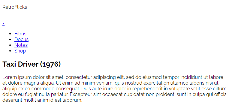
Here, we have created a nav element containing:
a RetroFlicks logo
a hamburger menu svg
navigation menu box nested in a background overlay element
a hero section containing generic content
An important factor we included was the onclick HTML attribute with the values of openNav() and exitNav() which we will define in the JavaScript section. The onclick attribute is an event handler that instructs the browser to run a script - or a function, as is our case - when the targeted element is clicked.
Style the markup with Tailwind CSS
Tailwind CSS does a lot of the heavy lifting as it determines the style and animation of each element. We will style our navigation menu component with utility classes to build a custom design. Most importantly, we will use the duration utility class to create a slightly delayed sliding motion.
I strongly recommend cross-referencing the Tailwind CSS Docs to determine the named utility classes we will apply. Additionally, you can set up the Tailwind CSS Intellisense extension directly in your code editor to provide you with advanced features such as autocomplete, syntax highlighting, and linting.
Let's apply the styling utility classes one section at a time.
Style the body and nav element
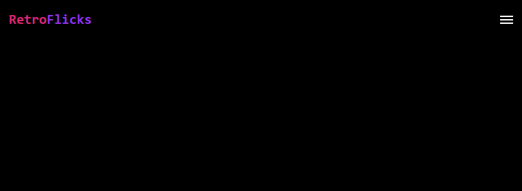
To begin, we’ll use Tailwind’s background color, font family and text color utilities (bg-black, font-mono and text-white) to style the page’s appearance and text.
<body class="bg-black font-mono text-white">
<nav class="flex justify-between items-center p-4">
...
</nav>
</body>
For the navigation bar nav - with the use of the flexbox utility class - we placed its child elements horizontally with equal space between them (justify-between), all aligned to the center on its vertical axis (items-center). For an acceptable amount of whitespace, we used the padding utility class (p-4).
Style the background overlay element
The background overlay element is the transparent backdrop element that will close the menu box when the user taps or clicks the area outside the menu box.
<!--background overlay element, will close menu box when clicked-->
<div onclick="exitNav()" id="sideBar" class="fixed top-0 right-0 bg-transparent w-0 h-full overflow-x-hidden duration-500 z-10">
...
</div>
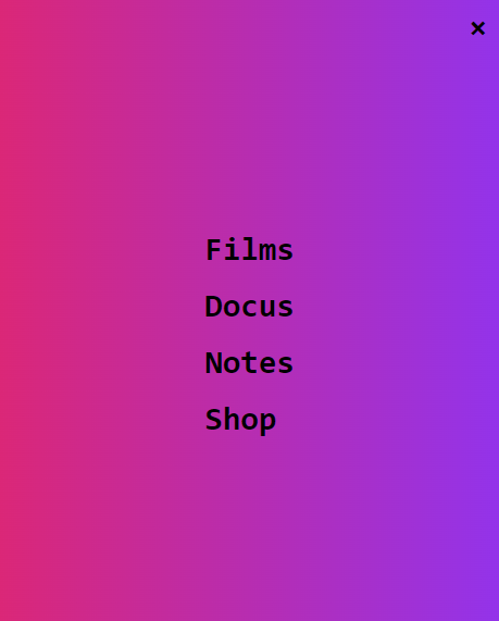
Here, we set the background overlay to:
A fixed position at the top right corner of the screen (
fixed,top-0andright-0), spanning the full height of the page (h-full).A transparent background color (
bg-transparent).
We’ve also set the background overlay’s initial width to 0 (w-0) to keep it hidden by default, and as a result, it will not be visible at this stage. As we progress, we will define the JavaScript functions that will change the width property, bringing it into view when triggered.
Additionally, we must set the overflow-x property to hidden (overflow-x-hidden). This will disable horizontal scroll and ensure the navigation menu contents are properly hidden. Another critical element is the duration-500 utility class which ensures a 0.5-second delay effect. This will make the sliding transition not appear too sudden.
Style the menu box and its items
The menu box will contain:
The exit icon - which will close the menu box when clicked/tapped.
The menu links.
<!--navigation menu box-->
<div id="sideNav" class="fixed top-0 right-0 bg-gradient-to-r from-pink-600 to-purple-600 z-10 overflow-x-hidden duration-500 font-bold flex justify-center items-center h-full w-0">
<!--exit icon, will close navbar when clicked-->
<a href="javascript:void(0)" onclick="exitNav()" class="text-3xl absolute top-0 right-0 mr-3 mt-2">×</a>
<!--menu links-->
<ul class="text-2xl sm:text-3xl">
<li class="p-2"><a href="#">Films</a></li>
<li class="p-2"><a href="#">Docus</a></li>
<li class="p-2"><a href="#">Notes</a></li>
<li class="p-2"><a href="#">Shop</a></li>
</ul>
</div>
Here, we set the menu box to nearly the same values as the background overlay with significant changes, further adding a few more styles:
A linear background gradient utility with pink and purple colors (
bg-gradient-to-r,from-pink-600andto-purple-600).Using the Flexbox utility (
flex,justify-centeranditems-center) to place the menu links at the center of the box, as well as, the position utility (absolute,topandright) to place the exit icon at the top right corner.The menu links font size - initially set at 1.5rem - will scale up to 1.875rem using the media query utility for screens beyond 640px (
sm) breakpoint.
The menu box is also not visible as we’ve set its width to 0.
Final markup styling
This is the final HTML markup with Tailwind CSS utility classes styling:
<body class="font-mono bg-black text-white">
<nav class="flex justify-between items-center p-4">
<p class="text-pink-600 font-bold text-xl">Retro<span class="text-purple-600">Flicks</span></p>
<!--Hamburger menu icon svg to trigger the slide-in menu when clicked-->
<div onclick="openNav()">
<svg class="cursor-pointer" xmlns="http://www.w3.org/2000/svg" width="18.853" height="12" viewBox="0 0 18.853 12">
<g id="Icon_feather-menu" data-name="Icon feather-menu" transform="translate(-4.5 -8)">
<path id="Path_3" data-name="Path 3" d="M4.5,18H23.353" transform="translate(0 -4)" fill="none" stroke="#fff" stroke-linejoin="round" stroke-width="2" />
<path id="Path_4" data-name="Path 4" d="M4.5,9H23.353" transform="translate(0)" fill="none" stroke="#fff" stroke-linejoin="round" stroke-width="2" />
<path id="Path_5" data-name="Path 5" d="M4.5,27H23.353" transform="translate(0 -8)" fill="none" stroke="#fff" stroke-linejoin="round" stroke-width="2" />
</g>
</svg>
</div>
<!--background overlay element, will close navbar when clicked-->
<div onclick="exitNav()" id="sideBar" class="fixed top-0 right-0 bg-transparent w-0 h-full overflow-x-hidden duration-500 z-10">
<!--navigation menu box-->
<div id="sideNav" class="fixed top-0 right-0 bg-gradient-to-r from-pink-600 to-purple-600 text-black w-0 h-full flex justify-center items-center overflow-x-hidden duration-500 font-bold z-50">
<!--exit icon, will close navbar when clicked-->
<a href="javascript:void(0)" onclick="exitNav()" class="text-3xl absolute top-0 right-0 mr-3 mt-2">×</a>
<!--menu links-->
<ul class="text-2xl sm:text-3xl">
<li class="p-2"><a href="#">Films</a></li>
<li class="p-2"><a href="#">Docus</a></li>
<li class="p-2"><a href="#">Notes</a></li>
<li class="p-2"><a href="#">Shop</a></li>
</ul>
</div>
</div>
</nav>
<!--just a hero section with generic content-->
<section class="mt-8 px-2 text-white flex justify-center ">
<div class="bg-black p-4 w-2/3 border-4 border-pink-600 border-double">
<h1 class="text-3xl font-bold mb-2 text-purple-600">Taxi Driver (1976)</h1>
<p>Lorem ipsum dolor sit amet, consectetur adipiscing elit, sed do eiusmod tempor incididunt ut labore et dolore magna aliqua. Ut enim ad minim veniam, quis nostrud exercitation ullamco laboris nisi ut aliquip ex ea commodo consequat. Duis aute irure dolor in reprehenderit in voluptate velit esse cillum dolore eu fugiat nulla pariatur. Excepteur sint occaecat cupidatat non proident, sunt in culpa qui officia deserunt mollit anim id est laborum.</p>
</div>
</section>
</body>
Enable the sliding menu interaction with JavaScript
Once we have outlined the layout and styles, we’re going to create the JavaScript functions openNav() and exitNav() that will assign the width to the targeted elements when they are clicked.
/*To open navigation menu, set the width to 60% of the background overlay*/
function openNav() {
    document.getElementById("sideBar").style.width = "100%";
    document.getElementById("sideNav").style.width = "60%";
}

/*Close navigation*/
function exitNav() {
    document.getElementById("sideBar").style.width = "0";
    document.getElementById("sideNav").style.width = "0";
}
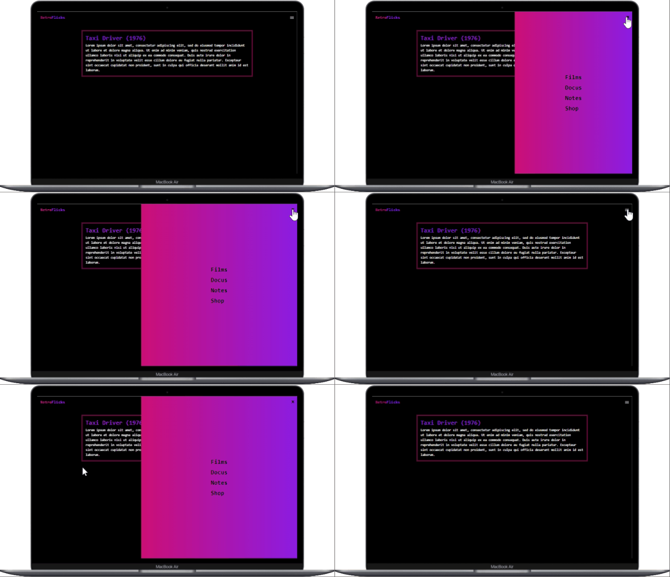
To open the navigation menu on click, we set the widths of the background overlay (sideBar) to 100% of the nav component, and the menu box (sideNav) to 60% of the background overlay.
To close the navigation menu on click, we set the widths of both items to 0.
On our webpage, clicking the hamburger menu icon will slide the navigation menu into view, and clicking the exit icon or outside the navigation menu box will slide the menu out of view. Fini.
Conclusion
Congrats, we have successfully built a sliding navigation menu component using Tailwind CSS and JavaScript! I hope this project has been useful in improving your skills. :)
Building practical components like this with Tailwind CSS takes a few lines of code, setting you up with a streamlined way to code responsive styles directly in the HTML markup. Plus, it is a great way to enhance your coding abilities and explore different frameworks.
If you encounter any difficulties along the way, you can refer to the complete source code available on my GitHub.
If you enjoyed this article or have any questions, feel free to say hi on Twitter and connect with me on LinkedIn.
Subscribe to my newsletter
Read articles from Diana Nnaemeka directly inside your inbox. Subscribe to the newsletter, and don't miss out.
Written by

Diana Nnaemeka
Diana Nnaemeka
I am a software developer exploring the fine middle ground between programming and writing. I build with tidy bits of code and write to contribute to open-source knowledge and technical documents. I am ever-curious — with a slight geographical bend to my passions — and willing to push the needle on matter and lore.