Particles & spiral patterns in CSS: part IV
 Maciek Fitzner
The Archimedean - that we talked about in part 3 - isn't the only type of concentric spiral. It's the OG, having been described by Archimedes ca. 225 BC. The next big thing didn't come for almost 2000 years. But in reality, it had always been there, everywhere around, and long before Archimedes himself walked the Earth. The logarithmic spiral:
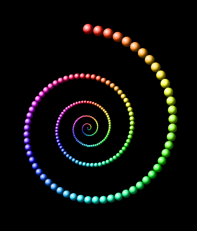
This shape - which is actually pretty common in nature: from sea shells and ram horns to sunflower pods - differs from the Archimedean in one crucial way.
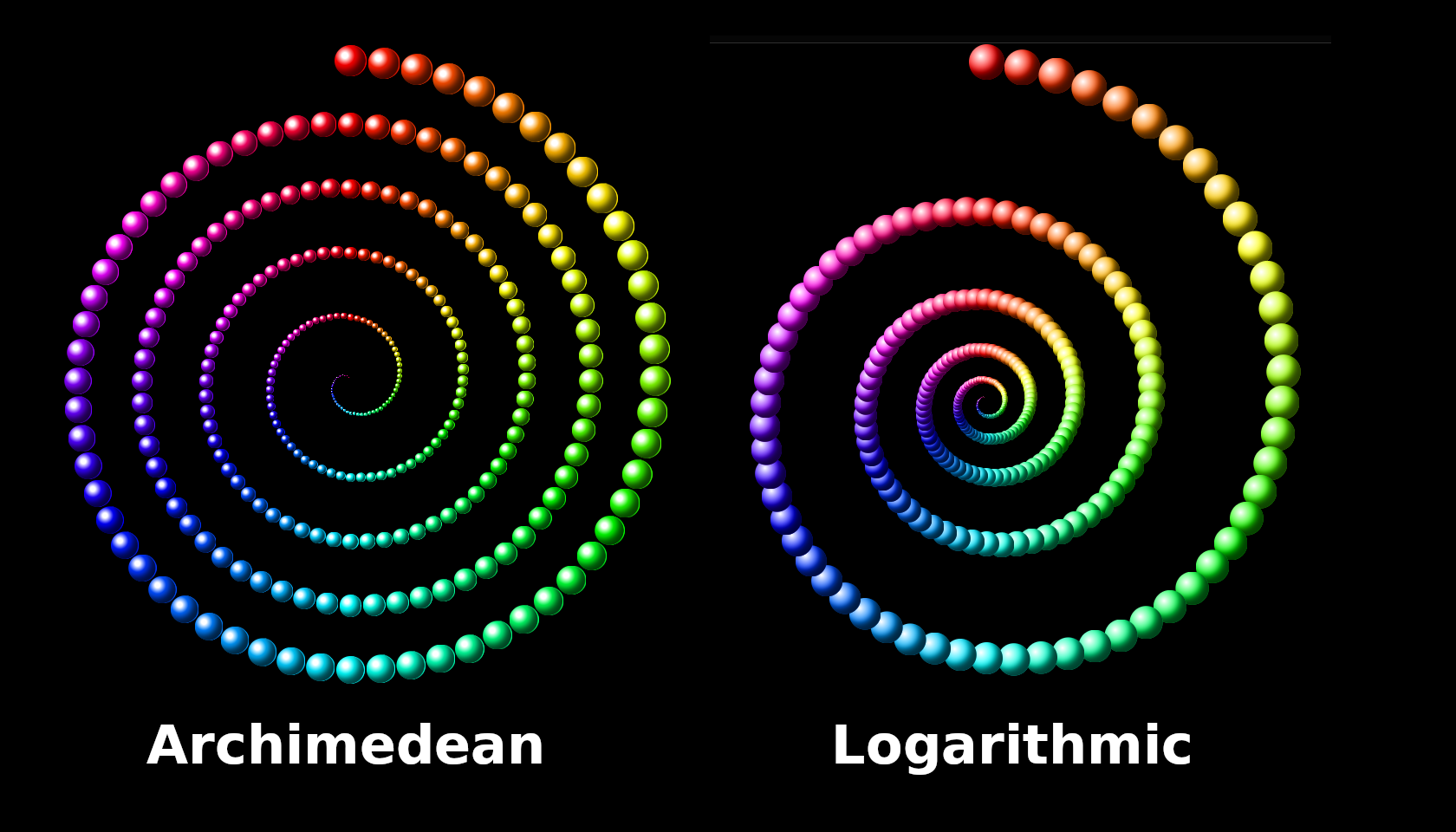
In the Archimedean variant, as the particles go in loops toward the center, the distance shrinks by a steady increment, resulting in the space between the loops being even throughout. In the logarithmic spiral, each particle is a set fraction of the one directly preceding it. For instance: the second particle is 99% of the first. The third is 99% of the second - and 98.01% of the first. Or 99% squared. The fourth is 97.0299% of the first, or 99% cubed. And so on.
In CSS we can achieve a similar effect with nesting.
<div>
  <div>
    <div>
      <div>
        <div>
          <div>
            <div>
              <div>
                <div>
                  <div></div>
                </div>
              </div>
            </div>
          </div>
        </div>
      </div>
    </div>
  </div>
</div>
div {
  position: relative; /* to make sure the parent, not the body, will be the point of reference for the child */
  width: 50%; /* half of the width of the parent */
  aspect-ratio: 1; /* height equals width */
  border: 2px solid;
  display: grid; /* to center the squares inside their containers/parents */
  place-items: center;
}
This produces a series of squares inside a square inside a square:
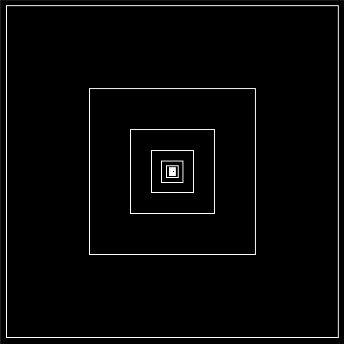
Each square has a width and height of 50% of its parent - but the shrinkage is so dramatic that we can only distinguish 5, maybe 6 squares (out of a total of 10), anything beyond that blends in with the rest. At the same time, unlike in the Archimedean, even if you go up to 1000 in this HTML matryoshka, the width will never be zero. It'll be a half of half of half of half, getting ever closer to zero - but ever slower, and ultimately never reaching it.
Now, we could create our logarithmic spiral that way - but that'd require too much fiddling with HTML: either manually recursively nesting 300 divs, or getting that done with a pre-processor like Pug, which isn't very straightforward, either.
Instead, let's do it with SCSS - reusing the code from the Archimedean:
For the HTML type:
.logarithmic>.arm*300
and press either Enter or Tab for the Emmet extension to instantly spawn 300 copies of <div class="arm"></div>
For the styling, we'll only have to marginally modify the SCSS of the Archimedean spiral:
$particles: 300; /* an SCSS variable defining the number of particles across the whole serpentine; not the same as a CSS variable */

body {
  margin: 0;
  background-color: #000; /* hex code for the color black */
  height: 100vh; /* so that the body takes up the entire viewport's height */
  display: grid; /* we'll want to center the content */
  place-items: center; /* centers the contents of the div horizontally and vertically */
  overflow: hidden;
  font-size: .8vmin; /* setting font size to be .8 of 1% of the shorter viewport dimension (height on desktop, width on mobile  */
}

.logarithmic { /* rather than .archimedean just to match with the HTML setup above */
  position: relative; /* thus the container will be the point of reference for its child, the .foreArm */
  display: flex; /* for centering the content */
  height: 100em; /* using font size as a unit for object size - making it 80% of the shorter vieport dimension */
  aspect-ratio: 1; /* the width is the same as the height */
  justify-content: center; /* we'll want the .arm to be placed at the center of the horizontal axis */
}

.arm { /* the single joint depositing the dots */
  --particles: #{$particles}; /* a proper CSS variable that takes its name and value after its SCSS counterpart */
  --loops: 5;
  position: absolute; /* the container floats freely, independent of any other objects */
  bottom: 50em; /* the bottom end of the .arm is anchored at the center of the viewport */
  height: calc(50em*(1 - var(--turnStep)/var(--particles))); /* each new instance of the .arm will be incrementally shortened by 1/300 of the original height */
  width: 5em; /* that's for defining the width of the dot */
  transform-origin: bottom; /* its pivot point is located at its bottom end */
  rotate: calc(360deg/var(--particles)*var(--turnStep)*var(--loops));
  /* it performs 5 loops of 360 degrees over 300 particles - ergo, each loop is 60 particles, each rotated incrementally by 6deg - but this formula will let you tweak that number  */
}

.arm::before {
  content: '';
  position: absolute;
  inset-inline: 0;
  aspect-ratio: 1;
  --increment: calc(360deg/var(--particles)*var(--loops));
  --color: calc(var(--turnStep)*var(--increment));
  background-image: radial-gradient(at 33% 33%, white, hsl(var(--color) 100% 50%) 50%);
  border-radius: 50%;
  scale: calc(1 - var(--turnStep)/var(--particles));
  box-shadow: inset -1em -1em 1em #000b;
  border-right: 1px solid var(--color);
  rotate: calc(-360deg/var(--particles)*var(--turnStep)*var(--loops));
}

@for $i from 1 through $particles { /* in our case that's 300*/
  .arm:nth-child(#{$i}) {
    --turnStep: #{$i - 1};
  }
}
First, about $particles add:
@use "sass:math";
This will let us use mathematical functions. We're going to need powers - as you might remember from the example of squaring and cubing 99%. We're going to add a second variable right below --turnstep in our for-loop:
@for $i from 1 through $particles { /* in our case that's 300*/
  .arm:nth-child(#{$i}) {
    --turnStep: #{$i - 1};
    --shrinkage: #{ math.pow(.99, $i - 1) }; /* .99 will be reaised to the power that is the current loops $i-1 */
  }
}
What this means .99 will be raised to the power of 0 (which equals 1, so no shrinkage occurs), then to the power of 1, which gives us .99, our default shrinkage factor, then to the powers of 2, 3, 4, all the way to 300.
We'll then apply this variable to change the paradigm of progressive shortening of the .arm:
.arm { /* the single joint depositing the dots */
  --particles: #{$particles};
  --loops: 5;
  position: absolute;
  bottom: 50em;
  height: calc(50em*var(--shrinkage)); /* the shrinkage factor is applied to the arm's default length is 50% of the container  */
  width: 5em;
  transform-origin: bottom;
  rotate: calc(360deg/var(--particles)*var(--turnStep)*var(--loops));
}
That should give us something like this:
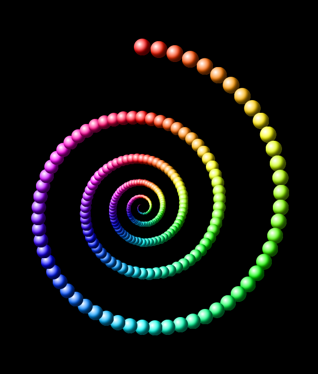
It gives you a nice idea of what we're going for - but the shrinkage of the orbs themselves is still off, so let's take care of that. We need to modify the scale:
.arm::before {
  content: '';
  position: absolute;
  inset-inline: 0;
  aspect-ratio: 1;
  --increment: calc(360deg/var(--particles)*var(--loops));
  --color: calc(var(--turnStep)*var(--increment));
  background-image: radial-gradient(at 33% 33%, white, hsl(var(--color) 100% 50%) 50%);
  border-radius: 50%;

  scale: var(--shrinkage); /* and that's it, no calcs needed */

  box-shadow: inset -1em -1em 1em #000b;
  border-right: 1px solid var(--color);
  rotate: calc(-360deg/var(--particles)*var(--turnStep)*var(--loops));
}
Our scale needs to start at 1 and shrink from there - and .99 to the power of zero is exactly that. The orbs shrink properly now:

But you can play with it some more:
For example, fiddle with the shrinkage factor on that last line of SCSS. It is at .99 - which might seem like barely anything at first. But remember how halving the width/height shrank the squares into mere dots ten steps in. Here we have 300 steps. If we changed it to .98 - again, a seemingly insignificant change - we'd get this:
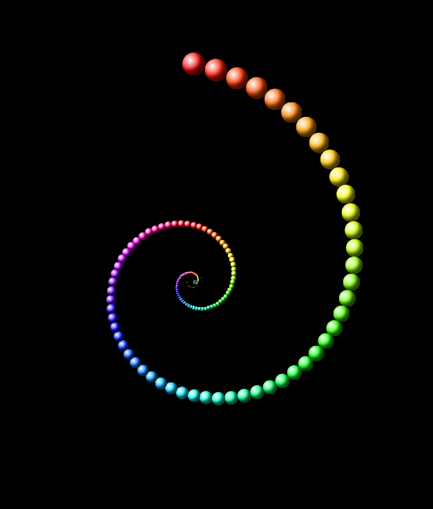
We don't even see much at all beyond the second loop (out of five)
Conversely, a shrinkage factor or .995 results in this:
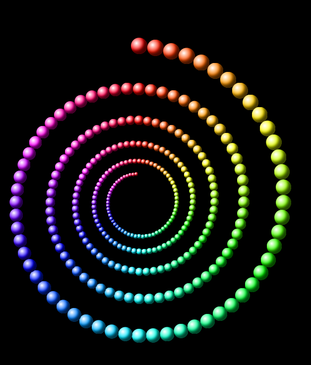
The 5 loops are clearly visible, but the last orb isn't even close to the center. You'd have to add more orbs to cover more ground.
So, depending on the number of loops and the shrinkage factor of your choosing, you'll have to try and decide what looks good.
There are more types of concentric spirals. Archimedes isn't the only one that had one named after him. Fermat, Fibonacci and Cornu had theirs - all very interesting on their own. There's also the hyperbolic spiral. But these are too much math for this series, which focuses more on the fun of CSS. So, upcoming parts will focus on other aspects of styling: extending the serpentine and spiral patterns into the third dimension and animating them.
Subscribe to my newsletter
Read articles from Maciek Fitzner directly inside your inbox. Subscribe to the newsletter, and don't miss out.
Written by
