Three ways to implement an accordion control
 Julian Ewers-Peters
Introduction
Accordions are brilliant, and I am not talking about the Austrian-developed musical instrument, which is popular for singing sea shanties in Germany (whether those are 'brilliant' is a matter of musical taste). I am talking about the type of user control that can be used to expand and collapse sections of content in user interfaces, such as in mobile apps and websites. By allowing the user to navigate content quickly without having to scroll endlessly back and forth, they enhance the user experience of any application and website that features a lot of content that can be split up into sections or sub-sections.
What makes an accordion? Essentially, an accordion is just a collection of expanders that can show and hide their content through user interaction. Many accordions are implemented in such a way that only one single expander of the collection can be expanded at a time, while the remaining expanders are in their collapsed state. When the user selects one of the expanders, it will expand its content while any open expander will collapse its content in that moment.
In the following sections, I will demonstrate three ways how you can implement an accordion that you can tailor to your own needs using my recently published and highly customizable expander control for .NET MAUI. The result will look like this:

Note: You can also use any other Expander control as the base of an accordion as long as it allows you to expand and collapse it programmatically. So, although this post focusses on how this can be done using my own Expander control, the general idea applies to any other appropriate implementation of an Expander.
You can find the sample code from this blog post in the GitHub repository of the expander control.
Note: This blog post uses the MVVM Source Generators of the .NET Community Toolkit to keep the code samples short. Use of the Source Generators is entirely optional.
Excursion: Why implement a new Expander control?
Recently, while porting an app from Xamarin.Forms to .NET MAUI, I came across a problem with the Expander control of the MAUI Community Toolkit (MCT). The Expander of the MCT behaves differently than the Expander of the Xamarin.Forms Community Toolkit (XCT).
This difference imposed a problem, because I couldn't use the Expander for an accordion control anymore in the way that I needed it. Usually, this calls for a bug report or a feature request. However, the differences in the control seem to be deliberate and the implementations differ quite a bit. Also, I needed a solution fast and it felt like a neat addition to my toolbox of open source controls for MAUI.
So, I whipped up my own little Expander control instead and using that, I am going to show you how you can use it to implement your own accordion control. Apart from being easy to use, one of the treats of this Expander is that it comes with simple collapse and expand animations built-in (at the time of writing these are still experimental).
Installing the Expander
The first thing we need to do before we can implement the accordion is adding the epj.Expander.Maui package (version 1.0.2 at the time of writing) from nuget.org to our MAUI app project:

Once that is done, you can optionally enable animations, which requires an explicit opt-in at the time of writing. In order to do this, simply put the following call anywhere in your app, ideally in MauiProgram.cs or App.xaml.cs:
Expander.EnableAnimations();
Now, that the Expander is installed and configured, we can implement the accordion.
Implementing the accordion
There are various use cases and different ways how to approach this. I will show three scenarios that I regard as the most common ones in the following sub-sections. As a general outline, all three accordion implementations will consist of a few instances of the Expander control contained inside of a VerticalStackLayout.
While the first approach will look at an implementation that works without data binding (not using a ViewModel), which is mainly useful for View-only scenarios, e.g. displaying static text, the second example will show a mix of data binding (using a ViewModel) and controlling the accordion's segments from the View's code-behind. Last but not least, the third approach will demonstrate how to control the state of the accordion purely based on data binding (using a ViewModel).
Version 1: View-only accordion
In this first example, the accordion will be built using three explicit, static instances of the Expander. The entire presentation and interaction is fully controlled by the View. This is useful when working with static content, such as long text or images that are not dynamically loaded.
For this, we need to take the following steps:
Add several Expander instances to a VerticalStackLayout
Provide an
x:Nameto the VerticalStackLayout to be able to access it from the code-behindAdd an event handler for the
HeaderTappedevent to the code-behind to be used by each Expander
The XAML of our View could look something like this, for example:
<VerticalStackLayout
  x:Name="AccordionLayout"
  Spacing="6">

  <maui:Expander
    HeaderTapped="Expander_OnHeaderTapped"
    Animated="True">
    <maui:Expander.HeaderContent>
      <Grid
        HeightRequest="80"
        BackgroundColor="Orange">
        <Label
          Text="Expander #1"
          FontSize="Title"
          VerticalOptions="Center"
          HorizontalOptions="Center" />
      </Grid>
    </maui:Expander.HeaderContent>
    <Grid
      HeightRequest="200"
      BackgroundColor="DarkSlateGray">
      <Label
        Text="This is the content of the first expander!"
        VerticalOptions="Center"
        HorizontalOptions="Center" />
    </Grid>
  </maui:Expander>

  <maui:Expander
    HeaderTapped="Expander_OnHeaderTapped"
    Animated="True">
    <maui:Expander.HeaderContent>
      <Grid
        HeightRequest="80"
        BackgroundColor="Orange">
        <Label
          Text="Expander #2"
          FontSize="Title"
          VerticalOptions="Center"
          HorizontalOptions="Center" />
      </Grid>
    </maui:Expander.HeaderContent>
    <Grid
      HeightRequest="200"
      BackgroundColor="DarkSlateGray">
      <Label
        Text="This is the content of the second expander!"
        VerticalOptions="Center"
        HorizontalOptions="Center" />
    </Grid>
  </maui:Expander>

  <maui:Expander
    HeaderTapped="Expander_OnHeaderTapped"
    Animated="True">
    <maui:Expander.HeaderContent>
      <Grid
        HeightRequest="80"
        BackgroundColor="Orange">
        <Label
          Text="Expander #3"
          FontSize="Title"
          VerticalOptions="Center"
          HorizontalOptions="Center" />
      </Grid>
    </maui:Expander.HeaderContent>
    <Grid
      HeightRequest="200"
      BackgroundColor="DarkSlateGray">
      <Label
        Text="This is the content of the third expander!"
        VerticalOptions="Center"
        HorizontalOptions="Center" />
    </Grid>
  </maui:Expander>

</VerticalStackLayout>
Each expander can already be expanded and collapsed separately. Now, in order to add the accordion-style functionality where only one expander is allowed to be in the expanded state at a time, all we need to do is adding the event handler for the HeaderTapped event, which is already set to a method name in the XAML above:
private void Expander_OnHeaderTapped(object sender, ExpandedEventArgs e)
{
    if (sender is not Expander expander)
    {
        return;
    }

    foreach (var child in AccordionLayout.Children)
    {
        if (child is not Expander other)
        {
            continue;
        }

        if (other != expander)
        {
            other.IsExpanded = false;
        }
    }
}
In this event handler, we simply iterate through the child elements of the VerticalStackLayout (which we've called AccordionLayout using the x:Name attribute), and check if the current element is an expander. If it is an expander, we compare it to the expander instance that invoked the event. If the other expander is not the same as the current expander, we simply set its IsExpanded property to false. This will collapse all expanders except for the one that has just been selected by the user.
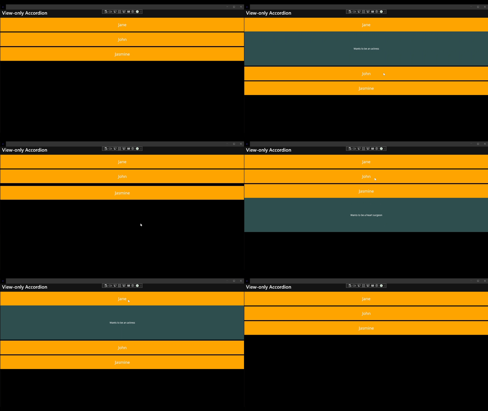
That's all we need to do, the final result should look something like this:

Version 2: Hybrid accordion
In this second example, the accordion will be built by dynamically populating the content using data binding while controlling the interaction from the View. This is useful when the content comes from some form of (external) data source and needs to be loaded dynamically. Here, we keep the user interaction and the business logic strictly separate.
For this approach, we will need to do the following:
Create a simple Model and a ViewModel
Add a VerticalStackLayout and use MAUI's BindableLayout to dynamically bind it to the ViewModel
Provide an
x:Nameto the VerticalStackLayout to be able to access it from the code-behindAdd a DataTemplate using the Expander as the templated control
Add an event handler for the
HeaderTappedevent to the code-behind which will be used by each Expander instance
The Model and ViewModel can be very simple, we basically just need a List of objects to bind to. In this case, I chose to create a simple PersonTuple Model class as well as a HybridAccordionViewModel as the ViewModel. The PersonTuple is just a tuple of two strings and the HybridAccordionViewModel simply holds an observable property which is a List<PersonTuple>:
public class PersonTuple : Tuple<string, string>
{
    public PersonTuple(string item1, string item2) : base(item1, item2) { }
}

public partial class HybridAccordionViewModel : ObservableObject
{
    [ObservableProperty]
    private List<PersonTuple> _people;

    public HybridAccordionViewModel()
    {
        People = new List<PersonTuple>
        {
            new("Jane", "Wants to be an actress"),
            new("John", "Wants to be a rock musician"),
            new("Jasmine", "Wants to be a heart surgeon")
        };
    }
}
With this set up, the next thing we need is the View. The XAML in this example is much shorter, because we dynamically create the Expander instances via the BindableLayout.ItemTemplate which is attached to a VerticalStackLayout:
<VerticalStackLayout
  x:Name="AccordionLayout"
  Spacing="6"
  BindableLayout.ItemsSource="{Binding People}">
  <BindableLayout.ItemTemplate>
    <DataTemplate x:DataType="{x:Type hybrid:PersonTuple}">

      <maui:Expander
        Animated="True"
        HeaderTapped="Expander_OnHeaderTapped">
        <maui:Expander.HeaderContent>
          <Grid
            HeightRequest="80"
            BackgroundColor="Orange">
            <Label
              Text="{Binding Item1}"
              FontSize="Title"
              VerticalOptions="Center"
              HorizontalOptions="Center" />
          </Grid>
        </maui:Expander.HeaderContent>
        <Grid
          HeightRequest="200"
          BackgroundColor="DarkSlateGray">
          <Label
            Text="{Binding Item2}"
            VerticalOptions="Center"
            HorizontalOptions="Center" />
        </Grid>
      </maui:Expander>

    </DataTemplate>
  </BindableLayout.ItemTemplate>
</VerticalStackLayout>
Here, we're telling the DataTemplate that the data type (indicated by x:DataType) is the previously created PersonTuple class (which is also useful for compiled bindings). Then, we can bind to Item1 and Item2 of the tuple, the first item holds the name and the second one some additional info about a person.
Last, but not least, we need to set up the event handler (which is identical to the one from the previous example), and set the BindingContext in the code-behind of the Page to the ViewModel:
public partial class HybridAccordionPage : ContentPage
{
    public HybridAccordionPage()
    {
        InitializeComponent();
        BindingContext = new HybridAccordionViewModel();
    }

    private void Expander_OnHeaderTapped(object sender, ExpandedEventArgs e)
    {
        if (sender is not Expander expander)
        {
            return;
        }

        foreach (var child in AccordionLayout.Children)
        {
            if (child is not Expander other)
            {
                continue;
            }

            if (other != expander)
            {
                other.IsExpanded = false;
            }
        }
    }
}
Just like that, we're already done with the hybrid approach, which combines data-binding and view-based control over the state of the Expander instances.
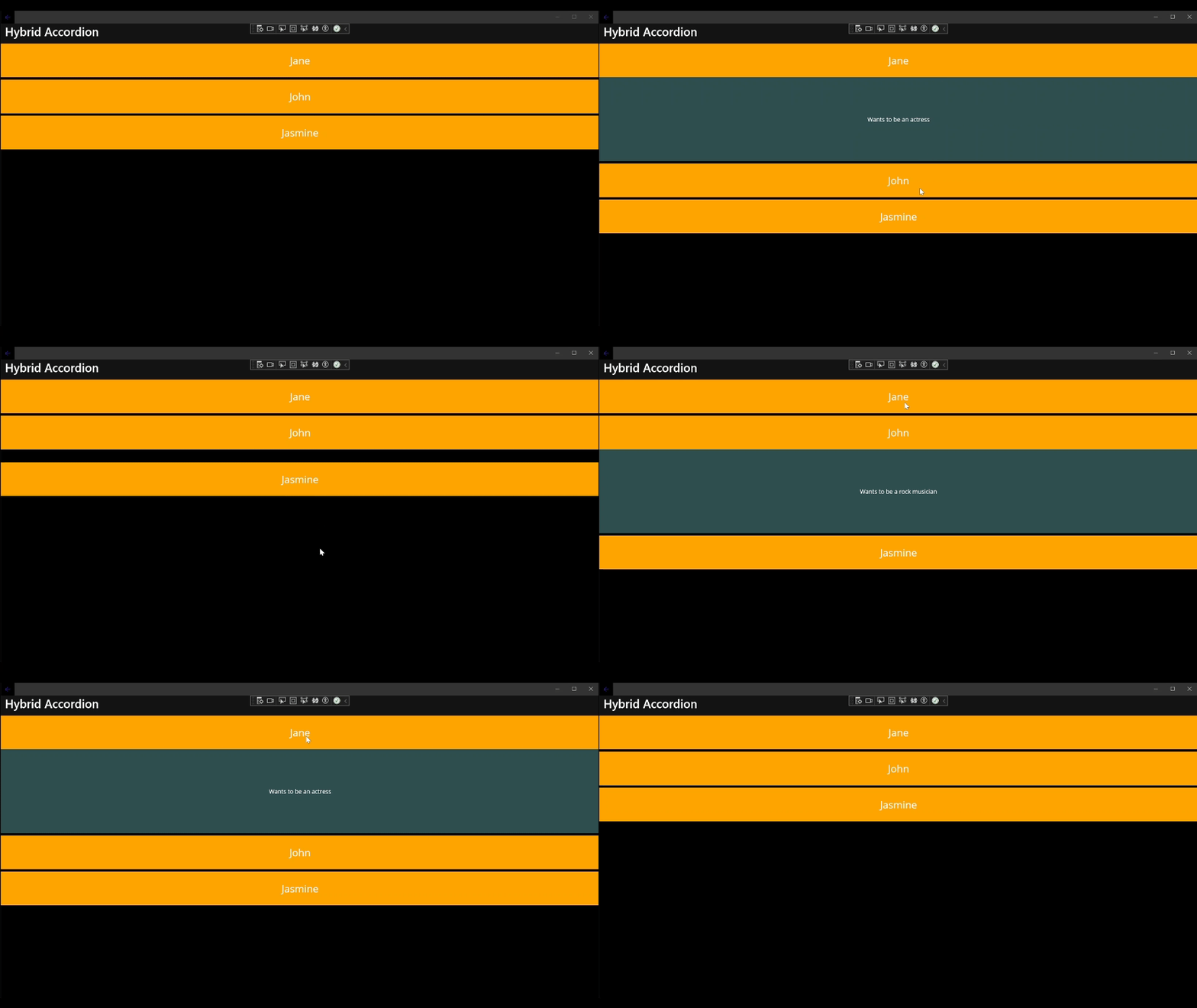
Like in the previous example, the finished accordion should look like this:

Version 3: Data binding-controlled accordion
In this third and last example, the accordion will be built by populating the content dynamically while also controlling the entire interaction from within the ViewModel using data binding only. This is useful when the user interaction directly affects the business logic, e.g. by updating the status of an object (such as item selection). The beauty of this approach is that the ViewModel still doesn't know anything about the user interaction or the View, at all - thanks to the MVVM pattern and data binding.
In order to achieve this, we need do these things:
Create a Model with a
SelectedpropertyCreate a simple ViewModel that holds a list of objects to bind to
Add a
SelectItemCommandto the ViewModel to update the item selectionAdd a VerticalStackLayout and use the BindableLayout to dynamically bind to the ViewModel
Add a DataTemplate using the Expander as the templated control
Bind the
IsExpandedproperty of the Expander to theSelectedproperty of the Model class
The Model class I have created for this is called PersonModel and has three observable properties:
public partial class PersonModel : ObservableObject
{
    [ObservableProperty]
    private string _name;

    [ObservableProperty]
    private string _description;

    [ObservableProperty]
    private bool _selected;
}
This is then used in the ViewModel, similar to the previous example. The ViewModel is called DataBindingAccordionViewModel, and it holds a List<PersonModel and exposes the SelectItemCommand mentioned above:
public partial class DataBindingAccordionViewModel : ObservableObject
{
    [ObservableProperty]
    private List<PersonModel> _people;

    public DataBindingAccordionViewModel()
    {
        People = new List<PersonModel>
        {
            new()
            {
                Name = "Jane",
                Description = "Wants to be an actress"
            },
            new()
            {
                Name = "John",
                Description = "Wants to be a rock musician"
            },
            new()
            {
                Name = "Jasmine",
                Description = "Wants to be a heart surgeon"
            },
        };
    }

    [RelayCommand]
    private void SelectItem(PersonModel item)
    {
        item.Selected = !item.Selected;

        foreach (var person in People)
        {
            if (person != item)
            {
                person.Selected = false;
            }
        }
    }
}
Note: The
SelectItemCommandis auto-generated from theSelectItem()method via the[RelayCommand]code generator attribute
The XAML of the View looks quite similar to the previous example, but this time there is no event handler and instead the Command property of the Expander binds to the SelectItemCommand of the ViewModel and the current instance of the PersonModel is used as the argument for the CommandParameter property of the Expander. Additionally, the IsExpanded property of the Expander binds to the Selected property of the Model:
<VerticalStackLayout
  Spacing="6"
  BindableLayout.ItemsSource="{Binding People}">
  <BindableLayout.ItemTemplate>
    <DataTemplate x:DataType="dataBinding:PersonModel">

      <maui:Expander
        Animated="True"
        Command="{Binding SelectItemCommand, Source={RelativeSource AncestorType={x:Type dataBinding:DataBindingAccordionViewModel}}}"
        CommandParameter="{Binding .}"
        IsExpanded="{Binding Selected}">
        <maui:Expander.HeaderContent>
          <Grid
            HeightRequest="80"
            BackgroundColor="Orange">
            <Label
              Text="{Binding Name}"
              FontSize="Title"
              VerticalOptions="Center"
              HorizontalOptions="Center" />
          </Grid>
        </maui:Expander.HeaderContent>
        <Grid
          HeightRequest="200"
          BackgroundColor="DarkSlateGray">
          <Label
            Text="{Binding Description}"
            VerticalOptions="Center"
            HorizontalOptions="Center" />
        </Grid>
      </maui:Expander>

    </DataTemplate>
  </BindableLayout.ItemTemplate>
</VerticalStackLayout>
In the code-behind, we only need to set the BindingContext to the ViewModel:
public DataBindingAccordionPage()
{
    InitializeComponent();
    BindingContext = new DataBindingAccordionViewModel();
}
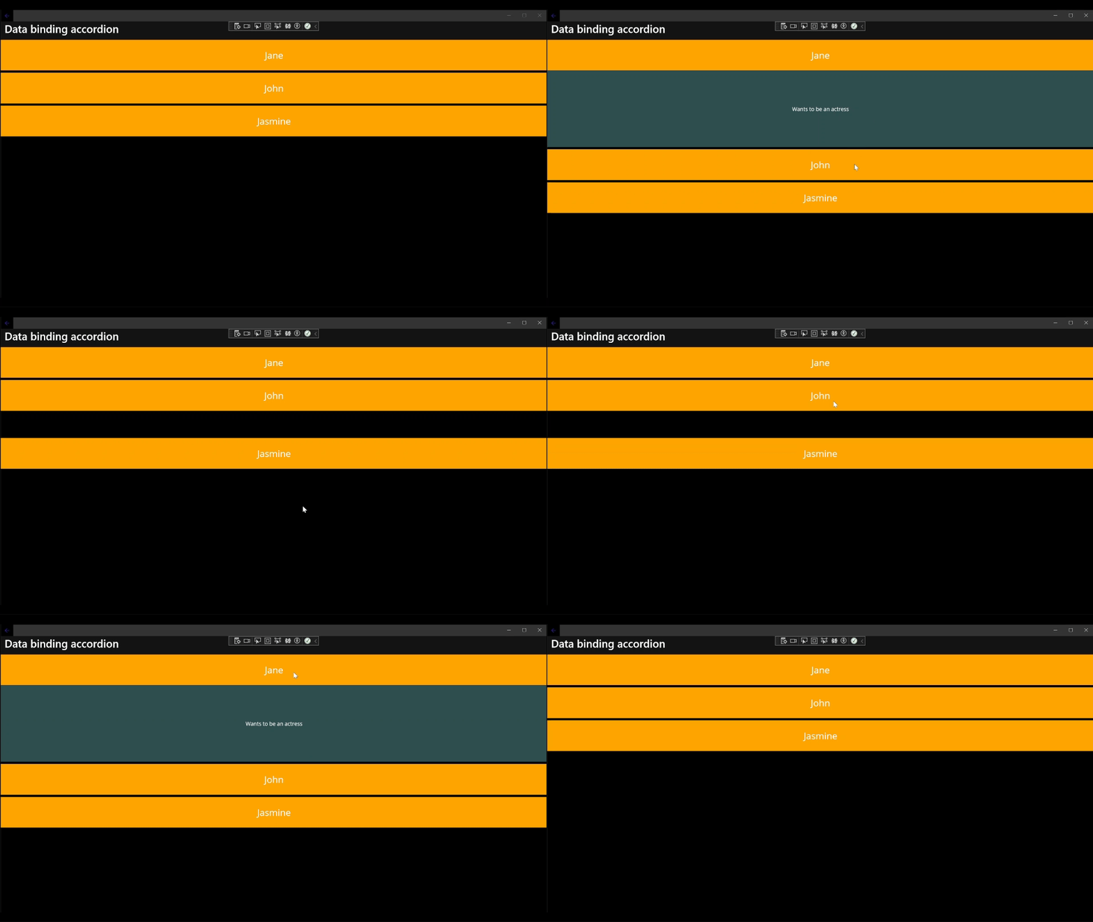
Now, when we run this, it should look like this, but this time, everything is entirely controlled by the ViewModel:

Conclusions and Next Steps
It's incredibly easy to enhance the user experience of your .NET MAUI app by using Expanders and Accordion controls. I have demonstrated three different approaches for the implementation of an Accordion that you can apply based on the requirements and use cases of your app, so that your app users will spend less time scrolling and can find the content they're looking for faster.
I hope this is useful for you. If you enjoyed this blog post, then follow me on LinkedIn, subscribe to this blog and star the GitHub repository of this post and also check out my MAUI Samples repository, so you don't miss out on any future posts and developments.
Attributions
Title photo by Dominik Vanyi on Unsplash
Subscribe to my newsletter
Read articles from Julian Ewers-Peters directly inside your inbox. Subscribe to the newsletter, and don't miss out.
Written by

Julian Ewers-Peters
Julian Ewers-Peters
I am a passionate mobile app and software developer with a focus on C# .NET, Xamarin.Forms and .NET MAUI.