Unboxing the Magic of CSS: Understanding the Website Box Model
 Shri
Shri
Have you ever received a long-awaited package in the mail, only to be captivated by the layers of protection and presentation that surround the item inside? Just as a carefully wrapped box holds the promise of exciting treasures, websites are also constructed with a similar concept in mind – the CSS box model. Much like the layers that shield your precious order, the CSS box model forms the foundation of how web content is organized, presented, and spaced. In this journey of exploration, we'll peel back the layers of this concept, using the analogy of online order delivery to demystify the core components that structure a website. So, let's embark on an adventure to unbox the magic of CSS and unravel the secrets of the website box model!
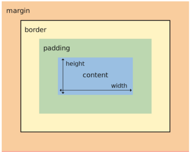
In the CSS box model, every HTML element is treated as a box with 4 areas. The areas are shown in the diagram below.

We will be exploring all the sections mentioned in the above diagram in detail with the help of a simple analogy.
Imagine you're ordering a special toy online, and when it arrives, it's in a box. This box has a few different parts that protect the toy and make sure it looks nice when you open it.
The Toy Inside (Content): Inside the box, there's the amazing toy you ordered. This is like the main part of a website, where all the important information, pictures, and buttons are.
Box's Outer Frame (Border): Now, around the toy, there's a frame. It's like the edges of the box that go around the toy. This frame makes the toy stand out and helps keep it safe. On a website, the frame is like the border you can put around things to make them look special.
Empty Space Around the Box (Padding): Outside the frame, there's a little bit of empty space. It's like the space between the toy and the edges of the box. This space makes sure the toy isn't too close to the edges and has some room to breathe. On a website, this empty space is called padding, and it helps things not get too crowded together.
The Box Itself (Margin): Around the whole box with the toy and the frame, there's some more space. This space is like the area around the box itself. It's not part of the box, but it keeps the box from being too close to other things. On a website, this space is called margin. It helps keep different parts of the website from being too squished together.
So, just like when you order a toy and it comes in a box with layers to keep it safe and nice-looking, a website has these layers too. The CSS box model helps decide how much space each part of the website needs, just like the layers in the box help make sure your toy arrives in perfect condition!
Thanks for your time! Happy learning!
Peace
Subscribe to my newsletter
Read articles from Shri directly inside your inbox. Subscribe to the newsletter, and don't miss out.
Written by

Shri
Shri
I am an aspiring software developer, currently learning Web dev. I write blogs sharing my knowledge as well as my tech journey.