All About Theming in Jetpack Compose
 Michelle and Jeremy

In mobile app development, creating visually appealing and consistent UIs is important. Having talked about creating Dynamic UIs in the previous article, one essential thing to consider has to be the theme of your application. So in this article, we are going to explore how theming works in Jetpack Compose and see its implementation.
Theming refers to applying consistent visual and behavioral attributes throughout an application, resulting in a distinct yet unified appearance.
Getting started with Theming
All material design components(Buttons, textfield, cards, etc.) are built on top of material theming. Material 3 comprises the following subsystems to add theming to your app: color scheme, typography and shapes.
When you create a new Compose project on Android Studio it adds a new package called UI.theme.That contains 4 Kotlin files :
Colors. kt
Type. kt
Shape. kt
Theme. kt
Now let's look at each subsystem
Colors: Adding life to your UI
Material 3 comes with a list of predefined colors that are divided into two:
1.) Accent colors i.e. Primary Key Color, Secondary Key Color and Tertiary Key Color
2.) Neutral colors i.e. Neutral Key color and Natural Variant Key Color.
Every accent color, spanning primary, secondary, and tertiary shades, is matched with four complementary colors showcasing a range of tones. These combinations are used to mix, highlight components, and convey visual stories. Similarly, neutral shades are sorted into four harmonious tones that form the foundation for surfaces and backgrounds. These tonal variations also play a pivotal role in enhancing text icons when placed on different surfaces.
One can choose to to create your own ColorScheme manually but it is often easier to generate one using The Material Theme Builder tool.
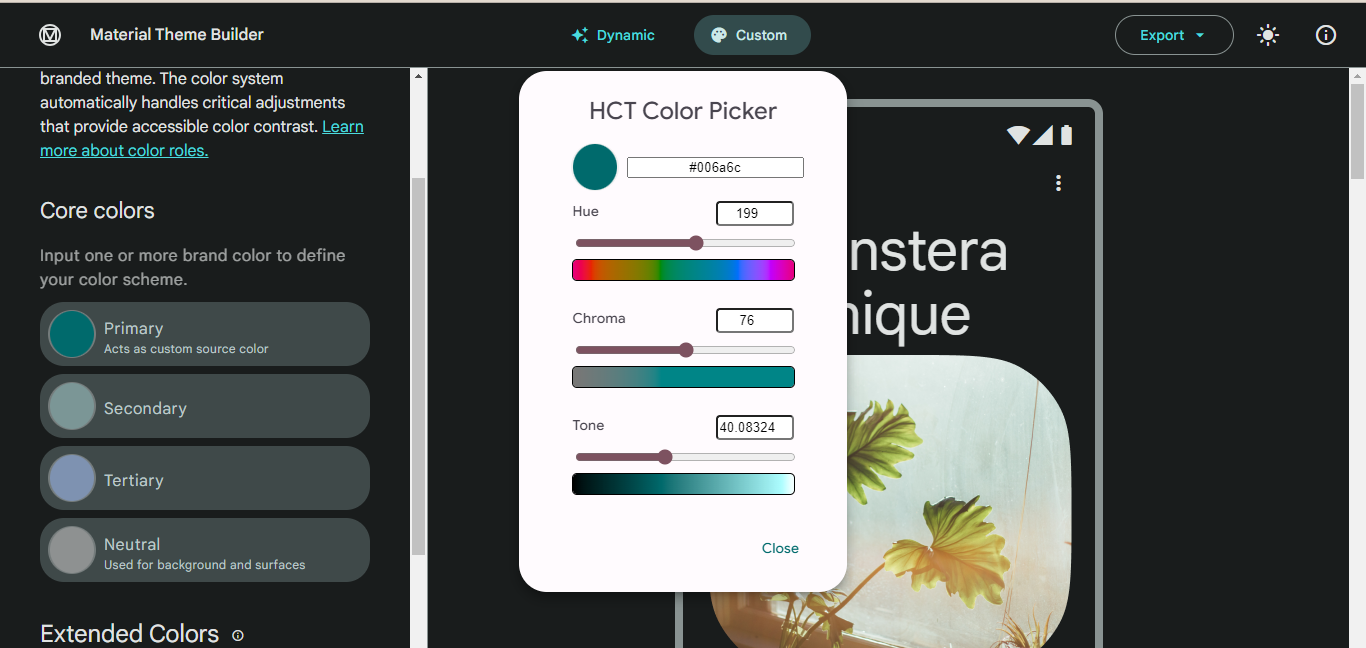
After using a material theme builder and you are already done setting up your theme, you use the export button to get the theme you generated.

Here is an example of a ColorScheme created manually
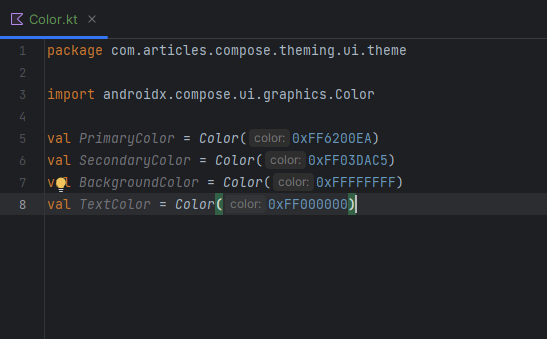
After modifying the Colors.kt file it is possible to use the colors anywhere in your application.
Typography: Beyond words
Typography involves more than just choosing a font for your app; it shapes the overall tone, readability, and user experience. Jetpack Compose provides a Type.kt file to define typography styles for our application. One can use 5 typography styles in their application: headlineSmall, titleLarge, bodyLarge, bodyMedium, and labelMedium.
Jetpack Compose supports the use of custom fonts, enabling you to select typefaces that align with your app's identity.
With Jetpack Compose's typography, you can easily adjust font weight and size for each text style. This fine-tuning ensures optimal readability and visual balance.
Here is an example of how you can modify our file:
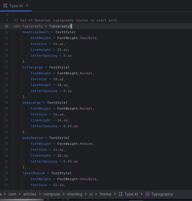
By mastering the Typography object, experimenting with custom fonts, and prioritizing accessibility, you can create an app that not only looks good but also ensures an enjoyable and inclusive user experience
You can also check out the Material 3 type scale
Shapes: Creating Unique Visual Elements
Shapes define the outline and appearance of UI elements. Material surfaces can be displayed in different shapes. Material 3 shape scale is similar to the type scale, which enables an expressive range of shapes across the UI. There are different sizes of shapes in the shape scale: Extra small, Small, Medium, Large and Extra large
Jetpack Compose allows you to customize the default shapes according to your app's aesthetics. This customization can involve adjusting corner radii, creating intricate outlines, or even experimenting with non-traditional shapes.
Shapes play a pivotal role in creating a visual hierarchy within user interfaces by imparting a sense of depth and dimension to various elements. For example, rounded corners can lend a gentle and approachable look to cards, whereas sharp edges can infuse buttons with a contemporary and modern feel.
The shape modifier allows you to infuse depth, dimension, and uniqueness into different parts of your interface.
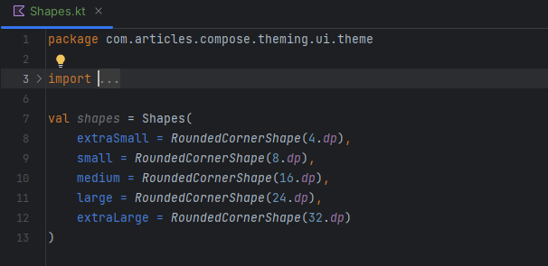
Putting It All Together: Creating a Theme
The Theme. kt generated file(we find it in the file we exported from the Material Theme Builder) contains a setup for Light and Dark color schemes.
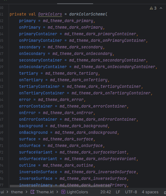
Here is where we also find the main theming composable function AppTheme()
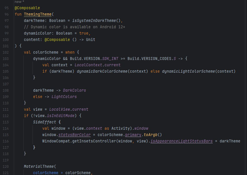
After this, you can implement themes in different parts of our application by adding AppTheme().
Theming in Jetpack Compose empowers developers to create visually consistent and aesthetically pleasing user interfaces. By leveraging colors, typography, and shapes, you can define a unique and engaging experience for your app users. With the code examples provided in this article, you're well on your way to mastering theming in Jetpack Compose and taking your Android app development to the next level.
You can also check out this codelab to learn more about theming!!
Subscribe to my newsletter
Read articles from Michelle and Jeremy directly inside your inbox. Subscribe to the newsletter, and don't miss out.
Written by
