Information Architecture: The Invisible Force Behind Great User Experiences
 Lucky Sikolia
UX researchers should understand how to convert research data into actionable information. This is the foundation for effective information design, needed to create user-friendly and engaging products.
What is Information Architecture?
Information architecture (IA) is the practice of organising, classifying, and structuring information in a manner that makes it easy for users to find and understand. UX researchers play a key role in IA by conducting user research to understand the needs of users and creating prototypes to test different designs.
The book, Everyday Information Architecture, provides one of the tactics used to organise information in IA. According to the author, Richard Wurman the LATCH framework has five components namely location, alphabet, time, category and information hierarchy. Each component has a distinct impact on how information is displayed. For example, 'Location' denotes grouping based on geographical location, as with e-commerce sites; 'Alphabet' denotes alphabetical arrangements; 'Time' denotes chronological organisation; 'Category' groups related items; and 'Hierarchy' establishes a structure based on the importance of the information. Although this framework is not set in stone it serves as an ideal starting point for anyone getting into IA.
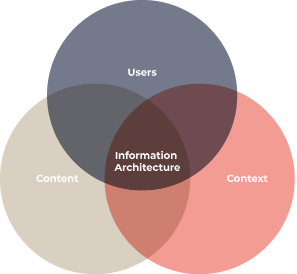
Information ecology is a pivotal component of IA highlighting the interplay between context, content, and users in shaping the perception of information. Understanding the influence of this interdependence enables UX teams to effectively communicate the product vision to stakeholders and set realistic expectations. A comprehensive grasp of information ecology's impact culminates in the creation of products that seamlessly cater to user needs, resulting in an engaging and user-friendly experience.

Principles of IA
These principles underpin the effective implementation of information ecology.
Categorising Information: Alignment with user needs is essential. Understanding their goals and information requirements ensures a meaningful organisation.
Clear Labels: Employ concise and lucid labels to describe information. This enhances user comprehension and retention.
Consistent Structure: Ensuring uniformity in how information is presented across platforms promotes user familiarity and effective system usage.
Utilising Visual Cues: Strategically employ icons, search bars, and menus to aid users during navigation, facilitating a smooth interaction with the system.
Since IA is a practice it is important to document the deliverables created. Sitemaps are one of the most common deliverables.
What is a sitemap?
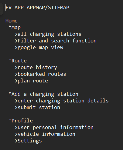
A sitemap is a visual representation of the hierarchical structure of a website or a digital application. It communicates the arrangement of information and how users can navigate the system. Sitemaps can be used to plan the system structure, content organization, and navigation pathways.
Example of a sitemap for an EV charging app

What is a user flow?
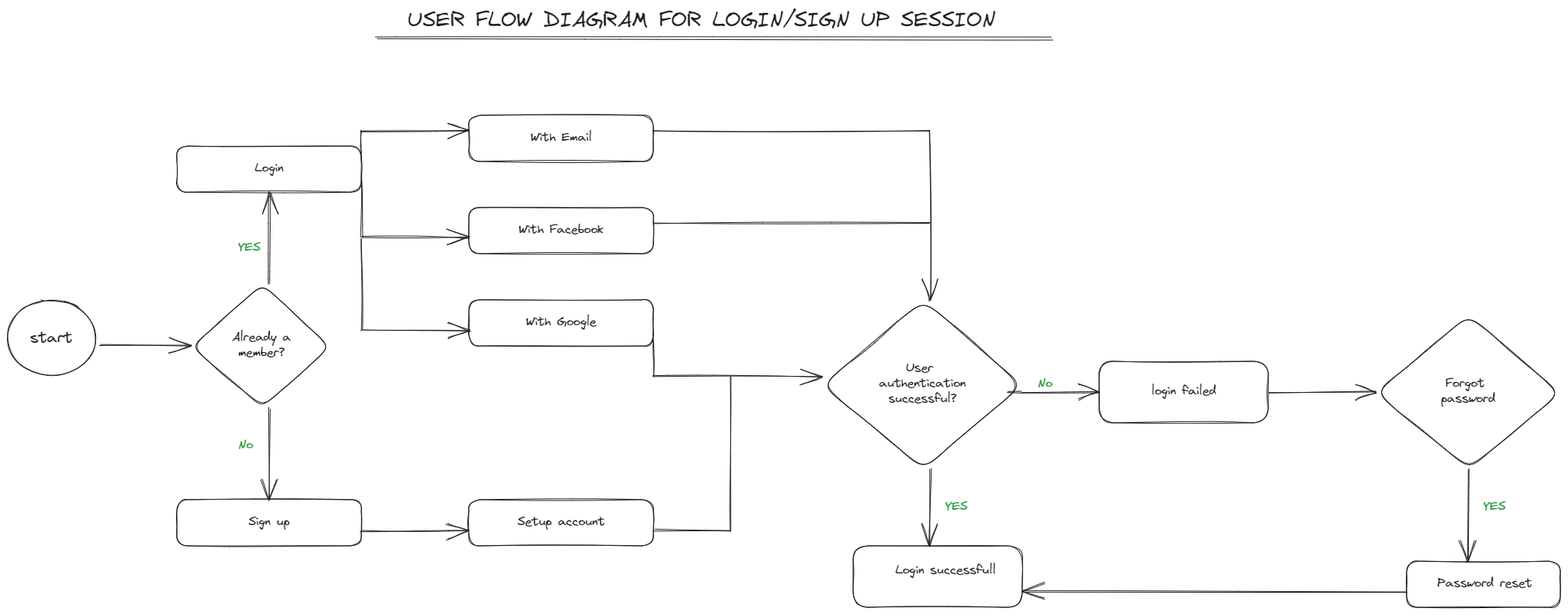
A user flow is a diagram that outlines the user's journey through the product, detailing every action they perform, from the initial access point to the last interaction. User flows can be used to understand human behaviour and identify potential pain points.

Example of a user flow
How do sitemaps and user flows differ?
When describing what a sitemap is, many designers mix user flow and sitemap diagrams. This is not true. Here are the distinctions between a sitemap and a user flow to help clear up any misunderstanding.
A sitemap provides a summary of the system's overall architecture. Consider it as a general perspective that shows you where you can travel. While a user flow provides detailed instructions for getting from point A to point B.
Sitemaps are static in that they focus on the arrangement of information and their hierarchy while user flows are dynamic as they show paths taken by users as they interact with the system.
Sitemaps are used for planning the system structure, content organization and navigation pathways while user flows are used to understand human behaviour and recognize potential pain points.
How do sitemaps and user flows improve user experience?
Maintain consistency. Sitemaps can be used to ensure that the information architecture reflected in the user flows is consistent. This helps users to easily find the information they need.
Scenario visualization. User flows can be used to visualize how users are moving through the system to achieve their goals. This can help designers to identify potential pain points and improve the user experience.
Iterative improvement. Sitemaps and user flows can be used to track changes to the system and make improvements based on user feedback. This helps to ensure that the system is constantly evolving to meet the needs of users.
Cross-functional communication. Sitemaps and user flows can be used to communicate the system structure and user journey across different teams. This helps to ensure that everyone is on the same page and working towards the same goals.
Closing thoughts
UX researchers who can convert research data into actionable information are key to creating intuitive and user-friendly digital products. Mastery of information architecture, sitemaps, and user flows is essential for this, as these tools help to ensure that products are aligned with stakeholder goals and delightful to use.
Subscribe to my newsletter
Read articles from Lucky Sikolia directly inside your inbox. Subscribe to the newsletter, and don't miss out.
Written by
