The Necessity of Interactive Reports
 Bold Reports Team
An increasing number of organizations are implementing technology in their businesses and need to strategically communicate relevant information through interactive reports. In essence, an interactive report should easily integrate data from sources such as files, databases, and cloud applications, and they should allow users to independently perform deeper analysis and create custom reports on demand. This article describes the necessity of interactive reports.
Content
What are interactive reports?
Why choose interactive reports?
How to perform interactive analysis using Bold Reports
Conclusion
What are interactive reports?
An interactive report is a comprehensive business intelligence solution that includes dynamic multidimensional analysis and reporting. Interactive reports provide top-to-bottom analysis, including all business information. These features allow end users to create highly customizable reports. An organization’s end users will always be able to customize a report’s layout by exposing specific columns, applying filters, sorting, and highlighting.
Interactive reports easily integrate data sources and reduce an organization’s development time with a rich point-and-click interface.
Why choose interactive reports?
Interactive reports support real-time analysis. You can drill down in a report to the lowest level of data to view the root cause of the visual outcome.
Ultimately, the consumer can always construct a report using interactive sorting. You can set multiple fields with sorting and filtering functionality so the report can be interacted with anytime
Interactive reports allow users to drill into the data that interests them by expanding and collapsing sections within a report.
Interactive reports specify the data to use in a report, connect related reports, and control report presentation.
How to perform interactive analysis using Bold Reports
To display data and information in detail, Bold Reports supports SQL RDL reporting’s extremely powerful interactive features, such as drilling through, drilling down, interactive sorting, bookmarks or anchors, document maps, and hyperlinks.
1. Drilling through reports
Drilling through allows end users to click on data values in a report to view related data in child reports. Small or large organizations can have detailed data in separate child reports, and they can pass parameters to filter and display data when an end-user clicks a link.
2. Drill-down reports
Drill-down reports, also known as toggle items, have options that let your end users view sections of a report by expanding and collapsing them at runtime. You can show or hide static rows and columns associated with groups in a table or matrix (pivot table). You can also use a subreport or nested data-region report items to show detailed records.
3. Hyperlinks
A user can click to open external web pages in a browser window that shows a static or dynamic URL’s value expression. Using Bold Report Designer, you can allow an end user to use hyperlink actions in text boxes, images, charts, and gauges. The hyperlink can contain a data field or other expression.
4. Document map
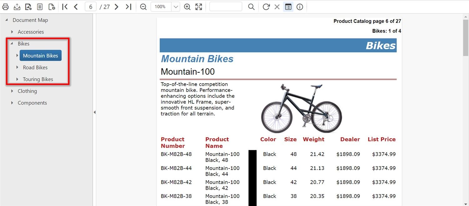
The document map displays a separate side pane or table of contents (TOC) next to the report. Clicking a link in the document map jumps to the respective report page. All document map items of the report sections and table groups are arranged in hierarchy of links.

Document Map
5. Bookmarks or anchors
A bookmark allows end users to click on data values to navigate to specific content while viewing reports easily and exporting documents. Bookmarks are supported in text boxes, tables, maps, images, charts, and gauges.
6. Interactive sorting
Table report items are displayed with sort icons in a column header or group header cell, enabling a user to sort or reverse the sort order of a column. A large or small business can specify sorting criteria for groups, rows, or columns. You can also combine fields into a single group expression.
7. Nested data regions
You can visualize reports with nested data regions by placing charts, maps, gauges, and indicators inside another data region to display data and information in detail.

Nested data regions
Conclusion
In conclusion, the necessity of interactive reports in today’s data-driven world cannot be overstated. As businesses face ever-increasing volumes of information, static and traditional reports fall short in delivering the insights required for making critical decisions. Interactive reports, on the other hand, provide a dynamic and engaging experience, enabling users to explore data, uncover patterns, and gain a deeper understanding of complex datasets.
To explore more, look through our demo samples and documentation site. If you have any questions, please post them in the comments section. You can also contact us through our contact page, or if you already have an account, you can log in to ask your support question.
Bold Reports offers a 15-day free trial without any credit card information required. We welcome you to start a free trial and experience Bold Reports. Try it, and let us know what you think!
Subscribe to my newsletter
Read articles from Bold Reports Team directly inside your inbox. Subscribe to the newsletter, and don't miss out.
Written by
