Ep. 17: Motion
 Oluwasegun Idowu
Udemy Course: Complete Web & Mobile Designer in 2023: UI/UX, Figma, + more by Andrei Neagoie & Daniel Schifano.
Episode 17: Motion
Introduction
In this episode, we will be looking into motion. Motion is something every product designer should use in their design, it doesn't necessarily mean that you need to incorporate some complex animations or micro-interactions and stuff like that.
Motion can help add that level of polish to designs, also it can create an overall great user experience for users.
The Importance of Motion
Having beautiful swipes, beautiful state changes and seeing little micro-interaction for example when something is added to the cart, helps improve the experience of the user towards your product as users are easily able to follow along.
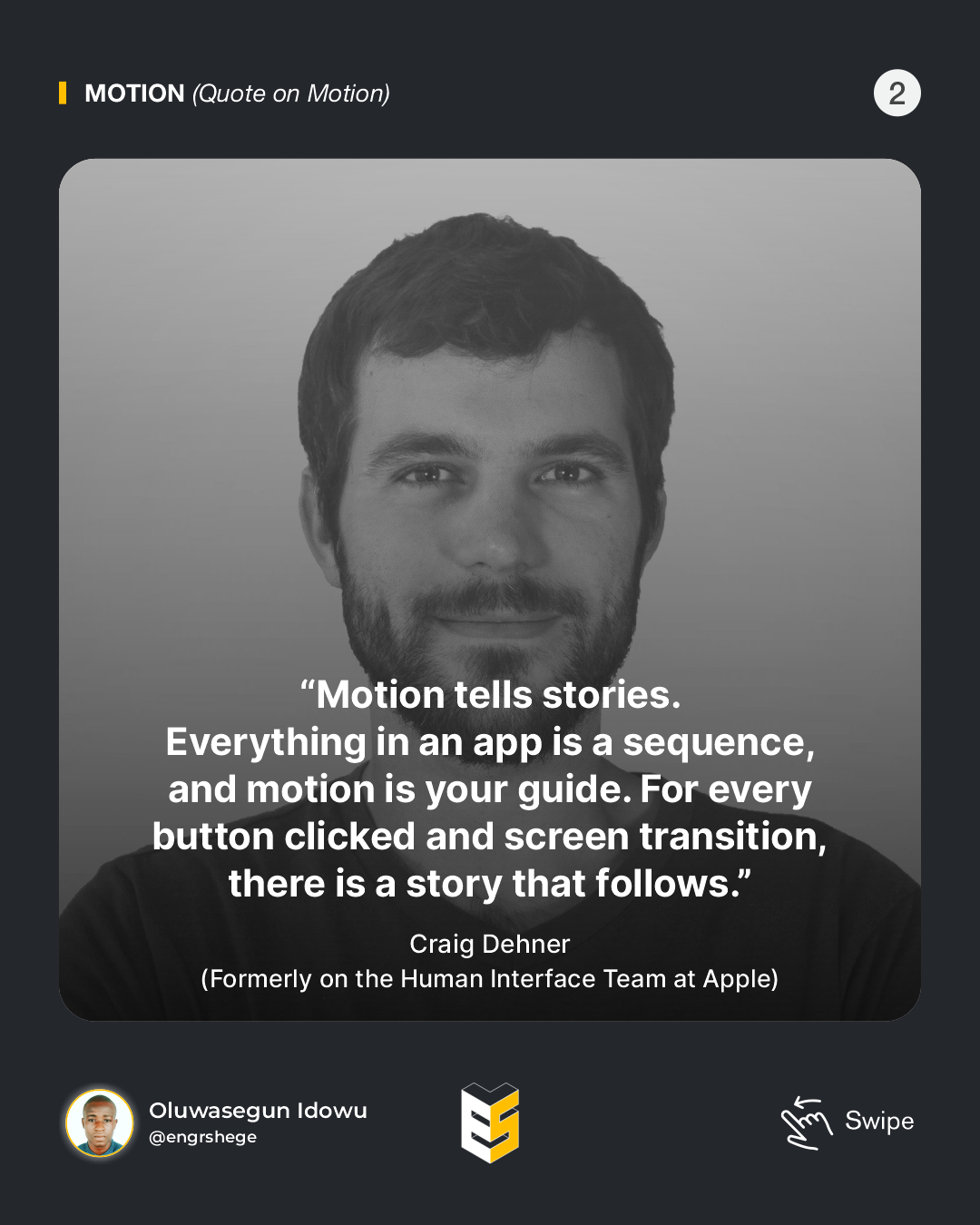
Now, this is a lovely quote by Craig Dehner, (formerly on the Human Interface Team at Apple). "Motion tells stories. Everything in an App is a sequence, and motion is your guide. For every button clicked and screen transition, there is a story that follows."

This quote is so true. Your motion should help tell your product story, whether that be moving from one screen to the next or just adding something and getting some sort of visual cue. It could help, not only tell that story but also heighten that brand's experience for the user.
Motion is Often an Afterthought.
The truth is that motion is often an afterthought. Although, motion is very important; nevertheless, designers who try to incorporate motion usually do it based on gut feeling or they do it way too late in the process and it comes off looking kind of amateurish. This means there is not a lot of thought put into it and that's just the wrong way to go about it.
Sometimes, this could be due to tight deadlines and we can't always put that level of polish into our designs. But, motion is incredibly important and we should strive to incorporate that earlier into our design process.
Too Much Motion can Degrade the User Experience. Think about tone!
Although motion is very important, but should be used in moderation. Use it as a tool for providing users with easily noticeable smooth feedback.
For Example:
Animations
This is a nice little animation and we don't necessarily need to do this but this is thoughtful and fits well into what this designer is using it for. Little unobtrusive animations like that are nice for the user experience as they create great delight but that's not all that motion is used for.
Motion for State Changes
Let's take a look at Motion for State Changes which prevents just any type of disorientation. When a user clicks on a card in this App over here, you can tell easily where you're going and there isn't any disorientation.
Purpose of Motion
When we subtly use motion, it helps build these mental models about how the system works and how users can interact with it.
Instead of creating animations just for delays, that's okay too, but we can use these animations or motion in general for usability. Think of clues for what is happening within your product or maybe signifiers for how certain UI elements will behave.
The first thing I want to talk about is;
State Transitions.
This is huge within the design, especially when we are moving across a mobile app or just a web app in terms of different transitions between screens.
State changes in your user interface can involve really hard cuts. A change from one screen to another without any transition whatsoever is a Big No-No which makes things difficult to follow.
Think about this; if you are to open a door, as you start to push the door open slowly the new room begins to appear to you. These same rules apply to digital products. Can you imagine, if you just tap the door and you're immediately in that room you want to be in? This will be very weird and disorientating.
The next thing to talk about is;
Visual Feedback.
Users want to know their current context within a system at any given time, and you should not keep them guessing. That could mean like, the visual feedback of an element being in an active state (like an element within your navigation).
Using just animation or motion to tell the user what is happening with feedback makes the user feel like they are interacting with visual elements on the screen. Pressing the button is one way to do it.
The last thing to point out under the purpose of the motion is;
Visual Cues.
When a user starts using a product, it may be unclear to them how to do something or where to look and that's normal. That's why Visual Cues are important in making their experience as delightful and easy to use as possible.
Animations can help guide the user's attention in certain areas. It aims to direct users' focus to the right spot at the right time.
So, this is true, especially in onboarding features(i.e. onboarding for learning how to use an app). You can think about when a user first comes to an app and they are given a tour/hint on how to use the products.
Those are the different ways you can use animation and motion in your product to make your product have a much better experience for users and; make your motions and animations much more purposeful.
Intro to Smart Animate
The different types of properties Figma smart animate supports are:
Scale
%[https://youtube.com/shorts/WyKnNhSVs5I?si=RgDka1o5m4ntoFDR]
Position
%[https://youtube.com/shorts/c2SFe_CODDo?si=PNNEc4hm27enLDu3]
Opacity
%[https://youtube.com/shorts/jc0f16s_cSg?si=nxwAwtTVxY6PKmLB]
Rotation
%[https://youtube.com/shorts/NUWOL1r9XZs?si=YjyI3DpAyJPITVUw]
Fill
%[https://youtube.com/shorts/mZgyNnh5_ps?si=qLtkVEo8ctI6qbqr]
Note: Naming conventions are very important in Figma Smart Animate.
It is better to create a separate page for your prototyping, so as to keep things clean as much as possible.
The journey gets better💪...
#Figma #ProductDesign #UIUXDesign #UIUX #UIUXCourse #Branding #BrandStrategy #UIElement #Design #Motion #MobileApp #VisualStyle #Udemy #UdemyCourses #ZTM #ZeroToMastery #DocumentingMyTechJourney #BuildingMySkillset #TechSkill #SkillSets #ProductDesigner #EngrShege #ES
Subscribe to my newsletter
Read articles from Oluwasegun Idowu directly inside your inbox. Subscribe to the newsletter, and don't miss out.
Written by

Oluwasegun Idowu
Oluwasegun Idowu
Welcome to my blog! I am Oluwasegun aka (engrshege). Founder & CEO: @StackTribe