Mastering Color Psychology in Web Design: A Guide to Choosing the Perfect Palette
 Youhana Sheriff
INTRODUCTION:
In the world of web design, colors aren’t just visual elements; They are powerful tools that can evoke emotions, deliver messages, and inform user experiences. Understanding the concept of color is essential to choosing the right colors that will resonate with your audience and reinforce your website’s goals. In this blog, we’ll explore the fascinating world of color concepts and walk you through choosing the perfect color scheme for your web design.
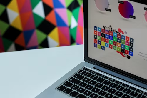
Fundamentals Of Color Psychology:
Before we dive into choosing colors, let’s explore the basics of color psychology:
Warm Vs. Warm Colors. Cool: Vibrant colors like yellow, orange, and yellow evoke feelings of energy, passion, and warmth.
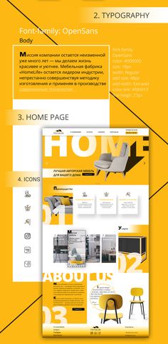
Cool colors like blue, green, and red are associated with calmness, confidence, and peace.
Key Emotions: Colors can trigger specific emotional reactions.
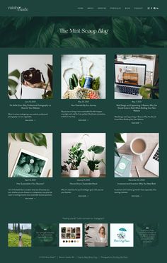
For example, red usually indicates excitement or urgency, while green indicates maturity and health.
Cultures: Keep in mind that colors can be interpreted differently in different cultures. White is a symbol of purity in Western cultures but in some Eastern cultures, it is associated with mourning.
Tips For Choosing The Right Colors:
Now that we understand the concept behind color, let’s talk about how to choose the right colors for your website design:
1. Define Your Brand Identity: Your colors should match your brand’s personality and values. Are you a tech-savvy startup with an eye toward innovation? Or a healthcare organization that emphasizes trust and confidence? First, define your brand identity.
2. Consider Your Target Audience: Consider your target demographic. Different ages, genders, and cultures can react differently to colors. Consider their preferences and emotional triggers.
3. Use Coordinated Color: Harmonious colors such as overlapping (contrasting) or parallel (adjacent) colors create visually appealing combinations. Tools like the color wheel can help you find harmonious colors.
4. Balance And Contrast: Make sure the colors are evenly distributed. Use contrasting colors for text and backgrounds to increase legibility. Significant differences can also point to key features.
5. Highlight Call-to-action (CTA) Buttons: Use bright, contrasting colors for CTA buttons to encourage user interaction. Buttons should stand out and invite clicking.
6. Testing And Iterating: A/B testing allows us to see which color variations resonate most with your audience. Be open to change based on feedback and data.
Examples Of Color Psychology In Action
Facebook: The use of the color blue emphasizes trust and confidence, in keeping with their mission of connecting people.

The blue color of the "Like" button encourages positive interaction.

McDonald’s: The combination of red and yellow creates a sense of urgency and excitement, perfect for the fast food chain.
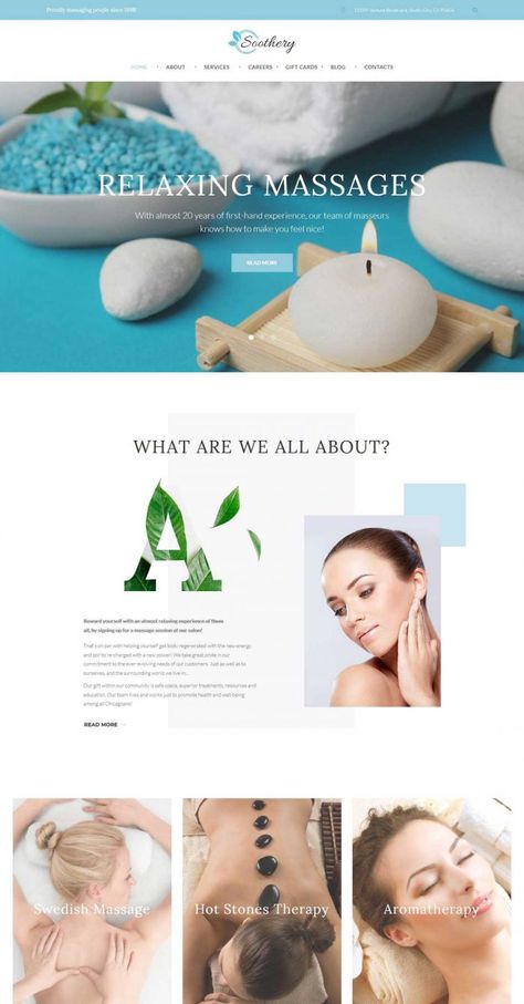
Spa websites: Spa and wellness websites often feature soothing colors like pastel blues and greens to promote relaxation and tranquility.
CONCLUSION:
The psychology of color in web design is a powerful tool that can influence user behavior and cognition. By choosing the right colors that match your brand, target audience, and messaging, you can create an engaging and emotional web experience Remember that color mood is only one aspect of web design, but when used properly it can have a huge impact on how users perceive your website, and how they interact with you.
Subscribe to my newsletter
Read articles from Youhana Sheriff directly inside your inbox. Subscribe to the newsletter, and don't miss out.
Written by
