Data Visualization on IPL Dataset
 Manjunath Irukulla
Hey people, we've performed a few basic EDA commands on the IPL dataset. Now we are going to learn how to visualize the data using the Seaborn and Matplotlib libraries.
Why do we need to Visualize data?
Fact: Humans remember more than they hear.
A picture can say a thousand words. Instead of analyzing each term, we can visualize them so that the maximum amount of data is analyzed. People can easily understand what a picture represents and the data in it.
There are several types of representation of data in terms of shape or relationship. We will try to cover a maximum of shapes and relations to make you understand the visualization.
Bar Graph
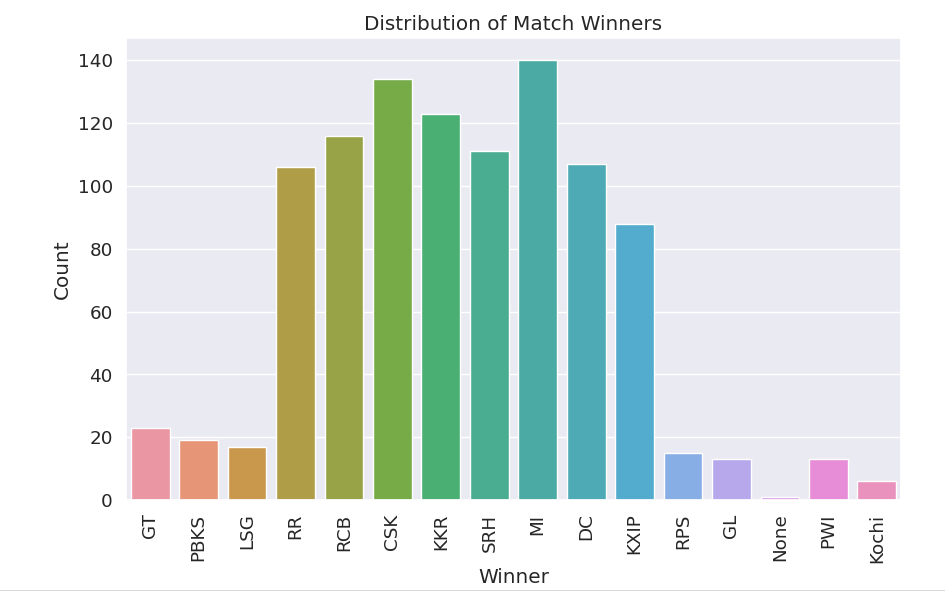
A bar graph enables you to visualize the data between two variables in bars.
Here, we've used the Matplotlib and Seaborn libraries to make it visual. (Which is imported as plt and sns)
Here,
xticksrefers to the labels that we used to represent each bar in the graph.xlabelandylabelsare used to indicate on which axis we need to plot which column's data.titleenables us to give a title to the bar graph, as its name suggests. The same goes for theshow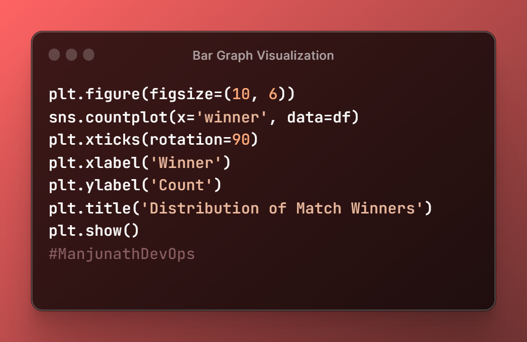
Line Chart
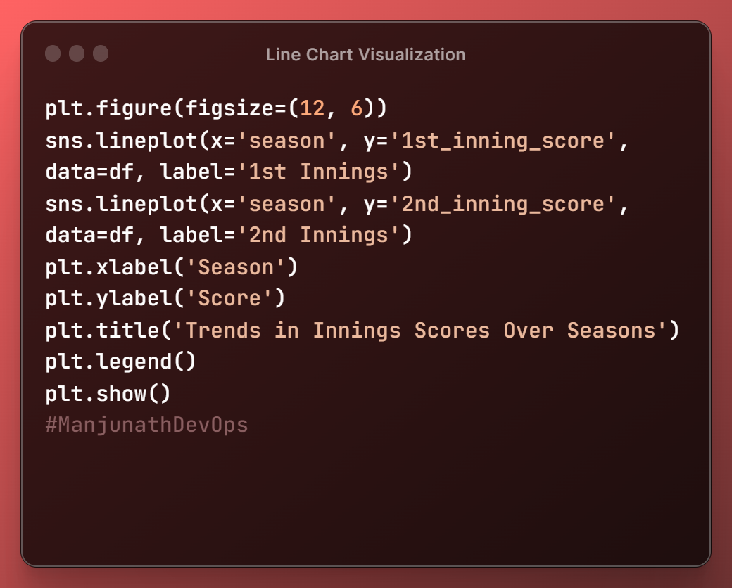
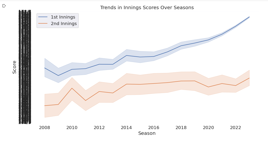
figurefunction enables us to give the size of the image in which we get our graph visualized.we need to include the column's name in the
lineplotfunction as mentioned.
Histogram
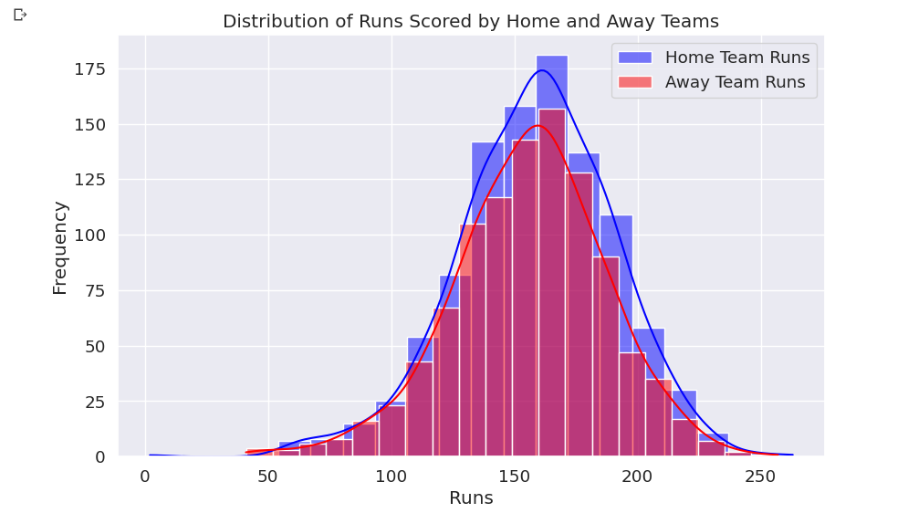
A histogram is similar to the bar graph, but here all the bars stick together so that we can analyze the data easily without strain.
The first line of code
plt.figure(figsize=(10, 6))creates a new figure with a width of 10 inches and a height of 6 inches.This is the size of the plot that will be displayed.
  sns.histplot(df['home_runs'], bins=20, kde=True, color='blue', label='Home Team Runs')
  sns.histplot(df['away_runs'], bins=20, kde=True, color='red', label='Away Team Runs')
use the Seaborn library to create two histograms, one for the home team runs and one for the away team runs.
The
binsThe parameter controls the number of bins in the histogram, and thekdeparameter controls whether to show a smoothed version of the distribution (called a kernel density estimate).The
colorThe parameter controls the color of the bars, and thelabelparameter adds a label to the legend.plt.xlabel('Runs') plt.ylabel('Frequency') plt.title('Distribution of Runs Scored by Home and Away Teams')set the labels for the x-axis, y-axis, and title of the plot.
  plt.legend()
  plt.show()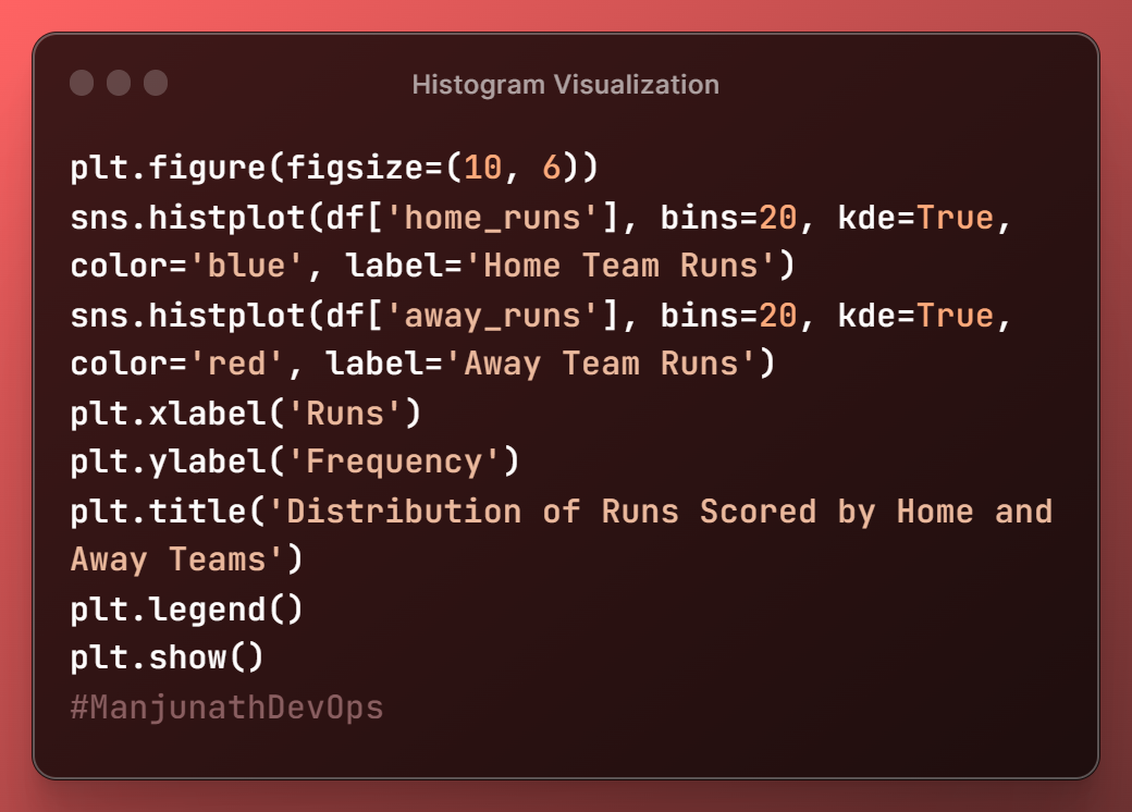
Scatter Plot
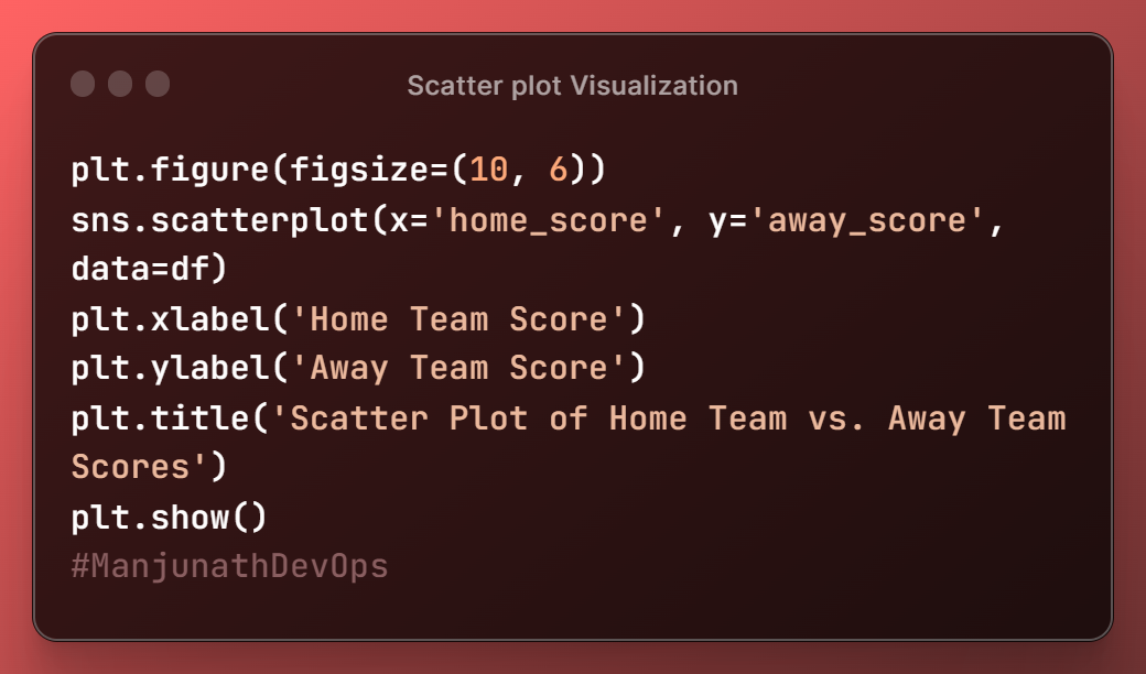
The first line of code, plt.figure(figsize=(10, 6)), creates a new figure with a width of 10 inches and a height of 6 inches. This is the size of the plot that will be displayed.
The next line of code
sns.scatterplot(x='home_score', y='away_score', data=df)
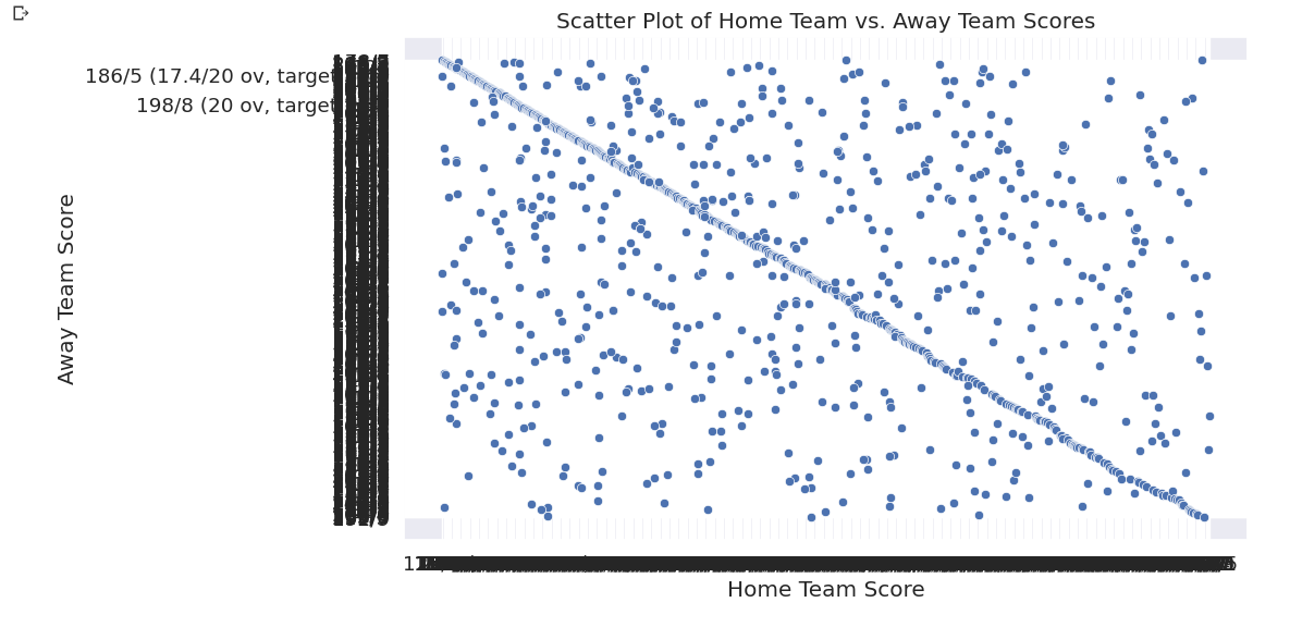
uses the Seaborn library to create a scatter plot of the home team score vs. the away team score. The x and y parameters specify the columns in the df DataFrame that contains the home team score and away team score, respectively.
The next two lines of code
plt.xlabel('Home Team Score')
plt.ylabel('Away Team Score')
plt.title('Scatter Plot of Home Team vs. Away Team Scores')
set the labels for the x-axis, y-axis, and title of the plot.
The final line of code
plt.show()
#displays the plot.
Pie Chart
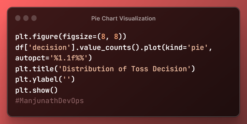
The
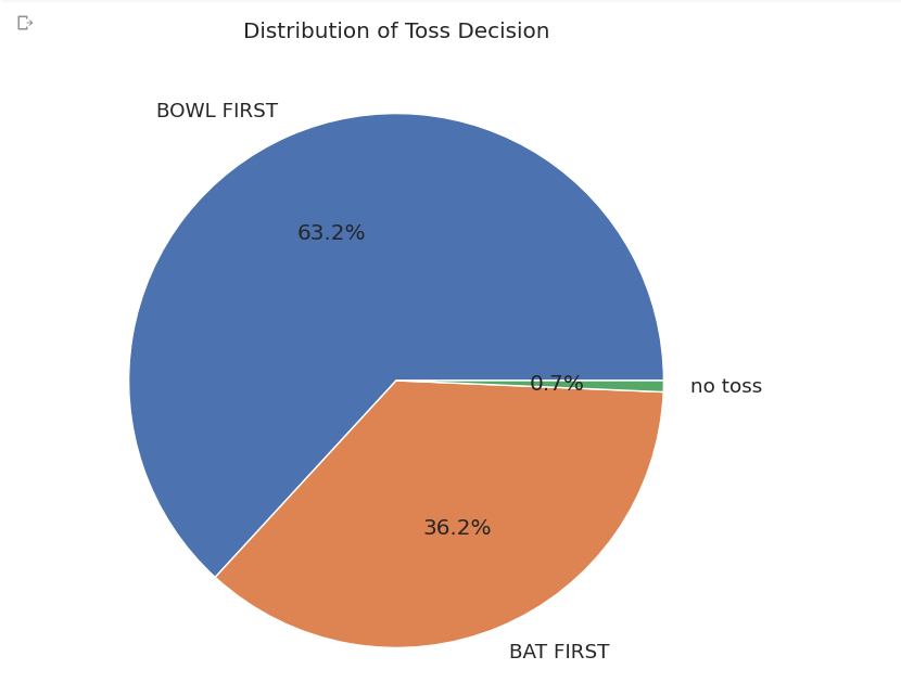
df['decision'].value_counts()The function counts the number of loans in each category ofdecision(approved or denied) and stores the results in a data frame.The
plot(kind='pie', autopct='%1.1f%%')function then creates a pie chart of the data frame, where each slice represents the percentage of loans in each category.The
autopctparameter specifies the format of the labels on the pie chart. In this case, the labels are formatted as percentages with one decimal place.
HeatMap
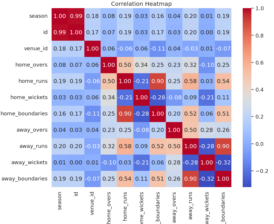
A heatmap is a graphical representation of data where values are depicted by color.
Heatmaps can be used to show a variety of things, such as:
The distribution of data: A heatmap can be used to show the distribution of data in a dataset. For example, a heatmap of the temperatures in a city can show how the temperatures vary across the city.
The relationship between two variables: A heatmap can be used to show the relationship between two variables. For example, a heatmap of the correlation between customer satisfaction and product price can show how customer satisfaction changes with product price.
The importance of features: A heatmap can be used to show the importance of features in a machine learning model. For example, a heatmap of the feature importance in a decision tree can show which features are most important for the model's predictions.
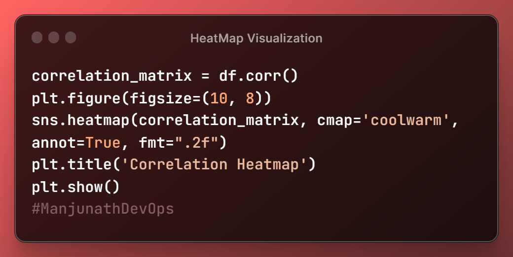
sns.heatmap(correlation_matrix, cmap='coolwarm', annot=True, fmt=".2f")
uses the Seaborn library to create a heatmap of the correlation matrix. The cmap parameter specifies the colormap to use, and the annot parameter specifies whether to annotate the heatmap with the correlation coefficients. The fmt parameter specifies the format of the annotations. In this case, the annotations are formatted as two-decimal-place floats.
Box Plot
The
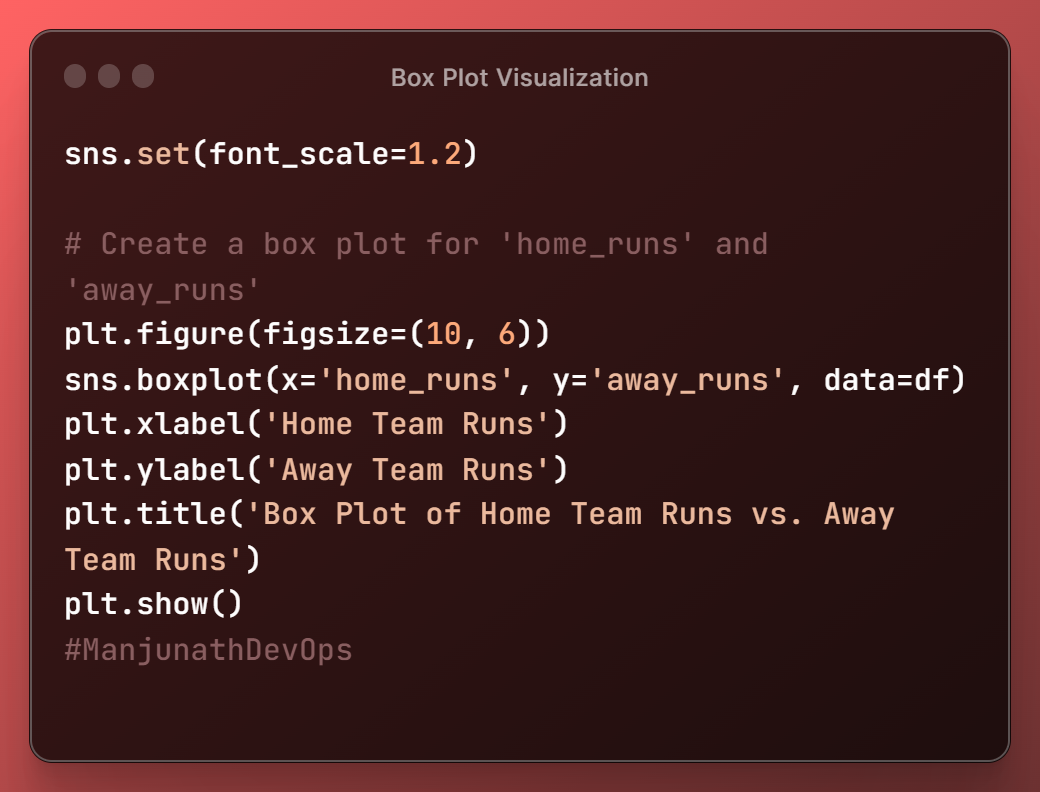
sns.set(font_scale=1.2)function is used to set the font scale for all subsequent plots.This means that the font size of all the text in the plot will be 1.2 times the default size. This can be useful for making the text in plots easier to read.
The
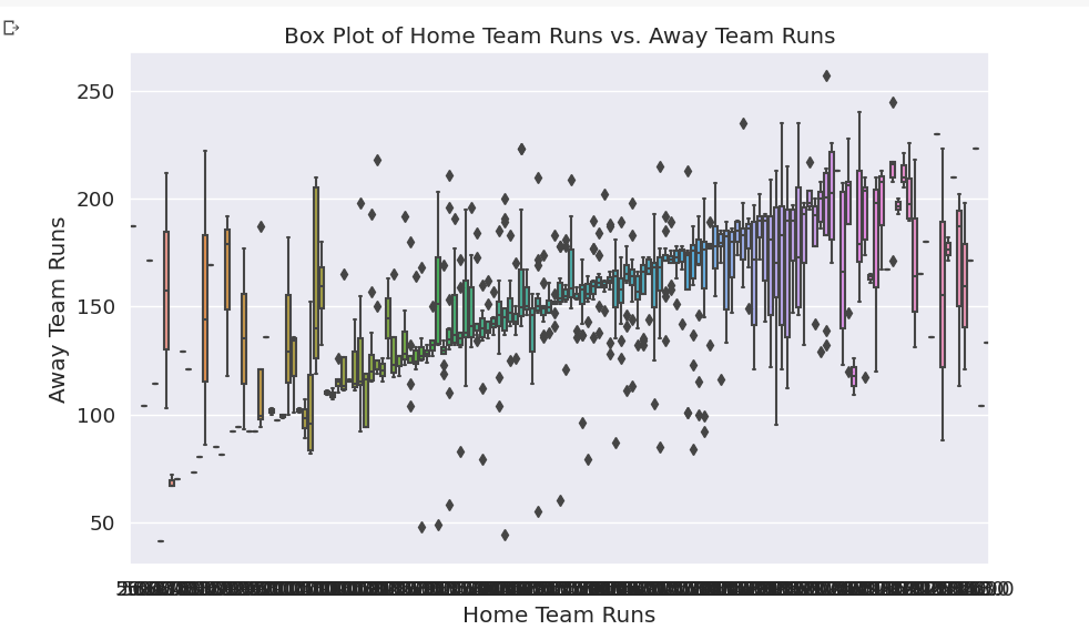
boxplot()function is used to create a box plot. A box plot is a graphical representation of the distribution of data.It shows the median, interquartile range, and outliers for each group of data. The median is the middle value in the distribution, and the interquartile range is the range of values between the first and third quartiles.
Outliers are values that are much higher or lower than the rest of the data.
Bubble Chart
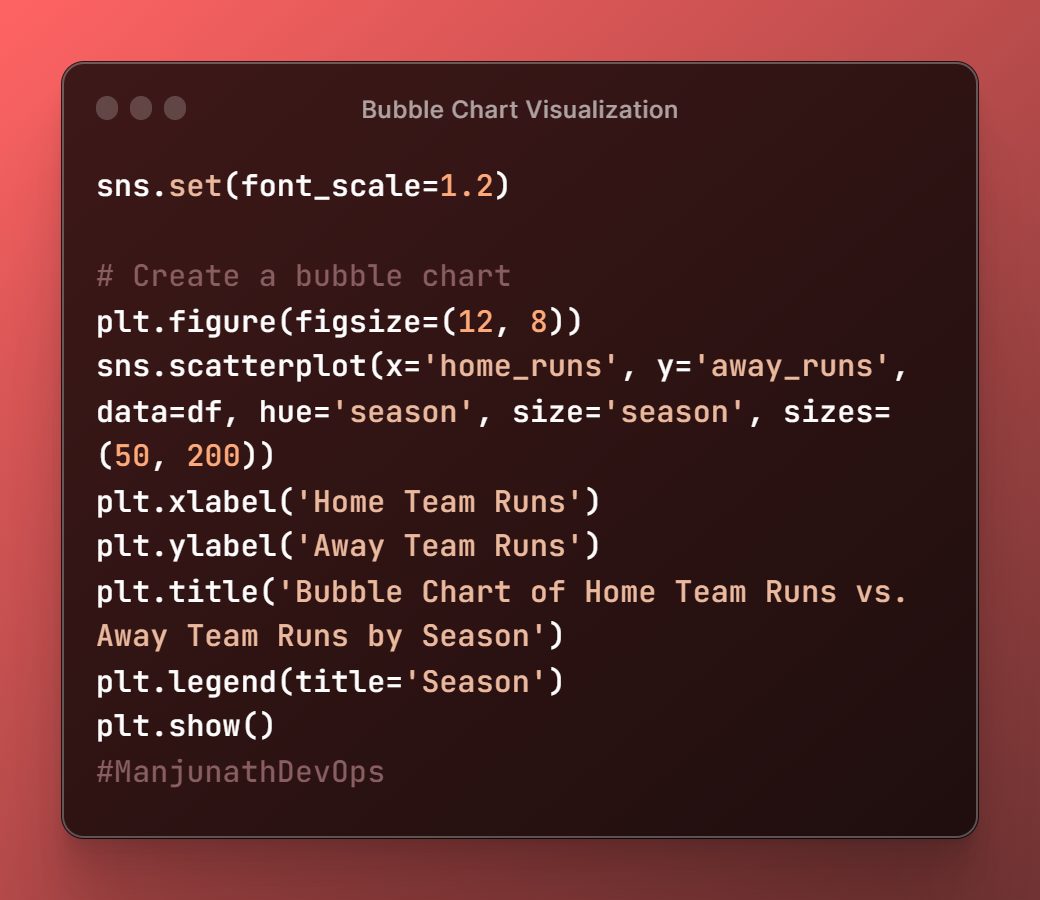
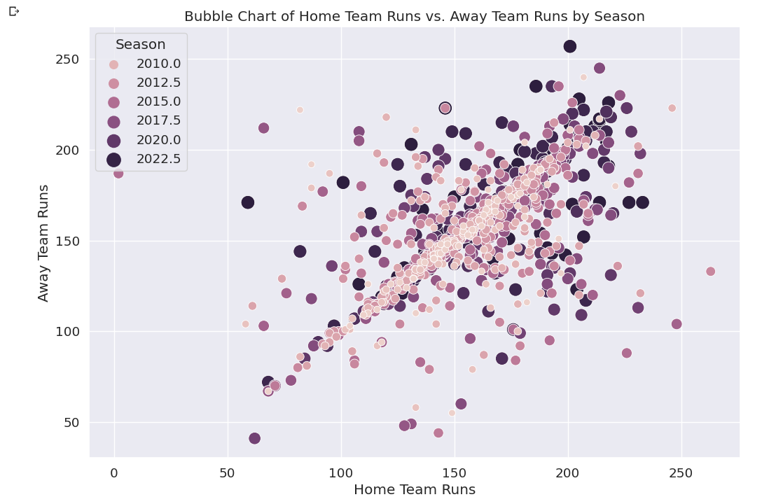
sns.scatterplot(x='home_runs', y='away_runs', data=df, hue='season', size='season', sizes=(50, 200))
- This uses the Seaborn library to create a bubble chart of the
home_runsandaway_runscolumns in the DataFramedf.
The
xandyparameters specify the columns to plot on the x-axis and y-axis, respectively.The
hueparameter specifies the column to use for coloring the bubbles, and thesizeparameter specifies the column to use for sizing the bubbles.The
sizesparameter specifies the range of sizes for the bubbles.
This is all I've learned about Data Visualization, I hope you guys learned something about visualizing data.
In the next article, we are going to implement basic Machine Learning algorithms on this dataset and perform few actions like
Regression
And going to create a model in which we predict the best batsman and blower in the IPL.
To not miss further articles, please follow me and comment if you've any doubts regarding Data Visualization.
Subscribe to my newsletter
Read articles from Manjunath Irukulla directly inside your inbox. Subscribe to the newsletter, and don't miss out.
Written by

Manjunath Irukulla
Manjunath Irukulla
I am a DevOps Enthusiast with Java DSA and Writing Skills