Good or Bad UX?
 Taofiqah
Hello there. Today, I will be talking about the user experience of an airline website I visit often.

There are a few things I was able to point out from their home page.
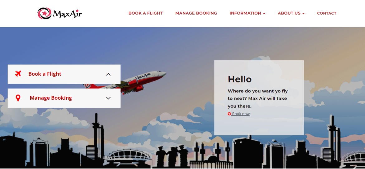
On landing on the home page, I can easily navigate to either book a flight, or manage my booking from the navigation menu. That's pretty impressive. I can also do either of the actions I mentioned earlier in the hero section.
I wonder why I can't find a call to action button on this screen. The CTA is 'Book now' and it is hidden in the white box with 'Hello'. This can be fixed by having a visible button, possibly inheriting the brand colour, so it won't get lost on the page.
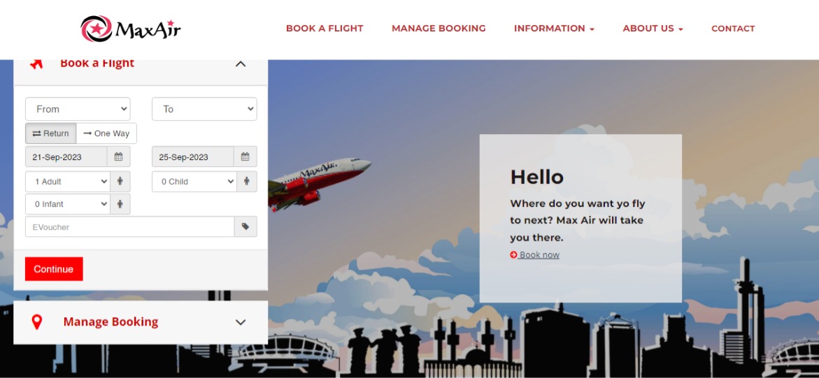
The direction of the arrow beside 'book a flight' indicates that the banner is open, which is quite confusing and can be solved by a quick fix.

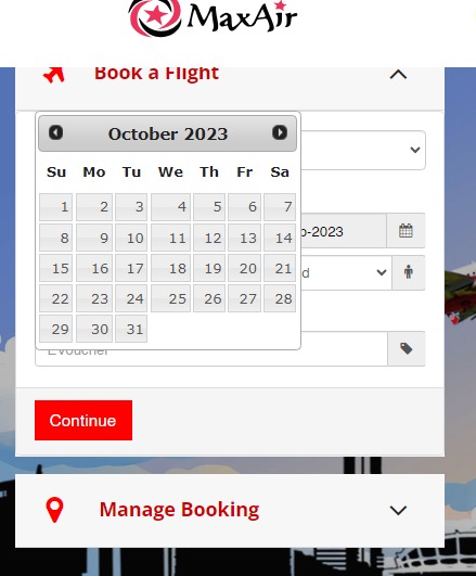
The 'book a flight' section seems not to fit, but no information was lost. The integration of a calendar pop-up to select a date is a good idea, as it saves the user the stress of confirming if the date and day match.

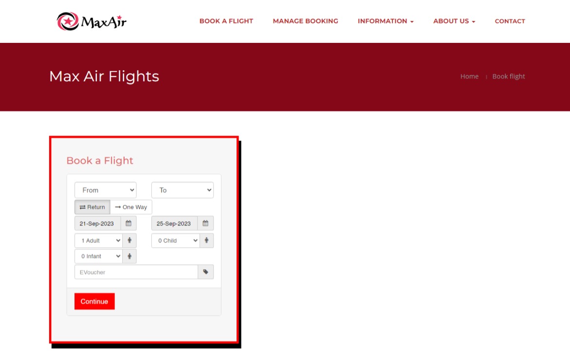
I decided to navigate to the 'Book a flight' section on the navigation menu, and here is what we have:

In my opinion, the red banner below the navigation menu is redundant. The small texts are difficult to see and I wonder why they are clickable. I agree that I might want to return to the home page, but why do I need to visit the 'Book Flight' page when I am already on it?
Those are the few things I would like to point out from the website.
I hope you look forward to my next article. Peace.✌🏼
Subscribe to my newsletter
Read articles from Taofiqah directly inside your inbox. Subscribe to the newsletter, and don't miss out.
Written by
