Bad UX vs Good UX
 Ayomikun Irewunmi
For now, my mantra is one rectangle at a time. In this article, I will be sharing my knowledge of good and bad UX after reading the Career Foundry article for my first task by Friends of Figma Africa Design Mentorship Program Cohort 1.0.
This is my first task to write an article on design and I'm super excited about this. User experience is not limited to the digital space. We live in a world where everything is designed, from the books we read to, the chairs we sit in, even the way our cities are built, shaping our experiences as humans.
What is UI and UX
UI vs Ux UI (User Interface): UI refers to the visual elements and layout of a product or interface. It includes everything that the user interacts with on the screen, such as buttons, icons, menus, and other graphical elements. UI design focuses on how these elements are arranged and presented to the user.
UX (User Experience): UX encompasses the overall experience a user has while interacting with a product or system. It goes beyond just the visual aspects and considers how the user feels, the ease of use, the efficiency, and the overall satisfaction during their journey through the product. UX design aims to create a positive and meaningful user experience.
What does good and bad UX look like?
Good Design is any product be it physical or digital that delivers the desired or expected outcome easily, efficiently, and pleasantly and Bad Design is just the opposite! Let's imagine you used your TV remote control in a bid to turn it off, however, you pressed the wrong button, an unexpected menu or setting popped up, and you encountered a bad UX. Good UX, in this scenario, would make operating your TV as straightforward as flipping a light switch, with intuitive controls that eliminate the need for a manual or guesswork. Similarly, think about the last time you visited a website that left you frustrated. Perhaps it was an online shopping platform where you struggled to find the checkout button or a news site that bombarded you with pop-up ads. These are examples of bad UX, where the user is left feeling annoyed.

Image source: www.opendoodles.com
Examples of Good and Bad UX
- YouTube Mini Video Player
The YouTube Mini Video Player is a feature that allows users to continue watching a video while browsing or navigating through the App or website. Users can continue watching their videos even when they receive notifications or interact with other parts of the app. This is very user-friendly and allows users to desire flexibility and convenience when consuming video content.

2. Google Search engine
Google search engine is clear and easy to navigate for the average Internet user. The Google Search homepage is clean and uncluttered, with a single search bar at the center. This makes it easy for users to know exactly what to do when they visit the site.

Google Search suggests search terms as the user types, which can help users refine their searches and find the information they are looking for more quickly. the search engine shows recently searched terms, suggests related searches, and corrects us in case of a typo in the phrase we typed incorrectly. Thus, it responds to the users’ needs and makes the whole search process as easy as possible for them.

- Netflix personalization
Netflix personalization is a good UX for users because it helps them to find content that they are likely to enjoy. Netflix uses a variety of factors to personalize its recommendations, such as the user's watch history, ratings, and searches. This helps Netflix to build a profile of the user's interests and preferences, which it can then use to recommend new content that the user is likely to enjoy.

- Twitter's “For you” and “Following” feature
Users can easily switch timelines allowing them to control the type of content they see on their Twitter feed. The For You timeline shows users tweets from accounts they follow and tweets from accounts that Twitter thinks they might be interested in based on their interests and engagement history. The Following timeline only shows tweets from accounts that the user follows.

- Arik Air
The website's information architecture was confusing and difficult to navigate, inconsistent use of typography and color. The typography and color choices could have been more consistent throughout the website, leading to a lack of visual hierarchy and making it difficult for users to differentiate important information from less.

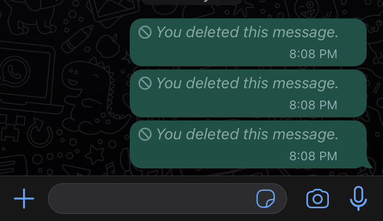
- WhatsApp delete message
Notifying the recipient that a message has been deleted defeats the purpose of deleting the message in the first place. If you're trying to hide something from someone, why would you tell them that you're hiding something? WhatsApp's "Delete for everyone" feature is a useful tool, but it has some bad UX design choices. These choices can lead to confusion, frustration, and accidental message deletion.

Subscribe to my newsletter
Read articles from Ayomikun Irewunmi directly inside your inbox. Subscribe to the newsletter, and don't miss out.
Written by

Ayomikun Irewunmi
Ayomikun Irewunmi
Designing for inclusion and growth.