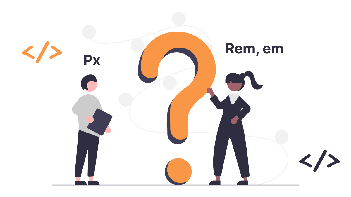
Popular font size units px, rem and em.
 Binay Maharjan
When it comes to setting font sizes in CSS, there are a few different units that you can use. The three most popular units are:
px(pixels)em(ems)rem(root ems)
Browser default base font size 16px.
Pixels (px)
Pixels are the most basic unit of measurement in CSS. They are always the same size, regardless of the size of the user's screen or browser window. This makes them a good choice for setting font sizes that need to be exact, such as the size of a button or a link.
html {
font-size: 14px;
}
// all the font are now default 14px
Ems (em)
Ems are relative units that are based on the font size of the parent element. This means that if you set the font size of the h1 element to 2em, the font size of the h1 element will be twice the size of the font size of its parent element.
Ems are a good choice for setting font sizes that need to be scalable. For example, you could use ems to set the font size of all of your headings, so that they all scale up and down together as the user changes the size of their browser window.
Rems (rem)
Rems are a new unit of measurement that is similar to ems, but they are based on the font size of the HTML element. This means that if you set the font size of the HTML element to 16px, then a value of 1rem will always be equal to 16px.
Rems are a good choice for setting font sizes that need to be both scalable and accessible. Because rems are based on the html element, they will always be the same size for all users, regardless of their browser settings or device.
Let's see with an example
<html>
    <body>
        <p> HTML tag is the root element</p>
        <div class="card">
            <div class="card-body">
                This is card body
            </div>
        </div>
    <body>
</html>
html{
font-size: 16px;
}
p{
font-size: 1rem;
// here 1rem = 16px because its relative to root element
}
.card{
font-size: 14px
}
.card .card-body{
font-size:1em;
// here 1em = 14px because its relative to parent element
 which is card whose font size is 14px
}
Pros and Cons of Each Unit
Each unit has its advantages and disadvantages, so it is important to choose the right one for the job.
Here is a table summarizing the pros and cons of each font unit:
| Unit | Pros | Cons |
px | Always the same size, regardless of the user's screen or browser window. | Not scalable, can be limiting for responsive design. |
em | Relative to the font size of the parent element, they are scalable. | Can be difficult to use with complex layouts. |
rem | Relative to the font size of the html element, they are both scalable and accessible. | Not as widely supported as px or em. |
Problems with font size px, em and rem
It's important to be aware of the potential problems associated with each one.

Problems with Pixels
If you want to create a responsive website that changes its layout based on the size of the user's screen, you'll need to use a different unit.
One of the biggest problems with using pixels for font size is that it can make your website difficult to use for people with disabilities. For example, people who are using screen readers or other assistive technologies may not be able to change the font size of your website if it is set in pixels.
Another problem with using pixels for font size is that it can make your website look inconsistent on different devices. For example, if you set the font size of your website to 16px in pixels, it will look the same on a 1080p monitor as it does on a 4K monitor. This can be jarring for users who are switching between devices.
Problems with Ems
If you have a complex layout with multiple nested elements, it can be difficult to keep track of how the font sizes will be inherited.
The problem with using ems is that they can be unpredictable when used with elements that have different font sizes. For example, if you have a p element inside of an h1 element, and the h1 element has a font size of 2em, the p element will have a font size of 4em. This can be unexpected and can lead to inconsistent layouts.
Problems with Rems
The problem with rems is that they can be difficult to use with complex layouts. If you have a complex layout with multiple nested elements, it can be difficult to keep track of how the font sizes will be inherited.
Which CSS unit should you use?
The best unit for you to use will depend on your specific needs.
If you need to set font sizes that need to be exact, then px is a good choice.
rem and em are both relative units in CSS that are used to set the size of elements. However, there is a key difference between the two: rem units are relative to the root element, while em units are relative to the parent element.
This means that rem units are more reliable when it comes to creating responsive designs. If you use rem units, the size of your elements will stay consistent even if the user changes their browser's font size. Em units, on the other hand, can be affected by changes to the parent element's font size, which can make your designs less responsive.
Note: Recommended to use
remunits for most of your CSS sizing
Conclusion
Font size is an important aspect of web design and user experience. It affects the readability, accessibility, and aesthetics of the web page. Font size can be specified in different units, such as pixels (px), points (pt), ems (em), rems (rem), percentages (%), and viewport units (vw, vh, vmin, vmax).
Choosing a font size unit is not a one-size-fits-all solution. Each unit has its advantages and disadvantages, depending on the context and purpose of the web page.
Subscribe to my newsletter
Read articles from Binay Maharjan directly inside your inbox. Subscribe to the newsletter, and don't miss out.
Written by
Binay Maharjan
Binay Maharjan
👋 Hello World! I'm Binay Maharjan, a passionate Front-End Developer the ever-evolving realm of web development. 🚀 🌈 Design Enthusiast: With an eye for aesthetics, I bring designs to life, ensuring a seamless fusion of form and function. My CSS skills extend to animations, transitions, and the art of making websites not just functional, but delightful. 📐 Responsive Design Advocate: From desktops to tablets and smartphones, I'm dedicated to creating websites that adapt flawlessly to every screen size. A user-centric approach guides my responsive design philosophy. ⚙️ Tech Innovator: I thrive on staying up-to-date with the latest trends and emerging technologies in the front-end development landscape. Constantly refining my skills to implement cutting-edge solutions, I am committed to delivering high-quality, forward-thinking code.