Visualizing Text and Image Embeddings Using Python: A Beginner's Guide
 Similoluwa Okunowo
Introduction
In machine learning, embeddings have emerged as a transformative technique that empowers us to capture intricate patterns from data using dense numerical vector representations. These embeddings encapsulate semantic information from diverse data types, including text, images, audio, etc., making them appropriate for a range of machine-learning tasks like classification, recommendation, clustering, etc.
A "picture", they say, "speaks louder than a thousand words numbers". Visualizing embeddings involves more than just creating aesthetically pleasing charts and graphs; it is a lens that can enable us to grasp hidden patterns in our data at a glance, amplifying our ability to extract valuable insights.
This article aims to be a comprehensive but beginner-friendly guide to generating and visualizing text and image embeddings. So, let's dive into the captivating world of embedding visualizations 👩🍳.
Who is this Article for?
This article is for machine learning or data science practitioners and enthusiasts curious about understanding how to visualize embeddings in a beginner-friendly manner.
What you will Learn?
After reading this article, you will (hopefully) accomplish the following learning objectives:
Generate embeddings from text and image data.
Transform high-dimensional data into a low-dimensional space using dimensionality reduction techniques.
Create interactive visualizations from embeddings.
Interpret embedding visualizations.
Tools Used
Working with embeddings in the context of textual or image data does benefit from a solid understanding of the related mathematical concepts, and I am by no means an expert in this field. Nonetheless, in this article, we will use pre-trained models and libraries that abstract the mathematical complexity, and focus on simply generating the embeddings and extracting useful insights using interactive visualizations.
Some of the tools we will use to accomplish the aforementioned learning objectives are:
Python (3.7+)
Cohere - For generating text embeddings. Get your API key Here.
PyTorch - For generating image embeddings using a pre-trained CNN model
Matplotlib, Altair - For creating plain and interactive visualizations
What are Embeddings?
An embedding is simply a numerical representation of data i.e. text, images, and audio in a high-dimensional space using dense vectors in a lower-dimensional space. These representations are designed to capture salient patterns in the data such that data containing similar information will have vectors close to each other in the embedding vector space.
For example, consider the word embedding illustration in Figure 1 below. The embedding of the text "Building" could be represented in a 300-dimensional vector space with a list of 300 numbers i.e. [0.82, 0.34, ...., 0.41]. Since the embedding captures the semantic information in the word "Building", it will be closer to a word like "House" and, conversely, farther from a word like "Pen" in the vector space. This same analogy applies to other data types like images or audio.

Figure 1: Word Embedding Illustration
Embeddings find utility in a wide range of domains, spanning diverse fields such as natural language processing, where they power semantic search, and computer vision, enabling applications like image search engines, clustering, recommendation systems, and data analysis, among others.
Techniques for Visualizing Embeddings
There are several techniques for visualizing embeddings that are applicable to a variety of embeddings. Here are some common techniques:
Scatter Plots: Scatter plots are one of the simplest ways to visualize embeddings in 2D or 3D space. Each point in the plot represents an embedding, and you can use different colors or markers to indicate categories or clusters. Interactive tools like Plotly or Altair can be used to create interactive scatter plots. This can be helpful for exploring embeddings and zooming in on specific data points.
Scatter plots are however not suitable for embeddings in higher dimensions. Dimensionality reduction techniques like t-SNE, Principal Component Analysis (PCA), or Uniform Manifold Approximation and Projection for Dimension Reduction (UMAP) may be used to reduce them to 2D for visualization.
Heatmaps: Heatmaps can be used to visualize the similarity or distance between embeddings. For example, you can create a heatmap to show the pairwise cosine similarity between word embeddings, where darker cells represent higher similarity.
Network Graphs: For embeddings related to network or graph data, you can visualize them as network graphs. Nodes represent data points, and edges represent relationships between them.
Color Maps: Using color maps to represent additional information, such as sentiment or intensity, in the embeddings can enhance visualization insights. For example, you can color code word embeddings based on sentiment.
Generating Embeddings in Python
Here, we will discuss how to generate text embeddings and image embeddings for visualization.
Generating Text Embeddings
We will use Cohere to generate text (i.e. word or sentence) embeddings. Cohere offers a robust means of generating accurate embeddings in English and 100+ languages. Alternatively, we can use OpenAI's embedding models, or state-of-the-art libraries like Sentence Transformers for the same purpose.
To generate embeddings using Cohere in Python, we will need Cohere's Python SDK and an API key which can be retrieved by signing up and visiting the API Keys page of your dashboard.
Let's dive into generating text embeddings following the steps below 👩🍳.
Install Cohere's Python SDK
 pip install --upgrade cohere

 # Install other necessary libraries
 pip install numpy python-dotenv
Define your text dataset
Next, we need to define a dataset containing the words or sentences from which we will generate the embeddings. We will use a small dataset which is a list of phrases here for convenience:
 text_dataset = [
     "The sun is shining today", "It's a beautiful day outside",
     "I love hiking in the mountains", "Nature hiking is my passion",
     "Pizza is my favorite food", "Italian cuisine is amazing",
     "Coding is a valuable skill", "Programming is an important skill",
     "The Eiffel Tower is a famous landmark in Paris", "Paris's iconic landmark is the Eiffel Tower",
     "Cats are known for their agility", "Felines are agile animals",
     "The ocean waves are calming", "Listening to ocean waves is soothing",
     "Art museums display incredible works of art", "Museums showcase amazing artworks",
     "Soccer is a popular sport worldwide", "Football is a global favorite",
     "Learning new languages is challenging but rewarding", "Mastering languages is tough but fulfilling",
 ]
Create the embeddings
Here we will create the embeddings using Cohere's
embed-english-v2.0model which supports the English language only and generates embeddings of 4,096 dimensions."""Generate text embeddings""" import os import cohere import numpy as np from typing import * from dotenv import load_dotenv, find_dotenv _ = load_dotenv(find_dotenv()) #Assumes that your COHERE_API_KEY is set in a .env file COHERE_API_KEY = os.environ.get("COHERE_API_KEY", "<YOUR_COHERE_API_KEY>") co = cohere.Client(COHERE_API_KEY) def generate_text_embeddings(texts: List[str]) -> List[List[float]]: """Generate embeddings from texts Args: texts (list): A list of texts (words or sentences). Returns: embeddings (list): A list of embeddings for each text """ output = co.embed( model="embed-english-v2.0", texts=texts ) embeddings = output.embeddings return embeddings # Testing text_embeddings = generate_text_embeddings(dataset) print(np.array(text_embeddings).shape) # Output: (20, 4096)Compute the similarity between text pairs
 """Compute the similarity between text pairs"""
 def compute_similarity(a: List[float], b: List[float]) -> float:
   """Compute the similarity between two embeddings"""
   return np.dot(a, b) / (np.linalg.norm(a) * np.linalg.norm(b))

 similarity_1 = compute_similarity(text_embeddings[0], text_embeddings[1])
 print(f"Similarity between '{text_dataset[0]}' and '{text_dataset[1]}' is {round(similarity_1, 2)}")

 similarity_2 = compute_similarity(text_embeddings[0], text_embeddings[5])
 print(f"Similarity between '{text_dataset[0]}' and '{text_dataset[5]}' is {round(similarity_2, 2)}")

 # Output:
 # Similarity between 'The sun is shining today' and 'It's a beautiful day outside' is 0.85
 # Similarity between 'The sun is shining today' and 'Italian cuisine is amazing' is 0.3
From the output, we can see that the text "The sun is shining today" is more similar to "It's a beautiful day outside" with a score of 0.85, and less similar to "Italian cuisine is amazing" with a score of 0.30.
In a further section, we will discuss how to visualize these generated embeddings using various techniques.
Generating Image Embeddings
To generate image embeddings, we will use a pre-trained convolutional neural network (CNN) - ResNet-18. Some notable alternatives to using a pre-trained CNN are the OpenAI CLIP model, and the imgbeddings library (which uses the OpenAI CLIP model via HuggingFace transformers).
Let's dive into generating image embeddings following the steps below 👩🍳.
Install the required libraries
Here, we will install PyTorch and other required libraries.
pip install --upgrade torch torchvision numpy matplotlibPrepare the image dataset
The dataset is a small dataset of 35 images distributed evenly across 7 classes - airplane, bird, car, cat, dog, fruit, and person. We will use the Dataset and Dataloader classes provided by PyTorch to load the image dataset from the folder.
You can download the dataset from HERE.
 """Prepare the image dataset"""
 import glob
 import torch
 from torchvision import transforms, datasets

 IMAGES_DATASET_DIR = "embedding-images-dataset" # Replace with the folder containing your images

 image_extensions = ['jpg', 'jpeg', 'png']
 image_files = []
 for ext in image_extensions:
   image_files.extend(glob.glob(f"{IMAGES_DATASET_DIR}/**/*{ext}"))

 print(f"There are {len(image_files)} images in the dataset folder.")
 # -> OUTPUT: There are 35 in the dataset folder.

 # Define the image transformations
 mean=[0.485, 0.456, 0.406]
 std=[0.229, 0.224, 0.225]
 transform = transforms.Compose([
     transforms.Resize((224, 224)),
     transforms.ToTensor(),
     transforms.Normalize(mean=mean, std=std)
 ])

 # Load the dataset
 images_dataset = datasets.ImageFolder(IMAGES_DATASET_DIR, transform=transform)
 images_classnames = images_dataset.classes
 images_dataloader = torch.utils.data.DataLoader(
     images_dataset,
     batch_size=1,
     shuffle=False
 )
Here is a plot of images for each category in the loaded dataset:

Create the image embeddings
The steps for creating the image embeddings from the loaded dataset are:
Load the ResNet-18 model's pre-trained weights via
torchvision.modelsExtract the avgpool layer (i.e. layer before the final classification layer) for feature extraction. The resulting embeddings will have 512 dimensions which corresponds to the shape of the output of the avgpool layer.
Define a hook that will be attached to the desired layer of the model to capture the features of each image and store them in a list.
Apply the model to each image in the data loader and store the results.
Here is the Python script for generating the image embeddings
    """Generate the image embeddings"""
    import numpy as np
    from torchvision import models

    # Get the ResNet18 model
    resnet18 = models.resnet18(pretrained=True)

    # Put the model in inference mode
    resnet18.eval()

    embeddings = [] # for storing the embedding for each image

    # Define a hook function to capture intermediate features
    def hook_fn(module, input, output):
      output = output[:, :, 0, 0].squeeze().detach().numpy().tolist()
      embeddings.append(output)

    # Register the hook to the target layer (i.e. the layer before the final classification layer)
    target_layer = resnet18._modules.get("avgpool")
    hook = target_layer.register_forward_hook(hook_fn)

    # Perform a forward pass
    with torch.no_grad():
      for image, label in images_dataloader:
        _ = resnet18(image)

    if embeddings is not None:
      image_embeddings = embeddings

    print(np.array(image_embeddings).shape)
    # OUTPUT: (35, 512)
Compute pairwise similarity scores between images
Now, let's compute the pairwise similarity scores between some images to check if the embeddings correctly capture the underlying patterns in the images:
 (image_1, label_1, image_emb_1) = images_info[0] # First image (airplane)
 (image_2, label_2, image_emb_2) = images_info[1] # Second image (airplane)
 (image_7, label_7, image_emb_7) = images_info[6] # Seventh image (bird)
 (image_27, label_27, image_emb_27) = images_info[26] # fruit

 print(f"Similarity between image 1 ('{images_classnames[label_1.item()]}') and image 2 ('{images_classnames[label_1.item()]}') is {round(compute_similarity(image_emb_1, image_emb_2), 2)}")
 print(f"Similarity between image 1 ('{images_classnames[label_1.item()]}') and image 7 ('{images_classnames[label_7.item()]}') is {round(compute_similarity(image_emb_1, image_emb_7), 2)}")
 print(f"Similarity between image 1 ('{images_classnames[label_1.item()]}') and image 27 ('{images_classnames[label_27.item()]}') is {round(compute_similarity(image_emb_1, image_emb_27), 2)}")
# Output Similarity between image 1 ('airplane') and image 2 ('airplane') is 0.82 Similarity between image 1 ('airplane') and image 7 ('bird') is 0.49 Similarity between image 1 ('airplane') and image 27 ('fruit') is 0.42Observing the output, there is a high degree of similarity (82%) among the airplane images. Furthermore, in terms of similarity, the airplane image bears a closer resemblance to the bird image, with a score of 49%, in contrast to its similarity to the fruit image, which stands at 42%.
Congratulations on making it this far 🎉. Generating the text and image embeddings is the first piece of the puzzle, now it's time to visualize them.
Visualizing Embeddings
Here, we will discuss how to visualize the generated embeddings using various techniques.
Visualizing Text Embeddings
Visualizing Text Embeddings Using Interactive Scatter Plots
Here, we will visualize the text embeddings generated in the section on "Generating Text Embeddings" using an interactive scatter plot in Altair. This interactive scatter plot will provide a way to explore relationships between texts in the text dataset from which the embeddings were generated.
Firstly, we need to reduce the dimensions of the embeddings from 4,096 to 2 to aid visualization on a 2D plane. This dimensionality reduction will be performed using UMAP.
Here is the code for visualizing the text embeddings:
import umap
import altair as alt

"""Visualize the text embeddings using UMAP"""
def visualize_text_embeddings_umap(
    texts: List[str],
    embeddings: List[List[float]],
    n_neighbors: Optional[int]=10):
  """Visualize text embeddings using UMAP.

  Args:
    texts: A list of texts in the dataset.
    embeddings: A list of the generated embeddings for each text.
    n_neighbors: Controls the local neighborhood size for each data point
      in the high-dimensional space.
  """
  # Reduce the dimensions of the embeddings to 2 dimensions using UMAP
  reducer = umap.UMAP(n_neighbors=n_neighbors)
  umap_embeds = reducer.fit_transform(embeddings)

  # Prepare the data for visualization using Altair
  df = pd.DataFrame({'text': texts})
  df['x'] = umap_embeds[:, 0]
  df['y'] = umap_embeds[:, 1]

  # Create plot
  chart = alt.Chart(df).mark_circle(size=80).encode(
      x=alt.X('x', scale=alt.Scale(zero=False)), # X Axis
      y=alt.Y('y', scale=alt.Scale(zero=False)), # Y Axis
      tooltip = ['text']
  ).properties(
      width=600,
      height=400,
      title="Visualization of text embeddings"
  )

  return chart

chart = visualize_text_embeddings_umap(text_dataset, text_embeddings)
chart.interactive()
The generated scatter plot is as shown below:
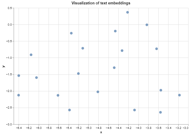
Hurray 🎉, you have visualized your first text embeddings. You can explore the relationships between data points by hovering over them or zooming in/out using the Altair chart's interactive features. The tooltip argument used in creating the Chart displays the corresponding texts of data points when hovering over them.
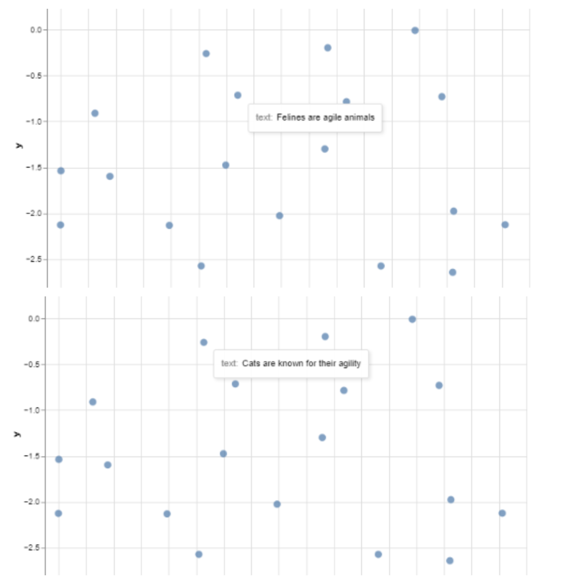
Now, to interpret the visualization. In the image below, we can see that the text "Felines are agile animals" is closest to the text "Cats are known for their agility" in the 2D embedding space. When you hover over the other data points, you will discover that similar texts are closer to each other in the embedding space.
Visualizing Pairwise Similarity Between Text Embeddings Using Heatmaps
Creating a heatmap to visualize pairwise text embedding similarity involves calculating the similarity scores between all pairs of text embeddings and then representing those scores as a heatmap.
The steps for creating the heatmap visualization are:
Create the similarity matrix
The similarity matrix is a 2D matrix generated from the list of embeddings. The dimension of the similarity matrix is of the form (N, N) where 'N' is the number of embeddings or length of the text dataset. For each position
iandj, the similarity matrix contains a score representing the similarity between textiandj.Similarity metrics such as cosine similarity or Euclidean distance are typically used to compute the similarity scores between pairs of text embeddings.
 """Create the similarity matrix from the text embeddings"""
 import random
 import numpy as np
 from sklearn.metrics.pairwise import cosine_similarity

 text_dataset = random.sample(text_dataset, 10) # Use first 10 samples for visualization
 text_embeddings = generate_text_embeddings(text_dataset)
 N = len(text_embeddings)

 # Create an empty similarity matrix of shape (N, N)
 similarity_matrix = np.zeros((N, N))

 # Compute the cosine similarity for each pair of embeddings
 for i in range(N):
   for j in range(N):
     emb_i = np.array(text_embeddings[i]).reshape(1, -1)
     emb_j = np.array(text_embeddings[j]).reshape(1, -1)
     similarity_score = cosine_similarity(emb_i, emb_j)
     similarity_matrix[i][j] = similarity_score[0][0]
Create the Heatmap from the Similarity Matrix
Here, we will plot the heatmap using
matplotlib"""Create the heatmap from the similarity matrix""" import matplotlib.pyplot as plt plt.figure(figsize=(6, 6)) plt.imshow(similarity_matrix, interpolation="nearest", cmap="coolwarm") plt.colorbar(label="Similarity Score") plt.xticks(np.arange(len(text_dataset)), text_dataset, rotation=90, fontsize=10) plt.yticks(np.arange(len(text_dataset)), text_dataset, fontsize=10) plt.title("Pairwise Text Embeddings Similarity Heatmap")The resulting heatmap representing pairwise text embedding similarity of the 10 samples in the text dataset is shown below.
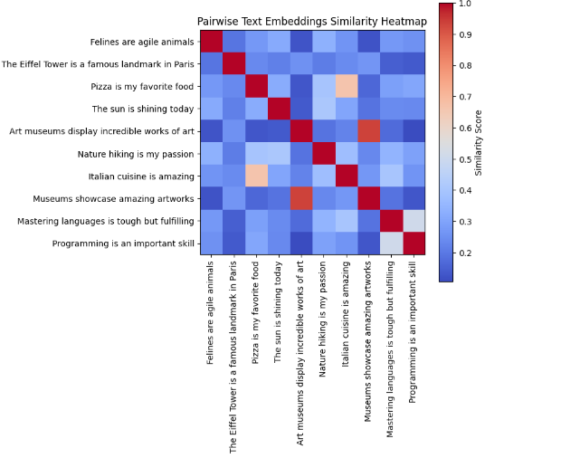
The color intensities, as shown in the color bar, represent the degree of similarity between pairs of text embeddings. Darker colors (i.e. dark red) typically indicate higher similarity, while lighter colors (i.e. light blue) represent lower similarity.
Visualizing Image Embeddings
Here, we will visualize the image embeddings generated in the section on "Generating Image Embeddings" using an interactive scatter plot in Altair. This interactive scatter plot will provide a way to explore relationships between images in the image dataset from which the embeddings were generated.
Firstly, we need to reduce the dimensions of the embeddings from 512 to 2 to aid visualization on a 2D plane. This dimensionality reduction will be performed using UMAP.
Here is the code for performing the visualization:
"""Visualizing image embeddings"""
import umap

def visualize_image_embeddings_umap(
    image_labels: List[str],
    embeddings: List[List[float]]):
  """Visualize image embeddings using PCA.

  Args:
    image_labels: A list of image labels in the dataset.
    embeddings: A list of the generated embeddings for each text.
    n_neighbors: Controls the local neighborhood size for each data point
      in the high-dimensional space.
  """
  # Reduce the dimensions of the embeddings to 2 dimensions using UMAP
  reducer = umap.UMAP(n_neighbors=10)
  reduced_embeddings = reducer.fit_transform(embeddings)


  # Prepare the data for visualization using Altair
  df = pd.DataFrame({'label': image_labels})
  df['x'] = reduced_embeddings[:, 0]
  df['y'] = reduced_embeddings[:, 1]

  # Create plot
  chart = alt.Chart(df).mark_circle(size=80).encode(
      x=alt.X('x', scale=alt.Scale(zero=False)),
      y=alt.Y('y', scale=alt.Scale(zero=False)),
      tooltip = ['label']
  ).properties(
      width=600,
      height=400,
      title="Visualization of image embeddings"
  )

  return chart

image_labels = [images_classnames[info[1].item()] for info in images_info]
image_embeddings = [info[2] for info in images_info]
chart = visualize_image_embeddings_umap(image_labels, image_embeddings)
chart.interactive()
The resulting scatter plot is shown below:
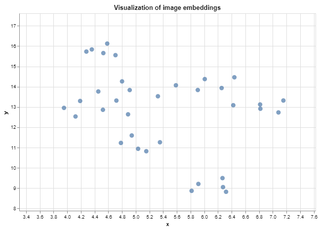
Hurray 🎉, you have visualized your first image embeddings. You can explore the relationships between data points by hovering over them or zooming in/out using the Altair chart's interactive features. The tooltip argument used in creating the Chart displays the corresponding labels of each image data point when hovering over them.
You can also experiment with other techniques of visualizing image embeddings such as heatmaps applying similar steps used for the text embeddings.
Clustering Embeddings
Clustering is a type of unsupervised machine-learning technique used to group similar data points into clusters or groups based on their inherent similarities or patterns in the data. With clustering, we can visualize a high-dimensional space of text embeddings, by creating a visual separation between different groups of texts.
To understand this concept, let's dive into clustering and visualizing text embeddings following the steps below:
Preparing Dataset
To perform clustering, we need a sufficiently large dataset. Here, we will use a modified form of the BANKING77 dataset publicly available on HuggingFace.
The modified dataset consists of 2,000 samples of banking queries already annotated with their corresponding intent and embeddings obtained using Cohere. The dataset consists of 77 classes of intents.
You can download the dataset from HERE. Now, Let's load the dataset.
 import pandas as pd

 banking77_df_2000 = pd.read_hdf("dataset/banking77_df_with_embeddings_2000.h5", key="df")
 print(banking77_df_2000.columns)
 # Index(['text', 'label', 'embeddings', 'intent'], dtype='object')
Create clusters
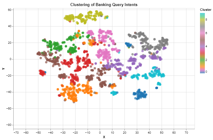
Here, we will cluster the bank queries using their text embeddings. The K-Means algorithm, where each data point belongs to the cluster with the nearest centroid, has been chosen to partition the data into 10 clusters for simplicity. Alternative clustering algorithms include Hierarchical clustering, DBSCAN, Agglomerative clustering, etc.
After creating the clusters, we will use t-SNE for dimensionality reduction to aid visualization in a 2D space.
 import numpy as np
 from sklearn.manifold import TSNE
 from sklearn.cluster import KMeans

 num_clusters = 10
 kmeans = KMeans(n_clusters=num_clusters, random_state=42)
 bdf_text_embeddings = np.array(list(map(lambda x: np.array(x), banking77_df_2000["embeddings"])))
 cluster_labels = kmeans.fit_predict(bdf_text_embeddings)

 # Apply t-SNE for dimensionality reduction
 tsne = TSNE(n_components=2, random_state=42)
 tsne_embeddings = tsne.fit_transform(bdf_text_embeddings)
Visualize the Clusters
Here, we will visualize the clusters in an interactive scatter plot using Altair.
 """Visualize clustered embeddings"""
 # Create a DataFrame for visualization
 df_for_viz = pd.DataFrame({
     'X': tsne_embeddings[:, 0],
     'Y': tsne_embeddings[:, 1],
     'Cluster': cluster_labels,
     'Label': banking77_df_2000["intent"]
 })

 # Create an Altair scatter plot for visualization
 scatter_plot = alt.Chart(df_for_viz).mark_circle(size=60).encode(
     x='X',
     y='Y',
     color=alt.Color('Cluster', scale=alt.Scale(scheme='category10')),
     tooltip='Label'
 ).properties(width=600, height=400, title="Clustering of Banking Query Intents")

 scatter_plot.interactive()
The resulting visualization is shown below. The colors are used to visually separate the clusters. You can also observe that related bank queries based on their intents are placed in the same cluster when you hover over the data points.
Conclusion
In this article, we discussed techniques for visualizing text and image embeddings generated using Cohere and a pre-trained CNN respectively. We also implemented some of these techniques using Python.
I hope you have been equipped with the necessary foundational knowledge to work on larger and more complex text and image datasets.
The Jupyter Notebook can be accessed on Google Colab HERE.
Finally, Thank you for reading! I wish you a great rest of the year 💖.
References/Further Reading
Subscribe to my newsletter
Read articles from Similoluwa Okunowo directly inside your inbox. Subscribe to the newsletter, and don't miss out.
Written by
