A Guide to Layouts, Modifiers, and Material 3 UI Components in Jetpack Compose
 Michelle and Jeremy
Jetpack Compose has redefined Android app development, offering a more intuitive and efficient way to create user interfaces. In this guide, we'll delve into the core concepts of Jetpack Compose: layouts, modifiers, and UI components. Assuming you already have a basic understanding of Compose and theming using material 3. In this guide, we will create a chat item/message card, to better explain the various layouts and implementation of the modifiers to the composables.
Compose layout basics
Layouts in Jetpack Compose are essential for organizing UI elements. They define how components are positioned and sized within your screen.
Now, start a new Project:
Open Android Studio and select Start a new Android Studio project.
Choose Empty Compose Activity from the available templates.
Click Next and configure your project as usual, calling it as you wish. I will be naming my app "ChatItem".
The Composable Function: The Heart of Compose Layouts
At the core of Jetpack Compose lies the Composable function. It's the fundamental building block for creating UI elements in your Android app. A Composable function is a lightweight, reusable piece of code that describes a part of your user interface. Below is our MessageCard composable function without any layouts and modifiers. We are using a data class to store our card's title and message.
data class ChatItems(
    val title: String,
    val message: String
)

@Composable
fun MessageCard(item: ChatItems) {
    Image(
        painter = painterResource(id = R.drawable.avatar ),
        contentDescription = "profile image" )
    Text(
        text = item.title
    )
    Text(
        text = item.message
    )
}
The preview will look something like this. I am using an avatar image from Pixabay.
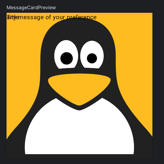
Without guidance on how you want the elements arranged, Compose stacks the Text, and the Image elements hierarchically on top of each other, making them unreadable.
Arranging UI Elements with Layouts
Layouts in Compose are essential for organizing UI elements on the screen. Compose provides a variety of layout components, each designed for specific use cases.
Some basic layout components include:
Column: Stacks UI elements vertically, one on top of another.Row: Arrange UI elements horizontally, side by side.Box: Allows for overlaying UI elements, enabling creative compositions.Surface: Creates a rectangular area with optional elevation (shadow) and rounded corners.
We will cover more layout components in future articles so stay tuned. At the moment let us cover the most commonly used layouts.
Using a Column layout
Let's add the column function to the MessageCard function in our previous code and don't forget to make necessary imports. We will be commenting on the image composable for a better preview of the column function.
@Composable
fun MessageCard(item: ChatItems) {
//    Image(
//        painter = painterResource(id =R.drawable.avatar ),
//        contentDescription = "profile image" )
    Column {
        Text(
            text = item.title
        )
        Text(
            text = item.message
        )
    }
}
This will arrange the two text composables vertically, this is the arrangement we want for the texts and not like before when they were stacked on top of each other.

Using a Row Layout
First, Comment out the Image element so that the MessageCard can have a profile picture. Add the Row Function to the MesssageCard composable like in the code snippet below.
@Composable
fun MessageCard(item: ChatItems) {
    Row {
        Image(
            painter = painterResource(id = R.drawable.avatar),
            contentDescription = "profile image"
        )
        Column {
            Text(
                text = item.title
            )
            Text(
                text = item.message
            )
        }
    }
}
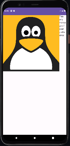
After finishing your project, it should look similar to this.
Modifiers
Modifiers enable you to modify a composable's size, arrangement, and visual attributes, or introduce advanced interactions, like making an element clickable.
The layout created has the correct structure, but there are issues with the spacing between elements, and the image appears too large. To adjust the appearance or configuration of a composable, Compose utilizes modifiers.
Configuring Layouts
Use the Modifier element to size down and clip the image to your preference. Declare the preferred size of the image to be exactly 40.dp square and then clip the image to a CircleShape.
@Composable
fun MessageCard(item: ChatItems) {

    Row {
        Image(
            painter = painterResource(id = R.drawable.avatar),
            contentDescription = "profile image",
            modifier = Modifier
                // Set image size to 40 dp
                .size(40.dp)
                // Clip image within our defined shape
                .clip(CircleShape)
        )
        Column {
            Text(
                text = item.title
            )
            Text(
                text = item.message
            )
        }
    }
}
Here's the preview of the final output:

The message card still has some issues with the spacing, but we will fix this using the Modifier.padding.
@Composable
fun MessageCard(item: ChatItems) {

    Row (modifier = Modifier.padding(8.dp)){
        Image(
            painter = painterResource(id = R.drawable.avatar),
            contentDescription = "profile image",
            modifier = Modifier
                // Set image size to 40 dp
                .size(40.dp)
                // Clip image within our defined shape
                .clip(CircleShape)
        )
        //add space of width 8.dp using Spacer composable
        Spacer(modifier = Modifier.width(8.dp))
        Column {
            Text(
                text = item.title
            )
            Text(
                text = item.message
            )
        }
    }
}
This is the output.

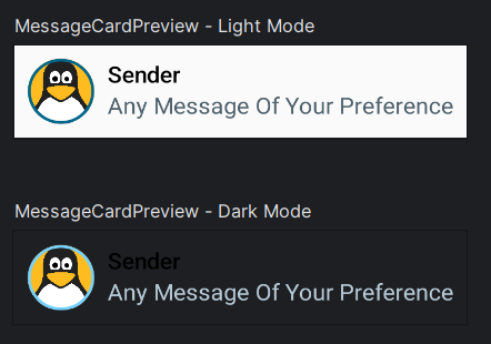
The message card looks good but not yet great. To enhance the aesthetic appeal of our card, we can employ the material design by applying color, typography, and shape. If you're not familiar with material design, it's recommended to check out the previous article on Theming to get up to speed.
This is the final version.
@Composable
fun MessageCard(item: ChatItems) {

    Row (modifier = Modifier.padding(8.dp)){
        Image(
            painter = painterResource(id = R.drawable.avatar),
            contentDescription = "profile image",
            modifier = Modifier
                // Set image size to 40 dp
                .size(40.dp)
                // Clip image within our defined shape
                .clip(CircleShape)
                //creates a circular border around the image
                //and color is set to primary color
                .border(1.5.dp, MaterialTheme.colorScheme.primary, CircleShape)
        )
        //add space of width 8.dp using Spacer composable
        Spacer(modifier = Modifier.width(8.dp))
        Column {
            Text(
                text = item.title,
                //set style to title small from the material theme
                style = MaterialTheme.typography.titleSmall
            )
            Text(
                text = item.message,
                //set color of the text to secondary from the material theme
                color = MaterialTheme.colorScheme.secondary,
                //set the style to a body medium from the material theme
                style = MaterialTheme.typography.bodyMedium
            )
        }
    }
}

/*This @Preview annotation defines
a preview of the MessageCard
Composable in light mode
 */
@Preview(
    showBackground = true,
    name = "Light Mode"
)
@Preview(
    //indicates that this is a dark mode preview
    uiMode = Configuration.UI_MODE_NIGHT_YES,
    //sets name of this preview
    name = "Dark Mode"
)
@Composable
fun MessageCardPreview() {
    ChatItemTheme {
        MessageCard()
    }
}
Learn more about Theming - read this article!
We will cover UI Components in our upcoming article. Stay tuned, follow, and subscribe to our newsletter for updates. Until next time, happy coding and designing!
To be Continued...
Recommended Reads:
Subscribe to my newsletter
Read articles from Michelle and Jeremy directly inside your inbox. Subscribe to the newsletter, and don't miss out.
Written by

