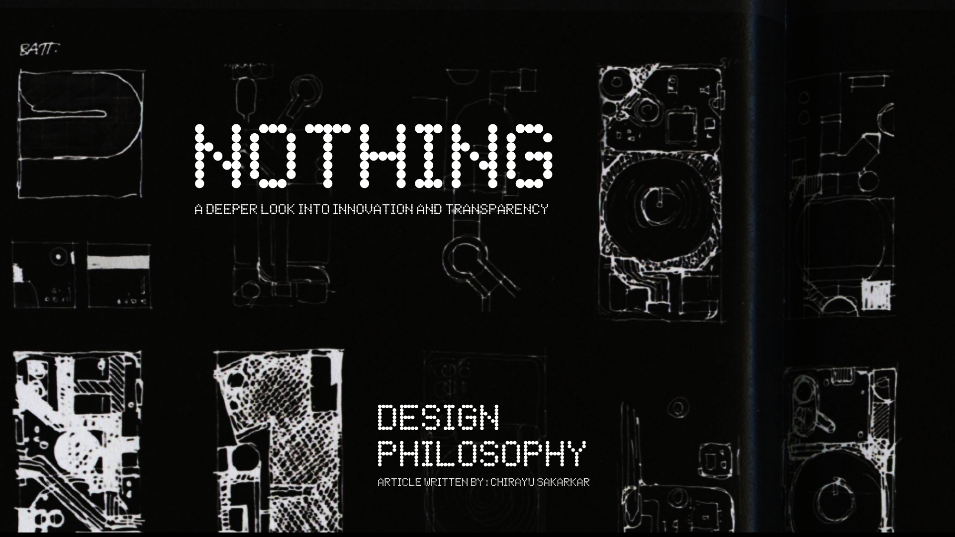
Design Philosophy of Nothing: A Deeper Look into Innovation and Transparency
 Chirayu Kishor Sakarkar
In the world of consumer electronics, where innovation often revolves around incremental improvements and spec races, Nothing, a tech startup founded by Carl Pei, has emerged as a breath of fresh air. Nothing's design philosophy and approach to transparency have sparked curiosity and enthusiasm among tech enthusiasts and consumers alike. In this article, we will delve into Nothing's design philosophy and explore the core principles that guide their product development.
Transparency as a Core Value
One of the standout features of Nothing's design philosophy is transparency, both in their product design and their company's communication. While transparency might seem like a simple concept, it goes beyond just creating a clear case for a smartphone or earbuds. For Nothing, transparency represents a commitment to showing the inner workings of their products, forging a deeper connection with users.
The "Grandmother's Pipe" Concept
Nothing's journey toward transparency began with the idea of the "grandmother's pipe." The design team drew inspiration from Italian tobacco pipes, which had a bulbous shape that gradually transitioned into a stem. This design not only paid homage to a personal memory but also posed a unique challenge for the engineers. It became an early prototype, embodying the concept of revealing the internal components.
The Challenge of Transparency
Creating transparent products is not as straightforward as it may seem. It requires collaboration between design and engineering teams, as well as overcoming technical challenges. The transparency is not just about aesthetics; it involves ensuring that the internal components are visible while maintaining functionality and durability.
Incorporating Light into Design
One of Nothing's most remarkable innovations is the use of light to enhance transparency. They explored the concept of "glyphs," a light-based interface that could communicate with users. This innovation involved shrinking down the technology found in filament LED bulbs to just 0.3 millimeters and integrating it into their products. These glyphs not only serve as a design element but also convey information to users in a unique way.
A Focus on User Experience
Nothing's design philosophy centers around improving the user experience. They understand that users don't need an overwhelming number of cameras or specifications; they need a product that works seamlessly and feels valuable. By focusing on the essential aspects of a product, Nothing aims to offer a streamlined and user-centric experience.
Balancing Aesthetics and Functionality
Nothing's commitment to aesthetics doesn't come at the expense of functionality. Their products are designed with precision, ensuring that even the smallest details, such as the even border around the display, are carefully considered. The choice of materials, like recycled aluminum and glass, adds to the overall user experience by providing a sense of quality and durability.
The Future of Nothing
As Nothing embarks on its journey to disrupt the tech industry, it's clear that their design philosophy is rooted in innovation, transparency, and a dedication to improving the user experience. While their first product, Phone One, represents a significant step in this direction, it's just the beginning. The "glyph" interface, the commitment to sustainability, and the focus on delivering value to users are all indications that Nothing is poised to leave a lasting impact on the tech world.
Nothing's design philosophy is a refreshing departure from the conventional approach to consumer electronics. Their emphasis on transparency, innovative use of light, and dedication to the user experience set them apart in an industry often overshadowed by spec sheets and camera counts. As Nothing continues to evolve and expand its product lineup, it's clear that they are here to challenge the status quo and redefine what technology can be.
Subscribe to my newsletter
Read articles from Chirayu Kishor Sakarkar directly inside your inbox. Subscribe to the newsletter, and don't miss out.
Written by

Chirayu Kishor Sakarkar
Chirayu Kishor Sakarkar
Hello, my name is Chirayu Sakarkar and I am a 3rd year student pursuing a degree in Computer technology. Currently, I am working as a product design intern in one of the fintech stealth startup, where I am gaining hands-on experience in the field and honing my skills in designing innovative and functional products. As a product design enthusiast, I am passionate about creating user-centric designs that solve real-world problems and enhance people's lives. I believe that design has the power to transform and make a positive impact on society, and I am committed to being a part of this change. Throughout my academic and professional journey, I have developed a strong foundation in product design, user experience, user interface design, and prototyping techniques. I am always eager to learn and explore new design concepts, collaborate with cross-functional teams, and push boundaries to create exceptional designs.