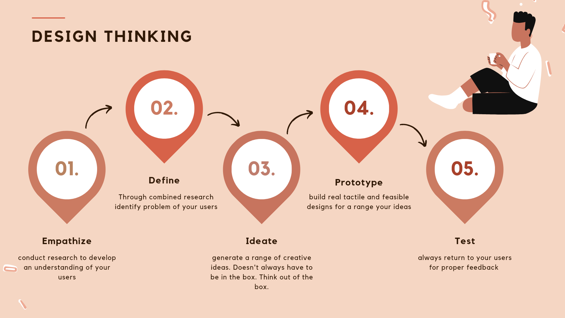
Design Thinking ; a roadmap to understanding users
 Joy Braide
Hey guys 👋
I'm here again with "another one" (in the voice of DJ Khaled.)
Like we all know, thinking is associated with every single decision one makes in life. Even when you choose to be decisionless, you still must have thought hard and wide, on why you don't want to make decisions and just go with the flow.
My favorite phrase; Let's skip the hooplahoo and jump right into how design thinking goes hand in hand with creating user centered designs.
A clear definition of Design Thinking, is that it is a human centered approach to innovation that is focused on understanding users, challenging assumptions, and creating life changing solutions.
Let me stop you there, yes right there ! It is what ? A human centered approach, which means it's main existence is tailored to understand the users point of view.
Now using this Case Study made by Jonhy Vivo, on Redesigning The New York Times App, along side his team mates. We can properly highlight the very important points he made in his short but "Timely" article. (You get it?)
There are three things he elaborated in this article that touches important aspects of a products functionality and usefulness to users.
The brief, the problem, and the goal. These three important aspects help shape a direction in which the designer should go and how the design should affect the user's experience.
One of the major things he talked about in this article was the reason for adding a new feature to the already existing New York Times App.
I mean usually you'd think, so what? What's the point of adding a new feature when the app is already dying, why not just create a new competitor. But is that what users really need at this point. There's so much competition in the "News" market, both locally, nationally and internationallly, that even the most recent news is starting to look stale to agile readers.
But sometimes a good competition is what most companies and product builders need, to sit up and reinvent themselves and revaluate their core values.
His approach is something most designer's nowadays should learn to apply to keep the sustainability of their product going.
Instead of letting a product or application die off, you could redefine it, add new features that incorporate user-centered design principles, to build a stronger long-term relationship with your potential users.
In the article, Jonhy gave a brief of the what the new feature entails, the idea behind it being that; it would present News articles in a more timely and accurate manner, while considering the schedule and habits of the users.
He also elaborated on the issues faced by the users of New York Times App. Some of which were, coverage, life experiences, lack of usage and irrelevant content.
Sometimes it gets really difficult to stay committed to a product when a user's experiences and interaction with that product or service leaves a negative impact on that user.
One thing to note is that not all news applications take into consideration, how far the gravity, of what a reader sees goes. They need to make an effort in creating a filter channel for users to give them exactly what they need, based on their preference and to get the best, even with their busy schedule.
Imagine waking up happy, only to see a very devasting news about a serious disaster that just befell a certain country or group of people, and over time, you keep getting the same series of news whenever you encounter that app.
As time goes on, this might leave a negative effect on the user's mindset. Some may develop a certain kind of phobia for anything relating to news and even avoid watching news channels and listening to radios or using news applications.
Understanding that as much as every user has a capacity, they also have a limit. And preferences change along the line, people grow out of things and people develop new habits.
Johny went further to explain the goals of the new addition, "Timely", that the new feature would enable users to receive notifications at opportune moments on a daily basis. Meaning that news would be short, timely, convenient and of course accurate.
Now that we have an insight as to what his Case Study entails, it's time we take a brief look at the design thinking process and steps he stated.
All together he gave six well known steps in the design thinking process to follow. Through this steps a designer would be able to create innovative solutions to solve undefined user problems.
This six steps are;
1) problem & concepts,
2) audiences, needs, scope out
3) empathy and sketches
4) wireframes, design critics
5) visual design, story telling
6) prototype
We've come to the very abrupt end of this article. However I would be writing more on this six steps of the design thinking process mentioned above, in another article. That being said feel free to check out my first ever article on hashnode. Also share, because knowledge shared is knowledge gained.
Subscribe to my newsletter
Read articles from Joy Braide directly inside your inbox. Subscribe to the newsletter, and don't miss out.
Written by

Joy Braide
Joy Braide
I'm a product designer & a Dev. I'm currently on my sophomore year in college. Enrolled in a few bootcamps, like Friends Of Figma Africa, hashnode 2023 fall bootcamp.