A review on a popular Newsletter Mobile Application
 Mary Sokoh
This article looks at the Case Study of The New York Times App's Redesign.
As a beginner reading the case study, I discovered a few interesting points that I would like to discuss. I admire the designer's authenticity and originality.
The users should always be at the center of the application, and this case study gave me a great example of how to do that.
Problems, goals and deadlines
The design case study's opening paragraph made it very clear what the application's issues were; it was well-written and to the point. As vital as the problem is, they also needed a target or end goal, therefore I for one thought it was crucial that they were highlighted.
Most people don't usually worry about deadlines while building an application, but the case study made the deadline very apparent. This was done to demonstrate the team's commitment to the project while also demonstrating that they had a system in place and should adhere to it.
User research

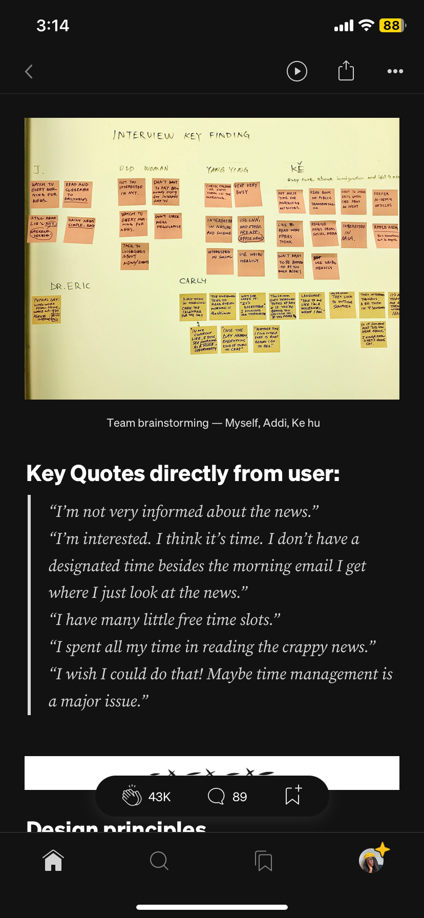
The design case study provides details on the type of user research done and the research methodology. According to the method of data gathering and synthesis described, the study gathered information from young individuals whose busy daily schedules prevented them from reading the newspaper. Through the use of research techniques including surveys and interviews, data was acquired. The case study also includes user feedback to aid in design decisions. Some of this feedback came from users who said they weren't interested in formal news, didn't have much free time to pay attention to the news, or weren't happy with the news they had read.
Sketches, wireframes and prototypes

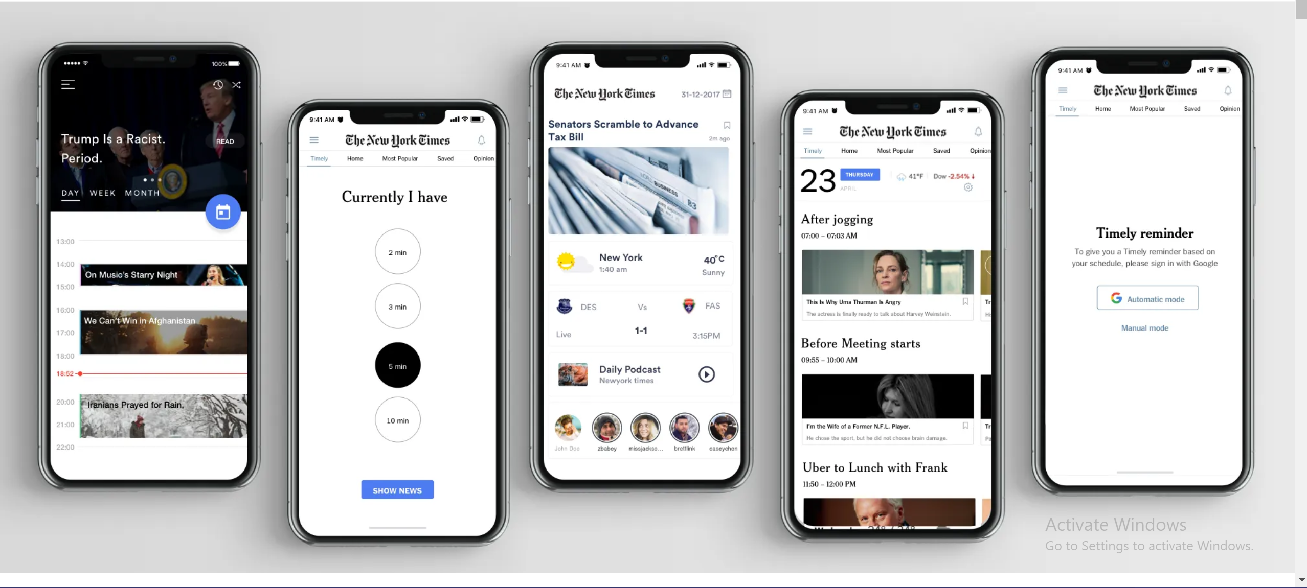
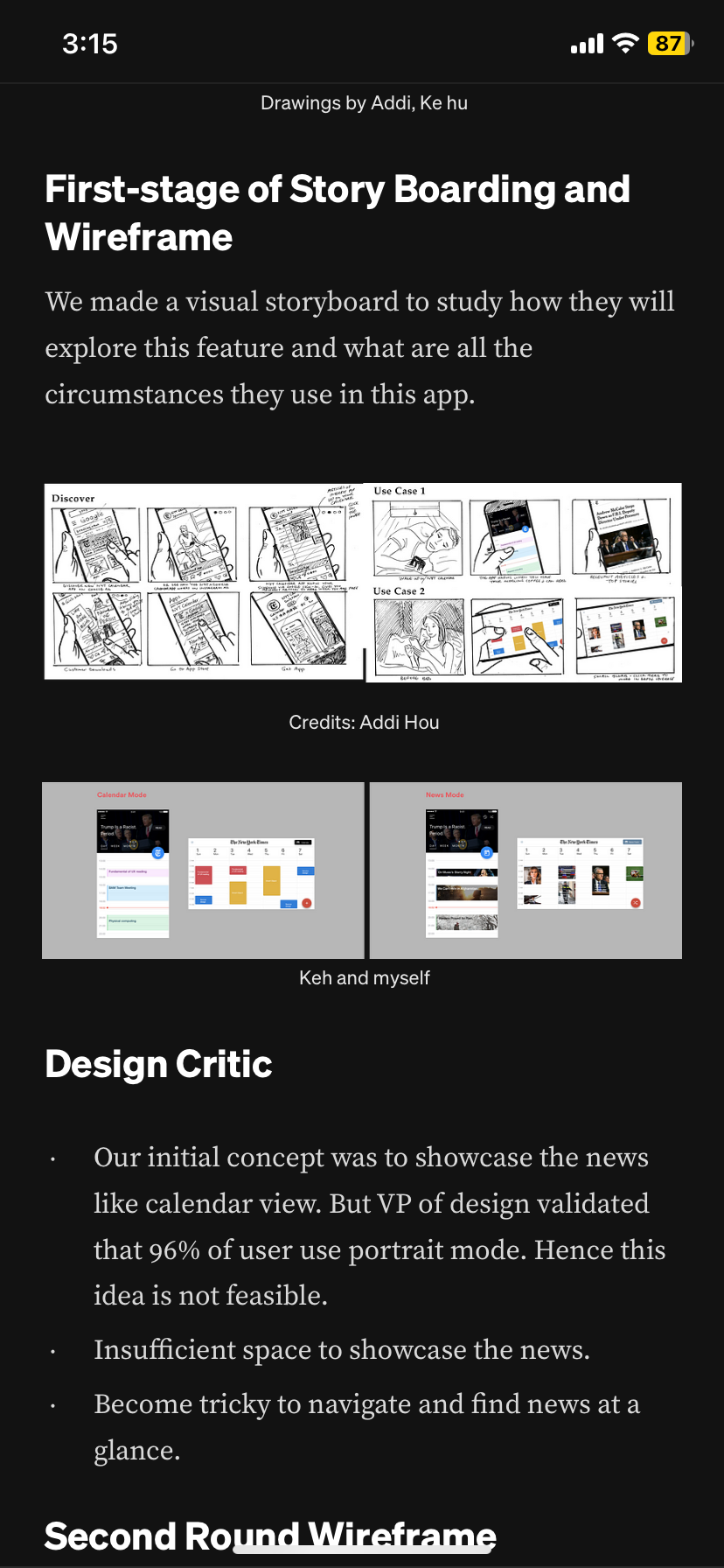
The case study makes strong use of visual representations, using the new app's prototypes, wireframes, and sketches to demonstrate how it fits naturally into the lives of those who use it. The updated software synchronizes seamlessly with users' Google calendars to deliver news at the appropriate moment.The developed prototypes also demonstrate that the app offers personalized news that is timed according to the user's preferences. The case study clearly demonstrates how the recently finished New York Times app would fit into the user's life using a user journey map in addition to the prototypes that were made. The journey map organizes a user's actions into a chronology and then adds thoughts and feelings to give the events in the user's life a narrative feel. The study was made more approachable and customer-focused with the aid of an empathy map and a storyboard.
In conclusion, the case study was able to convey the design project and the anticipated result in a straightforward and fluid manner. It also addressed all relevant design information, such as design choices and their effects on end users.
Subscribe to my newsletter
Read articles from Mary Sokoh directly inside your inbox. Subscribe to the newsletter, and don't miss out.
Written by
