Musings on v0, Currently
 Michelle Bakels
Two weeks ago Vercel announced their latest product offering, v0, "a generative user interface system by Vercel powered by AI".
v0 instantly went viral. Enter a UI description into a text field and seconds later receive a design with the code to copy, paste, and drop into your project. Tens of thousands of people went to give it a spin only to find a waitlist signup instead. Public links to v0's UI generations spread across Twitter via accounts with access. Speculation mounted on the advancement of v0's capabilities and whether this AI-powered tool would be the final dev killer.
Blessed are the Dev Rels, for Tey granted me access to v0 the day before it was announced. Since then I've been working to earn my keep with ample feedback, bug reports, and social posts to share my experience. I've noticed over the last couple of weeks that it's difficult to fully grasp the experience of using v0 via tweets and for as much excitement v0 has generated, there also seems to be a wave of anxiety.
Here, I'll share a more detailed review of my observations, impressions, and predictions on v0. I'll cover a lot, but I won't be able to cover absolutely everything. It is already surprisingly robust. Please note the following is speaking strictly to the v0 implementation of its first two weeks in Private Alpha. The v0 team has been iterating on this at such a phenomenal rate that some claims here could be outdated tomorrow. I'll try to keep up with annotating significant changes.
General Use
The user experience is dead simple. 70% of the view height on the landing page is a single text field with a dynamic placeholder offering suggestions on what to prompt. No part of this UI-generating experience is more than typing and a few clicks.
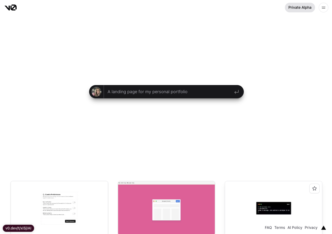
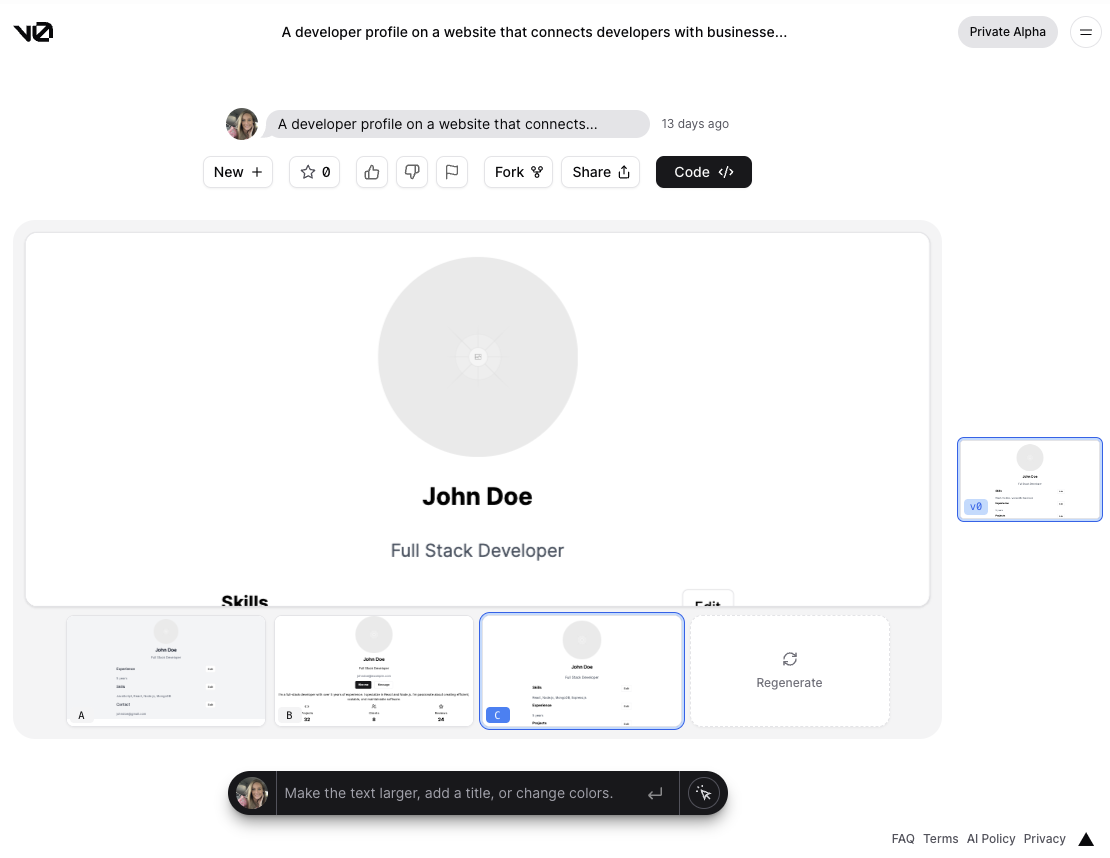
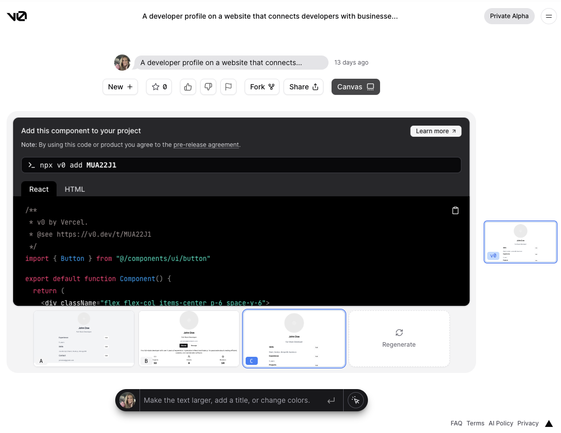
You can start a fresh design or "fork" a design featured at the bottom of the landing page or on the Explore page. The initial prompt will produce three generated results to evaluate where you either select the one you prefer the most or regenerate all results. Clicking the "Code </>" button will flip the main panel between the "Canvas" and its copy-pasteable code.
Currently, you can copy the React code or HTML code. At times certain elements are rendered using shadcn/ui components and all of the styling is in Tailwind. These are a few things I expect to quickly evolve as more options are mentioned here to be in the roadmap.
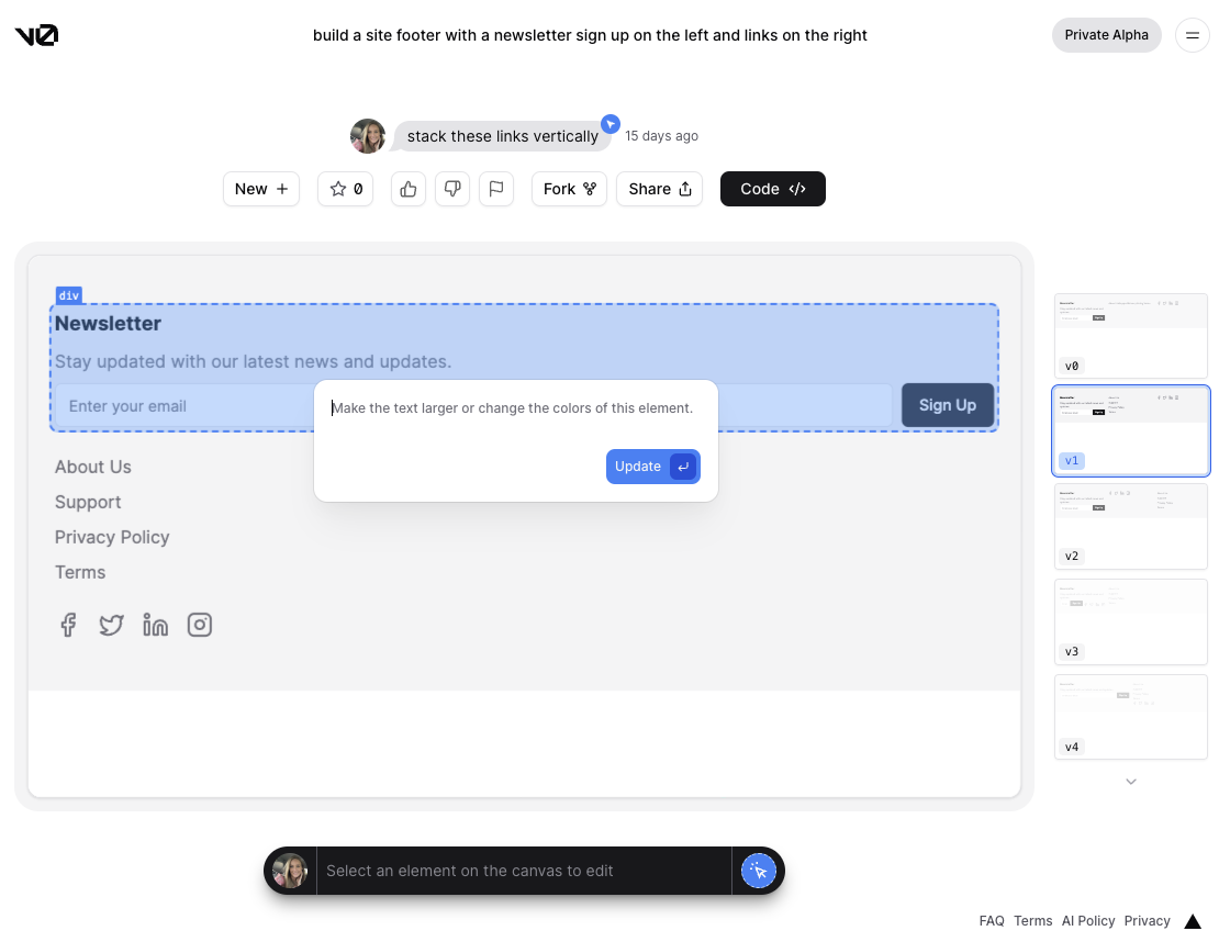
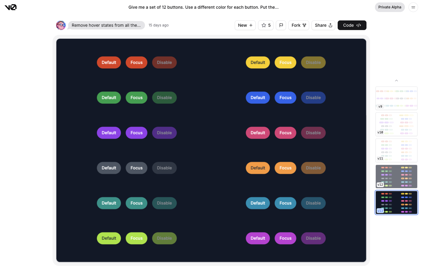
Once you select a design to start with a sidebar appears with each version iteration as you continue to prompt v0 for changes. You can prompt changes through the text field at the bottom or use the "pick and edit" pointer that allows you to write prompts for specific components. When using "pick and edit" only that element and its children will re-render.
Observations
Currently, v0 generates HTML elements and Tailwind styling. It can produce code for element attributes such as onFocus and onHover. However, it does not output JavaScript for handling data fetching or handling the UI as you would see in typical JSX. Developers who want AI-generated JavaScript will continue to use ChatGPT for now.
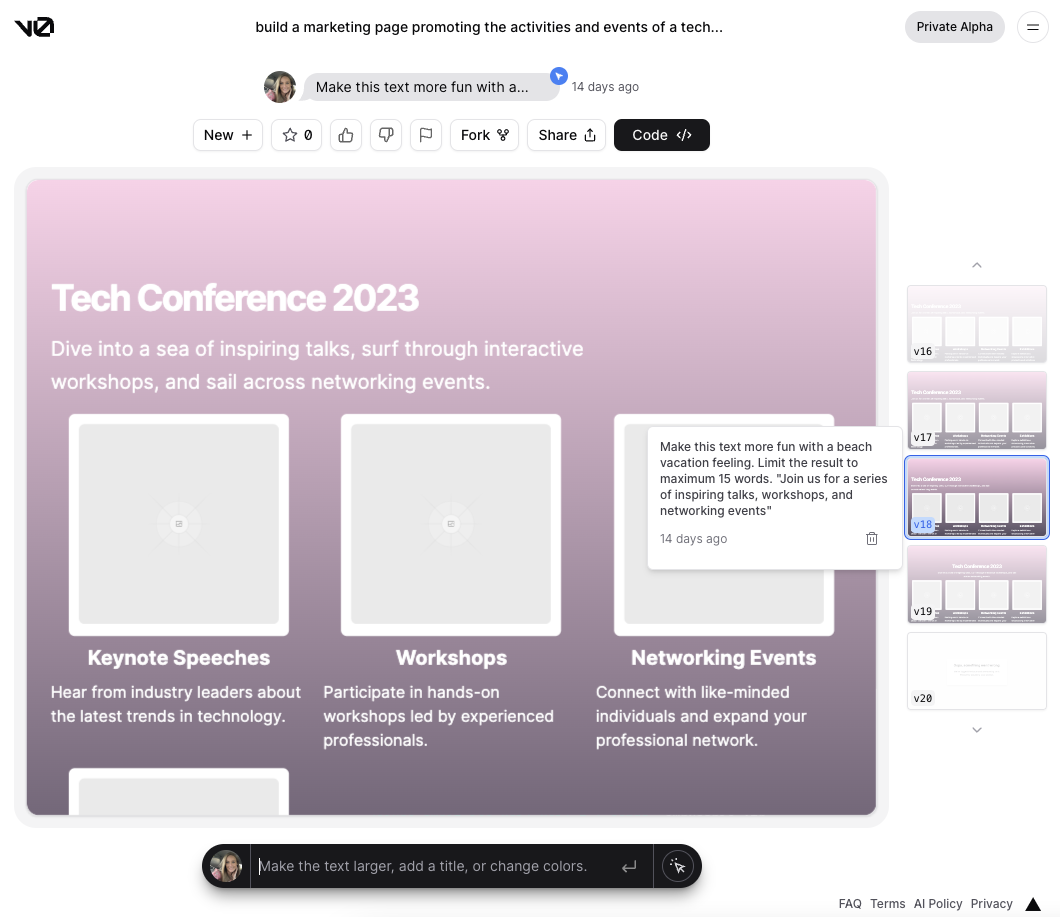
v0 does surprisingly well editing copy in your design. With the "pick and edit" tool you can prompt it to write something similar to how you'd prompt ChatGPT. Selecting the subheader and prompting v0 to write more fun, beachy copy turned, "Join us for a series of inspiring talks, workshops, and networking events" into "Dive into a sea of inspiring talks, surf through interactive workshops, and sail across networking events."
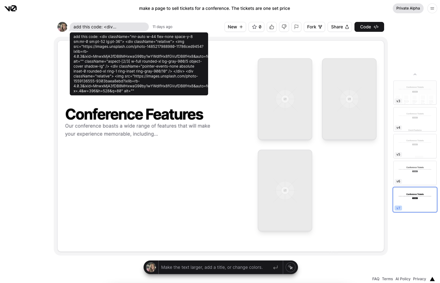
The text field for v0's prompts also accepts code. This is a prompt that I thought would break, but v0 managed to render the code provided as best it could. The character limit didn't allow me to enter my entire code snippet but for what it did receive it rendered pretty accurately.
Another great out-of-the-box feature is that all generated code is responsive to different screen sizes. It doesn’t always look perfect when resized, but getting most of the way there is still beneficial. It does best with the fundamentals of UI so a few things it doesn’t yet handle are custom fonts, animations beyond simple ones, video content, overlapping elements, or layouts that don't have a grid-like layout. It’s still a starter tool, which makes sense for its purpose (v0 = version0), however, I wouldn't be surprised if many of these features arrived soon.
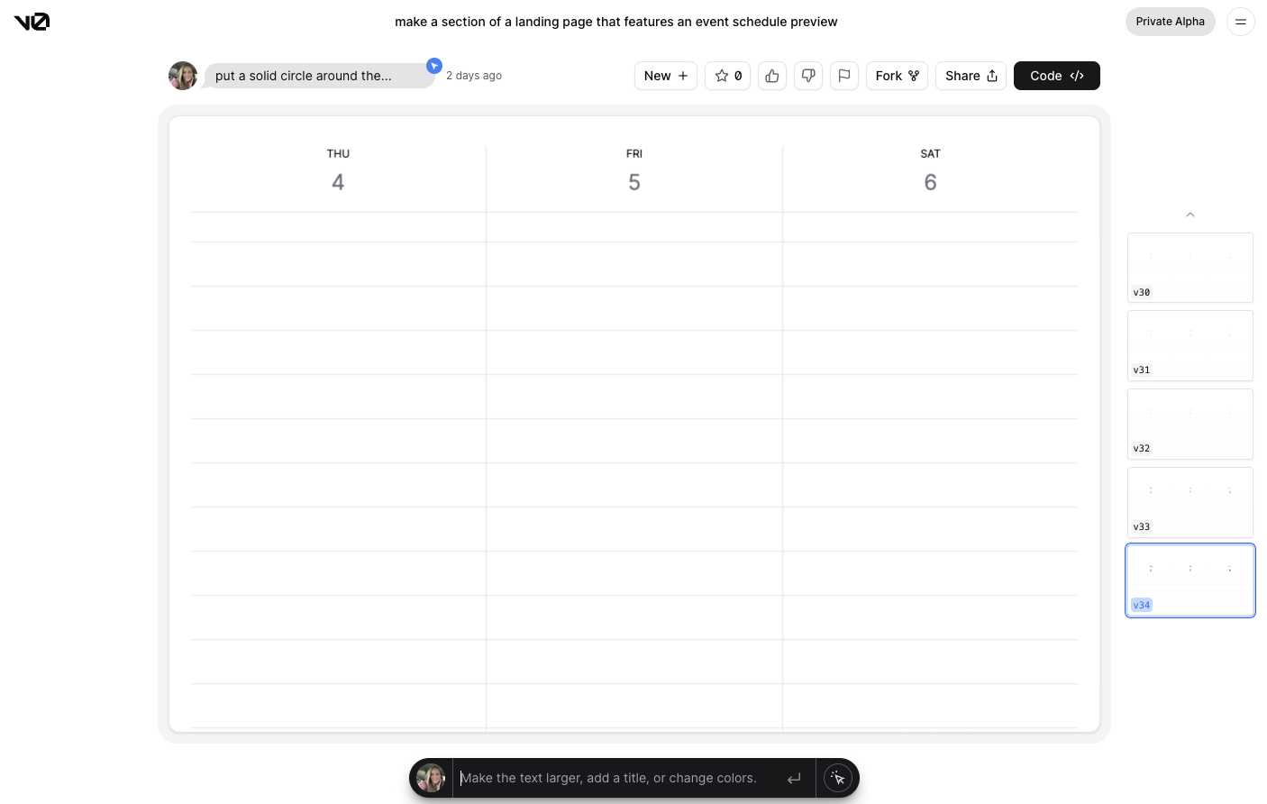
In v0, you can prompt it to the point of beautiful, final edit designs, but there is a precipitous drop in value to keep prompting v0 to this degree of completeness. Once you get into the more refined details of a design it becomes quicker to copy what you already have and finish the rest in your project code. In the following example, I was looking to recreate the Google Calendar weekly view for just three days. After around v17 (the 17th version of the design) the following changes become much smaller. Coding changes for more minor edits go quicker than continuing to prompt v0 and waiting for page re-renders or writing prompts that don't work out.
Asking v0 to generate a page that looks like another webpage yields interesting results. I experimented with this idea quite a bit and believe this will get better over time. The beginning of this exploration started when asked what v0 would do with the Framer AI Prompts. I tried out the first prompt on the Framer site and this was the result: https://v0.dev/t/zS7x2yX. The results from each tool are quite different, but that's expected as one tool caters to designers and the other to developers. However, this did give me the idea to start making some other comparisons on the web.
The first challenge I prompted was this:
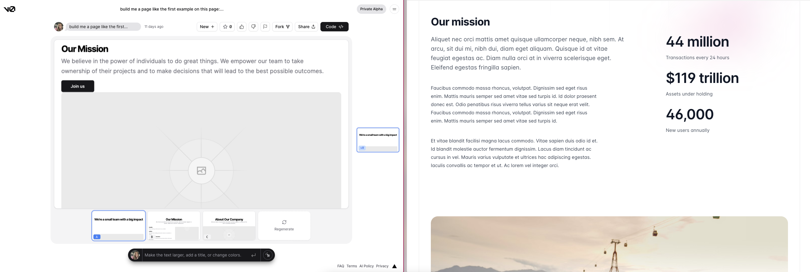
build me a page like the first example on this page: https://tailwindui.com/components/marketing/page-examples/about-pages
I assumed this prompt would break -- it didn't. (I'll refer to this result as aboutSpecific, seen two images below in a side-by-side screenshot.) My first thought was that v0 parsed keywords out of the URL and put together an About page. However, I noticed a few curiosities in the first generated result that made me reconsider. First, when v0 generates the results for a page design it typically only returns content for the initial view height of the page. Here is an example asking v0 to
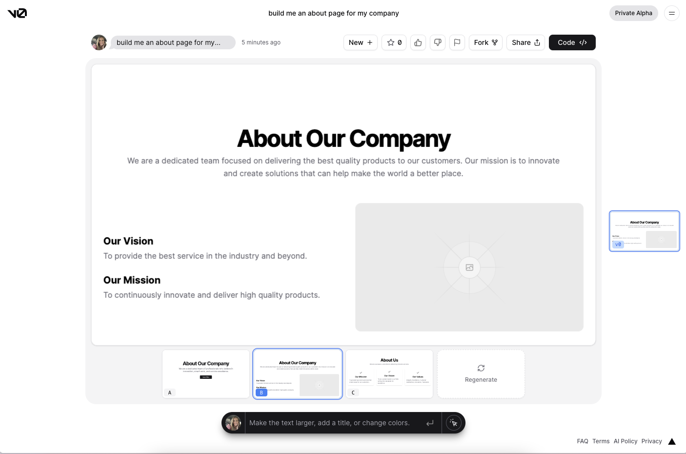
"build me an about page for my company": https://v0.dev/t/xApqLT5udCu.
(I'll refer to this result as aboutGeneric, seen below)
The content is generally the same in all three (header, values, mission, vision, etc.) In aboutSpecific, v0 produced a long, scrollable page with many large sections which is similar to the layout of Tailwinds page. Long, scrollable pages as a first generated result in v0 is highly unusual -- in fact, I've not yet seen that. aboutSpecific is also unusually ugly compared to the neat designs v0 creates. It included giant images like those in the Tailwind example, however, it didn't lay them out well on the page. The code for the layout in the Tailwind example is more complex than v0 has been able to produce so it tends to try and reorganize elements into a basic grid.
In aboutGeneric, v0 produced a much more expected design. All of the elements are neatly organized in the initial view height of the page. It looks much nicer than aboutSpecific. aboutSpecific also matched the order of the sections on the Tailwind page: header, Mission, Values. I don't believe that v0 was crawling the URL I gave it but I was getting the impression that v0 had some reference somehow to the actual page at that URL, and the generated results went beyond keyword parsing. So I continued to throw it more URL's.
Next, I tried the URL for the Next.js blog.
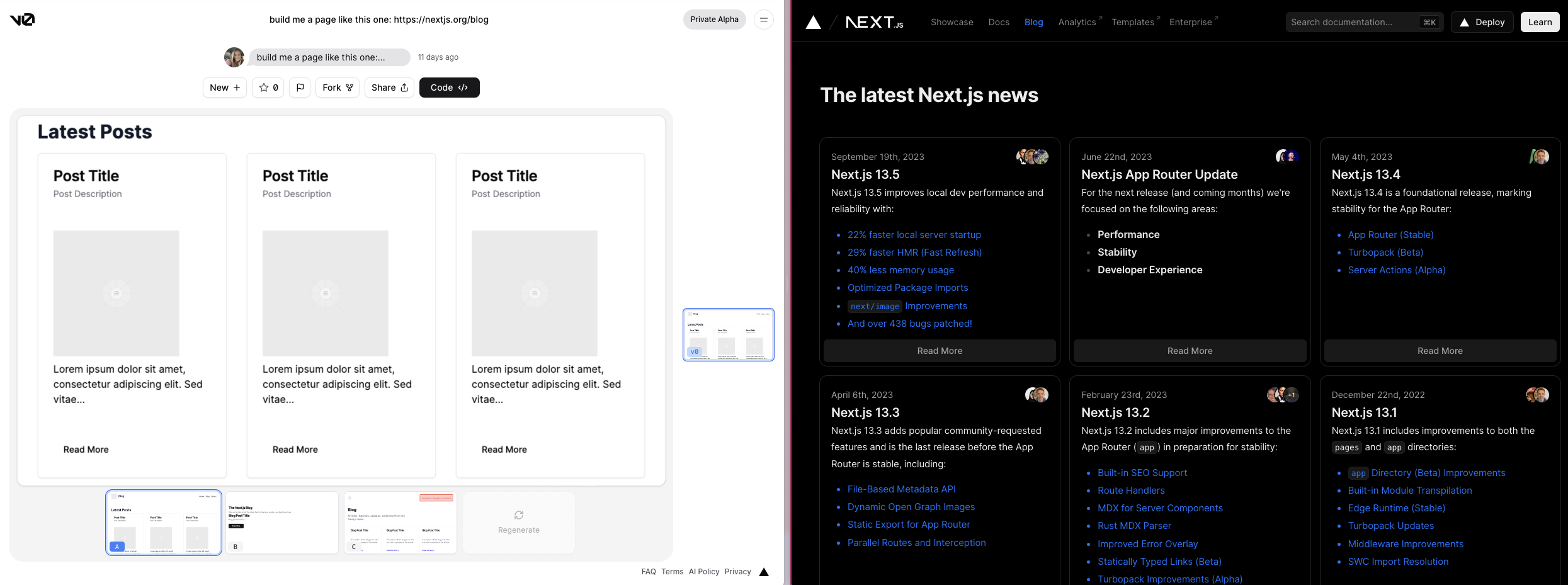
"build me a page that duplicates the layout of the page at this URL: https://nextjs.org/blog"
Initially, the results were underwhelming. Extremely basic. I felt more confident that the results from that prompt (seen at this link) were drawn from keyword parsing. However, I gave it another try with a simpler prompt.
"build me a page like this one: https://nextjs.org/blog"
Much better. It's not a mirror of the page, but the elements and layout are much more similar. It includes a navigation bar with a logo, page header, blog title, description, and a button that says "Read More" at the bottom of each post. Some elements are misarranged. For example, instead of tiny, overlapping images of the authors in the corner of each post, the v0 result includes a large image in the center of the post. Again, v0 is still weak at creative layouts. It can generally include the right elements but will lay them out in a simple grid. There's still no evidence that v0 is hitting the URL and crawling the page, but there seems to be some indication of having a reference to the page at this URL.
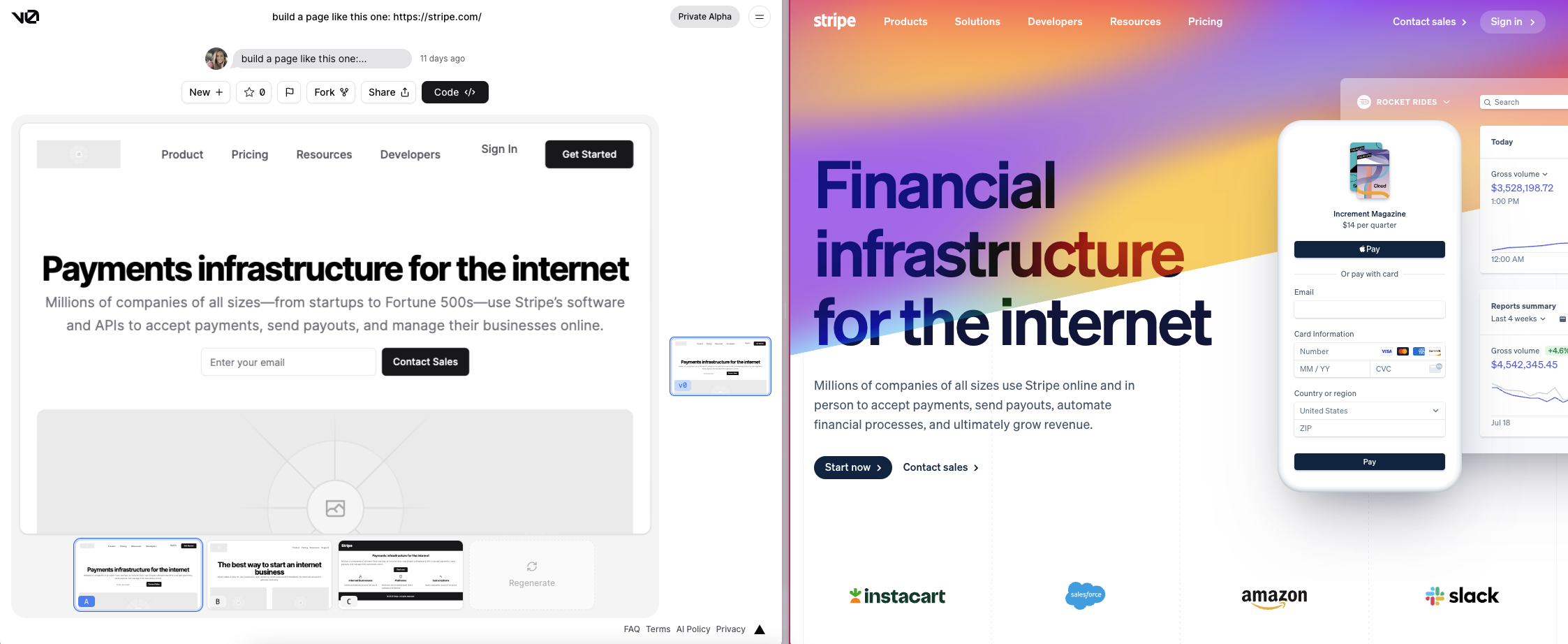
I have many examples of sites I tried this with, only a few others were really interesting, but I'll share one more in this post. This is my personal favorite, Stripe's landing page. v0 includes a button in the hero for "Contact Sales", the header has a logo, there's a navigation bar with nearly all of the same items, and two CTA buttons in the right corner. However, the most interesting thing to me was the copy. v0 captures the copy from Stripe's page nearly 100%, and where it doesn't get the exact words, it replaces it with a suggestion that means the same thing. For example,
Stripe:
Financial infrastructure for the Internet.
Millions of companies of all sizes use Stripe online and in person to accept payments, send payouts, automate financial processes, and ultimately grow revenue.
v0:
Payments infrastructure for the internet.
Millions of companies of all sizes—from startups to Fortune 500s—use Stripe’s software and APIs to accept payments, send payouts, and manage their businesses online.
I've run this prompt a few times. Sometimes it's given me more generic results, but this test was the closest it got to replicating the page. I don't believe Stripe's copy is vague enough to claim v0 doesn't have some kind of reference to the content at this URL.
Summing up this experiment, I don't believe v0 is hitting a given URL and crawling a page after a prompt, but I do believe that there is a reference somehow available. I can't speak more definitively than that because I don't know how v0 was specifically trained. Last, the prompt when providing a URL is fickle. "Build a page like this one: {URL}" returns results. "Build a page exactly like this one: {URL}" breaks. Until more definitive results occur we can only continue to test and observe.
Impressions
v0 is a developer aid, not a developer replacement. To use v0 successfully it helps to understand how to code and build web applications. Describing a design using technical language and asking for specific code edits tend to yield better v0 results. This may not always be the case though, as it's getting better every day.
Finer, polished details in v0 take time. The time-saving value of v0 is copying an early result over to your project code and making the final edits there. Seeing it in the context of your application will likely prompt you to make changes to styling and layout. The benefits of this tool are going to work fastest for people who can grab an early design version and run with the final edits in code.
Another benefit to understanding code with v0 is that at times a design may look correct, but under the hood it may not be the ideal implementation. You may spend a lot of time generating a pixel-perfect design only to find that you may not want to put this code in your application. For example, there are many ways to create space within and around elements. Perhaps the convention used in your application is different than the code v0 will output. Devs working in v0 can jump on those refactors more quickly by checking that the generated code is what they want to implement, and if it’s not, they can prompt it to generate code with a more specific implementation.
v0 kicks off the boring parts of web development and leaves developers with problem-solving and implementing logic. It can resolve design blocks, inspire ideas, and give developers a head start, but they still have to take it the final mile at least. It generates code. You have to know how to integrate this, add to it, or refactor it in your application. Developer jobs are safe.
Predictions
I'll start with a big one. With a successful rollout, marketing, and adoption there is the potential that v0 can grow to be bigger than Vercel. Ironically, I believe it can be what AWS is for Amazon, not the initial product that comes to mind when you hear "Vercel", but potentially one of its greatest revenue generators.
With that said, I have no idea what the pricing model will be for v0, but it’s safe to assume this isn’t going to be free and unlimited for the whole world to use. Vercel would go bankrupt in costs. The companies that pay for their developers to use co-pilot will likely be the same companies that pay for v0. Vercel embraces the "freemium" model and my prediction is that this will follow suit.
The v0 FAQ page mentions several roadmap features including support for other frameworks and the ability to implement your own design systems. In addition to these, I think naturally a good feature to pursue would be the ability to upload design files such as those from Figma, and generate the design's code. It would also be sick to make that URL prompt actually crawl a page and give you the layout code.
v0 works well in combination with other AI tools such as Co-pilot and ChatGPT, but doesn't currently replace either. Depending on how v0 develops and what the full scope of the project is determined to be, it could one day replace ChatGPT for frontend developers. For now, ChatGPT and Co-pilot remain the best AI developer tools for writing JavaScript and more complete framework logic while v0 handles the UI elements.
A more speculative prediction is that v0 can become the center of a new creative community online where code and art merge. Massively successful adoption has the potential to create a space that feels like a cross between Deviant Art and GitHub. People can develop prompting skills and gain notoriety for their ability to create exceptional v0 designs. For web developers, there will be a before and after v0. Similar to how most web applications today are started with a framework, most layouts, pages, and designs will be kicked off with v0.
Ultimately, the future of v0 is unknown, but it looks promising.
Subscribe to my newsletter
Read articles from Michelle Bakels directly inside your inbox. Subscribe to the newsletter, and don't miss out.
Written by

