CSS Units (Every Single One)
 Michael Salam
CSS units are often used in defining numerical values of certain properties.
Just like you measure a distance in centimetres, metres, and so on, several CSS values are defined with units attached. The unit you use then depends on the type of property, as well as the results you wish to achieve.
Let me tell you something.
Come closer.
You won't ever use a good number of the units I'm about to mention. (0_0)
This article is mainly for knowledge purposes.
Alright (^_^)
There are several categories of CSS units, but we will look at three only:
Length units
Angle units
Time units
Length Units
Length units can be further categorised into
absolute units and
relative units.
Absolute Length Units
These are fixed-size units and are used when we want the distance to appear exactly the size we specify.
They do not depend on any variable, and changes in screen size will not change the value. In other words, they cannot scale in size.
Pixels (px)
px is the most commonly used among the fixed units. You most definitely have used (and probably abused) it in your projects.
A pixel is the smallest unit in a digital display, and the px unit defines lengths using pixels.
Generally, 1px is one device pixel (dot) of the display.
Different devices may have different numbers of pixels on the screen (pixel density), and the size of a pixel may vary slightly depending on a device's pixel density.
Numerically, 1px = 1/96 of an inch.
Points (pt)
It is a unit of measurement used in print.
Numerically, 1pt = 1/72 of an inch.
There's not much else I can say about that :(
Picas (pc)
1pc = 12pt
That's it :)
Centimetres (cm)
Again, not much to say. I believe you know what a centimeter is.
Millimetres (mm)
You get the drill.
Inches (in)
1in = 96px = 2.54cm
Simple conversion.
When building for screens, px is the only fixed unit you will have to use. It's the most appropriate, unless, of course, you voluntarily choose to use the others (not advisable).
Relative Length Units
For most (if not all) of your work involving lengths, it is always advised to use a relative unit rather than an absolute one.
This is because screen sizes vary so much, and having fixed lengths on elements will seriously affect website responsiveness.
em
To scale the size of an element based on its parent's font-size, we use the em unit.
Assuming we had a web page with a paragraph inside of a div, the div is the parent element of the paragraph.
If the font size of the parent element (div) was set to 12px,
div {
  font-size: 12px;
}
and we wanted to use em on the paragraph,
1em = 12px,
2em = 24px,
3em = 36px,
and so on.
However, if the parent of the element does not have a different font-size set, the value of 1em will default to the root value, which is 16px.
Root em (rem)
I mentioned in the em section above that if the font-size of the parent of an element is not modified, the value of 1em will default to the root value, which is 16px by default.
What if we WANT to use the root element's font size as the scale value?
That's where the rem unit comes into the picture.
If 1rem = root font size = 16px by default,
2rem = 32px,
3rem = 48px,
and so on.
Of course, if we change the font-size of the root element, the scale value will change as well.
Therefore, if we changed the root font size to 10px,
html {
  font-size: 10px;
}
1rem = 10px,
2rem = 20px,
and so on.
root element =
<html>element
Character Unit (ch)
A character unit represents the width of a character.
However, not all characters are of the same width, so the character "0" (zero) was selected as a standard.
Thus, 1ch represents the width of the "0" character.
ex
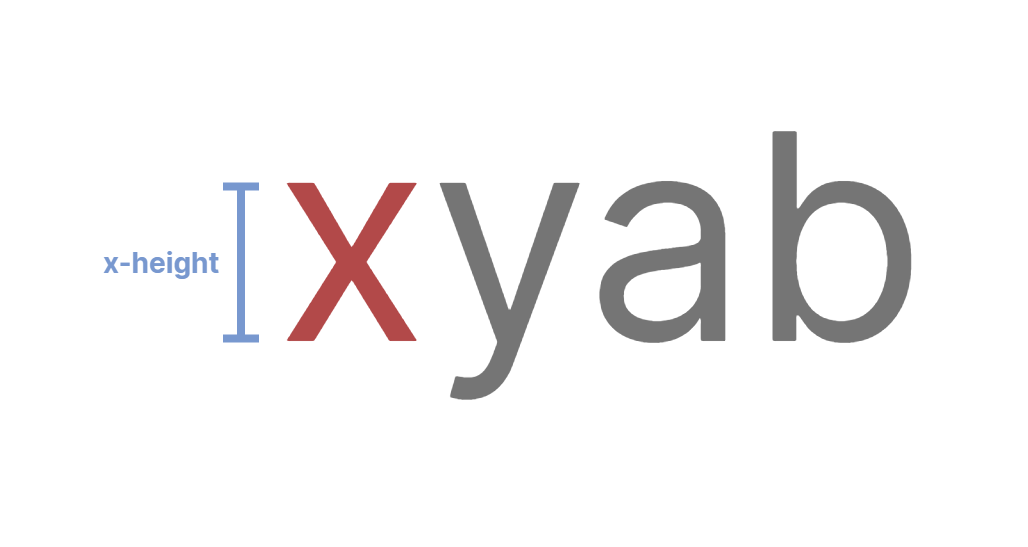
Although rarely used, like many other units on this list, the ex unit defines an element's dimensions relative to the x-height of the current font.
x-height:
"the height of a lower-case x, considered characteristic of a given typeface or script"
Viewport Width (vw)
The vw unit represents the width of the viewport.
viewport:
"the user's visible area of a web page"
Using the vw unit calculates dimensions as a percentage of the width of the viewport at any time.
Thus,
100vw = 100% of the viewport width,
30vw = 30% of the viewport width,
and so on.
This means the computed width of an element in a 320px wide viewport, for example, will be different from a 768px wide viewport.


Viewport Height (vh)
Viewports have widths, and they also have heights! :D
The same way vw computes dimensions as a percentage of the viewport's width, vh computes dimensions as a percentage of the viewport's HEIGHT.


vmin and vmax
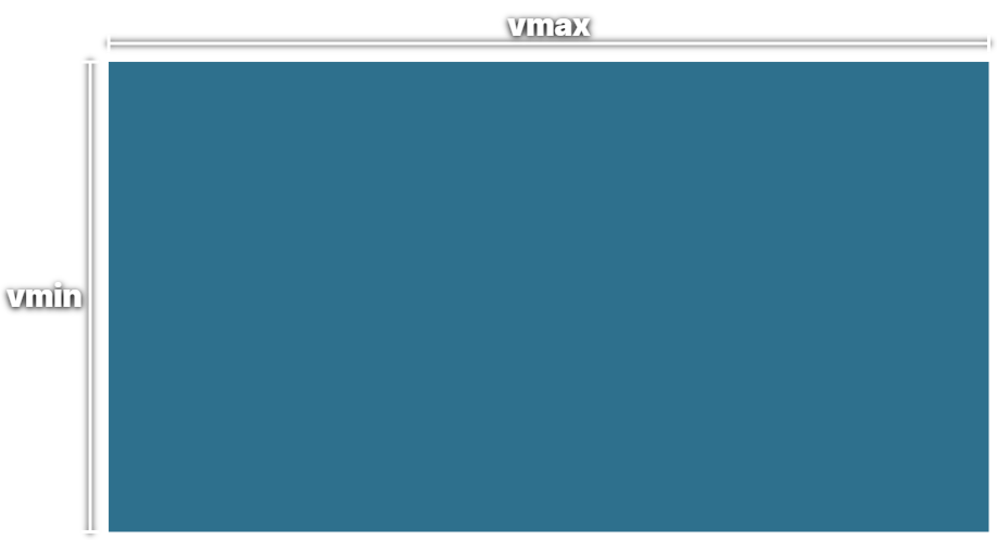
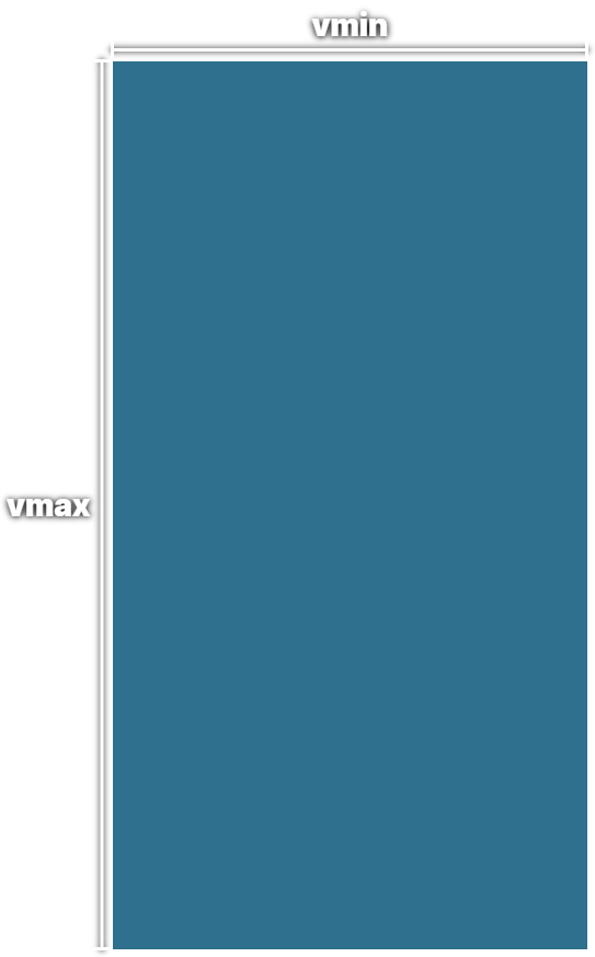
The vmin unit checks both the viewport's height and width and computes dimensions as a percentage of whichever is smaller.
The vmax unit does the opposite.
So, even if the viewport's height is smaller than its width, vmin will use the height.
Also, even if the viewport's width is greater than its height, vmax will use the width.
In summary, relative to the viewport height and width, vmin uses the smaller of the two, while vmax uses the larger of the two to compute dimensions.


Small, Large and Dynamic Viewport Units
Small viewport units (svh and svw),
large viewport units (lvh and lvw), and
dynamic viewport units (dvh and dvw)
are newly added units that take into consideration any UI elements of the browser, such as address bars, toolbars, etc. when calculating viewport dimensions.
More on those here.
Percent (%)
The percent (%) unit computes dimensions relative to the dimensions of the parent element.
For example,
width: 90% gives an element a width of 90% of the parent element's width.
height: 75% gives an element a height of 75% of the parent element's height.
Angle Units
Certain CSS properties require angles to be defined as values. There are four angle units in CSS:
Degrees (deg)
The deg unit represents rotations in degrees.
360 degrees of rotation makes a full circle.
Gradians (grad)
This unit represents rotations in gradians.
A full circle is 400 gradians.
Radians (rad)
The rad unit represents an angle in radians.
1 radian = 180/pi degrees
A full rotation = 2pi radians
Turns (turn)
Finally, a turn represents an angle using the number of turns.
A full rotation is 1 turn.
For most of your work,
degshould be sufficient and easiest to understand/work with.
Time Units
When working with animations and transitions in CSS, we need to specify the duration, and we do that using time values.
There are two units of time in CSS:
Seconds (s)
The s unit is used to define time values in seconds.
transition: all 3s;
animation: my-animation 2s linear;
Milliseconds (ms)
The ms unit is used to define time values in milliseconds.
You may prefer to use ms for smaller time values instead of decimal values in seconds.
transition: all 200ms;
animation: my-animation 400ms linear;
1s=1000ms
Other Units
There are several other types of units in CSS, such as
Grid fraction (fr): Used in CSS Grid layouts for specifying flexible grid tracks.
Dots per inch (dpi): Used in properties like background-resolution for specifying the resolution of an image.
Parting Words
That's it, (not really) every CSS unit! (^_^)
As mentioned at the beginning of this article, you won't have to use all of these units while building websites. You will probably only use a few of them.
Nevertheless, you need to understand what each one is used for, how it behaves, and when it is most appropriate to use it.
Thanks for reading this week's article.
Have a good one!
Subscribe to my newsletter
Read articles from Michael Salam directly inside your inbox. Subscribe to the newsletter, and don't miss out.
Written by

Michael Salam
Michael Salam
My technical writing has emerged as an intersection between web engineering and a deep interest in education. I write to help devs at all levels gain true understanding of foundational concepts. Trust me, you don't know as much about the basics as you think you do (^_^)

