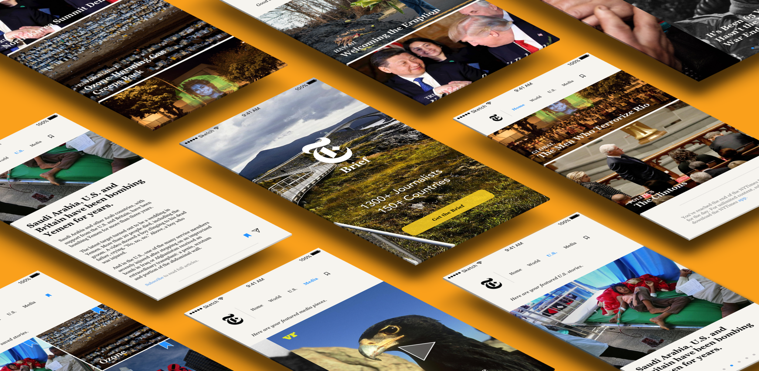
The Redesigned New York Times App: Unpacking the Design Thinking
 Loveday Precious
Introduction
The New York Times, a venerable institution in journalism, has always been at the forefront of delivering news to its readers. In today's digital age, where information consumption is rapidly evolving, The New York Times has redesigned its app to provide a cutting-edge experience. In this article, we will explore what stands out about the design thinking behind the New York Times' redesigned app.
User-Centric Approach:
The cornerstone of the New York Times app's redesign is a strong emphasis on user-centric design. The app is not just about delivering news; it's about delivering news tailored to the individual. Upon launching the app, users are greeted with a personalized feed that reflects their interests, previous reading habits, and location. This personalized approach keeps users engaged and informed.
Streamlined Navigation:
The app's navigation has undergone a significant overhaul. It employs a minimalist design with easily recognizable icons and a clean layout, making it incredibly intuitive to use. Readers can effortlessly explore various sections such as World, Business, Technology, and Opinion with a simple swipe or tap.
Enhanced Readability:
Designers have gone the extra mile to ensure articles are not only informative but also a pleasure to read. The typography is carefully selected, with a focus on readability. Articles are presented in a clean, spacious format, making long-form reading on digital devices comfortable and engaging.
Visual Storytelling:
In line with modern design trends, the app incorporates visual storytelling techniques. High-quality images, videos, and interactive elements complement written content, providing a richer, immersive experience. This approach not only informs but captivates the audience.
Seamless Multimedia Integration:
The New York Times app embraces multimedia content seamlessly. Users can access audio versions of articles, watch video clips, and interact with interactive graphics, enhancing the depth and variety of news consumption.
Intuitive Personalization:
Personalization is not limited to the homepage. The app allows users to fine-tune their interests and preferences, ensuring that they receive the most relevant content. This dynamic personalization creates a sense of ownership over the news feed.
Engagement Features:
Beyond the news itself, the app incorporates features designed to engage users. The "Save for Later" and "Bookmark" functions let readers curate their reading list, ensuring they don't miss essential stories. Push notifications are intelligently timed to deliver news at the right moments, enhancing user engagement.
Accessibility and Inclusivity:
The New York Times app is designed with inclusivity in mind. It offers features such as adjustable text size, dark mode for low-light reading, and compatibility with screen readers, ensuring that news is accessible to all users, regardless of their abilities.
Continuous Iteration:
Design thinking is an ongoing process, and The New York Times app exemplifies this by continuously evolving. Regular updates address user feedback, fix issues, and introduce new features to stay ahead of the curve.
Three key lessons that can be gleaned from the case study of the redesigned New York Times app are:
User-centric design is Paramount:
The redesigned New York Times app places a strong emphasis on user-centric design. It recognizes that personalization and user engagement are vital in the digital age. By tailoring the news feed to individual interests, preferences, and reading habits, the app keeps users engaged and ensures they receive content that matters to them. This underscores the importance of putting the user at the center of the design process to create a more meaningful and satisfying experience.
Evolution and Adaptation are Essential:
The New York Times app's continuous evolution is a significant takeaway. It demonstrates the importance of being open to change and responsive to user feedback. Design thinking is an iterative process, and successful apps like this one are willing to adapt to changing user needs, technological advancements, and design trends. This adaptability allows the app to stay relevant and competitive in a dynamic digital landscape.
Multimedia Integration Enhances Engagement:
Another valuable lesson from the redesigned app is the power of multimedia integration. The inclusion of high-quality images, videos, audio content, and interactive graphics enriches the news consumption experience. This not only makes the content more engaging but also caters to different learning styles and preferences among users. Embracing multimedia can significantly enhance user engagement and make the app more appealing to a broader audience.
Conclusion
In summary, the case study of the redesigned New York Times app underscores the importance of user-centric design, the necessity of ongoing evolution and adaptation, and the value of multimedia integration in enhancing user engagement. These lessons can be applied to the design and development of various digital products to create more compelling and user-friendly experiences.
The redesigned New York Times app showcases a remarkable commitment to design thinking that centers around the user's experience. Its user-centric approach, streamlined navigation, enhanced readability, visual storytelling, and accessibility features make it a standout in the realm of news apps. By embracing modern design principles and technologies, The New York Times app not only delivers news but also elevates the way users engage with information in the digital age. It's a testament to how design thinking can reshape and enhance the user's journey in a rapidly changing media landscape.
Subscribe to my newsletter
Read articles from Loveday Precious directly inside your inbox. Subscribe to the newsletter, and don't miss out.
Written by
